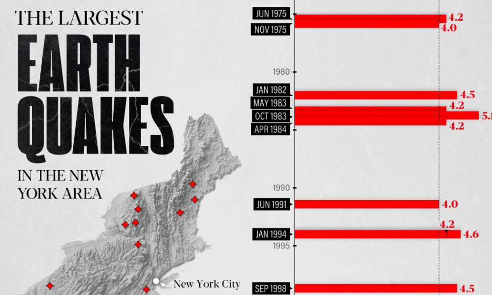
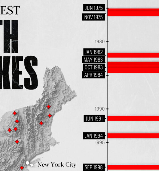
The earthquake that shook buildings across New York in April 2024 was the third-largest quake in the Northeast U.S. over...
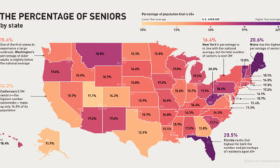

The U.S. senior population is much more vulnerable to COVID-19. Which states and cities have the most people in this at-risk age group?
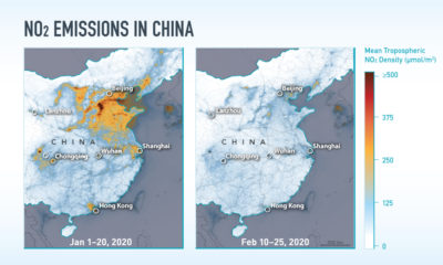

While the COVID-19 pandemic has been all-consuming, these satellite images show its unintended environmental impacts on NO₂ emissions.
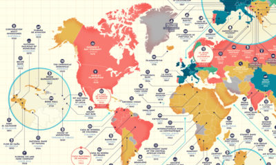

Which companies have stood the test of time? This detailed map highlights the oldest company in every country that is still in business.
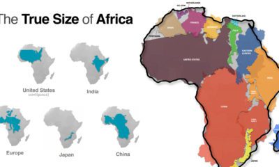

Common map projections warp our view of the globe. This graphic reveals the true size of Africa, which could fit the U.S., China, India, and more.
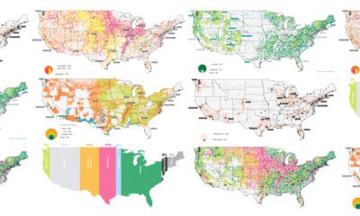

The U.S. covers an immense 3.8 million square miles—what is all this land currently used for, and what does that mean for the future?
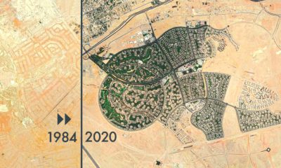

From rapid urbanization to retreating glaciers, these timelapsed satellite maps capture the drastic changes the Earth's surface has undergone.
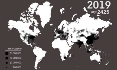

See every major coal power plant ever commissioned on this animation, which covers a time period from 1927 until 2019.
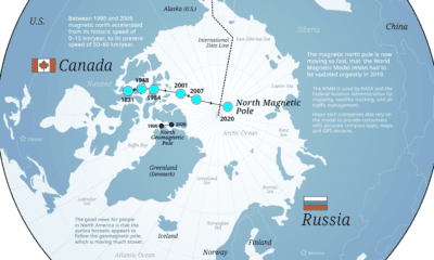

Is someone stealing Christmas? It isn't the Grinch or Putin stealing Santa’s workshop, but Earth's natural processes that are moving the North Pole.
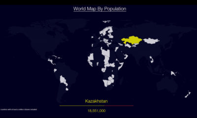

Watch countries appear one-by-one to form a cohesive world map, when they are ordered by population.
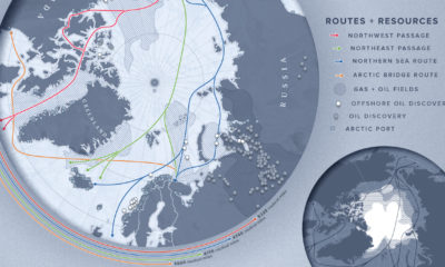

As the Arctic becomes more accessible due to reduced ice cover, countries with polar real estate increasingly viewing the region through an economic lens.


