Misc
Santa’s New Home: The North Pole is Moving to Russia
Santa’s New Home: The North Pole is Moving to Russia
The North Pole is moving and quickly. Is someone stealing Christmas?
It is not the Grinch or Vladimir Putin that is stealing Santa’s workshop, but instead it’s the natural processes of the Earth that are moving the North Pole. In fact, since scientists have been tracking the anomaly in the Arctic, the North Magnetic Pole has been shifting towards Russia.
So why exactly is the pole moving, and what does it mean?
Charting a Course: Magnetic North
A compass always points towards the North Magnetic Pole. Maritime and airplane navigation systems, defense systems, and even smartphones depend on accurate magnetic readings.
This magnetism has been long known, but the true origins of this force were poorly understood. In one of the first maps of the Arctic by Gerardus Mercator, the centerpiece of it was massive rock located exactly at the pole, Rupus Nigra et Altissima, or “Black, Very High Cliff.”
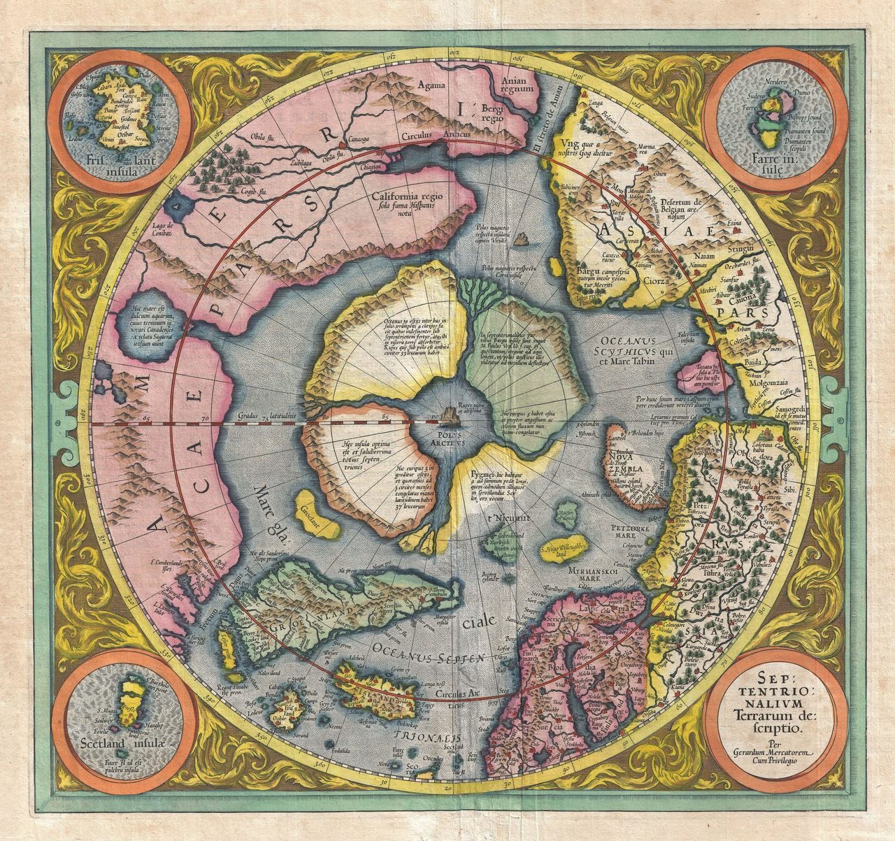
Most people thought that this rock formation was magnetic, which provided an easy explanation for why compasses point north. This did not convince Mercator, so he included a different rock, which he labeled the “Magnetic Pole.”
Mercator was right about the general location of Magnetic North, but he did not have the tools we have today to understand how the anomaly moves. The North Magnetic Pole is a spot on the top of the planet where the Earth’s magnetic field lines converge and drive straight into its core.
As it turns out, the Earth’s physical structure is behind all this magnetic shifting. The planet’s inner core is made of solid iron, while surrounding that is a molten metallic outer core. It’s from here that heat escapes, creating electric currents in the conductive iron alloys in the core.
In other words, the processes that create the magnetic effect are far more complex — and occur way deeper in the planet — than Mercator could have ever imagined.
The Dynamo Effect
The Earth itself spins on its axis. The inner core spins as well, and it spins at a different rate than the outer core. This creates a dynamo effect that enables the Earth’s magnetic field.
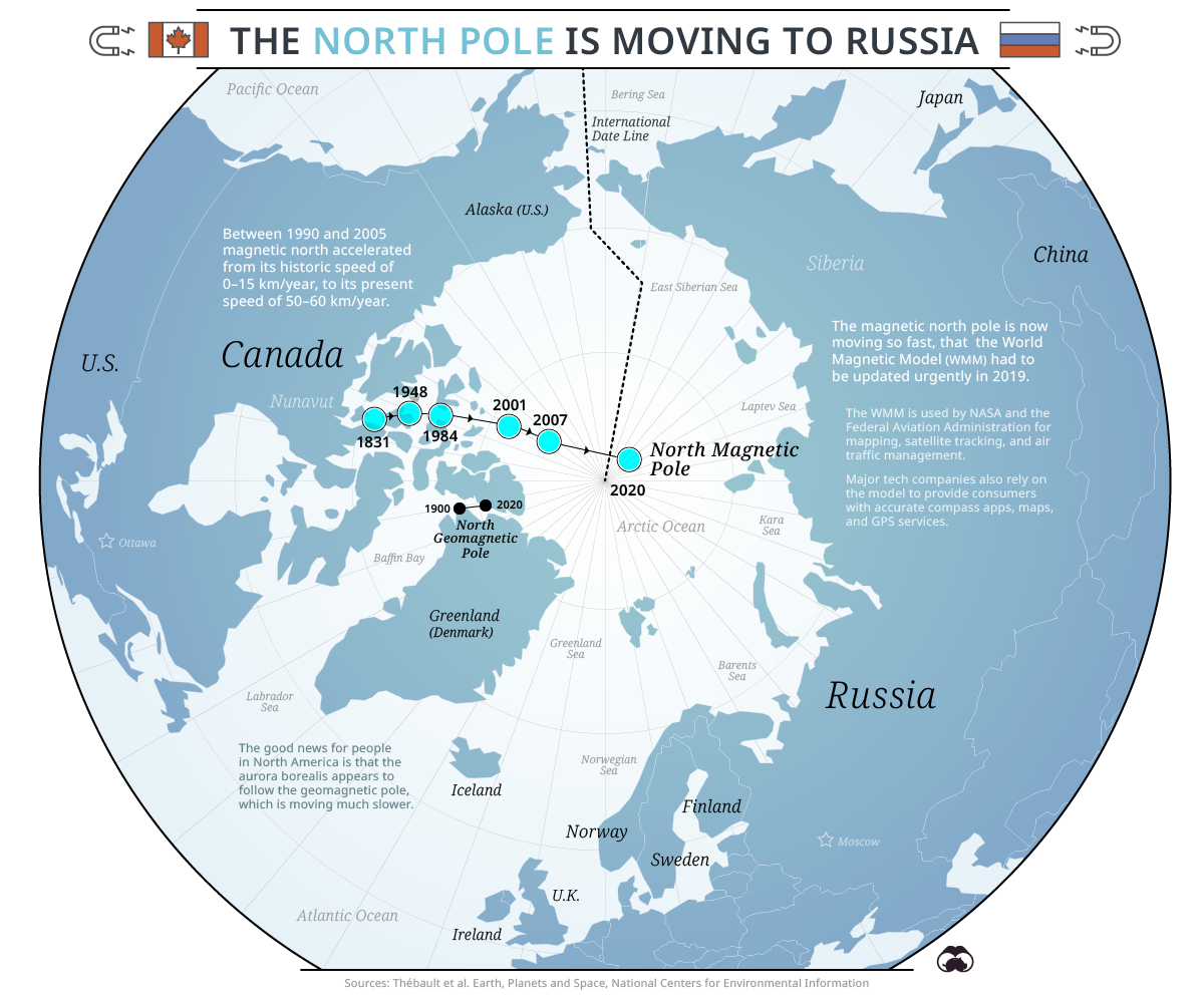
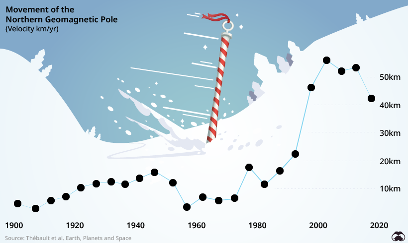
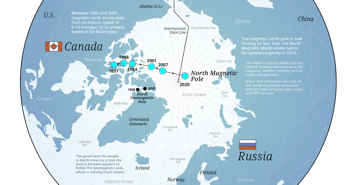
Satellite data tracking the Earth’s magnetic field indicate that the pole is moving faster across the Arctic than previously recorded. While it’s hard to estimate an exact date by which the North Pole will lie in Russia (due to contested geographic claims in the Arctic), it will eventually get there.
What surprises scientists is the rate at which the movement has increased in recent history:
This is happening because of a push and pull between two unusually strong magnetic patches in the Earth’s outer core. One patch is under Canada while the other is beneath Siberia.
The North Magnetic Pole has historically lain within Canadian borders because of stronger pull of the Canadian magnetic patch, but that is changing rapidly.
The Evidence: How Do We Know What We Know?
Scientists can study the phenomenon of moving poles by examining the rocks lying on the ocean floor that captured magnetic traces of previous orientations of the Earth’s magnetic field.
According to the geological record, the last time the poles switched was ~780,000 years ago, and it has happened about 400 times in 330 million years. Each reversal takes roughly a thousand years to complete. The field has weakened about 10% in the last 150 years. Some scientists think this is a sign of a flip in progress.
Technology is advancing and providing new tools for scientists to study this phenomenon. In 2013, the European Space Agency (ESA) launched the SWARM mission to study the Earth’s magnetic field using satellites. This will provide data for modeling the geomagnetic field and its interaction with other physical aspects of Earth, offering a look inside the Earth from space.
Happy Holidays from Visual Capitalist
Just like Santa going down the chimney of every home to deliver presents to all the girls and boys, Visual Capitalist wants to deliver a better understanding of the world we live in, so we can better appreciate how amazing it is. This is our small present to the world.
Happy Holidays to all, and a prosperous New Year.


VC+
VC+: Get Our Key Takeaways From the IMF’s World Economic Outlook
A sneak preview of the exclusive VC+ Special Dispatch—your shortcut to understanding IMF’s World Economic Outlook report.

Have you read IMF’s latest World Economic Outlook yet? At a daunting 202 pages, we don’t blame you if it’s still on your to-do list.
But don’t worry, you don’t need to read the whole April release, because we’ve already done the hard work for you.
To save you time and effort, the Visual Capitalist team has compiled a visual analysis of everything you need to know from the report—and our VC+ Special Dispatch is available exclusively to VC+ members. All you need to do is log into the VC+ Archive.
If you’re not already subscribed to VC+, make sure you sign up now to access the full analysis of the IMF report, and more (we release similar deep dives every week).
For now, here’s what VC+ members get to see.
Your Shortcut to Understanding IMF’s World Economic Outlook
With long and short-term growth prospects declining for many countries around the world, this Special Dispatch offers a visual analysis of the key figures and takeaways from the IMF’s report including:
- The global decline in economic growth forecasts
- Real GDP growth and inflation forecasts for major nations in 2024
- When interest rate cuts will happen and interest rate forecasts
- How debt-to-GDP ratios have changed since 2000
- And much more!

Get the Full Breakdown in the Next VC+ Special Dispatch
VC+ members can access the full Special Dispatch by logging into the VC+ Archive, where you can also check out previous releases.
Make sure you join VC+ now to see exclusive charts and the full analysis of key takeaways from IMF’s World Economic Outlook.
Don’t miss out. Become a VC+ member today.
What You Get When You Become a VC+ Member
VC+ is Visual Capitalist’s premium subscription. As a member, you’ll get the following:
- Special Dispatches: Deep dive visual briefings on crucial reports and global trends
- Markets This Month: A snappy summary of the state of the markets and what to look out for
- The Trendline: Weekly curation of the best visualizations from across the globe
- Global Forecast Series: Our flagship annual report that covers everything you need to know related to the economy, markets, geopolitics, and the latest tech trends
- VC+ Archive: Hundreds of previously released VC+ briefings and reports that you’ve been missing out on, all in one dedicated hub
You can get all of the above, and more, by joining VC+ today.

-

 Debt1 week ago
How Debt-to-GDP Ratios Have Changed Since 2000
-

 Markets2 weeks ago
Ranked: The World’s Top Flight Routes, by Revenue
-

 Countries2 weeks ago
Population Projections: The World’s 6 Largest Countries in 2075
-

 Markets2 weeks ago
The Top 10 States by Real GDP Growth in 2023
-

 Demographics2 weeks ago
The Smallest Gender Wage Gaps in OECD Countries
-

 United States2 weeks ago
Where U.S. Inflation Hit the Hardest in March 2024
-

 Green2 weeks ago
Top Countries By Forest Growth Since 2001
-

 United States2 weeks ago
Ranked: The Largest U.S. Corporations by Number of Employees