Misc
Mapped: The World’s Most Populous Countries, in Ascending Order
Mapping the Most Populous Countries, in Ascending Order
To keep information from getting stale, it can be worth changing things up.
One way to do this is to present data in a different way than what is traditionally expected, enabling a fresh perspective of the same information.
Today’s animated map comes to us from Reddit user notoriousstats, and it provides another angle of looking at a traditional world map: by plotting countries in the order of ascending populations, from the least populated to the most populated.
Filling a Map from Scratch
In the above animation, countries are added onto the map in sequence — each must have a minimum population of 1 million people — going from Swaziland (now officially known as Eswatini) all the way up to China.
It’s a visual trick that helps trigger some new insights, specifically about the population density of countries and continents. Let’s dive into a couple things that stood out.
Insights on Population Density
We naturally assume that the bigger a country is, the more people it usually has.
However, when we watch an animation like this, it becomes clear that this is not often the case. In fact, many large countries appear on the map early on — taking massive amounts of geographic real estate, but with very low populations.
Below is a list of the 10 countries with the lowest population densities on the planet:
| Rank | Country | Population | Density (sq. km) | Density (sq. mi) |
|---|---|---|---|---|
| #1 | 🇲🇳 Mongolia | 3,225,000 | 2.08 | 5.38 |
| #2 | 🇳🇦 Namibia | 2,495,000 | 3.03 | 7.85 |
| #3 | 🇦🇺 Australia | 25,203,000 | 3.30 | 8.55 |
| #4 | 🇱🇾 Libya | 6,777,000 | 3.85 | 9.98 |
| #5 | 🇧🇼 Botswana | 2,304,000 | 4.07 | 10.53 |
| #6 | 🇨🇦 Canada | 37,411,000 | 4.11 | 10.66 |
| #7 | 🇲🇷 Mauritania | 4,526,000 | 4.41 | 11.43 |
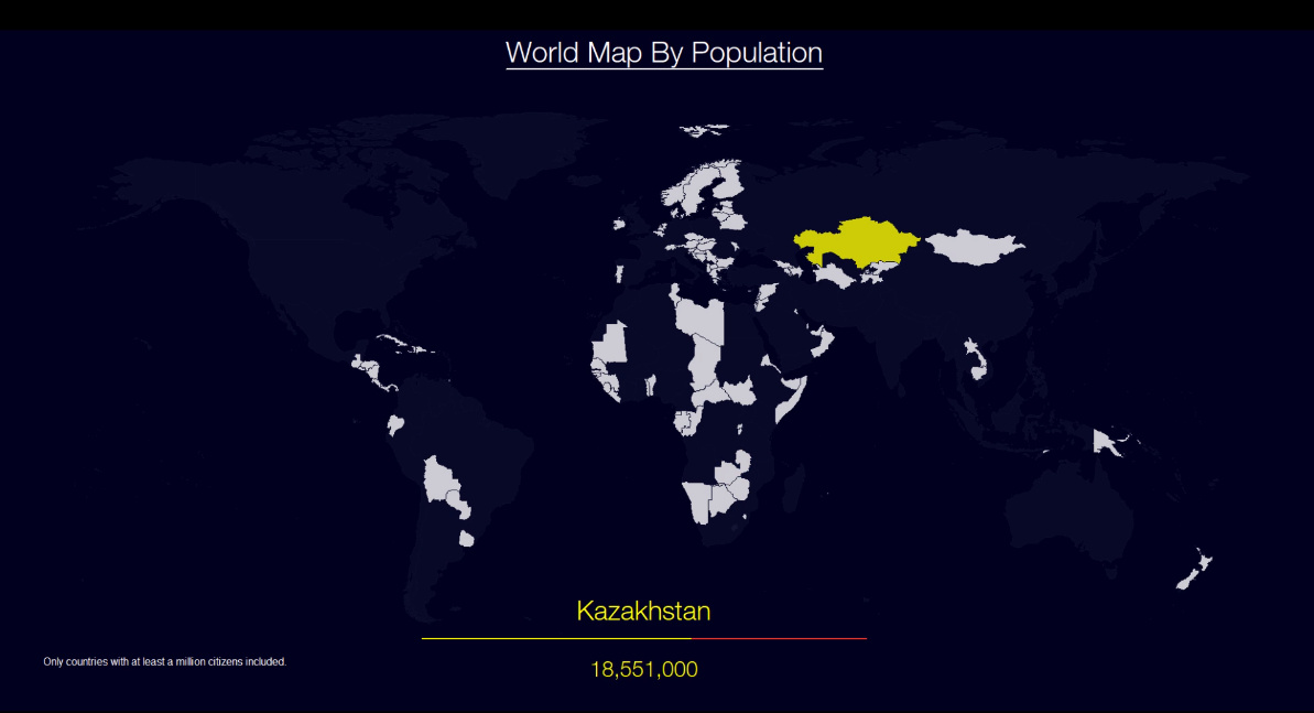
| #8 | 🇰🇿 Kazakhstan | 18,551,000 | 6.87 | 17.80 |
| #9 | 🇨🇫 Central African Rep. | 4,745,000 | 7.62 | 19.73 |
| #10 | 🇬🇦 Gabon | 2,173,000 | 8.43 | 21.84 |
Using this and the map as reference, what stands out?
Africa in Focus
Africa has over 1.2 billion people living on it, so we often think of the continent as having a fairly high population density.
However, if you watch the animation, you’ll notice that many of the first countries appearing on the map are African — in fact, six of the 10 least densely populated countries in the world are on the continent: Namibia, Libya, Botswana, Mauritania, Central African Republic, and Gabon.
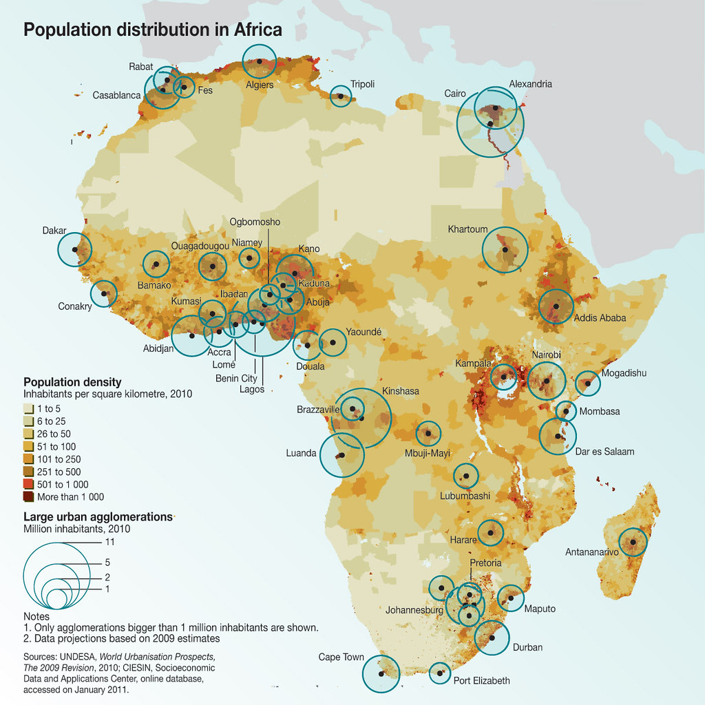
The reason for this lack of population density lies partly in geography.
We are all familiar with the vast extent of the Sahara (which makes most of Libya and Maritania desolate), but have you heard of the Namib or Kalahari deserts in the south?
The Namib takes away Namibia’s entire coastline, while the Kalahari makes most of Botswana and parts of Namibia almost inhospitable.
Juxtapositions
The animated map also creates some eye-popping juxtapositions between countries, which are appearing in order of population.
For example, Australia and North Korea appear in sequence. Both have about 26 million people, but Australia has a landmass that is about 63 times as large.
Russia and Bangladesh are also back-to-back; Russia has 145 million people, while Bangladesh has 163 million. Yet, if Russia had the population density of Bangladesh, it would be home to 19 billion people, which is three times the current global total.
Changing Perspectives
If we always look at things the same way, it’s hard to notice something new.
Each time we view a map from a different angle, it creates the opportunity to discover new insights. This same thought process can be applied to other areas of life, so that we can always be learning — and data never gets stale.


Misc
Visualizing the Most Common Pets in the U.S.
Lions, tigers, and bears, oh my!—these animals do not feature on this list of popular American household pets.


Visualizing The Most Common Pets in the U.S.
This was originally posted on our Voronoi app. Download the app for free on iOS or Android and discover incredible data-driven charts from a variety of trusted sources.
In this graphic, we visualized the most common American household pets, based on 2023-2024 data from the American Pet Products Association (accessed via Forbes Advisor).
Figures represent the number of households that own each pet type, rather than the actual number of each animal. The “small animal” category includes hamsters, gerbils, rabbits, guinea pigs, chinchillas, mice, rats, and ferrets.
What is the Most Popular American Household Pet?
Based on this data, dogs—one of the first domesticated animals—are the most common pets in the United States. In fact, around 65 million households own a dog, and spend an average of $900 a year on their care.
| Rank | Species | Households |
|---|---|---|
| 1 | 🐶 Dog | 65M |
| 2 | 🐱 Cat | 47M |
| 3 | 🐟 Freshwater Fish | 11M |
| 4 | 🐰 Small Animals | 7M |
| 5 | 🐦 Bird | 6M |
| 6 | 🦎 Reptile | 6M |
| 7 | 🐴 Horse | 2M |
| 8 | 🐠 Saltwater Fish | 2M |
Note: Households can own multiple pets, and are counted for all relevant categories.
Cats rank second, at 47 million households, and these smaller felines are a little less expensive to own at $700/year according to Forbes estimates.
But aside from these two juggernauts, there are plenty of other common pet types found in households across the country.
Freshwater fish can be found in 11 million households, along with small animals—rabbits, hamsters, guinea pigs—in 7 million. Meanwhile, nearly 6 million homes have birds or reptiles.
Pet Ownership is on the Rise in America
Forbes found that 66% of all American households (numbering 87 million) own at least one pet, up from 56% in 1988. One third of these (29 million) own multiple pets.
A combination of factors is driving this increase: rising incomes, delayed childbirth, and of course the impact of the pandemic which nearly cleared out animal shelters across the globe.
America’s loneliness epidemic may also be a factor. Fledgling research has shown that single-individual households with pets recorded lower rates of loneliness during the pandemic than those without a pet.

-

 Science1 week ago
Visualizing the Average Lifespans of Mammals
-

 Markets2 weeks ago
The Top 10 States by Real GDP Growth in 2023
-

 Demographics2 weeks ago
The Smallest Gender Wage Gaps in OECD Countries
-

 United States2 weeks ago
Where U.S. Inflation Hit the Hardest in March 2024
-

 Green2 weeks ago
Top Countries By Forest Growth Since 2001
-

 United States2 weeks ago
Ranked: The Largest U.S. Corporations by Number of Employees
-

 Maps2 weeks ago
The Largest Earthquakes in the New York Area (1970-2024)
-

 Green2 weeks ago
Ranked: The Countries With the Most Air Pollution in 2023