

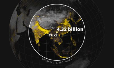
We visualize Asia’s population patterns to see where 4.6 billion people, or two-thirds of the world’s population, actually live.
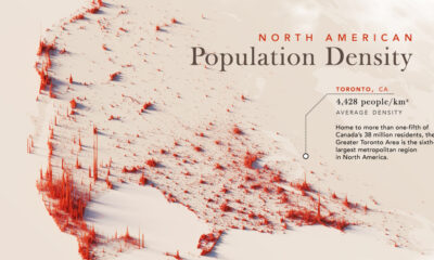

Nearly half a billion people live on the third-largest continent. We take a closer look in this population map of North America.
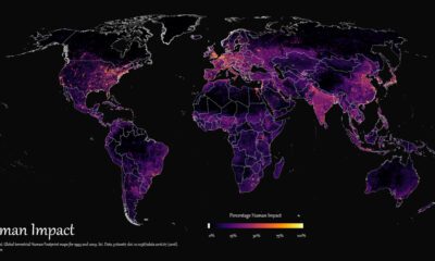

How far has humanity spread, and where haven't we gone? This graphic maps the extent of humanity’s impact on the world from 1993 to 2009.
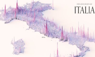

These maps show the population density of several countries, using 3D spikes to denote where more people live.
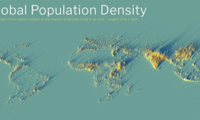

What does population density look like on a global scale? These detailed 3D renders illustrate our biggest urban areas and highlight population trends.
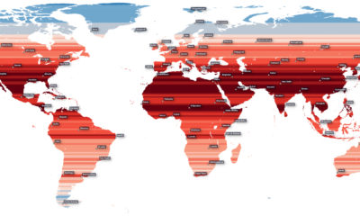

How much of the Earth’s population is located near the equator? This map visualizes the world’s population density by latitude.

Population density varies across the globe. These maps use geographical circles to show the most densely populated areas on multiple continents.
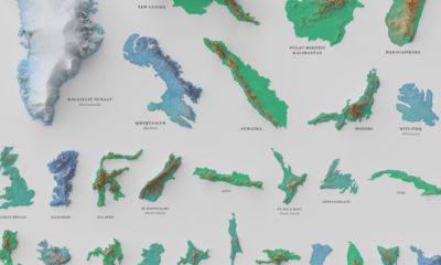

See the world's 100 biggest islands in a side-by-side comparison. Then, we look to see which islands have the highest population densities.
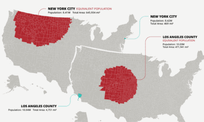

The U.S. population is spread across a huge amount of land, but its distribution is far from equal. These maps are a unique look at population...
What does population density look like on a global scale? These detailed 3D renders illustrate our biggest urban areas and highlight population trends.


 Creator Program