
Which countries have the largest populations, or the highest GDP? This animation compares countries based on 20 different metrics.
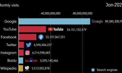

This video shows the evolution of the internet, highlighting the most popular websites from 1993 until 2022.
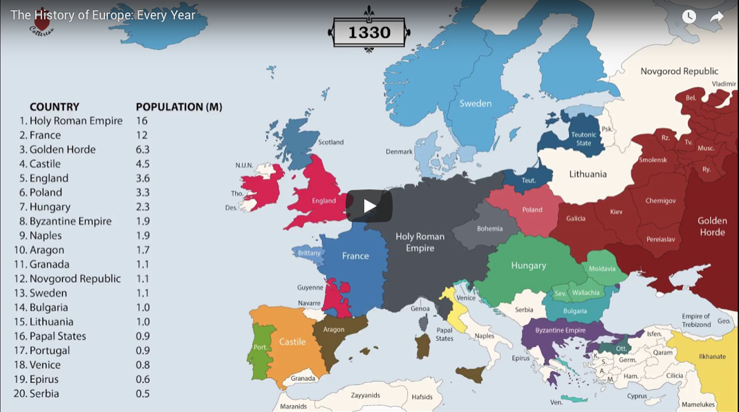
The history of Europe is breathtakingly complex, but this animation helps makes sense of 2,400 years of change on the European map.
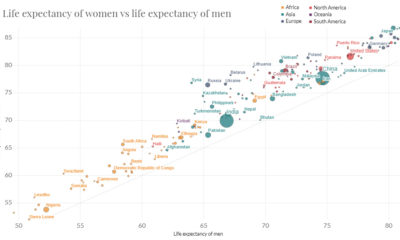

In just 65 years, global life expectancy has skyrocketed. See its ascent in this short animation, or dive into the interactive version for more data.
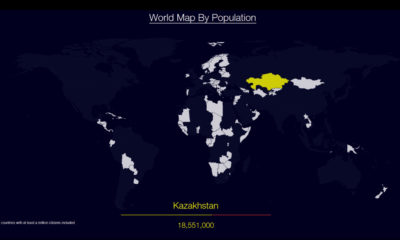

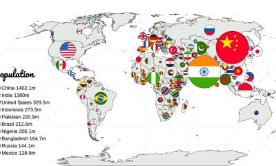
Watch countries appear one-by-one to form a cohesive world map, when they are ordered by population.
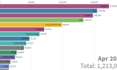

This stunning animation visualizes the last nine years of U.S. electric vehicle sales. We also look at who will lead the race in the coming years.
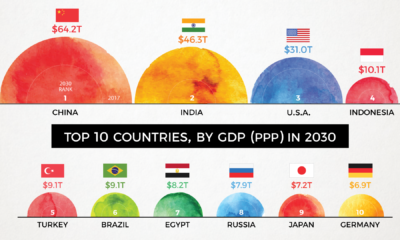

By 2030, the complexion of the global economy could look very different. This animation shows how the world's biggest economies will change over time.
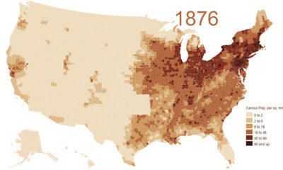

This animation shows the population density of U.S. counties between 1790 and 2010, showing the westward expansion of the country's population.
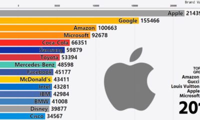

This stunning animation shows a dramatic change in the world's most valuable global brands. Watch tech companies like Apple shoot up the rankings in style.
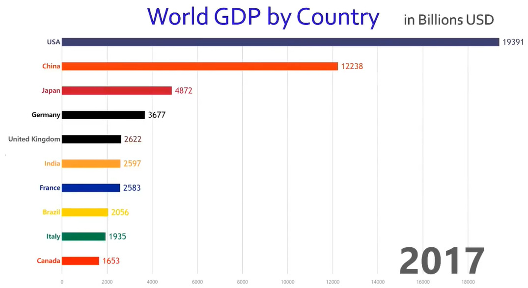
This rapid-paced animation shows year-by-year changes in GDP for the world's 10 largest economies over the course of 57 years.


 Creator Program