Green
Visualizing the Biggest Threats to Earth’s Biodiversity


The Biggest Threats to Earth’s Biodiversity
Biodiversity benefits humanity in many ways.
It helps make the global economy more resilient, it functions as an integral part of our culture and identity, and research has shown it’s even linked to our physical health.
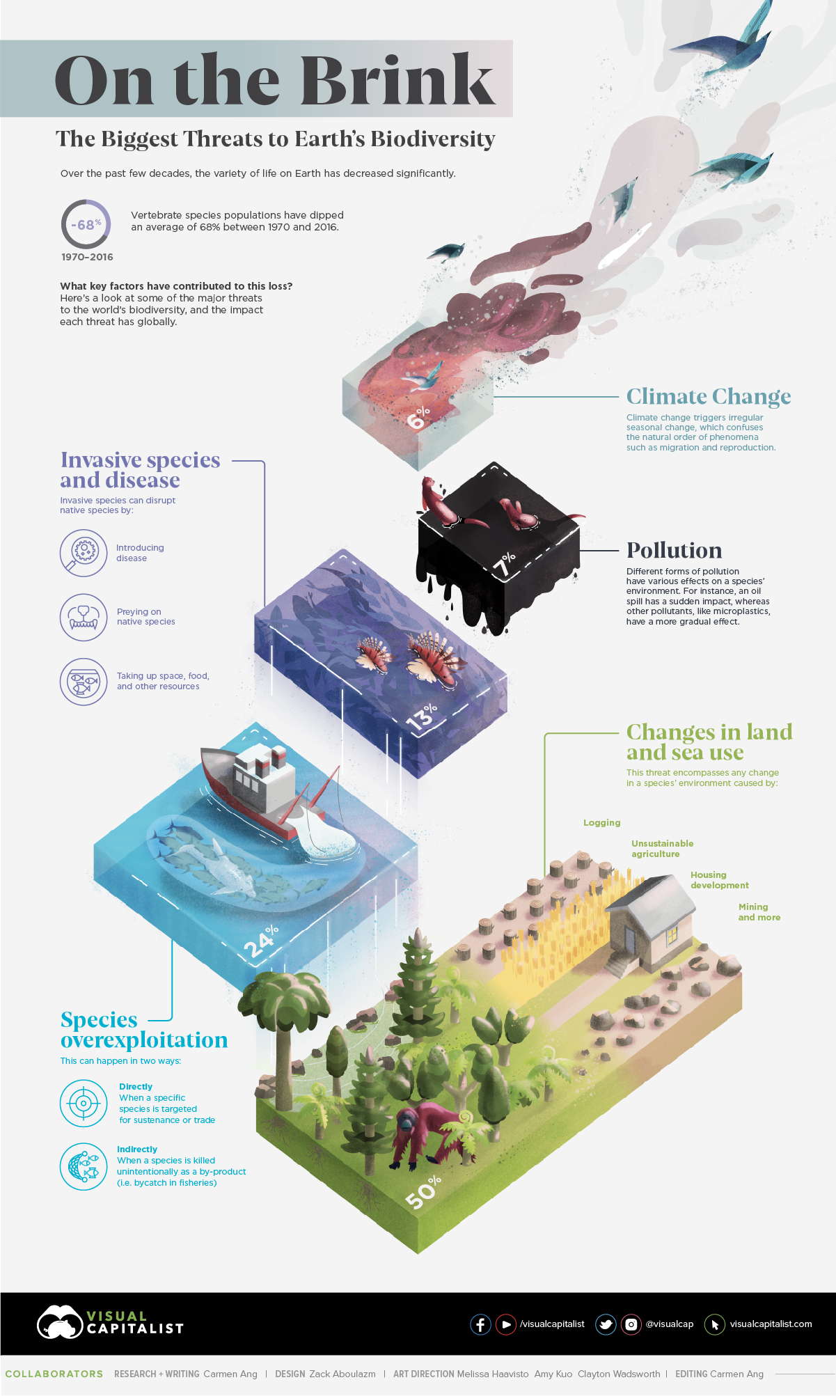
However, despite its importance, Earth’s biodiversity has decreased significantly over the last few decades. In fact, between 1970 and 2016, the population of vertebrate species fell by 68% on average worldwide. What’s causing this global decline?
Today’s graphic uses data from WWF’s Living Planet Report 2020 to illustrate the biggest threats to Earth’s biodiversity, and the impact each threat has had globally.
Measuring the Loss of Biodiversity
Before looking at biodiversity’s biggest threats, first thing’s first—how exactly has biodiversity changed over the years?
WWF uses the Living Planet Index (LPI) to measure biodiversity worldwide. Using data from over 4,000 different species, LPI tracks the abundance of mammals, birds, fish, reptiles, and amphibians across the globe.
Here’s a look at each region’s average decline between 1970 and 2016:
| Rank | Region | Average decline (between 1970 and 2016) |
|---|---|---|
| 1 | Latin America & Caribbean | 94% |
| 2 | Africa | 65% |
| 3 | Asia Pacific | 45% |
| 4 | North America | 33% |
| 5 | Europe and Central Asia | 24% |
Latin America & Caribbean has seen the biggest drop in biodiversity at 94%. This region’s drastic decline has been mainly driven by declining reptile, amphibian, and fish populations.
Despite varying rates of loss between regions, it’s clear that overall, biodiversity is on the decline. What main factors are driving this loss, and how do these threats differ from region to region?
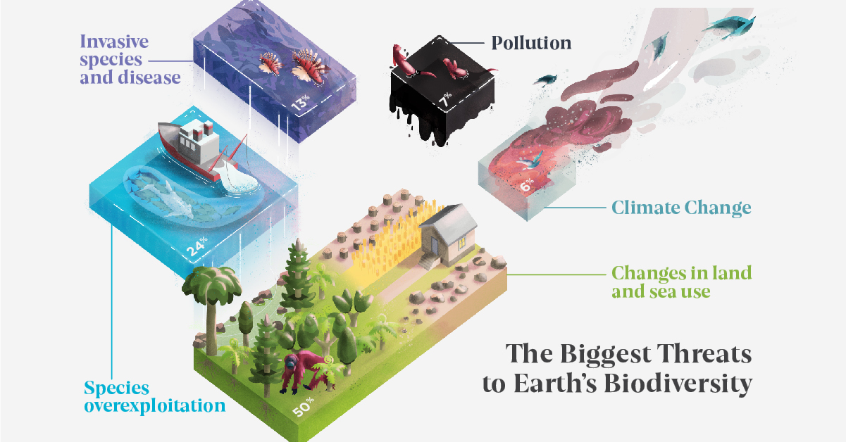
Biggest Threats to Biodiversity, Overall
While it’s challenging to create an exhaustive list, WWF has identified five major threats and shown each threats proportional impact, averaged across all regions:
| Threat | Proportion of threat (average across all regions) |
|---|---|
| Changes in land and sea use | 50% |
| Species overexploitation | 24% |
| Invasive species and disease | 13% |
| Pollution | 7% |
| Climate Change | 6% |
Across the board, changes in land and sea use account for the largest portion of loss, making up 50% of recorded threats to biodiversity on average. This makes sense, considering that approximately one acre of the Earth’s rainforests is disappearing every two seconds.
Species overexploitation is the second biggest threat at 24% on average, while invasive species takes the third spot at 13%.
Biggest Threats to Biodiversity, By Region
When looking at the regional breakdown, the order of threats in terms of biodiversity impact is relatively consistent across all regions—however, there are a few discrepancies:
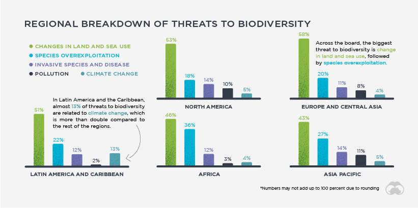
In Latin America and Caribbean, climate change has been a bigger biodiversity threat than in other regions, and this is possibly linked to an increase in natural disasters. Between 2000 and 2013, the region experienced 613 extreme climate and hydro-meteorological events, from typhoons and hurricanes to flash floods and droughts.
Another notable variation from the mean is species over-exploitation in Africa, which makes up 35% of the region’s threats. This is higher than in other regions, which sit around 18-27%.
While the regional breakdowns differ slightly from place to place, one thing remains constant across the board—all species, no matter how small, play an important role in the maintenance of Earth’s ecosystems.
Will we continue to see a steady decline in Earth’s biodiversity, or will things level out in the near future?


Green
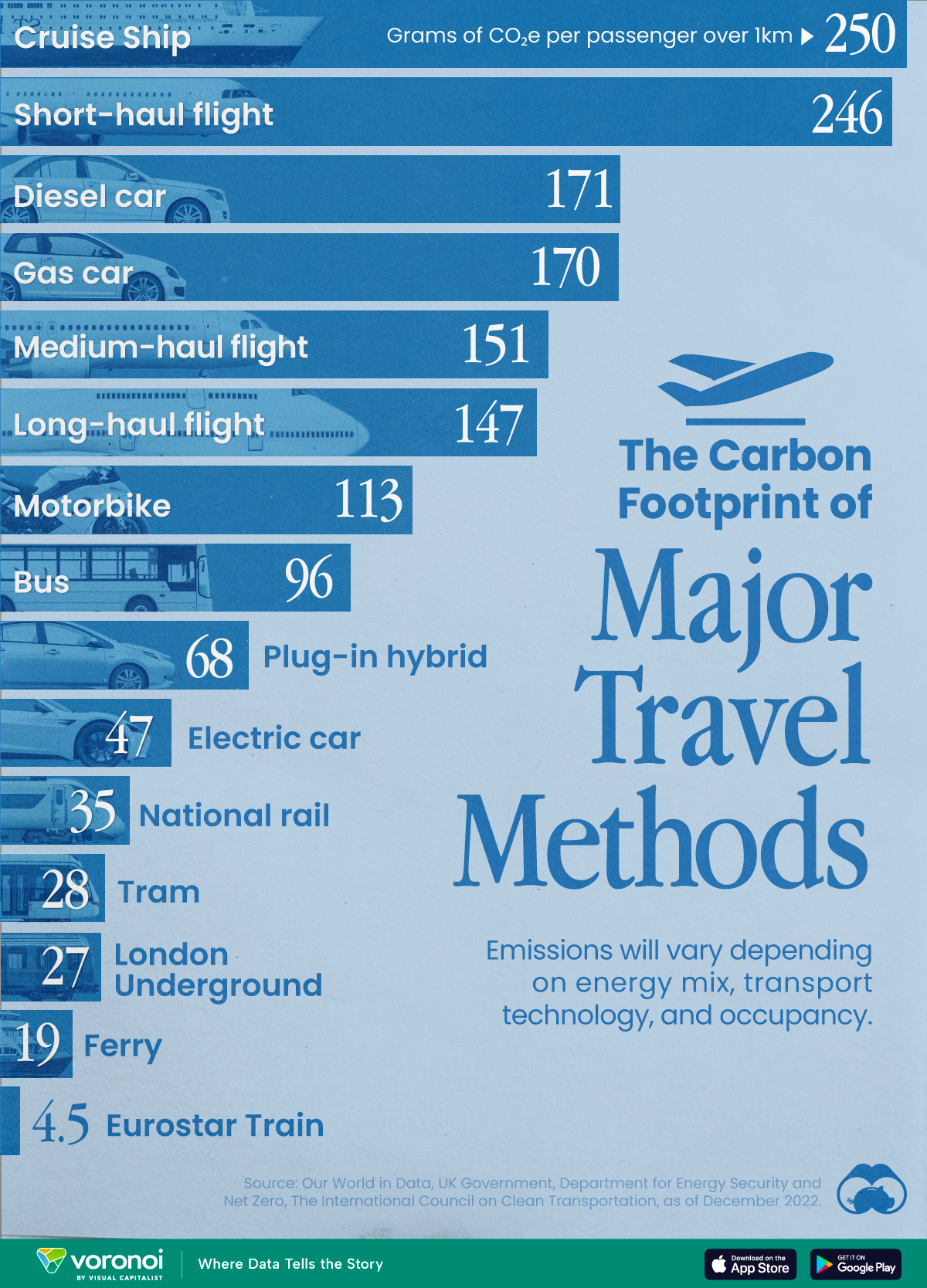
The Carbon Footprint of Major Travel Methods
Going on a cruise ship and flying domestically are the most carbon-intensive travel methods.
The Carbon Footprint of Major Travel Methods
This was originally posted on our Voronoi app. Download the app for free on iOS or Android and discover incredible data-driven charts from a variety of trusted sources.
Did you know that transport accounts for nearly one-quarter of global energy-related carbon dioxide (CO₂) emissions?
This graphic illustrates the carbon footprints of major travel methods measured in grams of carbon dioxide equivalent (CO₂e) emitted per person to travel one kilometer. This includes both CO₂ and other greenhouse gases.
Data is sourced from Our World in Data, the UK Government’s Department for Energy Security and Net Zero, and The International Council on Clean Transportation, as of December 2022.
These figures should be interpreted as approximations, rather than exact numbers. There are many variables at play that determine the actual carbon footprint in any individual case, including vehicle type or model, occupancy, energy mix, and even weather.
Cruise Ships are the Most Carbon-Intensive Travel Method
According to these estimates, taking a cruise ship, flying domestically, and driving alone are some of the most carbon-intensive travel methods.
Cruise ships typically use heavy fuel oil, which is high in carbon content. The average cruise ship weighs between 70,000 to 180,000 metric tons, meaning they require large engines to get moving.
These massive vessels must also generate power for onboard amenities such as lighting, air conditioning, and entertainment systems.
Short-haul flights are also considered carbon-intensive due to the significant amount of fuel consumed during initial takeoff and climbing altitude, relative to a lower amount of cruising.
| Transportation method | CO₂ equivalent emissions per passenger km |
|---|---|
| Cruise Ship | 250 |
| Short-haul flight (i.e. within a U.S. state or European country) | 246 |
| Diesel car | 171 |
| Gas car | 170 |
| Medium-haul flight (i.e. international travel within Europe, or between U.S. states) | 151 |
| Long-haul flight (over 3,700 km, about the distance from LA to NY) | 147 |
| Motorbike | 113 |
| Bus (average) | 96 |
| Plug-in hybrid | 68 |
| Electric car | 47 |
| National rail | 35 |
| Tram | 28 |
| London Underground | 27 |
| Ferry (foot passenger) | 19 |
| Eurostar (International rail) | 4.5 |
Are EVs Greener?
Many experts agree that EVs produce a lower carbon footprint over time versus traditional internal combustion engine (ICE) vehicles.
However, the batteries in electric vehicles charge on the power that comes straight off the electrical grid—which in many places may be powered by fossil fuels. For that reason, the carbon footprint of an EV will depend largely on the blend of electricity sources used for charging.
There are also questions about how energy-intensive it is to build EVs compared to a comparable ICE vehicle.

-

 Debt1 week ago
How Debt-to-GDP Ratios Have Changed Since 2000
-

 Markets2 weeks ago
Ranked: The World’s Top Flight Routes, by Revenue
-

 Countries2 weeks ago
Population Projections: The World’s 6 Largest Countries in 2075
-

 Markets2 weeks ago
The Top 10 States by Real GDP Growth in 2023
-

 Demographics2 weeks ago
The Smallest Gender Wage Gaps in OECD Countries
-

 United States2 weeks ago
Where U.S. Inflation Hit the Hardest in March 2024
-

 Green2 weeks ago
Top Countries By Forest Growth Since 2001
-

 United States2 weeks ago
Ranked: The Largest U.S. Corporations by Number of Employees