Markets
The $86 Trillion World Economy in One Chart
Check out the latest 2023 update of the world economy in one chart.
The $86 Trillion World Economy in One Chart
Check out the latest 2023 update of the world economy by country GDPs in one chart.
The world economy is in a never-ending state of flux.
The fact is that billions of variables — both big and small — factor into any calculation of overall economic productivity, and these inputs are changing all of the time.
Buying this week’s groceries or filling up your car with gas may seem like a rounding error when we are talking about trillions of dollars, but every microeconomic decision or set of preferences can add up in aggregate.
And as consumer preferences, technology, trade relationships, interest rates, and currency valuations change — so does the final composition of the world’s $86 trillion economy.
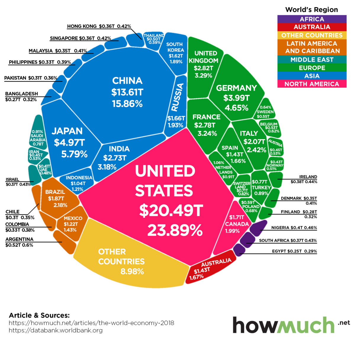
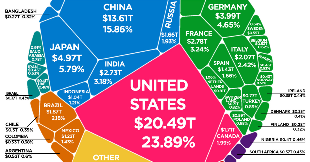
Country GDPs, by Size
Today’s visualization comes to us from HowMuch.net, and it charts the most recent composition of the global economic landscape.
It should be noted that the diagram uses nominal GDP to measure economic output, which is different than using GDP adjusted for purchasing power parity (PPP). The data in the diagram and table below come from the World Bank’s latest update, published in July 2019.
The Top 15 Economies, by GDP
| Rank | Country | GDP (Nominal, USD) | Share of World Total (%) |
|---|---|---|---|
| #1 | 🇺🇸 United States | $20.49 trillion | 23.89% |
| #2 | 🇨🇳 China | $13.61 trillion | 15.86% |
| #3 | 🇯🇵 Japan | $4.97 trillion | 5.79% |
| #4 | 🇩🇪 Germany | $4.00 trillion | 4.66% |
| #5 | 🇬🇧 United Kingdom | $2.83 trillion | 3.29% |
| #6 | 🇫🇷 France | $2.78 trillion | 3.24% |
| #7 | 🇮🇳 India | $2.73 trillion | 3.18% |
| #8 | 🇮🇹 Italy | $2.07 trillion | 2.42% |
| #9 | 🇧🇷 Brazil | $1.87 trillion | 2.18% |
| #10 | 🇨🇦 Canada | $1.71 trillion | 1.99% |
| #11 | 🇷🇺 Russian Federation | $1.66 trillion | 1.93% |
| #12 | 🇰🇷 Korea, Rep. | $1.62 trillion | 1.89% |
| #13 | 🇦🇺 Australia | $1.43 trillion | 1.67% |
| #14 | 🇪🇸 Spain | $1.43 trillion | 1.66% |
| #15 | 🇲🇽 Mexico | $1.22 trillion | 1.43% |
The above 15 economies represent a whopping 75% of total global GDP, which added up to $85.8 trillion in 2018 according to the World Bank.
Most interestingly, the gap between China and the United States is narrowing — and in nominal terms, China’s economy is now 66.4% the size.
A Higher Level Look
The World Bank also provides a regional breakdown of global GDP, which we helps to give additional perspective:
| Rank | Geographic Region | GDP (Nominal, USD) | Global Share |
|---|---|---|---|
| #1 | East Asia & Pacific | $25.9 trillion | 30.2% |
| #2 | Europe & Central Asia | $23.0 trillion | 26.8% |
| #3 | North America | $22.2 trillion | 25.9% |
| #4 | Latin America & Caribbean | $5.8 trillion | 6.8% |
| #5 | Middle East & North Africa | $3.6 trillion | 4.2% |
| #6 | South Asia | $3.5 trillion | 4.1% |
| #7 | Sub-Saharan Africa | $1.7 trillion | 2.0% |
| World Total | $85.8 trillion | 100.0% |
The organization breaks it down by income levels, as well:
| Income Level | GDP (Nominal, USD) | Global Share |
|---|---|---|
| High income countries | $54.1 trillion | 63.1% |
| Upper middle income countries | $24.4 trillion | 28.4% |
| Lower middle income countries | $6.7 trillion | 7.8% |
| Low income countries | $0.6 trillion | 0.7% |
| World total | $85.8 trillion | 100.00% |
The low income countries — which have a combined population of about 705 million people — add up to only 0.6% of global GDP.
Looking Towards the Future
For more on the world economy and predictions on country GDPs on a forward-looking basis, we suggest looking at our animation on the Biggest Economies in 2030.
It is worth mentioning, however, that the animation uses GDP (PPP) calculations instead of the nominal ones above.


Markets
The European Stock Market: Attractive Valuations Offer Opportunities
On average, the European stock market has valuations that are nearly 50% lower than U.S. valuations. But how can you access the market?
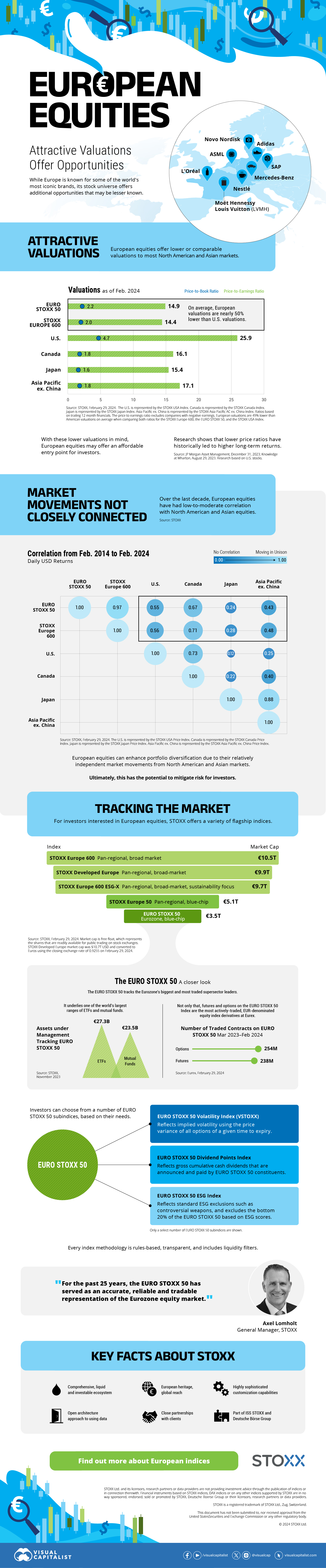
European Stock Market: Attractive Valuations Offer Opportunities
Europe is known for some established brands, from L’Oréal to Louis Vuitton. However, the European stock market offers additional opportunities that may be lesser known.
The above infographic, sponsored by STOXX, outlines why investors may want to consider European stocks.
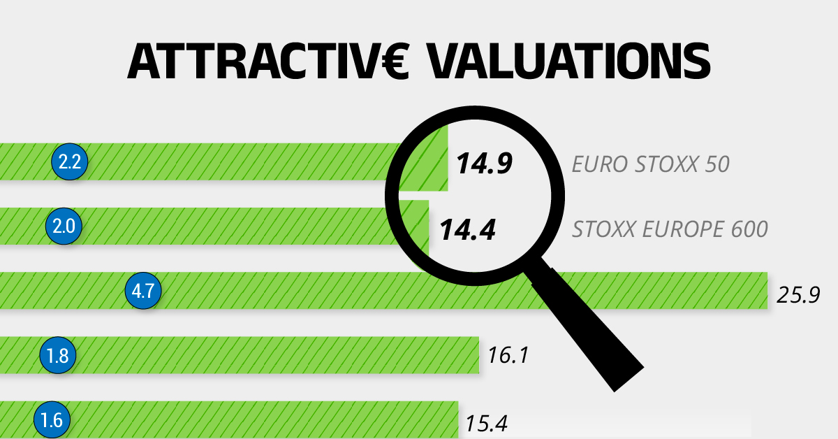
Attractive Valuations
Compared to most North American and Asian markets, European stocks offer lower or comparable valuations.
| Index | Price-to-Earnings Ratio | Price-to-Book Ratio |
|---|---|---|
| EURO STOXX 50 | 14.9 | 2.2 |
| STOXX Europe 600 | 14.4 | 2 |
| U.S. | 25.9 | 4.7 |
| Canada | 16.1 | 1.8 |
| Japan | 15.4 | 1.6 |
| Asia Pacific ex. China | 17.1 | 1.8 |
Data as of February 29, 2024. See graphic for full index names. Ratios based on trailing 12 month financials. The price to earnings ratio excludes companies with negative earnings.
On average, European valuations are nearly 50% lower than U.S. valuations, potentially offering an affordable entry point for investors.
Research also shows that lower price ratios have historically led to higher long-term returns.
Market Movements Not Closely Connected
Over the last decade, the European stock market had low-to-moderate correlation with North American and Asian equities.
The below chart shows correlations from February 2014 to February 2024. A value closer to zero indicates low correlation, while a value of one would indicate that two regions are moving in perfect unison.
| EURO STOXX 50 | STOXX EUROPE 600 | U.S. | Canada | Japan | Asia Pacific ex. China |
|
|---|---|---|---|---|---|---|
| EURO STOXX 50 | 1.00 | 0.97 | 0.55 | 0.67 | 0.24 | 0.43 |
| STOXX EUROPE 600 | 1.00 | 0.56 | 0.71 | 0.28 | 0.48 | |
| U.S. | 1.00 | 0.73 | 0.12 | 0.25 | ||
| Canada | 1.00 | 0.22 | 0.40 | |||
| Japan | 1.00 | 0.88 | ||||
| Asia Pacific ex. China | 1.00 |
Data is based on daily USD returns.
European equities had relatively independent market movements from North American and Asian markets. One contributing factor could be the differing sector weights in each market. For instance, technology makes up a quarter of the U.S. market, but health care and industrials dominate the broader European market.
Ultimately, European equities can enhance portfolio diversification and have the potential to mitigate risk for investors.
Tracking the Market
For investors interested in European equities, STOXX offers a variety of flagship indices:
| Index | Description | Market Cap |
|---|---|---|
| STOXX Europe 600 | Pan-regional, broad market | €10.5T |
| STOXX Developed Europe | Pan-regional, broad-market | €9.9T |
| STOXX Europe 600 ESG-X | Pan-regional, broad market, sustainability focus | €9.7T |
| STOXX Europe 50 | Pan-regional, blue-chip | €5.1T |
| EURO STOXX 50 | Eurozone, blue-chip | €3.5T |
Data is as of February 29, 2024. Market cap is free float, which represents the shares that are readily available for public trading on stock exchanges.
The EURO STOXX 50 tracks the Eurozone’s biggest and most traded companies. It also underlies one of the world’s largest ranges of ETFs and mutual funds. As of November 2023, there were €27.3 billion in ETFs and €23.5B in mutual fund assets under management tracking the index.
“For the past 25 years, the EURO STOXX 50 has served as an accurate, reliable and tradable representation of the Eurozone equity market.”
— Axel Lomholt, General Manager at STOXX
Partnering with STOXX to Track the European Stock Market
Are you interested in European equities? STOXX can be a valuable partner:
- Comprehensive, liquid and investable ecosystem
- European heritage, global reach
- Highly sophisticated customization capabilities
- Open architecture approach to using data
- Close partnerships with clients
- Part of ISS STOXX and Deutsche Börse Group
With a full suite of indices, STOXX can help you benchmark against the European stock market.
Learn how STOXX’s European indices offer liquid and effective market access.

-

 Economy2 days ago
Economic Growth Forecasts for G7 and BRICS Countries in 2024
The IMF has released its economic growth forecasts for 2024. How do the G7 and BRICS countries compare?
-

 Markets2 weeks ago
U.S. Debt Interest Payments Reach $1 Trillion
U.S. debt interest payments have surged past the $1 trillion dollar mark, amid high interest rates and an ever-expanding debt burden.
-

 United States2 weeks ago
Ranked: The Largest U.S. Corporations by Number of Employees
We visualized the top U.S. companies by employees, revealing the massive scale of retailers like Walmart, Target, and Home Depot.
-

 Markets2 weeks ago
The Top 10 States by Real GDP Growth in 2023
This graphic shows the states with the highest real GDP growth rate in 2023, largely propelled by the oil and gas boom.
-

 Markets2 weeks ago
Ranked: The World’s Top Flight Routes, by Revenue
In this graphic, we show the highest earning flight routes globally as air travel continued to rebound in 2023.
-

 Markets3 weeks ago
Ranked: The Most Valuable Housing Markets in America
The U.S. residential real estate market is worth a staggering $47.5 trillion. Here are the most valuable housing markets in the country.


-

 Debt1 week ago
How Debt-to-GDP Ratios Have Changed Since 2000
-
Markets2 weeks ago
Ranked: The World’s Top Flight Routes, by Revenue
-

 Demographics2 weeks ago
Population Projections: The World’s 6 Largest Countries in 2075
-
Markets2 weeks ago
The Top 10 States by Real GDP Growth in 2023
-

 Demographics2 weeks ago
The Smallest Gender Wage Gaps in OECD Countries
-

 Economy2 weeks ago
Where U.S. Inflation Hit the Hardest in March 2024
-

 Green2 weeks ago
Top Countries By Forest Growth Since 2001
-
United States2 weeks ago
Ranked: The Largest U.S. Corporations by Number of Employees