Visualizing Global Inflation Forecasts (2024-2026)
The World’s Fastest Growing Emerging Markets (2024-2029 Forecast)
The Most Valuable Companies in Major EU Economies
Visualized: Interest Rate Forecasts for Advanced Economies
The Best U.S. Companies to Work for According to LinkedIn
All of the Grants Given by the U.S. CHIPS Act
Visualizing AI Patents by Country
How Tech Logos Have Evolved Over Time
Ranked: Semiconductor Companies by Industry Revenue Share
The Stock Performance of U.S. Chipmakers So Far in 2024
Ranked: The Top 20 Countries in Debt to China
Charted: Which Country Has the Most Billionaires in 2024?
Charted: Which City Has the Most Billionaires in 2024?
Charted: Who Has Savings in This Economy?
How Debt-to-GDP Ratios Have Changed Since 2000
The Cost of an EpiPen in Major Markets
Charted: Global Tobacco Use by Country and Sex
Visualized: What Lives in Your Gut Microbiome?
Charted: Average Years Left to Live by Age
Charted: The Average Cost of Insulin By Country
Mapped: The Age of Energy Projects in Interconnection Queues, by State
Ranked: The Top 10 EV Battery Manufacturers in 2023
The World’s Biggest Nuclear Energy Producers
The World’s Biggest Oil Producers in 2023
How Much Does the U.S. Depend on Russian Uranium?
The Largest Earthquakes in the New York Area (1970-2024)
Mapped: Average Wages Across Europe
Mapped: Asia’s Population Patterns by Density
A Map of Global Happiness By Country in 2024
Mapped: Population Growth by Region (1900-2050F)
Visualizing Global Gold Production in 2023
Gold vs. S&P 500: Which Has Grown More Over Five Years?
Charted: The Value Gap Between the Gold Price and Gold Miners
Charted: Global Uranium Reserves, by Country
The Carbon Footprint of Major Travel Methods
Ranking the Top 15 Countries by Carbon Tax Revenue
Ranked: The Countries With the Most Air Pollution in 2023
Top Countries By Forest Growth Since 2001
Ranked: Top Countries by Total Forest Loss Since 2001
...year, with each frame in the animation representing a month of time. #20 Map Explainer: Key Facts About Ukraine As columns of Russian tanks began snaking...
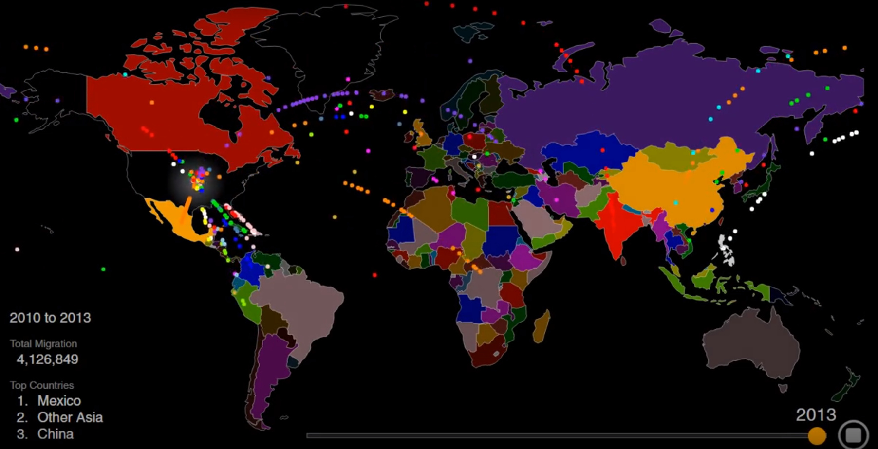
Animation: Visualizing Two Centuries of U.S. Immigration America is a nation of immigrants, and though the country has seen a lot of new arrivals over the...
...following animation, which comes from Aaron Penne, compares three data sets to show that our worries and media coverage have become quite disproportionate from the actual...
...for Native American populations. “Go West, Young Man” As you might notice in the animation, there is one anomaly that appears in the late-1800s: the area...
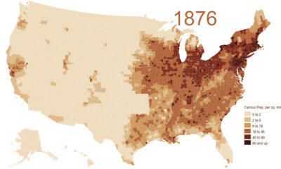
...both negotiation and bloodshed. Today’s above animation, by u/Golbwiki, is the perfect visual aid to understand how the United States evolved from the Thirteen Colonies to...
...and predictions on country GDPs on a forward-looking basis, we suggest looking at our animation on the Biggest Economies in 2030. It is worth mentioning, however,...
...interesting to reflect on how much the web has changed over the last few decades. This animation by Captain Gizmo provides a historical rundown of the...
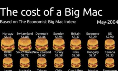
...evidenced by the Big Mac Index. Spanning from 2004-2022, this animation from James Eagle shows the U.S. dollar price of a Big Mac in select countries...
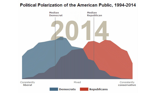
...estate magnate confirm this to be true. As seen in the above animation, the share of Americans who express a consistently liberal or conservative views have...
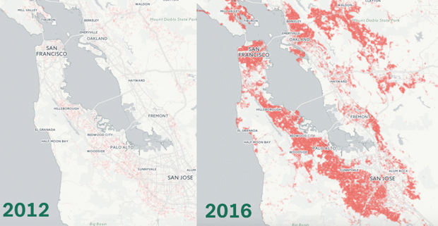
...Using data from the real estate website Trulia, this animation plots the number of million dollar homes in the Bay Area. In 2012, just under 20%...


 Creator Program