Visualizing Global Inflation Forecasts (2024-2026)
The World’s Fastest Growing Emerging Markets (2024-2029 Forecast)
The Most Valuable Companies in Major EU Economies
Visualized: Interest Rate Forecasts for Advanced Economies
The Best U.S. Companies to Work for According to LinkedIn
All of the Grants Given by the U.S. CHIPS Act
Visualizing AI Patents by Country
How Tech Logos Have Evolved Over Time
Ranked: Semiconductor Companies by Industry Revenue Share
The Stock Performance of U.S. Chipmakers So Far in 2024
Ranked: The Top 20 Countries in Debt to China
Charted: Which Country Has the Most Billionaires in 2024?
Charted: Which City Has the Most Billionaires in 2024?
Charted: Who Has Savings in This Economy?
How Debt-to-GDP Ratios Have Changed Since 2000
What Causes Preventable Child Deaths?
The Cost of an EpiPen in Major Markets
Charted: Global Tobacco Use by Country and Sex
Visualized: What Lives in Your Gut Microbiome?
Charted: Average Years Left to Live by Age
Mapped: The Age of Energy Projects in Interconnection Queues, by State
Ranked: The Top 10 EV Battery Manufacturers in 2023
The World’s Biggest Nuclear Energy Producers
The World’s Biggest Oil Producers in 2023
How Much Does the U.S. Depend on Russian Uranium?
The Largest Earthquakes in the New York Area (1970-2024)
Mapped: Average Wages Across Europe
Mapped: Asia’s Population Patterns by Density
A Map of Global Happiness By Country in 2024
Mapped: Population Growth by Region (1900-2050F)
Visualizing Global Gold Production in 2023
Gold vs. S&P 500: Which Has Grown More Over Five Years?
Charted: The Value Gap Between the Gold Price and Gold Miners
Charted: Global Uranium Reserves, by Country
The Carbon Footprint of Major Travel Methods
Ranking the Top 15 Countries by Carbon Tax Revenue
Ranked: The Countries With the Most Air Pollution in 2023
Top Countries By Forest Growth Since 2001
Ranked: Top Countries by Total Forest Loss Since 2001
...change over the coming decades, it’s worth taking a look at this animation that shows median age projections with a focus on Western countries all the...
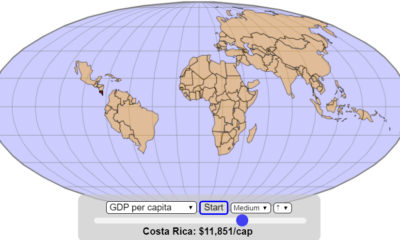
...Capita (Nominal) Now, let’s take a look at the same map, constructed in order of GDP per capita: This animation is more cohesive, given that it...
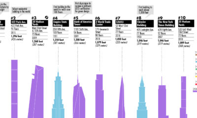
...observation deck set 1,000 feet above the ground. Want to visualize more data about the Big Apple? Check out this animation, which shows the population pulse...
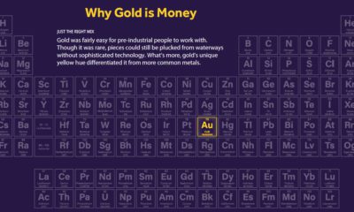
...of years. The Periodic Table The periodic table organizes 118 elements in rows by increasing atomic number (periods) and columns (groups) with similar electron configurations. Just...
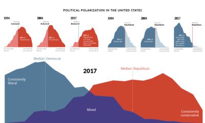
...from 1994 to 2017. The results are a fascinating deep dive into America’s shifting political sentiment. Over Two Decades of Differences The animation above demonstrates how...
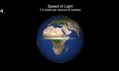
...confines of life on Earth? Today’s animation, which comes from planetary scientist Dr. James O’Donoghue, helps visualize the speed of light in a broader context. It...
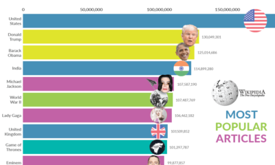
...result for virtually any topic is likely to be Wikipedia. Wikipedia often acts as a quick-and-dirty first source of information—and today’s intriguing animation from Data Geek...
...animation from SVT Nyheter details every coal power plant in the world from 1927 to 2019, and it shows that coal power — especially in South...
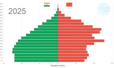
...IMF. Diverging Demographics But aside from the obvious differences in their political regimes, the two populous nations have also diverged in another way: demographics. As seen...
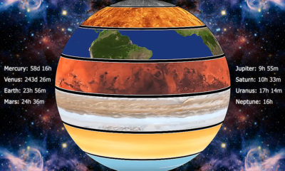
...Uranus. In the following animation, their respective rotation speeds are compared directly: The most visually striking result of planetary spin is on Jupiter, which has the...