Misc
As the Worlds Turn: Visualizing the Rotation of Planets
As the Worlds Turn: Visualizing the Rotations of Planets
The rotation of planets have a dramatic effect on their potential habitability.
Dr. James O’Donoghue, a planetary scientist at the Japanese space agency who has the creative ability to visually communicate space concepts like the speed of light and the vastness of the solar system, recently animated a video showing cross sections of different planets spinning at their own pace on one giant globe.
Cosmic Moves: The Rotation of the Planets
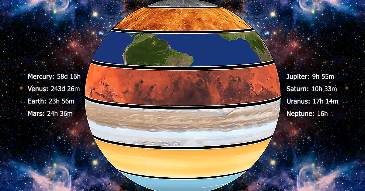
Each planet in the solar system moves to its own rhythm. The giant gas planets (Jupiter, Saturn, Uranus, and Neptune) spin more rapidly on their axes than the inner planets. The sun itself rotates slowly, only once a month.
| Planet | Rotation Periods (relative to stars) |
|---|---|
| Mercury | 58d 16h |
| Venus | 243d 26m |
| Earth | 23h 56m |
| Mars | 24h 36m |
| Jupiter | 9h 55m |
| Saturn | 10h 33m |
| Uranus | 17h 14m |
| Neptune | 16h |
The planets all revolve around the sun in the same direction and in virtually the same plane. In addition, they all rotate in the same general direction, with the exceptions of Venus and Uranus.
In the following animation, their respective rotation speeds are compared directly:
The most visually striking result of planetary spin is on Jupiter, which has the fastest rotation in the solar system. Massive storms of frozen ammonia grains whip across the surface of the gas giant at speeds of 340 miles (550 km) per hour.
Interestingly, the patterns of each planet’s rotation can help in revealing whether they can support life or not.
Rotation and Habitability
As a fish in water is not aware it is wet, so it goes for humans and the atmosphere around us.
New research reveals that the rate at which a planet spins is an essential component for supporting life. Not only does rotation control the length of day and night, bit it influences atmospheric wind patterns and the formation of clouds.
The radiation the Earth receives from the Sun concentrates at the equator. The Sun heats the air in this region until it rises up through the atmosphere and moves towards the poles of the planet where it cools. This cool air falls through the atmosphere and flows back towards the equator.
This process is known as a Hadley cell, and atmospheres can have multiple cells:
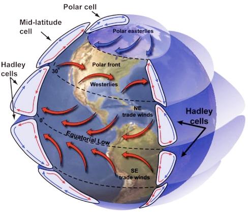
A planet with a quick rotation forms Hadley cells at low latitudes into different bands that encircle the planet. Clouds become prominent at tropical regions, which reflect a proportion of the light back into space.
For a planet in a tighter orbit around its star, the radiation received from the star is much more extreme. This decreases the temperature difference between the equator and the poles, ultimately weakening Hadley cells. The result is fewer clouds in tropical regions available to protect the planet from intense heat, making the planet uninhabitable.
Slow Rotators: More Habitable
If a planet rotates slower, then the Hadley cells can expand to encircle the entire world. This is because the difference in temperature between the day and night side of the planet creates larger atmospheric circulation.
Slow rotation makes days and nights longer, such that half of the planet bathes in light from the sun for an extended period of time. Simultaneously, the night side of the planet is able to cool down.
This difference in temperature is large enough to cause the warm air from the day side to flow to the night side. This movement of air allows more clouds to form around a planet’s equator, protecting the surface from harmful space radiation, encouraging the possibility for the right conditions for life to form.
The Hunt for Habitable Planets
Measuring the rotation of planets is difficult with a telescope, so another good proxy would be to measure the level of heat emitted from a planet.
An infrared telescope can measure the heat emitted from a planet’s clouds that formed over its equator. An unusually low temperature at the hottest location on the planet could indicate that the planet is potentially a habitable slow rotator.
Of course, even if a planet’s rotation speed is just right, many other conditions come into play. The rotation of planets is just another piece in the puzzle in identifying the next Earth.


VC+
VC+: Get Our Key Takeaways From the IMF’s World Economic Outlook
A sneak preview of the exclusive VC+ Special Dispatch—your shortcut to understanding IMF’s World Economic Outlook report.

Have you read IMF’s latest World Economic Outlook yet? At a daunting 202 pages, we don’t blame you if it’s still on your to-do list.
But don’t worry, you don’t need to read the whole April release, because we’ve already done the hard work for you.
To save you time and effort, the Visual Capitalist team has compiled a visual analysis of everything you need to know from the report—and our VC+ Special Dispatch is available exclusively to VC+ members. All you need to do is log into the VC+ Archive.
If you’re not already subscribed to VC+, make sure you sign up now to access the full analysis of the IMF report, and more (we release similar deep dives every week).
For now, here’s what VC+ members get to see.
Your Shortcut to Understanding IMF’s World Economic Outlook
With long and short-term growth prospects declining for many countries around the world, this Special Dispatch offers a visual analysis of the key figures and takeaways from the IMF’s report including:
- The global decline in economic growth forecasts
- Real GDP growth and inflation forecasts for major nations in 2024
- When interest rate cuts will happen and interest rate forecasts
- How debt-to-GDP ratios have changed since 2000
- And much more!

Get the Full Breakdown in the Next VC+ Special Dispatch
VC+ members can access the full Special Dispatch by logging into the VC+ Archive, where you can also check out previous releases.
Make sure you join VC+ now to see exclusive charts and the full analysis of key takeaways from IMF’s World Economic Outlook.
Don’t miss out. Become a VC+ member today.
What You Get When You Become a VC+ Member
VC+ is Visual Capitalist’s premium subscription. As a member, you’ll get the following:
- Special Dispatches: Deep dive visual briefings on crucial reports and global trends
- Markets This Month: A snappy summary of the state of the markets and what to look out for
- The Trendline: Weekly curation of the best visualizations from across the globe
- Global Forecast Series: Our flagship annual report that covers everything you need to know related to the economy, markets, geopolitics, and the latest tech trends
- VC+ Archive: Hundreds of previously released VC+ briefings and reports that you’ve been missing out on, all in one dedicated hub
You can get all of the above, and more, by joining VC+ today.

-

 Mining1 week ago
Gold vs. S&P 500: Which Has Grown More Over Five Years?
-

 Markets2 weeks ago
Ranked: The Most Valuable Housing Markets in America
-

 Money2 weeks ago
Which States Have the Highest Minimum Wage in America?
-

 AI2 weeks ago
Ranked: Semiconductor Companies by Industry Revenue Share
-

 Markets2 weeks ago
Ranked: The World’s Top Flight Routes, by Revenue
-

 Countries2 weeks ago
Population Projections: The World’s 6 Largest Countries in 2075
-

 Markets2 weeks ago
The Top 10 States by Real GDP Growth in 2023
-

 Demographics2 weeks ago
The Smallest Gender Wage Gaps in OECD Countries