
From airbags to firefighting equipment, components made from brass rods play a vital role in creating a safer environment.


click for more →


Scan with your phone's camera or QR code app to view
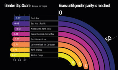

At our current rate of change, it will take up to 136 years to close the global gender gap. Here's a look at gender inequality across...
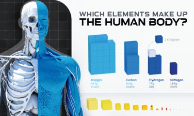

Of the 118 chemical elements found on Earth, only 21 make up the human body. Here we break down the elemental composition of the average human.
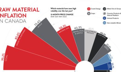

Over the last year, raw material inflation in Canada was 37%. Which material prices jumped the most, and how does this impact manufacturers?
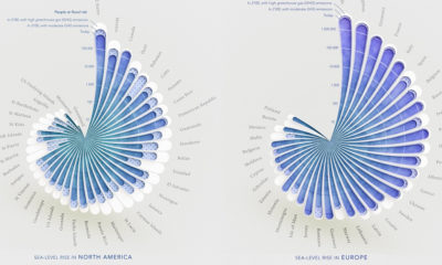

Here's a look at how people around the world could be impacted by coastal flooding by 2100, based on rising sea level projections.
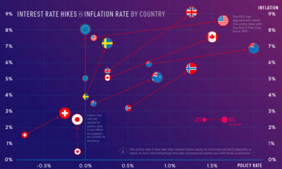

Inflation rates are reaching multi-decade highs in some countries. How aggressive have central banks been with interest rate hikes?
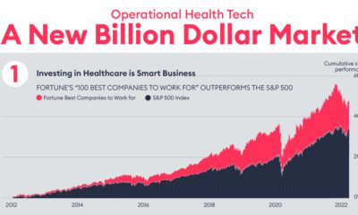

Operational health tech is poised to be a multi-billion dollar industry. This graphic breaks down how its disrupting healthcare as we know it.
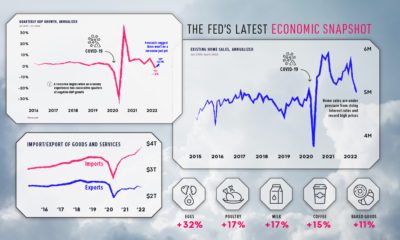

Stay up to date on the U.S. economy with this infographic summarizing the most recent Federal Reserve data released.
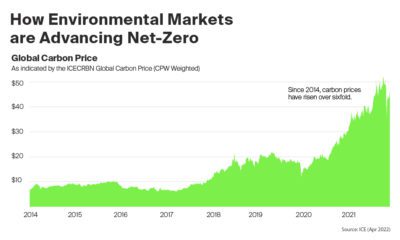

The global price of carbon increased 91% in 2021. Below, we show how environmental markets are supporting a greener future.
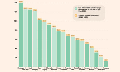

This graphic looks at gas affordability in Latin America, showing how much a liter of gas costs in 19 countries, relative to average incomes.


Visual Capitalist is launching a new app that will combine powerful data and visual storytelling. Learn more about how to support it here.
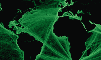

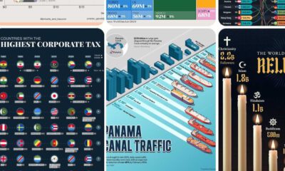
Where are the world’s major shipping lanes? These maps show global maritime traffic density, highlighting some of the busiest areas across the globe.
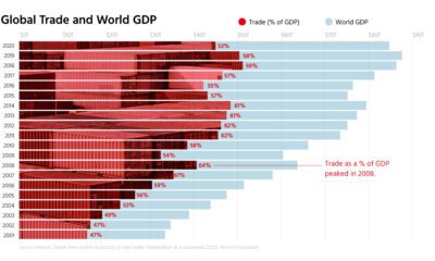

Free trade is a powerful engine for economic growth, but rising protectionism stands in the way. See what the data says in this infographic.
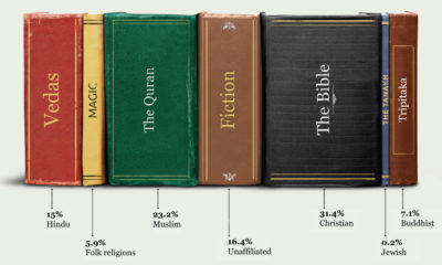

This graphic shows a breakdown of the world's major religions, and how much of the global population follows each one.
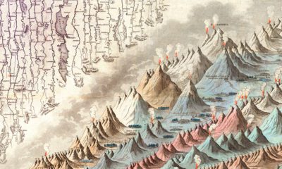

This iconic infographic map is an early and ambitious attempt to compare the world's tallest mountains and longest rivers.
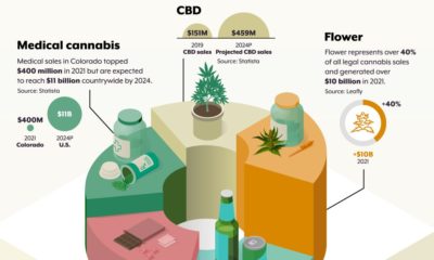

Legal cannabis in Colorado has flourished for nearly a decade now. This graphic looks at the broad set of benefits realized since legalization.
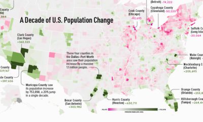

This map shows which counties in the U.S. have seen the most growth, and which places have seen their populations dwindle in the last 10 years.
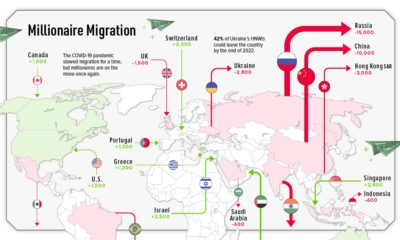

This graphic maps out the migration of millionaires across the globe, showing the top 10 countries the ultra-rich are moving to and from.


 Creator Program