Misc
Chart: A Global Look at How People Spend Their Time
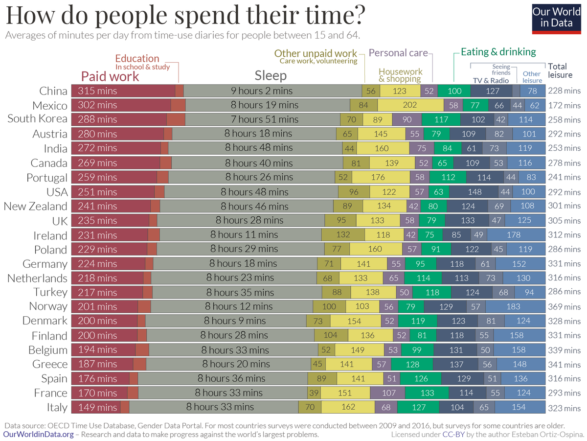
A Global Look at How People Spend Their Time
We all have the same 24 hours in a day, but we don’t spend them the same way. Some prioritize family time or household chores, while others cherish a good night’s sleep or seeing friends.
This chart from Our World in Data compares the average time allocated across various day-to-day activities, from paid work to leisurely activities.
The data for the 33 countries profiled come from the Organization for Economic Co-operation and Development (OECD)’s Time Use database, for ages 15 through 64 years old.
Countries with the Highest Time Spent Per Activity
As the chart shows, basic patterns—work, rest, and play—emerge across the board.
When it comes to paid work, Japan emerges the highest on this list with approximately 5.5 hours per day. However, this country also has some of the highest overtime in a workweek. In contrast, European countries such as France and Spain report nearly half the same hours (less than 3 hours) of paid work per day on average.
Certain trends, however, transcend cultural boundaries. Those in Mexico find themselves spending significant portions of the day (3 hours or more) on housework, as do those in Portugal.
| Activity category | Country with highest time spent | Time spent in minutes |
|---|---|---|
| Paid work | 🇯🇵 Japan | 326 (Approx. 5.5 hrs) |
| Education | 🇰🇷 South Korea | 57 |
| Care for household members | 🇮🇪 Ireland | 61 |
| Housework | 🇲🇽 Mexico | 187 (Approx. 3 hrs) |
| Shopping | 🇩🇪 Germany | 32 |
| Other unpaid work & volunteering | 🇯🇵 Japan | 98 (Approx. 1.5 hrs) |
| Sleep | 🇿🇦 South Africa | 553 (Approx. 9 hrs) |
| Eating | 🇫🇷 France | 133 (Approx. 2 hours) |
| Personal care | 🇫🇷 France | 107 (Approx. 1 hr 45 min) |
| Sports | 🇪🇸 Spain | 42 |
| Attending events | 🇮🇪 Ireland | 42 |
| Seeing friends | 🇿🇦 South Africa | 82 |
| TV and radio | 🇺🇸 U.S. | 148 (Approx. 2.5 hrs) |
| Other leisure (Religious/ civic duties, or unspecified) | 🇳🇴 Norway | 154 (Approx. 2.5 hrs) |
As the saying goes, all work and no play makes Jack a dull boy. In the realm of leisure activities, those in the U.S. spend approximately 2.5 hours consuming media in a day, a number that has risen even higher during the pandemic.
Meanwhile, another interesting cultural pattern is that people in France spend the most time eating, approximately 2 hours per day. These durations are similar to those in other Mediterranean countries such as Greece, Italy, and Spain—perhaps because meals are viewed as a social activity in these cultures.
Gender Disparities in Time Spent
Digging deeper, another way to look at how people spend their time globally is through the lens of gender.
Women spend nearly three times more in unpaid care work compared to men—a whopping total of 1.1 trillion hours each year—which means a lot less leisure time. This inequality is clearly defined by country in the following scatterplot:
In Norway, both men and women have equally high levels of leisure time—though it’s a rare example of such a case.
Meanwhile, in countries like India or China, significant gender gaps prevent women from moving up the socioeconomic ladder, potentially costing trillions of dollars to the global economy.


Misc
The Evolution of U.S. Beer Logos
In this graphic, we analyze the evolution of popular U.S. beer logos like Budweiser, Coors Light, Bud Light, and more.
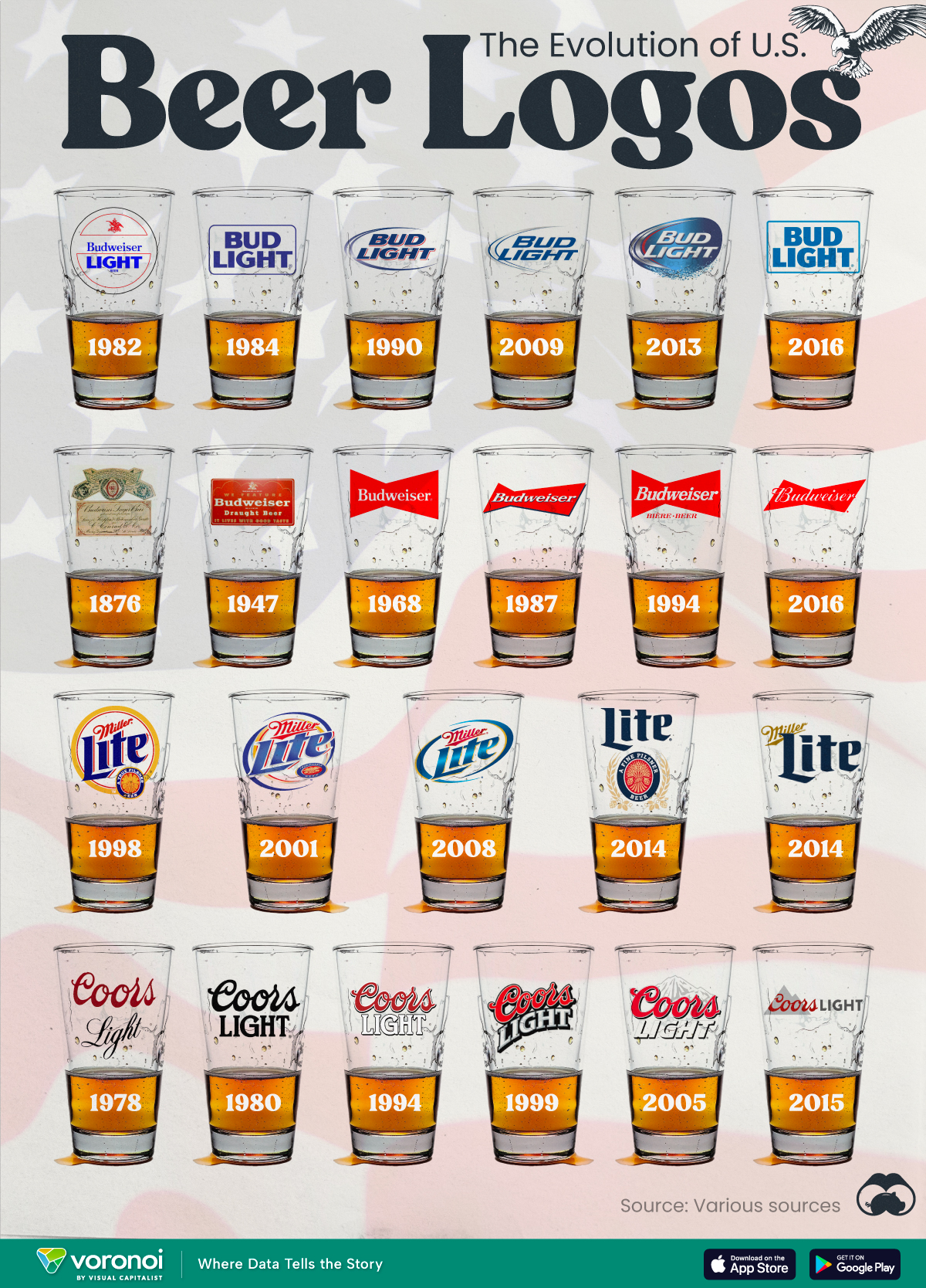

The Evolution of U.S. Beer Logos
This was originally posted on our Voronoi app. Download the app for free on iOS or Android and discover incredible data-driven charts from a variety of trusted sources.
Despite selling a popular product, beer companies have to be creative to stand out in a competitive market.
In this graphic, we analyze the evolution of some U.S. beer logos based on various sources. We chose brands based on a mixture of criteria, including popularity (based on YouGov surveys), availability of logo assets, and those with interesting developments.
Bud Light Back to the ’80s
Despite recent backlash and calls for a boycott after sending a commemorative can to transgender influencer Dylan Mulvaney, Bud Light remains one of America’s best-selling beers.
The brand of light beer, owned by the Anheuser-Busch company, has switched from its more circular logo with italic letters adopted in the 1990s back to the Bud Light badge of the 1980s. It is composed of heavy uppercase lettering, written in two levels in a shade of blue with the inscription placed on a solid white background and enclosed in a thin rectangular frame.
Miller Lite Goes Old School
After following a similar approach to Bud Light’s branding throughout the 2000s, Miller Lite decided to undergo a major rebranding in 2014.
The company returned to its 1970s roots, once again combining a white can with its original blue, gold, and red logo. The redesign was largely considered a success, given that Miller Lite sales immediately increased following the change.
A Symbol of American Brewing
The oldest brand on our U.S. beer list, the Budweiser logo, has undergone more than 15 changes over the years.
The design of two connected triangles represents a red bow tie, as a symbol of American brewing.
The colors of the Budweiser logo include a vibrant red, which helps the logo stand out and be easily recognizable from a distance. Studies also suggest that the color red stimulates appetite. Meanwhile, the white inscription symbolizes purity and cleanliness.
Curious to learn more about the beer market? Check out this graphic about global beer consumption.

-

 Money6 days ago
Charted: Which Country Has the Most Billionaires in 2024?
-

 Energy2 weeks ago
Ranked: The Top 10 EV Battery Manufacturers in 2023
-

 Demographics2 weeks ago
Countries With the Largest Happiness Gains Since 2010
-

 VC+2 weeks ago
VC+: Get Our Key Takeaways From the IMF’s World Economic Outlook
-

 Demographics2 weeks ago
The Countries That Have Become Sadder Since 2010
-

 Money2 weeks ago
Charted: Who Has Savings in This Economy?
-

 Technology1 week ago
Visualizing AI Patents by Country
-

 Markets1 week ago
Economic Growth Forecasts for G7 and BRICS Countries in 2024