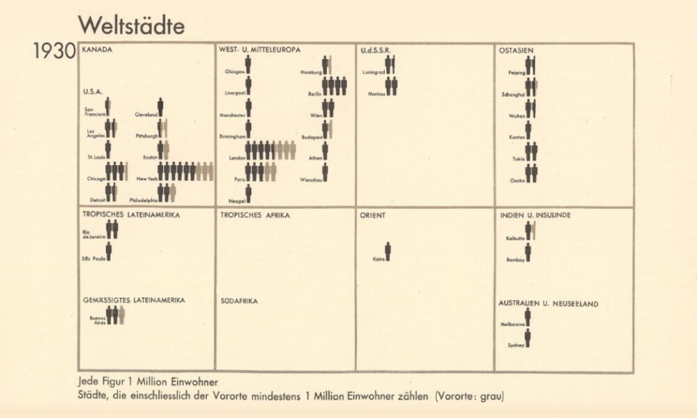
From someone born in the 19th century, in the midst of historic population growth, comes this vintage visualization showing world...


Rural counties across the U.S. are losing residents as large cities and the coasts are growing. This map shows U.S. population change by county.
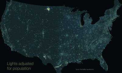

This unique map subtracts population from nighttime light output, giving us a unique perspective into America's rural light pollution hot spots.
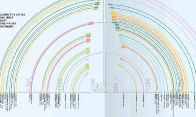

While we all see the same sky, some see it differently, depending on where they live. Today's graphic ranks world cities by annual hours of sunshine.
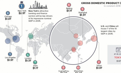

Cities are heavy hitters in the global economy. Where will the top 10 cities be in 2035—based on GDP, population, and annual growth?
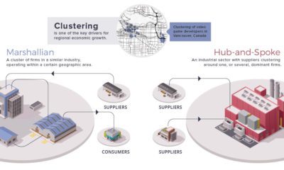

Economies create distinct spatial patterns. This week's chart visualizes the relationships businesses and industry imprint on the urban environment.


Today’s stunning map ranks the world’s most powerful megaregions — together, they contribute a whopping $28 trillion to the global economy.
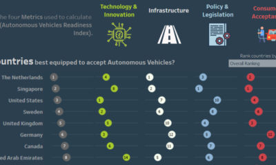

This interactive visual shows the countries best prepared for the shift to autonomous vehicles, as well as the associated societal and economic impacts.
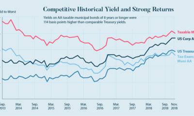

Taxable municipal bonds will help finance the $4 trillion needed for U.S. infrastructure repairs. Here's a case for why they are an interesting investment.
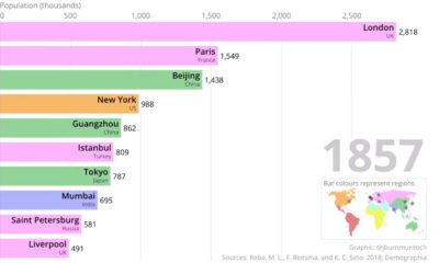

This two-minute animation shows changes in the last 500 years of historical rankings for the world's 10 most populous cities.
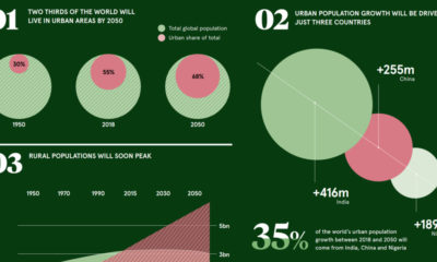

These pivotal trends show how urban demographics are aiding in the transition to a very different economic and investment landscape.


