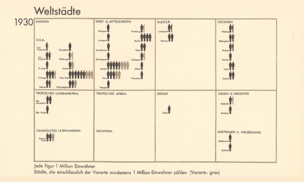
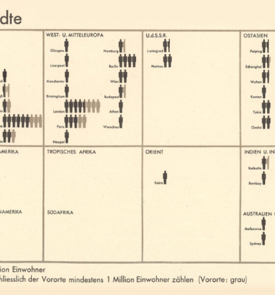
From someone born in the 19th century, in the midst of historic population growth, comes this vintage visualization showing world...

The total U.S. GDP stands at a whopping $21 trillion, but which metro areas contribute to the most in terms of economic output?

How much higher and further into the skies can we reach? This infographic looks at the most impressive skyscrapers gracing every continent.
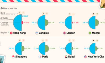

Even a pandemic can't curb wanderlust—when tourism comes back, here are the most popular city destinations that will be seeing visitors.
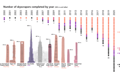

Once a rarity, supertall skyscrapers now punctuate the skylines of cities around the world. We chart the construction of these structures over the past 20 years
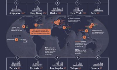

From Osaka to New York, we look at a global ranking of the 10 most expensive cities, and how those rankings have changed over the last...
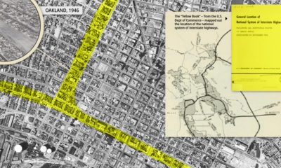

Highways improved mobility for the average American, ingraining the automobile into the urban fabric of American cities, for better and worse.
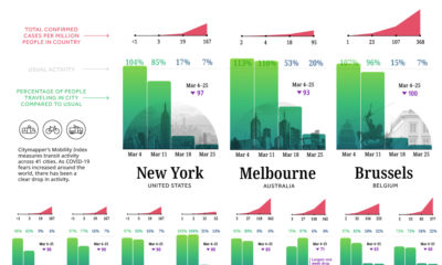

Amid the COVID-19 crisis, cities are dramatically slowing down. Today's chart demonstrates the impact of lockdowns on commuter activity worldwide.
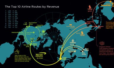

This visualization tracks the high-value routes that generate the most revenue for airlines – primarily links between the world's financial centers
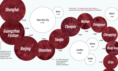

China has the same amount of 1 million+ population cities as both North America and the EU combined. Here they all are, from biggest to smallest.
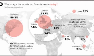

Perceptions of major financial centers are being reexamined amid shifts in the geopolitical landscape, including Brexit and unrest in Hong Kong.


