Green
Invisible Stars: Mapping America’s Rural Light Pollution
Invisible Stars: Mapping America’s Rural Light Pollution
From the bright lights of Times Square to the high-powered flood lights of a suburban Walmart, we expect our cities to give off a certain amount of light pollution. Even though our view of the universe is largely blotted out around city centers, there’s a measure of comfort in knowing an inspiring view of a starry night is only a short drive away.
Increasingly though, economic activity in America’s rural spaces is casting a glow into the sky, and now four out of five people in North America cannot see the Milky Way at night.
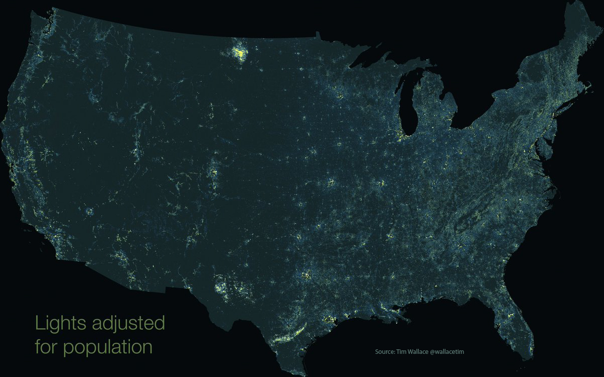
Today’s map, from geographer and journalist, Tim Wallace, is a different perspective on light pollution in the United States. The map was created by subtracting population from light output, which highlights areas that throw off more light than predicted given their population density.
On this style of map, it isn’t the glowing metropolitan centers of New York and Los Angeles that stand out, but regions like the oil-rich corner of South Dakota or the final leg of the Mississippi River. Let’s zoom in and investigate what’s happening in these unexpected illumination zones.
Oil & Gas
Some of the most prominent patterns on the map appear in regions where shale oil is being extracted.
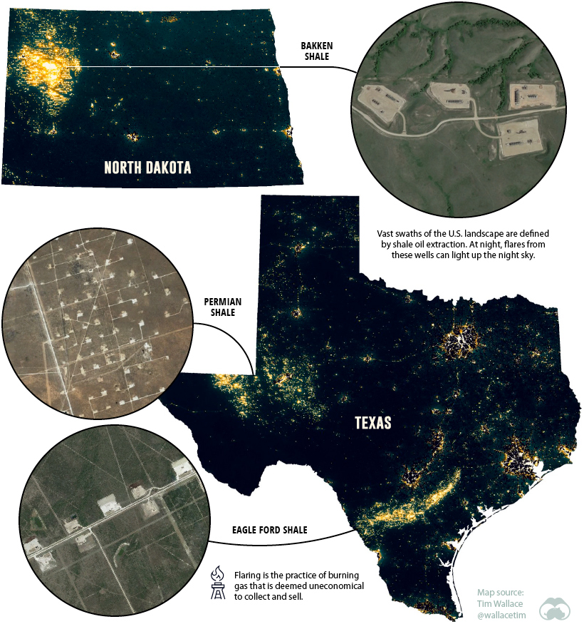
In a relatively short amount of time, America became the largest oil producer on the planet. One of the major factors that fueled record production for shale oil producers was the proliferation of multi-well pad drilling — when multiple wells are drilled from a single drill site. From the air, it’s easy to spot these well formations spreading across the landscape, but the effect is even more pronounced at night.
At times, oil production is so strong that drillers flare the excess natural gas. In North Dakota alone, there are nearly 14,000 producing wells, and the resulting flares are what create the distinctive grid patterns on the map.
One of the brightest areas per capita in the country is Loving County, Texas. The county has around 100 residents, but more than 6,000 drilled wells.
Industrial Activities
Another point of interest on the map is Louisiana’s “petrochemical corridor”, running between New Orleans and Baton Rouge. An overhead view of Southern Louisiana in the daytime will be punctuated by the “ribbon farms” flanking the Mississippi River — a nod to the region’s history of French settlement.
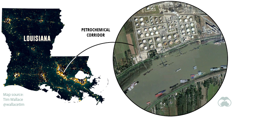
At night though, a different scene emerges. Over 100 sprawling petrochemical facilities run by companies like Dow Chemical and Union Carbide dot the landscape, a patchwork of highly-illuminated plots.
Commercial Sprawl
Some types of infrastructure are typically located away from the city center. Airports, power stations, and racetracks, for example, need a lot of space and aren’t the most popular neighbors.
Another type of facility has been replacing farmland in recent years — logistics hubs. Many of the bright spots on the map outside cities show the warehouses and sortation centers that feed our growing demand for e-commerce.
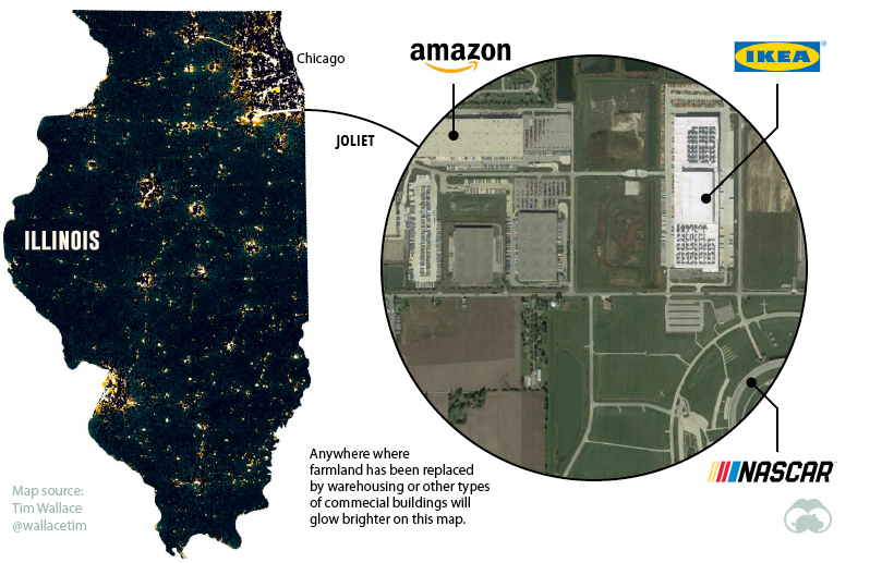
In the example above, companies like Amazon, Home Depot, Dollar Tree, and Ikea have all clustered their facilities in the sparsely populated farmland south of Joliet, Illinois. This trend is repeated around the country, resulting in the “halos” of light that ring most cities on the map.
Flipping the Switch on Light Pollution
Though light isn’t toxic or overtly damaging to the natural landscape, it can still have a serious impact on wildlife, as well as blunting the beauty of the night sky.
The good news is that light is one of the easiest forms of pollution to prevent. New technologies and lighting techniques aren’t just good for our night skies, they’re generally more energy efficient as well.
Just as economic incentive lured buildings and infrastructure to America’s natural spaces, it may be energy efficiency that helps us return more of the night sky to its natural state.
Green
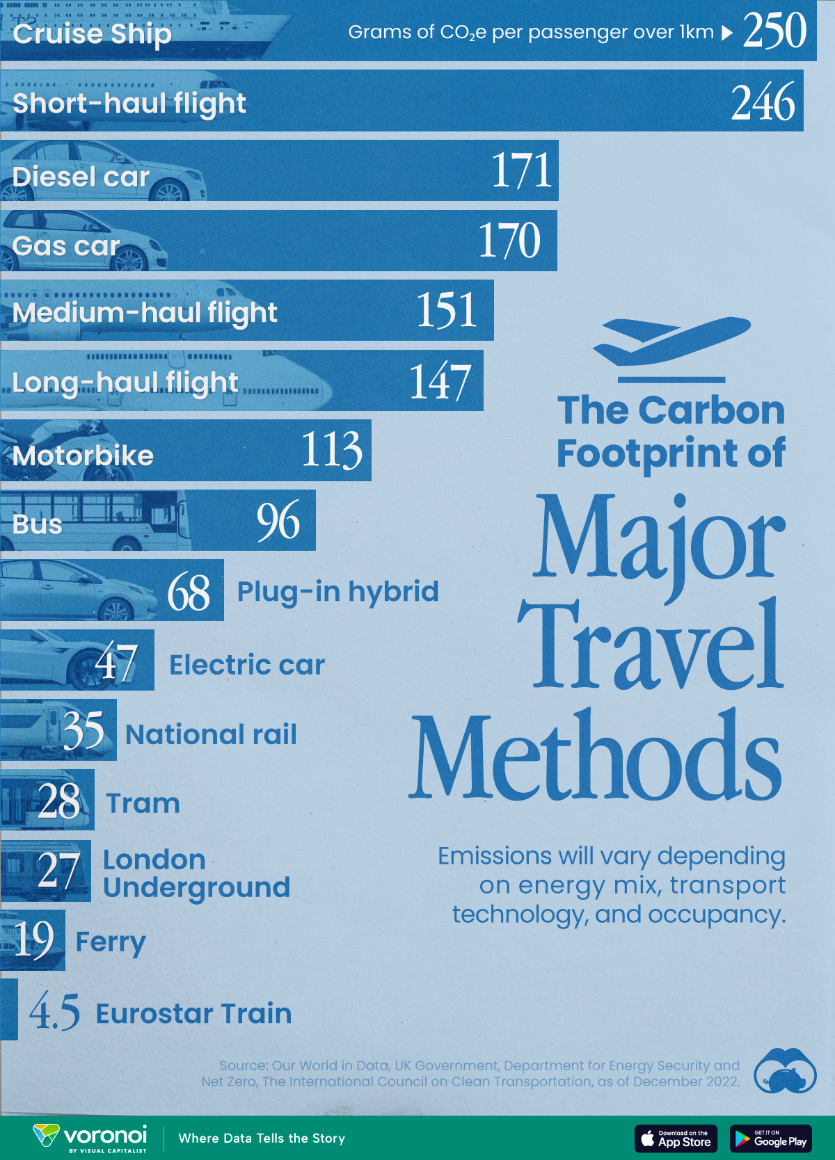
The Carbon Footprint of Major Travel Methods
Going on a cruise ship and flying domestically are the most carbon-intensive travel methods.

The Carbon Footprint of Major Travel Methods
This was originally posted on our Voronoi app. Download the app for free on iOS or Android and discover incredible data-driven charts from a variety of trusted sources.
Did you know that transport accounts for nearly one-quarter of global energy-related carbon dioxide (CO₂) emissions?
This graphic illustrates the carbon footprints of major travel methods measured in grams of carbon dioxide equivalent (CO₂e) emitted per person to travel one kilometer. This includes both CO₂ and other greenhouse gases.
Data is sourced from Our World in Data, the UK Government’s Department for Energy Security and Net Zero, and The International Council on Clean Transportation, as of December 2022.
These figures should be interpreted as approximations, rather than exact numbers. There are many variables at play that determine the actual carbon footprint in any individual case, including vehicle type or model, occupancy, energy mix, and even weather.
Cruise Ships are the Most Carbon-Intensive Travel Method
According to these estimates, taking a cruise ship, flying domestically, and driving alone are some of the most carbon-intensive travel methods.
Cruise ships typically use heavy fuel oil, which is high in carbon content. The average cruise ship weighs between 70,000 to 180,000 metric tons, meaning they require large engines to get moving.
These massive vessels must also generate power for onboard amenities such as lighting, air conditioning, and entertainment systems.
Short-haul flights are also considered carbon-intensive due to the significant amount of fuel consumed during initial takeoff and climbing altitude, relative to a lower amount of cruising.
| Transportation method | CO₂ equivalent emissions per passenger km |
|---|---|
| Cruise Ship | 250 |
| Short-haul flight (i.e. within a U.S. state or European country) | 246 |
| Diesel car | 171 |
| Gas car | 170 |
| Medium-haul flight (i.e. international travel within Europe, or between U.S. states) | 151 |
| Long-haul flight (over 3,700 km, about the distance from LA to NY) | 147 |
| Motorbike | 113 |
| Bus (average) | 96 |
| Plug-in hybrid | 68 |
| Electric car | 47 |
| National rail | 35 |
| Tram | 28 |
| London Underground | 27 |
| Ferry (foot passenger) | 19 |
| Eurostar (International rail) | 4.5 |
Are EVs Greener?
Many experts agree that EVs produce a lower carbon footprint over time versus traditional internal combustion engine (ICE) vehicles.
However, the batteries in electric vehicles charge on the power that comes straight off the electrical grid—which in many places may be powered by fossil fuels. For that reason, the carbon footprint of an EV will depend largely on the blend of electricity sources used for charging.
There are also questions about how energy-intensive it is to build EVs compared to a comparable ICE vehicle.

-

 Lithium7 days ago
Ranked: The Top 10 EV Battery Manufacturers in 2023
-

 Green2 weeks ago
Top Countries By Forest Growth Since 2001
-

 United States2 weeks ago
Ranked: The Largest U.S. Corporations by Number of Employees
-

 Maps2 weeks ago
The Largest Earthquakes in the New York Area (1970-2024)
-

 Green2 weeks ago
Ranked: The Countries With the Most Air Pollution in 2023
-

 Green2 weeks ago
Ranking the Top 15 Countries by Carbon Tax Revenue
-

 Markets2 weeks ago
U.S. Debt Interest Payments Reach $1 Trillion
-

 Mining2 weeks ago
Gold vs. S&P 500: Which Has Grown More Over Five Years?