Politics
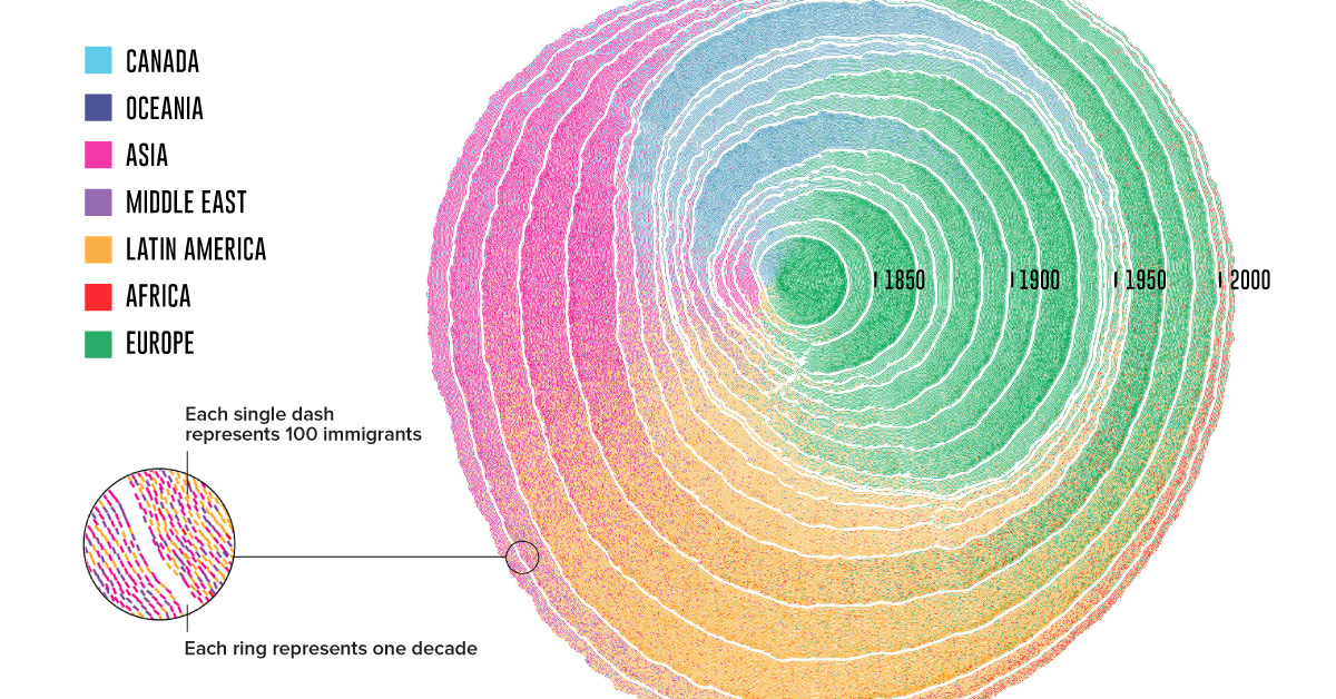
Animation: 200 Years of U.S. Immigration As Tree Rings
If you walk down the streets in the United States, the odds are that one in every four people you’ll see is an immigrant, or was born to immigrant parents.
While those odds might seem high, the truth is nearly everyone in the U.S. hails from someplace else if you look far back enough.
Visualizing U.S. Immigration
Today’s intriguing visualization was created by professors Pedro M. Cruz and John Wihbey from Northeastern University, and it depicts U.S. immigration from 1830 until 2015, as rings in a growing tree trunk.
The researchers turned registered U.S. Census data into an estimate for the total number of immigrants arriving each decade, and then the yearly figures in the visualization. One caveat is that it does not account for the populations of slaves, or indigenous communities.
From the Old to the New World
The pattern of U.S. immigration can be explained in four major waves overall:
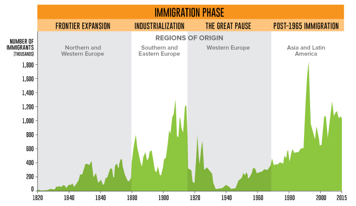
The origins of U.S. immigrant populations transform from era to era. Which events influenced each wave?
Frontier Expansion: 1830-1880
- Cheap farmland and the promise of economic growth in the first Industrial Revolution spurred large-scale immigration from Britain, Germany, and other parts of Central Europe.
- The Irish Potato Famine from 1845 to 1849 drove many immigrants from Ireland over to the U.S.
- The 1848 Treaty of Guadalupe ended the Mexican-American war, and extended U.S. citizenship to over 70,000 Mexican residents.
Industrialization: 1880-1915
- Immigrant mobility increased with the introduction of large steam-powered ships. The expansion of railroads in Europe also made it easier for people to reach oceanic ports.
- On the other hand, the Chinese Exclusion act in 1882 prohibited Chinese laborers from entry.
- In 1892, the famous Ellis Island opened; the first federal immigration station provided a gateway for over 12 million people.
The Great Pause: 1915-1965
- The Immigration Act of 1924 enacted quotas on immigrant numbers, restricting groups from countries in Southern and Eastern Europe, and virtually all immigrants of Asian origin.
- The Great Depression, and subsequent World Wars also complicated immigration matters as many came to seek refuge in the United States.
Post-1965 Immigration: 1965-Present
- The Hart-Cellber (Immigration and Naturalization Act) of 1965 overturned all previous quotas based on national origin. Family unification and an increase in skilled labor were two major aims of this act.
- This decision significantly impacted the U.S. demographic makeup in the following decades, as more immigrants of Latin, Asian, and African descent entered the country.
E Pluribus Unum (From Many, One)
While others have mapped two centuries of immigration before, few have captured its sheer scale and impact quite as strikingly. The researchers explain their reasoning behind this metaphor of tree rings:
This idea lends itself to the representation of history itself, as it shows a sequence of events that have left a mark and shaped the present. If cells leave a mark in the tree, so can incoming immigrants be seen as natural contributors to the growth of a trunk that is the United States.
It’s no wonder that this animation showing U.S. immigration won Gold for the “People, Language, and Identity” and “Most Beautiful” categories at the 2018 Kantar Information is Beautiful Awards.


Economy
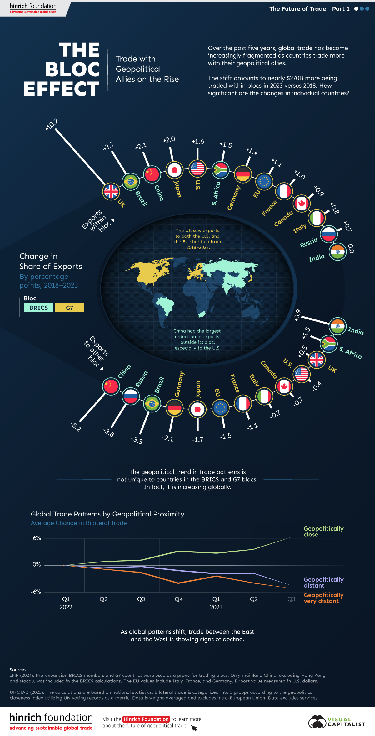
The Bloc Effect: International Trade with Geopolitical Allies on the Rise
Rising geopolitical tensions are shaping the future of international trade, but what is the effect on trading among G7 and BRICS countries?


The Bloc Effect: International Trade with Allies on the Rise
International trade has become increasingly fragmented over the last five years as countries have shifted to trading more with their geopolitical allies.
This graphic from The Hinrich Foundation, the first in a three-part series covering the future of trade, provides visual context to the growing divide in trade in G7 and pre-expansion BRICS countries, which are used as proxies for geopolitical blocs.
Trade Shifts in G7 and BRICS Countries
This analysis uses IMF data to examine differences in shares of exports within and between trading blocs from 2018 to 2023. For example, we looked at the percentage of China’s exports with other BRICS members as well as with G7 members to see how these proportions shifted in percentage points (pp) over time.
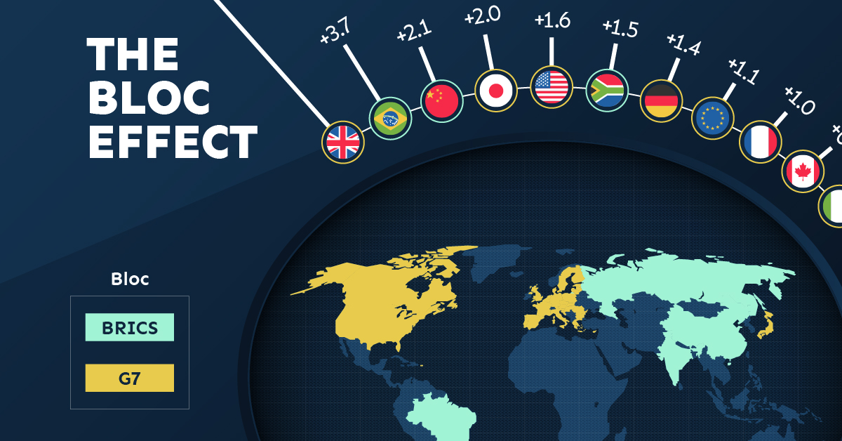
Countries traded nearly $270 billion more with allies in 2023 compared to 2018. This shift came at the expense of trade with rival blocs, which saw a decline of $314 billion.
Country Change in Exports Within Bloc (pp) Change in Exports With Other Bloc (pp)
🇮🇳 India 0.0 3.9
🇷🇺 Russia 0.7 -3.8
🇮🇹 Italy 0.8 -0.7
🇨🇦 Canada 0.9 -0.7
🇫🇷 France 1.0 -1.1
🇪🇺 EU 1.1 -1.5
🇩🇪 Germany 1.4 -2.1
🇿🇦 South Africa 1.5 1.5
🇺🇸 U.S. 1.6 -0.4
🇯🇵 Japan 2.0 -1.7
🇨🇳 China 2.1 -5.2
🇧🇷 Brazil 3.7 -3.3
🇬🇧 UK 10.2 0.5
All shifts reported are in percentage points. For example, the EU saw its share of exports to G7 countries rise from 74.3% in 2018 to 75.4% in 2023, which equates to a 1.1 percentage point increase.
The UK saw the largest uptick in trading with other countries within the G7 (+10.2 percentage points), namely the EU, as the post-Brexit trade slump to the region recovered.
Meanwhile, the U.S.-China trade dispute caused China’s share of exports to the G7 to fall by 5.2 percentage points from 2018 to 2023, the largest decline in our sample set. In fact, partly as a result of the conflict, the U.S. has by far the highest number of harmful tariffs in place.
The Russia-Ukraine War and ensuing sanctions by the West contributed to Russia’s share of exports to the G7 falling by 3.8 percentage points over the same timeframe.
India, South Africa, and the UK bucked the trend and continued to witness advances in exports with the opposing bloc.
Average Trade Shifts of G7 and BRICS Blocs
Though results varied significantly on a country-by-country basis, the broader trend towards favoring geopolitical allies in international trade is clear.
Bloc Change in Exports Within Bloc (pp) Change in Exports With Other Bloc (pp)
Average 2.1 -1.1
BRICS 1.6 -1.4
G7 incl. EU 2.4 -1.0
Overall, BRICS countries saw a larger shift away from exports with the other bloc, while for G7 countries the shift within their own bloc was more pronounced. This implies that though BRICS countries are trading less with the G7, they are relying more on trade partners outside their bloc to make up for the lost G7 share.
A Global Shift in International Trade and Geopolitical Proximity
The movement towards strengthening trade relations based on geopolitical proximity is a global trend.
The United Nations categorizes countries along a scale of geopolitical proximity based on UN voting records.
According to the organization’s analysis, international trade between geopolitically close countries rose from the first quarter of 2022 (when Russia first invaded Ukraine) to the third quarter of 2023 by over 6%. Conversely, trade with geopolitically distant countries declined.
The second piece in this series will explore China’s gradual move away from using the U.S. dollar in trade settlements.
Visit the Hinrich Foundation to learn more about the future of geopolitical trade

-

 United States1 day ago
Visualizing the Most Common Pets in the U.S.
Lions, tigers, and bears, oh my!—these animals do not feature on this list of popular American household pets.
-

 Economy4 days ago
Economic Growth Forecasts for G7 and BRICS Countries in 2024
The IMF has released its economic growth forecasts for 2024. How do the G7 and BRICS countries compare?
-

 United States2 weeks ago
Ranked: The Largest U.S. Corporations by Number of Employees
We visualized the top U.S. companies by employees, revealing the massive scale of retailers like Walmart, Target, and Home Depot.
-

 United States2 weeks ago
Where U.S. Inflation Hit the Hardest in March 2024
We visualized product categories that saw the highest % increase in price due to U.S. inflation as of March 2024.
-

 Economy1 month ago
G20 Inflation Rates: Feb 2024 vs COVID Peak
We visualize inflation rates across G20 countries as of Feb 2024, in the context of their COVID-19 pandemic peak.
-

 Jobs1 month ago
Mapped: Unemployment Claims by State
This visual heatmap of unemployment claims by state highlights New York, California, and Alaska leading the country by a wide margin.


-

 Lithium6 days ago
Ranked: The Top 10 EV Battery Manufacturers in 2023
-

 Green2 weeks ago
Top Countries By Forest Growth Since 2001
-
United States2 weeks ago
Ranked: The Largest U.S. Corporations by Number of Employees
-

 Maps2 weeks ago
The Largest Earthquakes in the New York Area (1970-2024)
-

 Green2 weeks ago
Ranked: The Countries With the Most Air Pollution in 2023
-

 Green2 weeks ago
Ranking the Top 15 Countries by Carbon Tax Revenue
-

 Markets2 weeks ago
U.S. Debt Interest Payments Reach $1 Trillion
-

 Mining2 weeks ago
Gold vs. S&P 500: Which Has Grown More Over Five Years?