Green
Visualizing Changes in CO₂ Emissions Since 1900
![]() Subscribe to the Elements free mailing list for more like this
Subscribe to the Elements free mailing list for more like this
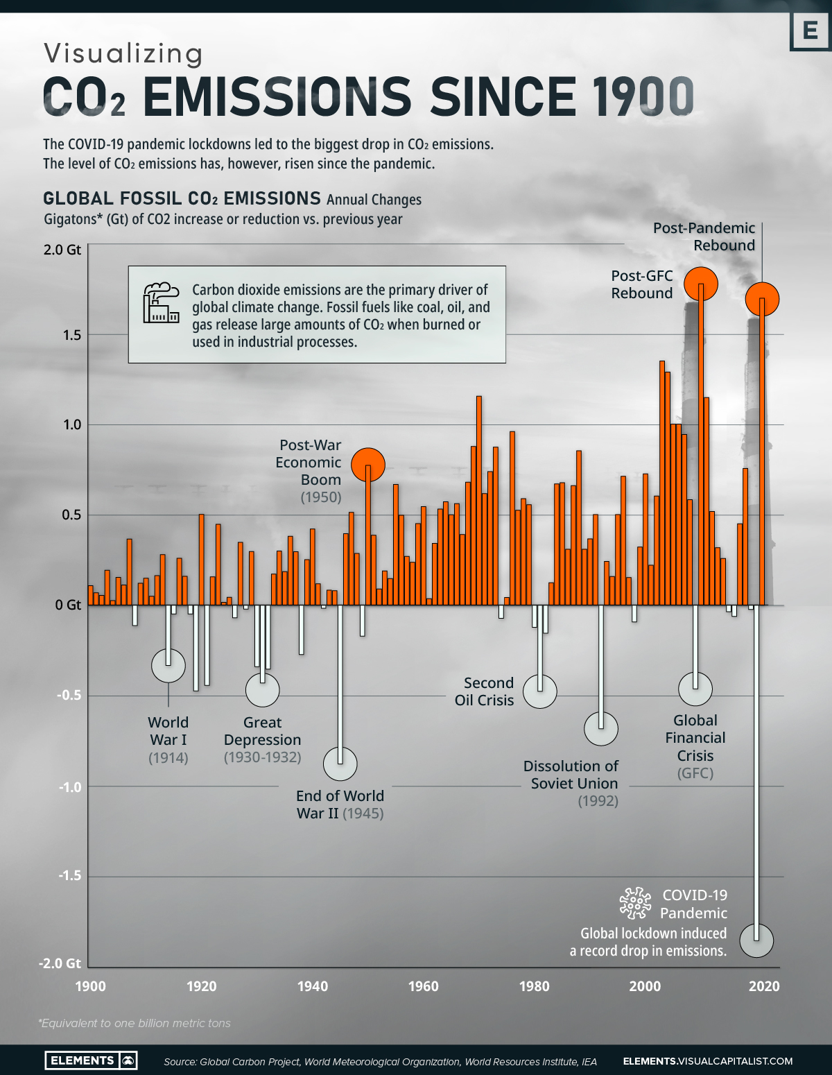


Visualizing CO₂ Emissions Since 1900
This was originally posted on Elements. Sign up to the free mailing list to get beautiful visualizations on natural resource megatrends in your email every week.
Leaders from all over the world are currently gathering at the Conference of the Parties of the UNFCCC (COP 27) in Egypt to discuss climate action, and to negotiate the commitments being made by countries to the global climate agenda.
This visualization based on data from the Global Carbon Project shows the changes in global fossil fuel carbon dioxide (CO₂) emissions from 1900 to 2020, putting the challenge of fighting climate change into perspective.
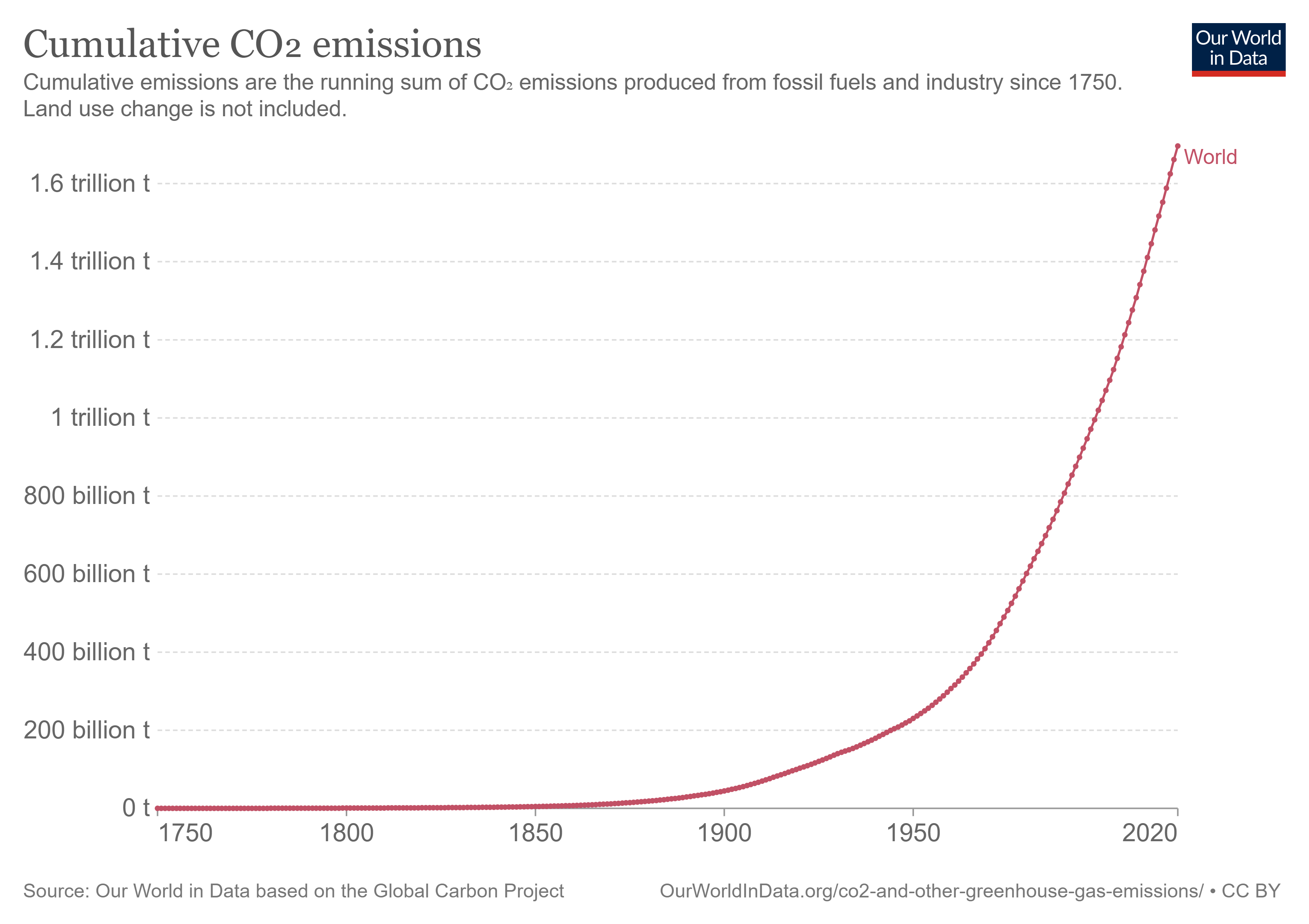
Cumulative CO₂ Emissions vs. Rate of Change
Global climate change is primarily caused by carbon dioxide emissions. Fossil fuels like coal, oil, and gas release large amounts of CO₂ when burned or used in industrial processes.
Before the Industrial Revolution (1760-1840), emissions were very low. However, with the increased use of fossil fuels to power machines, emissions rose to 6 billion tonnes of CO₂ per year globally by 1950. The amount had almost quadrupled by 1990, reaching a rate of over 22 billion tonnes per year.
Currently, the world emits over 34 billion tonnes of CO₂ each year. Since 1751, the world has emitted over 1.5 trillion tonnes of CO₂ cumulatively.
Prior to the COVID-19 pandemic, average global growth in fossil CO₂ emissions had slowed to 0.9% annually during the 2010s, reaching 36.7 gigatons of CO₂ added to the atmosphere in 2019.
However, in 2020, global lockdowns led to the biggest decrease in CO₂ emissions ever seen in absolute terms. Global fossil CO₂ emissions decreased by 5.2% to 34.8 gigatons, mainly due to halts in aviation, surface transport, power generation, and manufacturing during the pandemic.
Since then, emissions have approached pre-pandemic levels, reaching 36.2 gigatons added to the atmosphere in 2021.
Biggest Emitters, by Country
Asia, led by China, is the largest emitter, with the continent accounting for more than half of global emissions.
| Rank | Country | 2020 CO₂ Emissions (Millions of metric tons) |
|---|---|---|
| #1 | 🇨🇳 China | 10,668 |
| #2 | 🇺🇸 United States | 4,713 |
| #3 | 🇮🇳 India | 2,442 |
| #4 | 🇷🇺 Russia | 1,577 |
| #5 | 🇯🇵 Japan | 1,031 |
| #6 | 🇮🇷 Iran | 745 |
| #7 | 🇩🇪 Germany | 644 |
| #8 | 🇸🇦 Saudi Arabia | 626 |
| #9 | 🇰🇷 South Korea | 598 |
| #10 | 🇮🇩 Indonesia | 590 |
| #11 | 🇨🇦 Canada | 536 |
| #12 | 🇧🇷 Brazil | 467 |
| #13 | 🇿🇦 South Africa | 452 |
| #14 | 🇹🇷 Turkey | 393 |
| #15 | 🇦🇺 Australia | 392 |
CO₂ emissions from developing economies already account for more than two-thirds of global emissions, while emissions from advanced economies are in a structural decline.
Coal Power Generation Set for Record Increase
To avoid the worst impacts of climate change, more than 130 countries have now set or are considering a target of reducing emissions to net zero by 2050.
Much of the slowdown in emissions growth in the 2010s was attributable to the substitution of coal—the fuel that contributes most to planet-warming emissions—with gas and renewables. In addition, during the previous COP26 held in Glasgow, 40 nations agreed to phase coal out of their energy mixes.
Despite that, in 2021, coal-fired electricity generation reached all-time highs globally and is set for a new record in 2022 as consumption surged in Europe to replace shortfalls in hydro, nuclear, and Russian natural gas.
As leaders meet in Egypt for the world’s largest gathering on climate action, it will be up to them to come up with a plan for making their environmental aspirations a reality.


Green
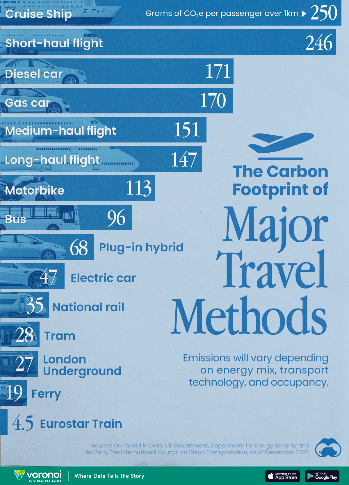
The Carbon Footprint of Major Travel Methods
Going on a cruise ship and flying domestically are the most carbon-intensive travel methods.

The Carbon Footprint of Major Travel Methods
This was originally posted on our Voronoi app. Download the app for free on iOS or Android and discover incredible data-driven charts from a variety of trusted sources.
Did you know that transport accounts for nearly one-quarter of global energy-related carbon dioxide (CO₂) emissions?
This graphic illustrates the carbon footprints of major travel methods measured in grams of carbon dioxide equivalent (CO₂e) emitted per person to travel one kilometer. This includes both CO₂ and other greenhouse gases.
Data is sourced from Our World in Data, the UK Government’s Department for Energy Security and Net Zero, and The International Council on Clean Transportation, as of December 2022.
These figures should be interpreted as approximations, rather than exact numbers. There are many variables at play that determine the actual carbon footprint in any individual case, including vehicle type or model, occupancy, energy mix, and even weather.
Cruise Ships are the Most Carbon-Intensive Travel Method
According to these estimates, taking a cruise ship, flying domestically, and driving alone are some of the most carbon-intensive travel methods.
Cruise ships typically use heavy fuel oil, which is high in carbon content. The average cruise ship weighs between 70,000 to 180,000 metric tons, meaning they require large engines to get moving.
These massive vessels must also generate power for onboard amenities such as lighting, air conditioning, and entertainment systems.
Short-haul flights are also considered carbon-intensive due to the significant amount of fuel consumed during initial takeoff and climbing altitude, relative to a lower amount of cruising.
| Transportation method | CO₂ equivalent emissions per passenger km |
|---|---|
| Cruise Ship | 250 |
| Short-haul flight (i.e. within a U.S. state or European country) | 246 |
| Diesel car | 171 |
| Gas car | 170 |
| Medium-haul flight (i.e. international travel within Europe, or between U.S. states) | 151 |
| Long-haul flight (over 3,700 km, about the distance from LA to NY) | 147 |
| Motorbike | 113 |
| Bus (average) | 96 |
| Plug-in hybrid | 68 |
| Electric car | 47 |
| National rail | 35 |
| Tram | 28 |
| London Underground | 27 |
| Ferry (foot passenger) | 19 |
| Eurostar (International rail) | 4.5 |
Are EVs Greener?
Many experts agree that EVs produce a lower carbon footprint over time versus traditional internal combustion engine (ICE) vehicles.
However, the batteries in electric vehicles charge on the power that comes straight off the electrical grid—which in many places may be powered by fossil fuels. For that reason, the carbon footprint of an EV will depend largely on the blend of electricity sources used for charging.
There are also questions about how energy-intensive it is to build EVs compared to a comparable ICE vehicle.

-

 Science1 week ago
Visualizing the Average Lifespans of Mammals
-

 Markets2 weeks ago
The Top 10 States by Real GDP Growth in 2023
-

 Demographics2 weeks ago
The Smallest Gender Wage Gaps in OECD Countries
-

 United States2 weeks ago
Where U.S. Inflation Hit the Hardest in March 2024
-

 Green2 weeks ago
Top Countries By Forest Growth Since 2001
-

 United States2 weeks ago
Ranked: The Largest U.S. Corporations by Number of Employees
-

 Maps2 weeks ago
The Largest Earthquakes in the New York Area (1970-2024)
-

 Green2 weeks ago
Ranked: The Countries With the Most Air Pollution in 2023