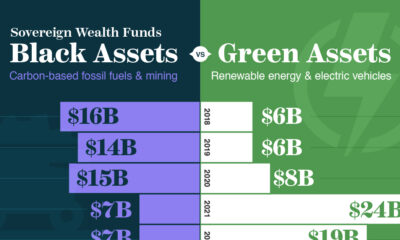

Sovereign wealth funds have scaled up their green investments in the push towards decarbonizing the global economy.
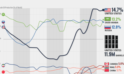

Over the last decade, the United States has established itself as the world's top producer of crude oil, surpassing Saudi Arabia and Russia.
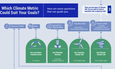

When selecting climate metrics, it is important to consider your purpose, the applicability and acceptability of the climate strategy, and the availability of historical data.
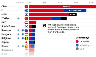

With Russia’s revenues from fossil fuel exports having declined significantly, which countries are still importing Russian fossil fuels?

Despite the advent of renewable sources of energy, fossil fuels and their carbon emissions, haven’t gone anywhere.


While Russia still makes billions from fossil fuel exports, revenues are declining. Here are the largest importers since the start of the invasion.
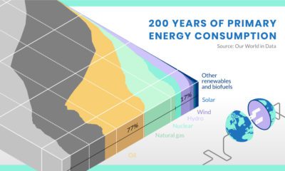

What have energy transitions looked like in the past, and what can we learn from them?


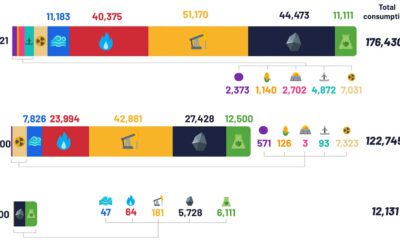
How much oil, coal, and natural gas do we extract each year? See the scale of annual fossil fuel production in perspective.


This infographic lists the most fuel efficient cars over the past 46 years, including the current leader for 2023.
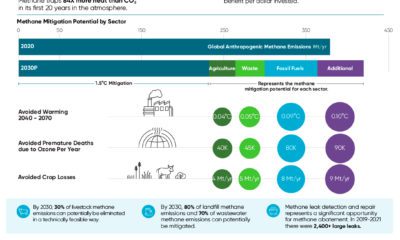

Methane emissions contribute to over half of net global warming. Where do the greatest opportunities lie for methane abatement?


 Creator Program