Money
These Maps Show Where a Dollar Goes Furthest in the U.S.
Go to any large, high-density city like New York or San Francisco, and you’ll notice a difference in costs immediately.
The price you pay for groceries, dinner at the restaurant, filling up your tank, or even your daily coffee goes up substantially. With high-paying jobs, booming economies, limited space, and soaring levels of density, cities can be expensive.
Dollar Disparity
While this effect on costs is most evident in cities, it’s actually present throughout the country.
What you can buy for your paycheck varies wildly depending on where you are, greatly impacting purchasing power and the cost of living. Sometimes even a short one-hour drive can make a difference in some cases.
Today’s two maps come from TaxFoundation.org, and they look at regional differences in purchasing power, based on information from the Bureau of Economic Analysis.
Bang for Buck, by State
The following map shows the buying power of $100 by state.
If the number is below, such as $90, it means money buys less than the federal average. If a state’s number is higher, such as $110, that means each dollar goes further, giving residents more purchasing power.
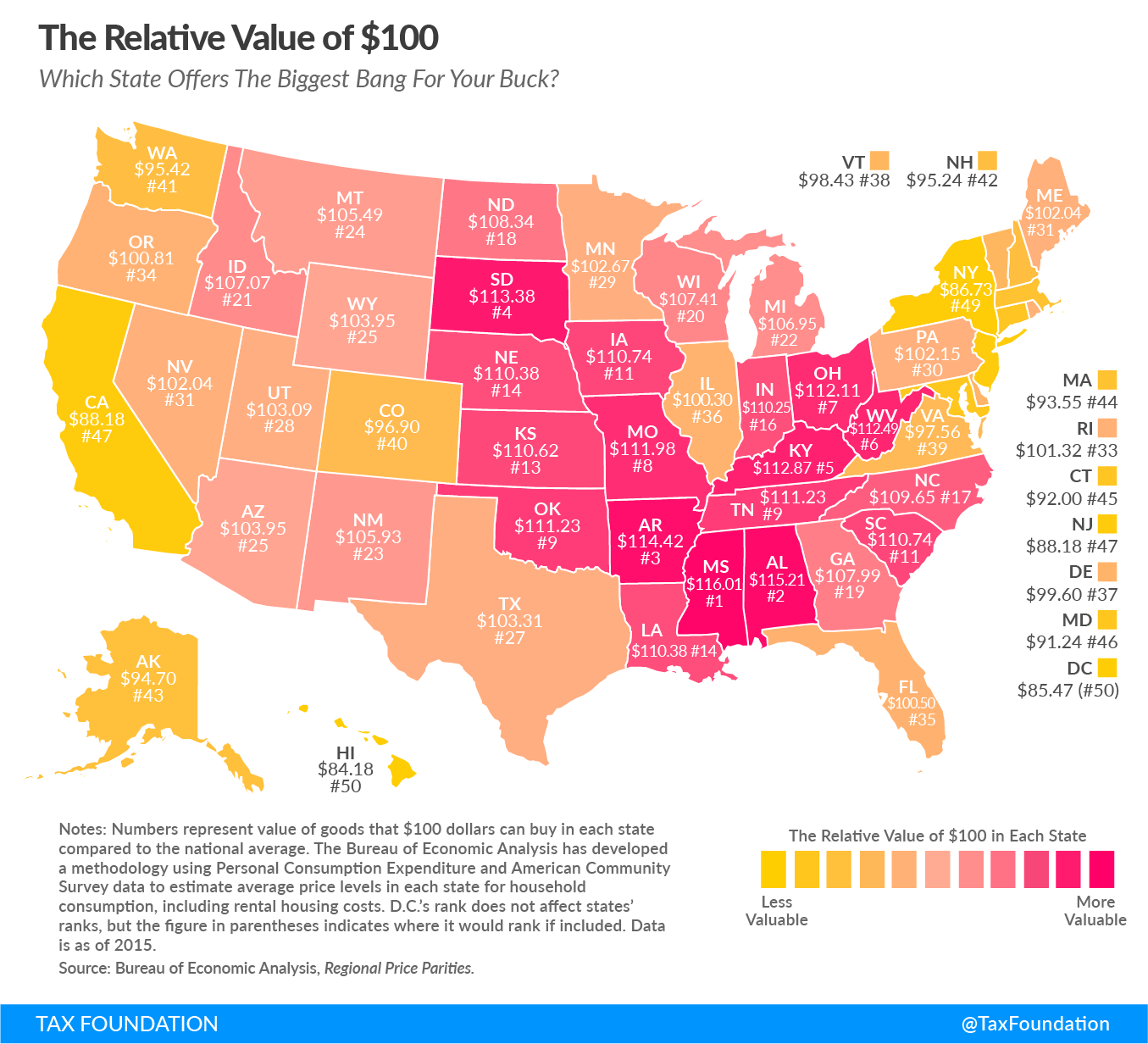
Generally speaking, dollars go furthest in states in the Southeast and Midwest parts of the country. Go to places like Arkansas or South Dakota, and you’ll see higher purchasing power.
Here are the five states that have the most buying power:
| Rank | State or District | Relative Value of $100 |
|---|---|---|
| #1 | Mississippi | $116.01 |
| #2 | Alabama | $115.21 |
| #3 | Arkansas | $114.42 |
| #4 | South Dakota | $113.38 |
| #5 | Kentucky | $112.87 |
And here are the five with the least buying power:
| Rank | State or District | Relative Value of $100 |
|---|---|---|
| #47 | New Jersey | $88.18 |
| #47 | California | $88.18 |
| #49 | New York | $86.73 |
| #50 | District of Columbia | $85.47 |
| #51 | Hawaii | $84.18 |
Bang for Buck, by County
The state map does not tell the whole story, however.
The reality is that density makes a big difference for buying power, and large metropolitan areas tend to be more expensive. The following chart breaks it down based on county, creating a much more interesting contrast.
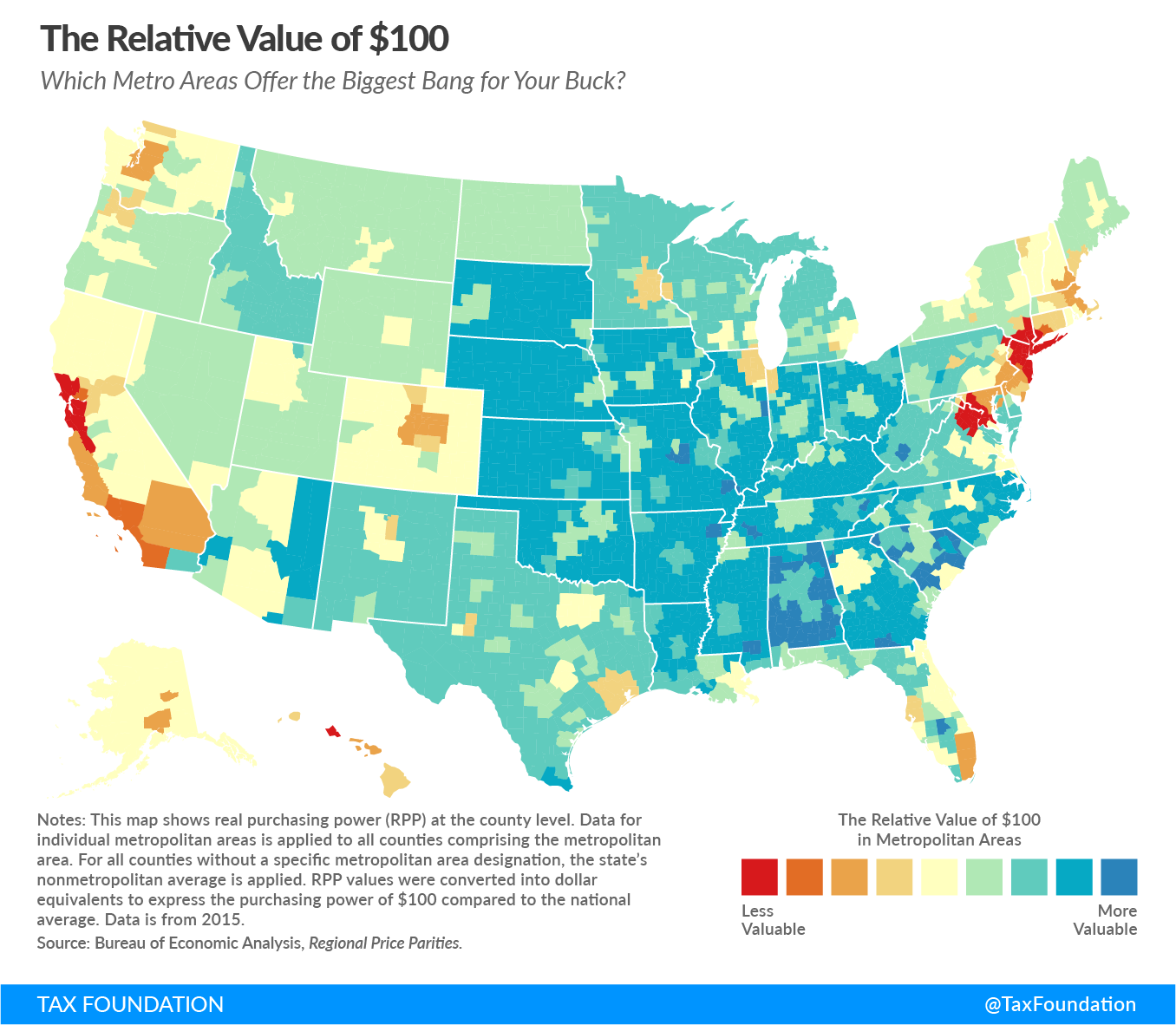
The above rendition makes it clear that the Bay Area, New York City, and Washington D.C. are the places where the relative value of a dollar is lowest.
Meanwhile, it also shows that metropolitan areas in some parts of the country are not too bad for the cost of living. Cities like Atlanta ($104.10), Nashville ($106.50), Phoenix ($102.90), Milwaukee ($104.50), Kansas City ($106.70), Jacksonville ($104.40), and New Orleans ($104.60) buck the trend, being cheaper than the American average.
Here’s another look – this time with an interactive map that allows you to hover over individual metro areas:


Money
Charted: Which City Has the Most Billionaires in 2024?
Just two countries account for half of the top 20 cities with the most billionaires. And the majority of the other half are found in Asia.


Charted: Which Country Has the Most Billionaires in 2024?
This was originally posted on our Voronoi app. Download the app for free on iOS or Android and discover incredible data-driven charts from a variety of trusted sources.
Some cities seem to attract the rich. Take New York City for example, which has 340,000 high-net-worth residents with investable assets of more than $1 million.
But there’s a vast difference between being a millionaire and a billionaire. So where do the richest of them all live?
Using data from the Hurun Global Rich List 2024, we rank the top 20 cities with the highest number of billionaires in 2024.
A caveat to these rich lists: sources often vary on figures and exact rankings. For example, in last year’s reports, Forbes had New York as the city with the most billionaires, while the Hurun Global Rich List placed Beijing at the top spot.
Ranked: Top 20 Cities with the Most Billionaires in 2024
The Chinese economy’s doldrums over the course of the past year have affected its ultra-wealthy residents in key cities.
Beijing, the city with the most billionaires in 2023, has not only ceded its spot to New York, but has dropped to #4, overtaken by London and Mumbai.
| Rank | City | Billionaires | Rank Change YoY |
|---|---|---|---|
| 1 | 🇺🇸 New York | 119 | +1 |
| 2 | 🇬🇧 London | 97 | +3 |
| 3 | 🇮🇳 Mumbai | 92 | +4 |
| 4 | 🇨🇳 Beijing | 91 | -3 |
| 5 | 🇨🇳 Shanghai | 87 | -2 |
| 6 | 🇨🇳 Shenzhen | 84 | -2 |
| 7 | 🇭🇰 Hong Kong | 65 | -1 |
| 8 | 🇷🇺 Moscow | 59 | No Change |
| 9 | 🇮🇳 New Delhi | 57 | +6 |
| 10 | 🇺🇸 San Francisco | 52 | No Change |
| 11 | 🇹🇭 Bangkok | 49 | +2 |
| 12 | 🇹🇼 Taipei | 45 | +2 |
| 13 | 🇫🇷 Paris | 44 | -2 |
| 14 | 🇨🇳 Hangzhou | 43 | -5 |
| 15 | 🇸🇬 Singapore | 42 | New to Top 20 |
| 16 | 🇨🇳 Guangzhou | 39 | -4 |
| 17T | 🇮🇩 Jakarta | 37 | +1 |
| 17T | 🇧🇷 Sao Paulo | 37 | No Change |
| 19T | 🇺🇸 Los Angeles | 31 | No Change |
| 19T | 🇰🇷 Seoul | 31 | -3 |
In fact all Chinese cities on the top 20 list have lost billionaires between 2023–24. Consequently, they’ve all lost ranking spots as well, with Hangzhou seeing the biggest slide (-5) in the top 20.
Where China lost, all other Asian cities—except Seoul—in the top 20 have gained ranks. Indian cities lead the way, with New Delhi (+6) and Mumbai (+3) having climbed the most.
At a country level, China and the U.S combine to make up half of the cities in the top 20. They are also home to about half of the world’s 3,200 billionaire population.
In other news of note: Hurun officially counts Taylor Swift as a billionaire, estimating her net worth at $1.2 billion.

-

 Debt1 week ago
How Debt-to-GDP Ratios Have Changed Since 2000
-

 Markets2 weeks ago
Ranked: The World’s Top Flight Routes, by Revenue
-

 Countries2 weeks ago
Population Projections: The World’s 6 Largest Countries in 2075
-

 Markets2 weeks ago
The Top 10 States by Real GDP Growth in 2023
-

 Demographics2 weeks ago
The Smallest Gender Wage Gaps in OECD Countries
-

 United States2 weeks ago
Where U.S. Inflation Hit the Hardest in March 2024
-

 Green2 weeks ago
Top Countries By Forest Growth Since 2001
-

 United States2 weeks ago
Ranked: The Largest U.S. Corporations by Number of Employees