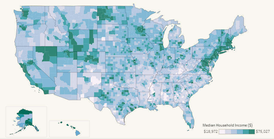
This interactive map allows you to pull data on median household income for all 3,000+ U.S. counties in existence, allowing for some interesting insights.
Every dollar spent is not equal. In some cities like NYC or SF, it will buy you far less - and in other places, a dollar...
This interactive data visualization allows you to see median household income levels for every U.S. county - as well as the ability to sort data by...
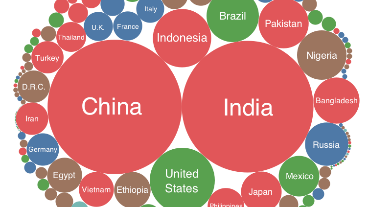
Every country is represented in this deceptively simple visualization. We then show all U.S. counties using a similar method, which might make you feel small!
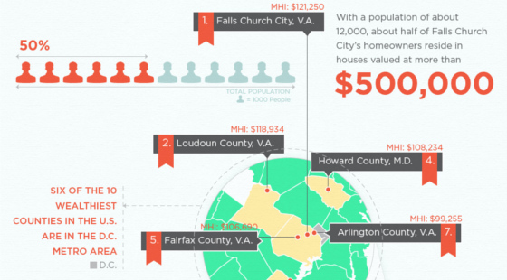
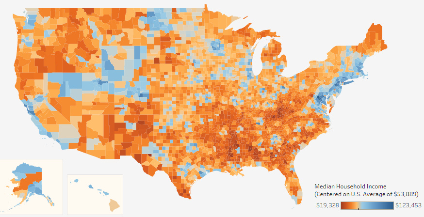
The richest counties in America by median income are not located near Silicon Valley or adjacent to Wall Street. They are not in oil rich Texas...


