Money
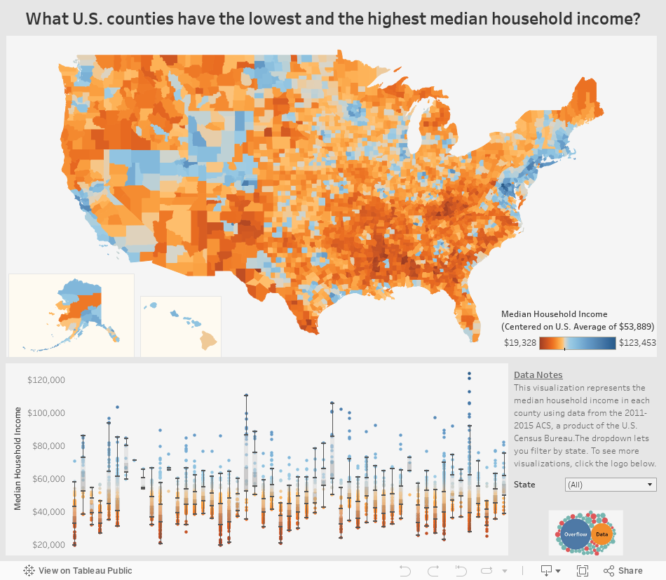
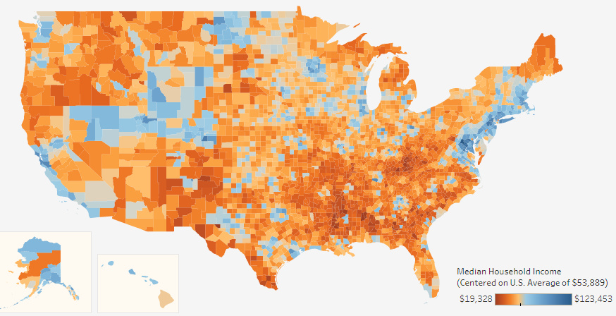
Interactive: Visualizing Median Income For All 3,000+ U.S. Counties
var divElement = document.getElementById(‘viz1503420628886’); var vizElement = divElement.getElementsByTagName(‘object’)[0]; if ( divElement.offsetWidth > 800 ) { vizElement.style.width=’954px’;vizElement.style.height=’869px’;} else if ( divElement.offsetWidth > 500 ) { vizElement.style.width=’954px’;vizElement.style.height=’869px’;} else { vizElement.style.width=’100%’;vizElement.style.height=’1136px’;} var scriptElement = document.createElement(‘script’); scriptElement.src = ‘https://public.tableau.com/javascripts/api/viz_v1.js’; vizElement.parentNode.insertBefore(scriptElement, vizElement);
Interactive: Visualizing Median Income for All 3,000+ U.S. Counties
When thinking about the United States and its economy, we often think in terms of maps.
That’s why we have previously visualized the country’s $18 trillion economy by comparing specific regions to similarly sized countries. It’s also why we have shown the extreme variance in population distribution across counties, or highlighted the average income of the “Top 1%” throughout the country.
But there is perhaps nothing more telling or interesting to explore than the “granddaddy” of all economic maps: an interactive visualization of median household income.
That’s why today’s fantastic interactive map from Overflow Data is such a treat. It covers all 3,007 U.S. counties using color coding to show the richest and poorest counties based on median income, and it also allows users to drill down to the stats on counties at the state level.
Coasts, Mountains, and Oil
While the areas around coastal cities like San Francisco, Los Angeles, New York City, Boston, or Washington, D.C. are often thought of as the wealthier parts of the country, this map helps reveal two other “belts” in the country with median incomes well above the national average of $53,889.
The first is in the mountains through states like Utah, Colorado, Wyoming and even parts of Nevada – where there is a cluster of more than 40 counties with median incomes of $60,000 or above. Aside from upscale ski areas in places like Summit County, UT or Jackson, WY, the counties in this belt also feature cities like Boulder, CO, or Salt Lake City, UT.
Areas that are rich in natural resources, such as parts of Alaska, Texas, and North Dakota, also tend to have more counties with above average median incomes. For example, Williams County, ND, is in the middle of the Bakken oilfield – and the median household income there is $88,013.
In Alaska, the northernmost county of North Slope Borough has less than 8,000 residents, but they boast a median household income of $72,576.
Tougher Times
On this map, the less wealthy areas are also very evident – and they tend to be most concentrated in the Southeast region of the country.
Many states, including ones like Kentucky, Alabama, Mississippi, Montana, Louisiana, Missouri, New Mexico, Arkansas, Texas, West Virginia, North Carolina, South Carolina, and South Dakota, all have some counties that are at the very low end of median income spectrum.
More specifically, there are only two counties in the country that have income levels below $20,000: Sumter County, AL, and McCreary County, KY.


Money
How Debt-to-GDP Ratios Have Changed Since 2000
See how much the debt-to-GDP ratios of advanced economies have grown (or shrank) since the year 2000.


How Debt-to-GDP Ratios Have Changed Since 2000
This was originally posted on our Voronoi app. Download the app for free on Apple or Android and discover incredible data-driven charts from a variety of trusted sources.
Government debt levels have grown in most parts of the world since the 2008 financial crisis, and even more so after the COVID-19 pandemic.
To gain perspective on this long-term trend, we’ve visualized the debt-to-GDP ratios of advanced economies, as of 2000 and 2024 (estimated). All figures were sourced from the IMF’s World Economic Outlook.
Data and Highlights
The data we used to create this graphic is listed in the table below. “Government gross debt” consists of all liabilities that require payment(s) of interest and/or principal in the future.
| Country | 2000 (%) | 2024 (%) | Change (pp) |
|---|---|---|---|
| 🇯🇵 Japan | 135.6 | 251.9 | +116.3 |
| 🇸🇬 Singapore | 82.3 | 168.3 | +86.0 |
| 🇺🇸 United States | 55.6 | 126.9 | +71.3 |
| 🇬🇧 United Kingdom | 36.6 | 105.9 | +69.3 |
| 🇬🇷 Greece | 104.9 | 160.2 | +55.3 |
| 🇫🇷 France | 58.9 | 110.5 | +51.6 |
| 🇵🇹 Portugal | 54.2 | 104.0 | +49.8 |
| 🇪🇸 Spain | 57.8 | 104.7 | +46.9 |
| 🇸🇮 Slovenia | 25.9 | 66.5 | +40.6 |
| 🇫🇮 Finland | 42.4 | 76.5 | +34.1 |
| 🇭🇷 Croatia | 35.4 | 61.8 | +26.4 |
| 🇨🇦 Canada | 80.4 | 103.3 | +22.9 |
| 🇨🇾 Cyprus | 56.0 | 70.9 | +14.9 |
| 🇦🇹 Austria | 65.7 | 74.0 | +8.3 |
| 🇸🇰 Slovak Republic | 50.5 | 56.5 | +6.0 |
| 🇩🇪 Germany | 59.3 | 64.0 | +4.7 |
| 🇧🇪 Belgium | 109.6 | 106.8 | -2.8 |
| 🇮🇱 Israel | 77.4 | 56.8 | -20.6 |
| 🇮🇸 Iceland | 75.8 | 54.6 | -21.2 |
The debt-to-GDP ratio indicates how much a country owes compared to the size of its economy, reflecting its ability to manage and repay debts. Percentage point (pp) changes shown above indicate the increase or decrease of these ratios.
Countries with the Biggest Increases
Japan (+116 pp), Singapore (+86 pp), and the U.S. (+71 pp) have grown their debt as a percentage of GDP the most since the year 2000.
All three of these countries have stable, well-developed economies, so it’s unlikely that any of them will default on their growing debts. With that said, higher government debt leads to increased interest payments, which in turn can diminish available funds for future government budgets.
This is a rising issue in the U.S., where annual interest payments on the national debt have surpassed $1 trillion for the first time ever.
Only 3 Countries Saw Declines
Among this list of advanced economies, Belgium (-2.8 pp), Iceland (-21.2 pp), and Israel (-20.6 pp) were the only countries that decreased their debt-to-GDP ratio since the year 2000.
According to Fitch Ratings, Iceland’s debt ratio has decreased due to strong GDP growth and the use of its cash deposits to pay down upcoming maturities.
See More Debt Graphics from Visual Capitalist
Curious to see which countries have the most government debt in dollars? Check out this graphic that breaks down $97 trillion in debt as of 2023.

-

 Real Estate2 weeks ago
Visualizing America’s Shortage of Affordable Homes
-

 Technology1 week ago
Ranked: Semiconductor Companies by Industry Revenue Share
-

 Money1 week ago
Which States Have the Highest Minimum Wage in America?
-

 Real Estate1 week ago
Ranked: The Most Valuable Housing Markets in America
-

 Business1 week ago
Charted: Big Four Market Share by S&P 500 Audits
-

 AI1 week ago
The Stock Performance of U.S. Chipmakers So Far in 2024
-

 Misc2 weeks ago
Almost Every EV Stock is Down After Q1 2024
-

 Money2 weeks ago
Where Does One U.S. Tax Dollar Go?