Economy
The World’s Tech Giants, Compared to the Size of Economies
It’s no secret that tech giants have exploded in value over the last few years, but the scale can be hard to comprehend.
Through wide-scaling market penetration, smart diversification, and the transformation of products into services, Apple, Microsoft, Amazon, and Google have reached market capitalizations well above $1.5 trillion.
To help us better understand these staggering numbers, a recent study at Mackeeper took the market capitalization of multiple tech giants and compared them with the annual Gross Domestic Product (GDP) of countries.
Editor’s note: While these numbers are interesting to compare, it’s worth noting that they represent different things. Market cap is the total value of shares outstanding in a publicly-traded company and gives an indication of total valuation, and GDP measures the value of all goods and services produced by a country in an entire year.
Companies vs. Countries: Tech Giants
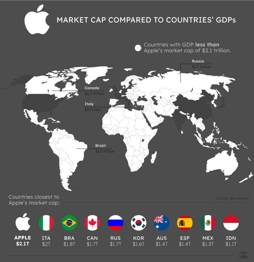


If Apple’s market capitalization was equal to a country’s annual GDP, it might just be in the G7.
At a market cap of more than $2.1 trillion, Apple’s market capitalization is larger than 96% of country GDPs, a list that includes Italy, Brazil, Canada, and Russia.
In fact, only seven countries in the world have a higher GDP than Apple’s market cap.
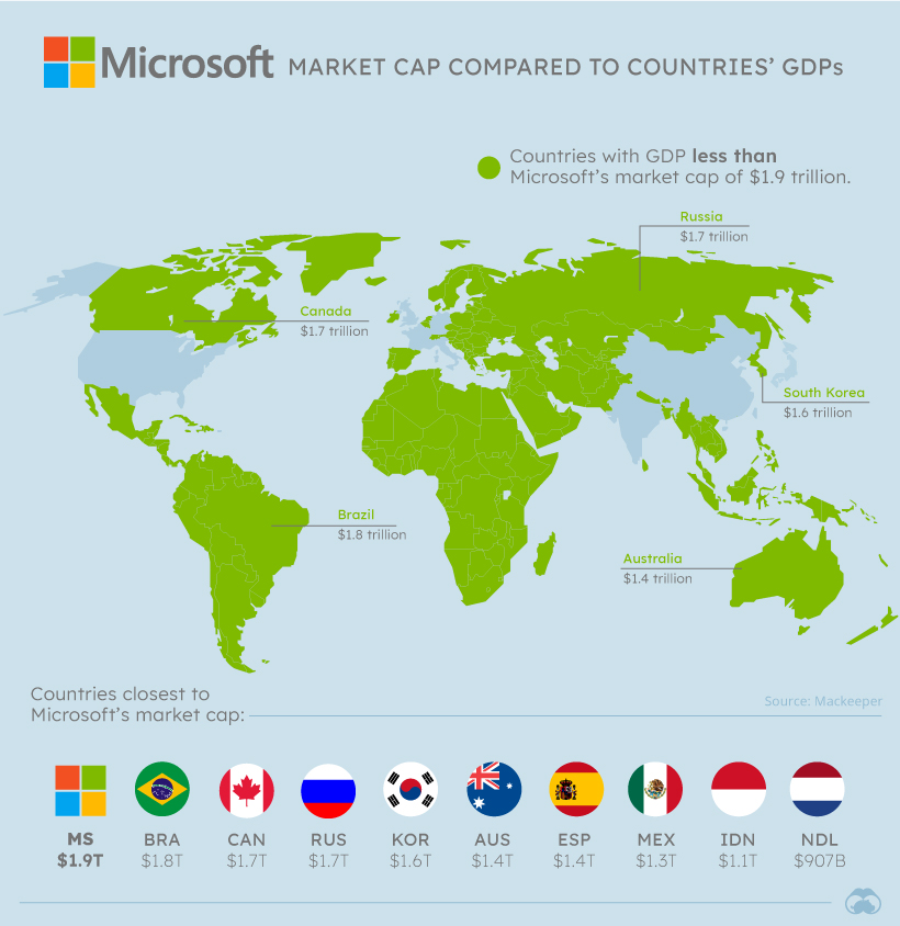
Further back is Microsoft, which would be the 10th richest country in the world if market cap was equivalent to GDP.
With a market cap of more than $1.9 trillion, Microsoft’s value is larger than the GDP of global powerhouses Brazil, Canada, Russia, and South Korea.
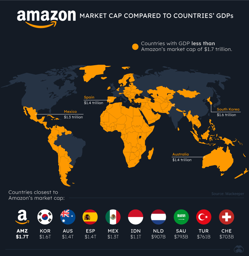
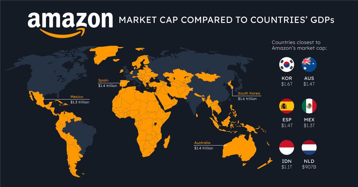
Though all of the tech giants fared well during the COVID-19 pandemic, perhaps none have stood to benefit as much as Amazon.
With online retail and web services both in high demand, Amazon’s market cap has grown to $1.7 trillion, larger than 92% of country GDPs.
Other Companies “Bigger” Than Countries
Tech giants aren’t the only companies that would give countries a run for their money.
| Country/Company | Nominal GDP (country) or Market Cap (company) |
|---|---|
| United States of America | $21,433 B |
| China | $14,343 B |
| Japan | $5,082 B |
| Germany | $3,861 B |
| India | $2,869 B |
| United Kingdom | $2,829 B |
| France | $2,716 B |
| Apple | $2,125 B |
| Italy | $2,004 B |
| Microsoft | $1,942 B |
| Saudi Aramco | $1,888 B |
| Brazil | $1,840 B |
| Canada | $1,736 B |
| Russia | $1700 B |
| Amazon | $1,688 B |
| Alphabet | $1,656 B |
| South Korea | $1,647 B |
| Australia | $1,397 B |
| Spain | $1,393 B |
| Mexico | $1,269 B |
| Indonesia | $1,119 B |
| $939 B | |
| Netherlands | $907 B |
| Saudi Arabia | $793 B |
| Turkey | $761 B |
| Tencent | $736 B |
| Switzerland | $703 B |
| Poland | $596 B |
Saudi Arabia’s state-owned corporation Saudi Aramco also makes the list, boasting a market cap more than double the GDP of its home country.
China’s tech giant Tencent also has a market cap that towers over many country GDPs, such as those of Switzerland or Poland.
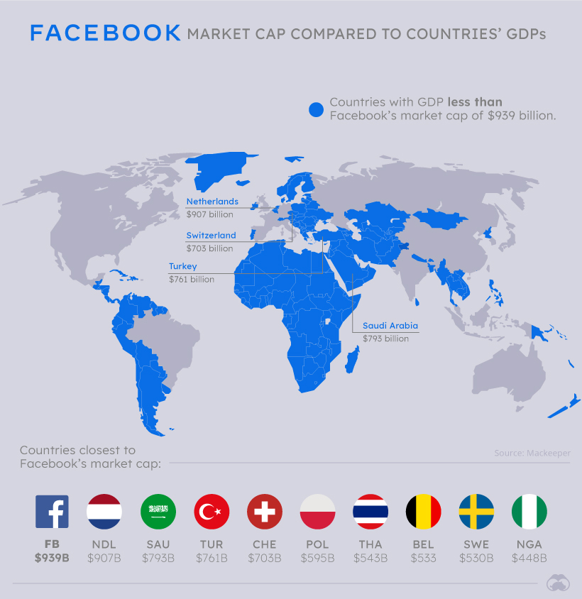
Until recently, Tencent was also ahead of fellow tech giant Facebook in market cap, but the social network has climbed ahead and almost reached $1 trillion in market capitalization.
Of course, the biggest caveat to consider with these comparisons is the difference between market cap and GDP numbers.
A company’s market cap is a proxy of its net worth in the eyes of public markets and changes constantly, while GDP measures the economic output of a country in a given year.
But companies directly and indirectly affect the economies of countries around the world. With international reach, wealth accumulation, and impact, it’s important to consider just how much wealth and power these companies have.


Economy
Economic Growth Forecasts for G7 and BRICS Countries in 2024
The IMF has released its economic growth forecasts for 2024. How do the G7 and BRICS countries compare?
G7 & BRICS Real GDP Growth Forecasts for 2024
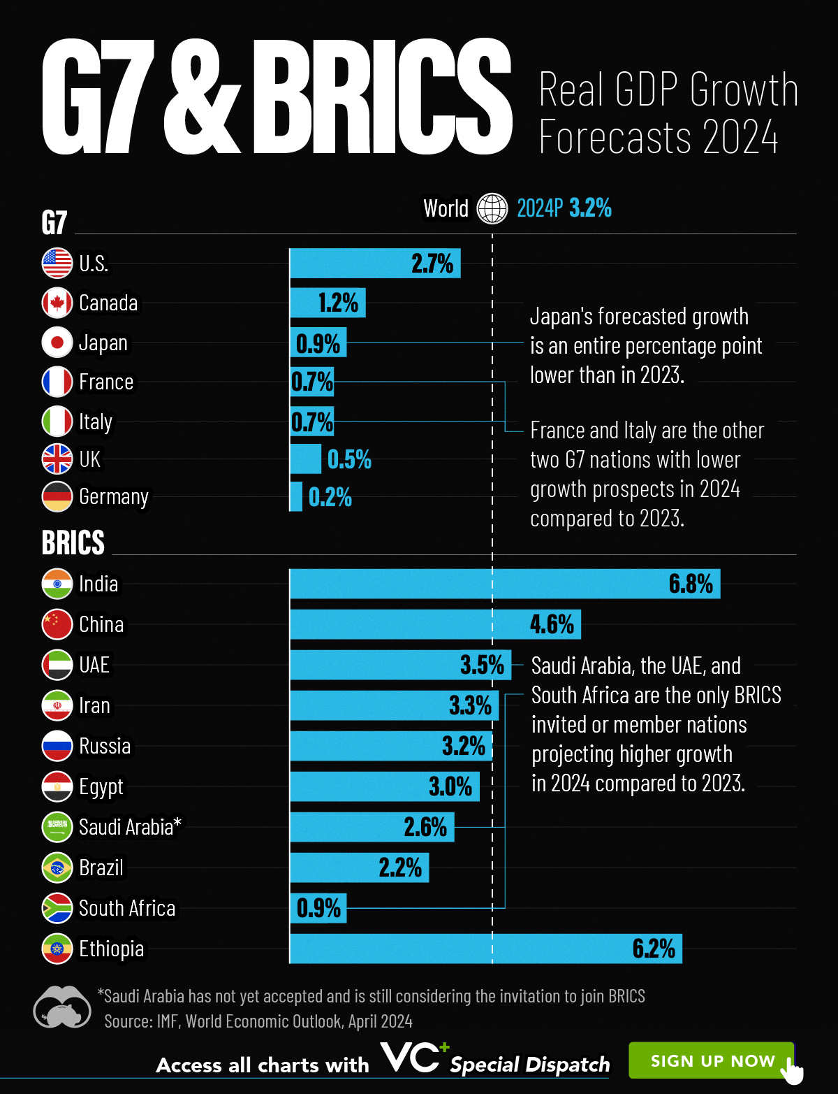
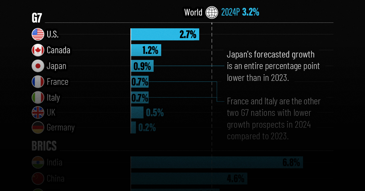
The International Monetary Fund’s (IMF) has released its real gross domestic product (GDP) growth forecasts for 2024, and while global growth is projected to stay steady at 3.2%, various major nations are seeing declining forecasts.
This chart visualizes the 2024 real GDP growth forecasts using data from the IMF’s 2024 World Economic Outlook for G7 and BRICS member nations along with Saudi Arabia, which is still considering an invitation to join the bloc.
Get the Key Insights of the IMF’s World Economic Outlook
Want a visual breakdown of the insights from the IMF’s 2024 World Economic Outlook report?
This visual is part of a special dispatch of the key takeaways exclusively for VC+ members.
Get the full dispatch of charts by signing up to VC+.
Mixed Economic Growth Prospects for Major Nations in 2024
Economic growth projections by the IMF for major nations are mixed, with the majority of G7 and BRICS countries forecasted to have slower growth in 2024 compared to 2023.
Only three BRICS-invited or member countries, Saudi Arabia, the UAE, and South Africa, have higher projected real GDP growth rates in 2024 than last year.
| Group | Country | Real GDP Growth (2023) | Real GDP Growth (2024P) |
|---|---|---|---|
| G7 | 🇺🇸 U.S. | 2.5% | 2.7% |
| G7 | 🇨🇦 Canada | 1.1% | 1.2% |
| G7 | 🇯🇵 Japan | 1.9% | 0.9% |
| G7 | 🇫🇷 France | 0.9% | 0.7% |
| G7 | 🇮🇹 Italy | 0.9% | 0.7% |
| G7 | 🇬🇧 UK | 0.1% | 0.5% |
| G7 | 🇩🇪 Germany | -0.3% | 0.2% |
| BRICS | 🇮🇳 India | 7.8% | 6.8% |
| BRICS | 🇨🇳 China | 5.2% | 4.6% |
| BRICS | 🇦🇪 UAE | 3.4% | 3.5% |
| BRICS | 🇮🇷 Iran | 4.7% | 3.3% |
| BRICS | 🇷🇺 Russia | 3.6% | 3.2% |
| BRICS | 🇪🇬 Egypt | 3.8% | 3.0% |
| BRICS-invited | 🇸🇦 Saudi Arabia | -0.8% | 2.6% |
| BRICS | 🇧🇷 Brazil | 2.9% | 2.2% |
| BRICS | 🇿🇦 South Africa | 0.6% | 0.9% |
| BRICS | 🇪🇹 Ethiopia | 7.2% | 6.2% |
| 🌍 World | 3.2% | 3.2% |
China and India are forecasted to maintain relatively high growth rates in 2024 at 4.6% and 6.8% respectively, but compared to the previous year, China is growing 0.6 percentage points slower while India is an entire percentage point slower.
On the other hand, four G7 nations are set to grow faster than last year, which includes Germany making its comeback from its negative real GDP growth of -0.3% in 2023.
Faster Growth for BRICS than G7 Nations
Despite mostly lower growth forecasts in 2024 compared to 2023, BRICS nations still have a significantly higher average growth forecast at 3.6% compared to the G7 average of 1%.
While the G7 countries’ combined GDP is around $15 trillion greater than the BRICS nations, with continued higher growth rates and the potential to add more members, BRICS looks likely to overtake the G7 in economic size within two decades.
BRICS Expansion Stutters Before October 2024 Summit
BRICS’ recent expansion has stuttered slightly, as Argentina’s newly-elected president Javier Milei declined its invitation and Saudi Arabia clarified that the country is still considering its invitation and has not joined BRICS yet.
Even with these initial growing pains, South Africa’s Foreign Minister Naledi Pandor told reporters in February that 34 different countries have submitted applications to join the growing BRICS bloc.
Any changes to the group are likely to be announced leading up to or at the 2024 BRICS summit which takes place October 22-24 in Kazan, Russia.
Get the Full Analysis of the IMF’s Outlook on VC+
This visual is part of an exclusive special dispatch for VC+ members which breaks down the key takeaways from the IMF’s 2024 World Economic Outlook.
For the full set of charts and analysis, sign up for VC+.

-

 Education1 week ago
How Hard Is It to Get Into an Ivy League School?
-

 Technology2 weeks ago
Ranked: Semiconductor Companies by Industry Revenue Share
-

 Markets2 weeks ago
Ranked: The World’s Top Flight Routes, by Revenue
-

 Demographics2 weeks ago
Population Projections: The World’s 6 Largest Countries in 2075
-

 Markets2 weeks ago
The Top 10 States by Real GDP Growth in 2023
-

 Demographics2 weeks ago
The Smallest Gender Wage Gaps in OECD Countries
-

 Economy2 weeks ago
Where U.S. Inflation Hit the Hardest in March 2024
-

 Green2 weeks ago
Top Countries By Forest Growth Since 2001