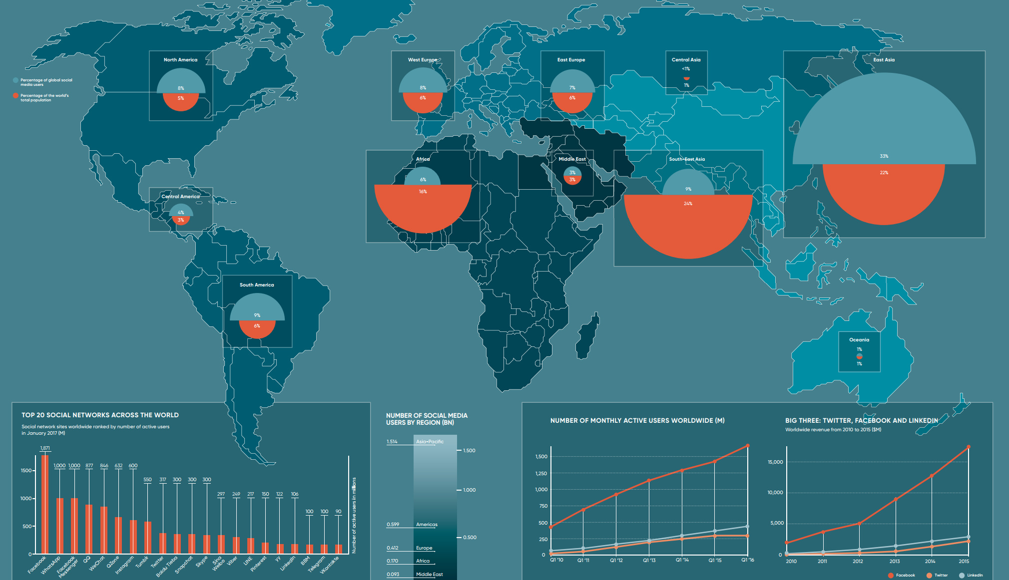
How representative is social media of actual regional geographic populations? This map compares both numbers side by side with interesting results.
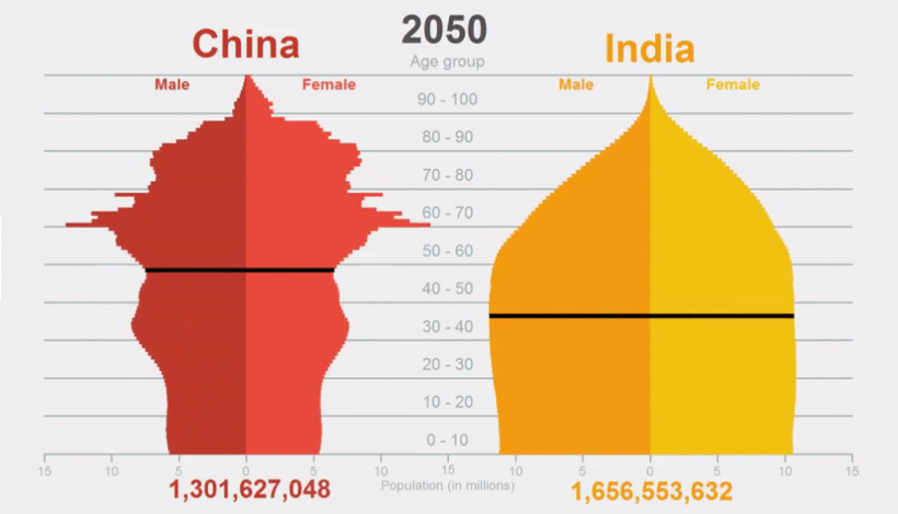
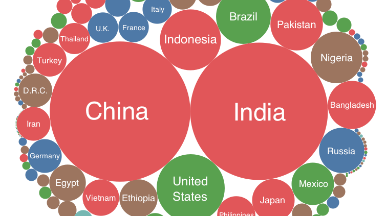
Unintended effects of China's population control policies, the challenges of Chinese demographics, and a new population paradigm where India sits up top.
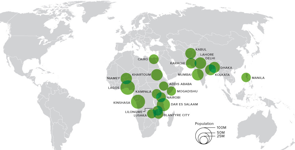
This animation shows big changes in the world's most populous cities over the next 80+ years. Africa alone will hold 13 cities bigger than NYC by...
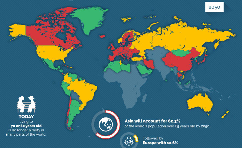
The percentage of the global population that is 65+ will double from 10% to 20% by 2050, creating potential economic headwinds especially for millennials.
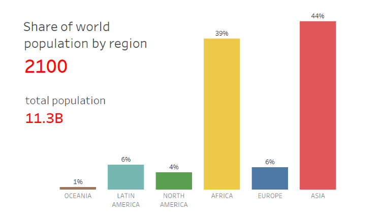
Based on data and projections from the U.N. Population Division, here is how the world's population will shift between 1950 and 2100, sorted by region.
Every country is represented in this deceptively simple visualization. We then show all U.S. counties using a similar method, which might make you feel small!
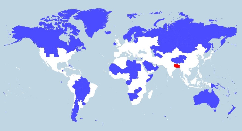
More people live in the tiny red region than all of the blue areas combined. This map really shows the disparity in population density throughout the...
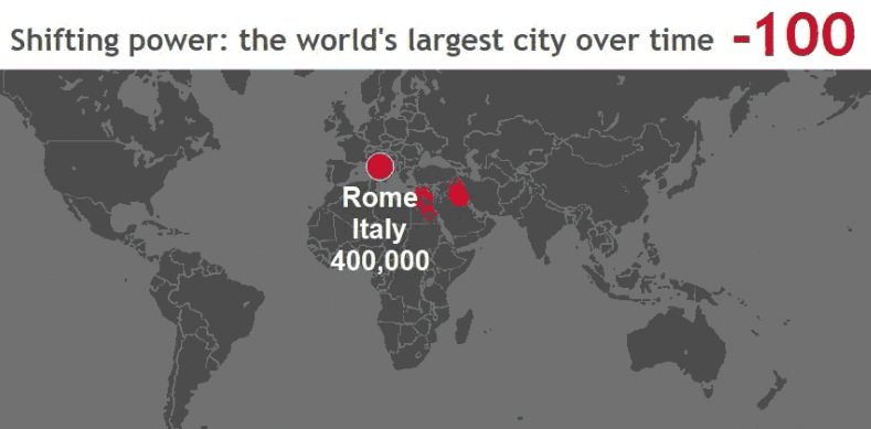
These stunning animations and interactive maps show the changing title for the world's largest city, as well as the rapid pace of urbanization in today's world.
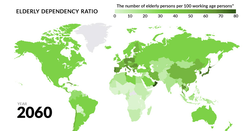
Globally, fertility rates have decreased by about half since 1960. What will happen to the economy when the world's aging population begins to retire?
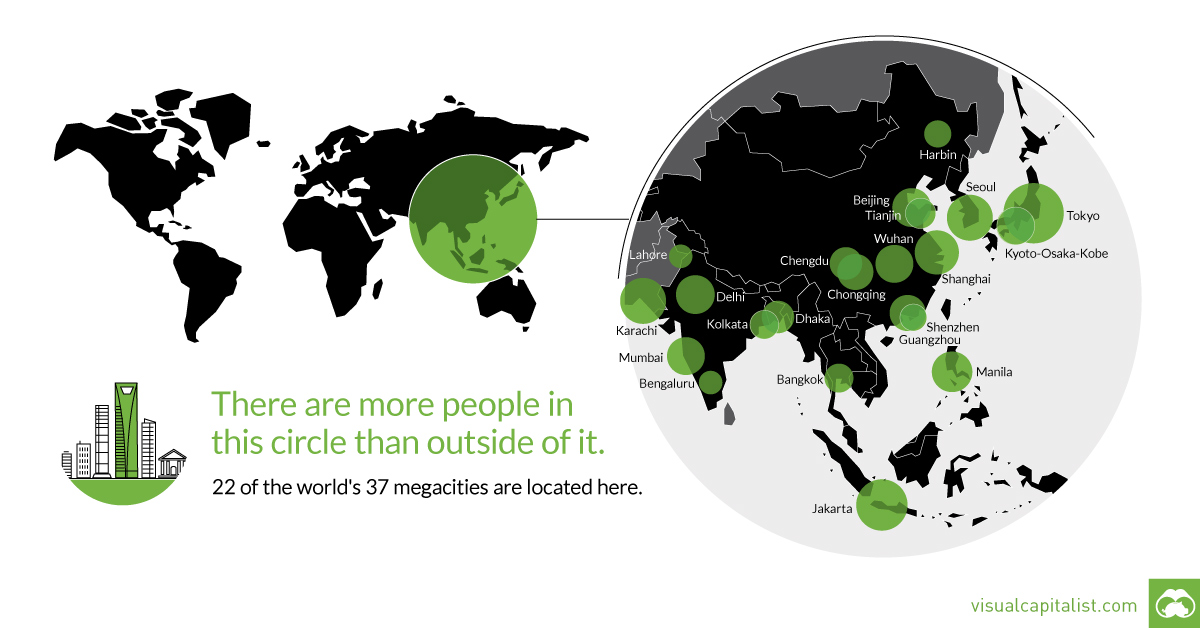
That's right - nearly 4 billion people live inside the circle on this world map, including 22 of the world's 37 megacities.


