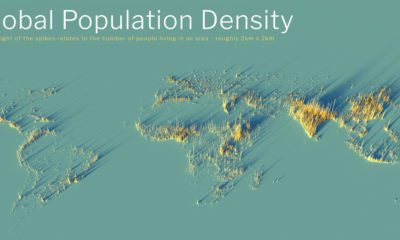

What does population density look like on a global scale? These detailed 3D renders illustrate our biggest urban areas and highlight population trends.
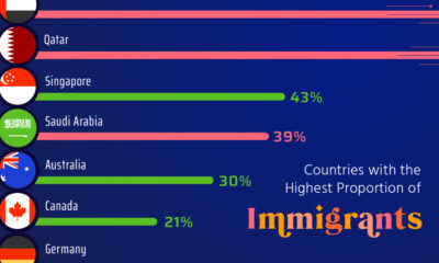

Here, we highlight countries that are magnets for immigration, such as UAE and Qatar, as well as nations with very few foreign born residents.
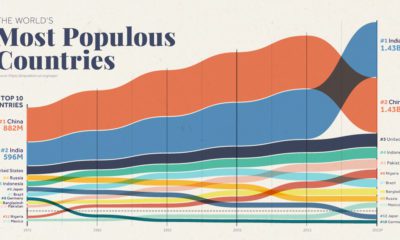

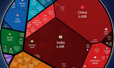
Over the past 50 years, the world's population has doubled, and there have been big changes in the ranking of the world's most populous countries
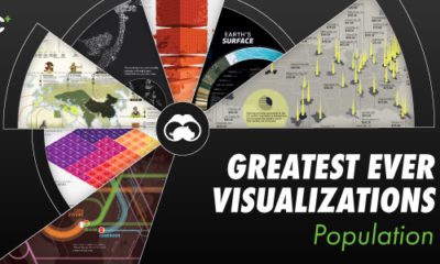

New VC+ subscribers get access to a special gift: a roundup of our best ever visualizations around population.

Our population will soon reach a new milestone—8 billion. These visualizations show where all those people are distributed around the world
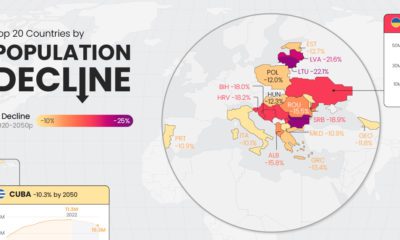

Population decline is a rising issue for many countries in Eastern Europe, as well as outliers like Japan and Cuba.
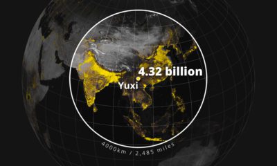

Population density varies across the globe. These maps use geographical circles to show the most densely populated areas on multiple continents.
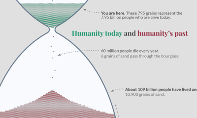

This impactful hour glass visualization shows all of humanity, including the 7% of humans who are alive today
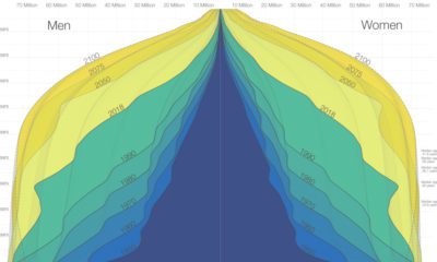

The world is in the midst of a notable demographic transition. Here's how the world population pyramid will change as we close in on the year...
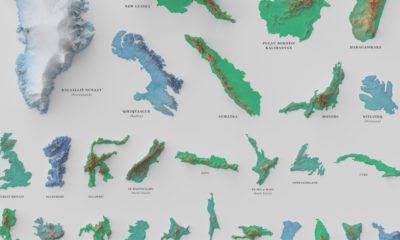

See the world's 100 biggest islands in a side-by-side comparison. Then, we look to see which islands have the highest population densities.


 Creator Program