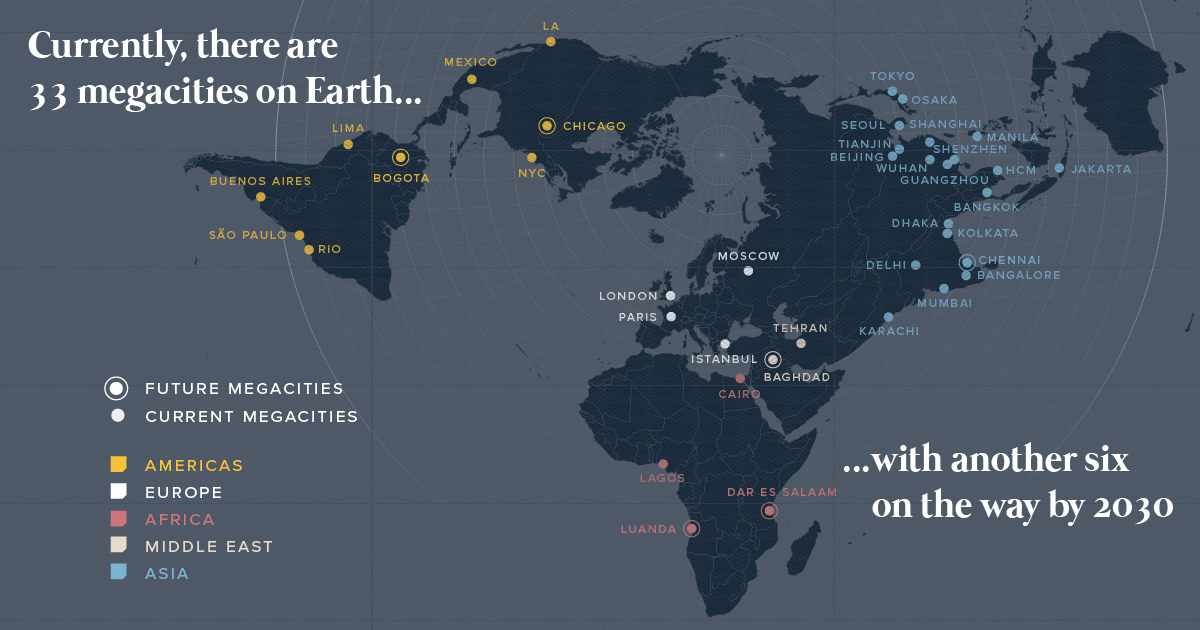
There are currently 33 megacities in the world with over 10 million inhabitants - but by 2030, there will be six new megacities, including one in...
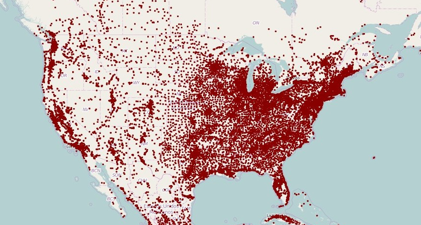
These maps of North America and Europe use a deceivingly simple method to plot population density: replacing each town with a single dot.
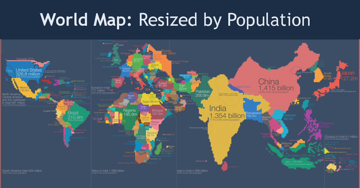
Look at global population in a whole new light, when countries on the world map are drawn based on population numbers instead of their usual borders.
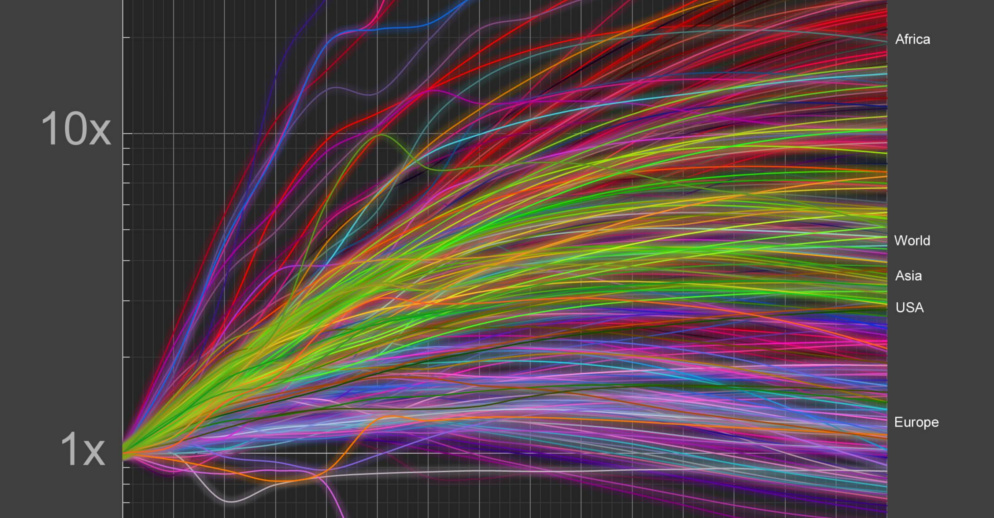
With every country's growth visualized on a logarithmic scale, we look at a few world population growth outliers and their unique stories.
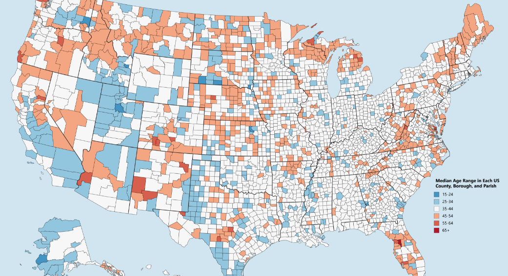
Which counties have the youngest populations, and which are meccas for aging retirees? This map shows the median age of every county in the United States.
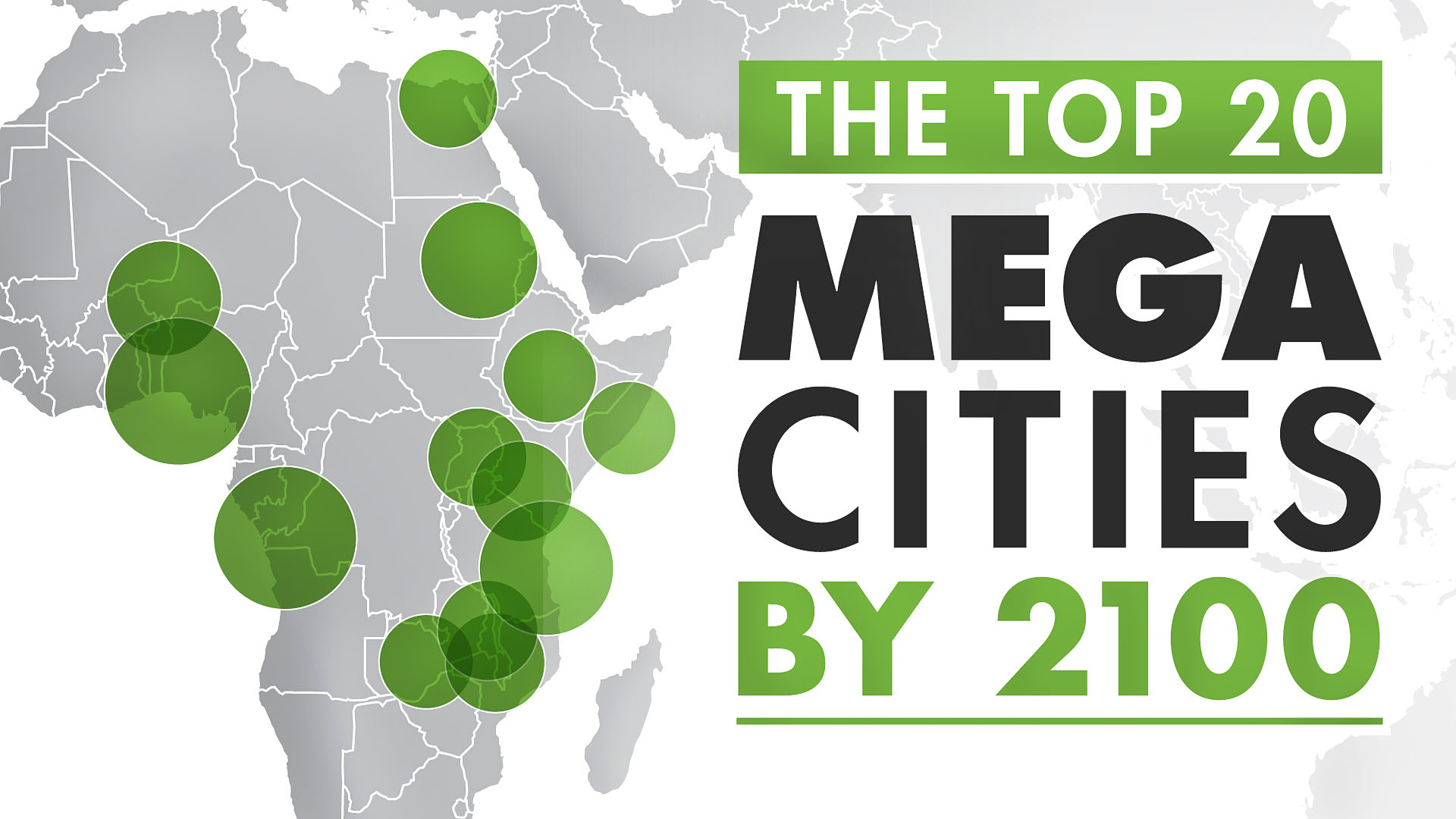
The world's population centers are shifting rapidly, and by 2100, it is projected that the world's largest megacities will exceed 70 million people.
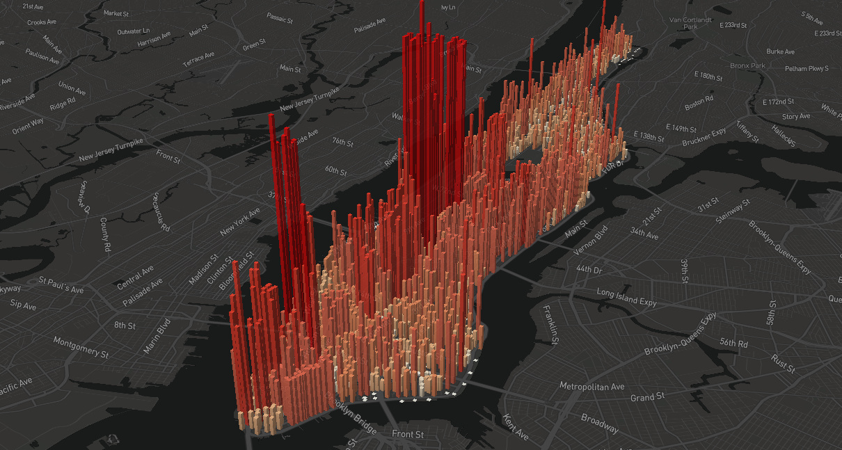
An eye-opening look at the population 'heartbeat' of Manhattan, which swells to an incredible four million people during an average workday.
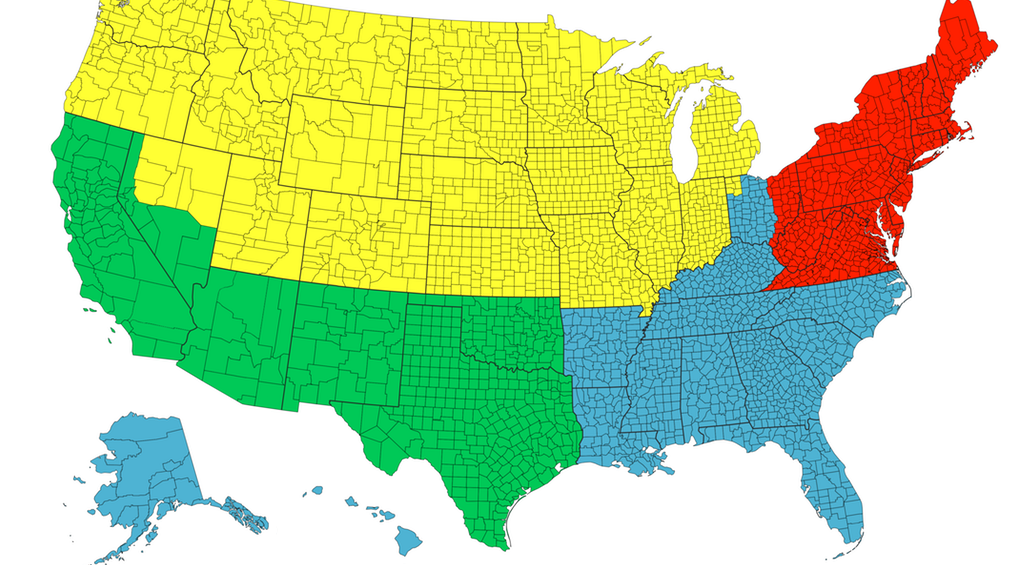
Each of the four colors is equal to 25% of the country's total population - and things get interesting when looking at Canada, Chile, or California.
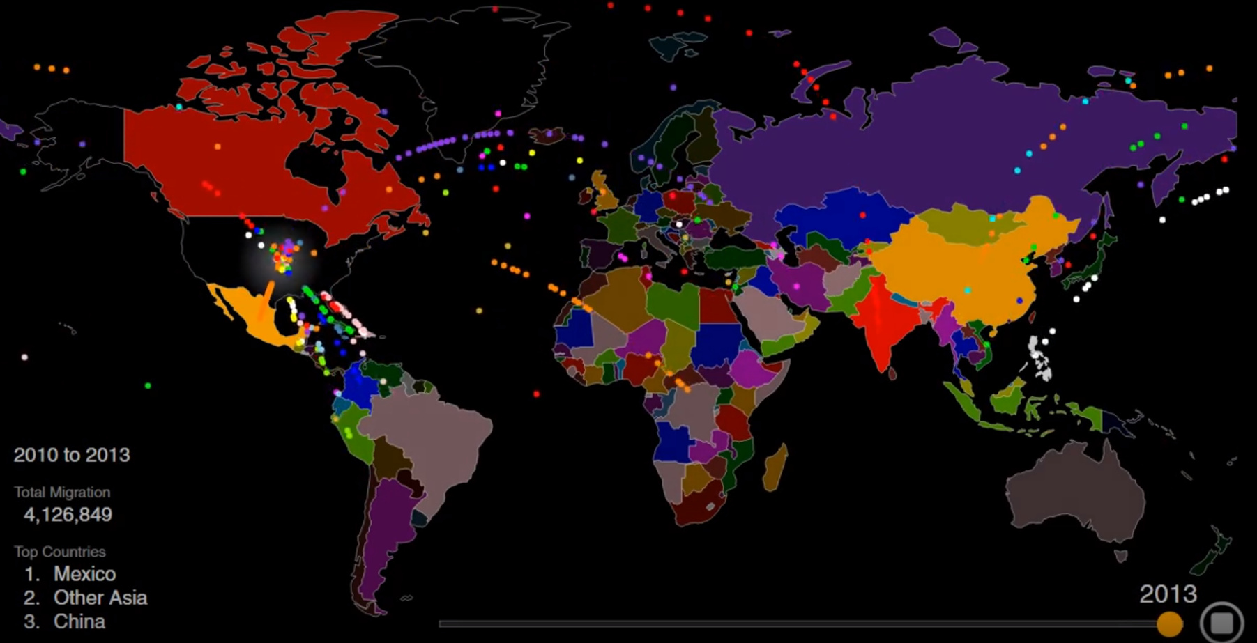
The U.S. is known as a nation of immigrants - but just who came to America, and why? This striking animation tells the story.
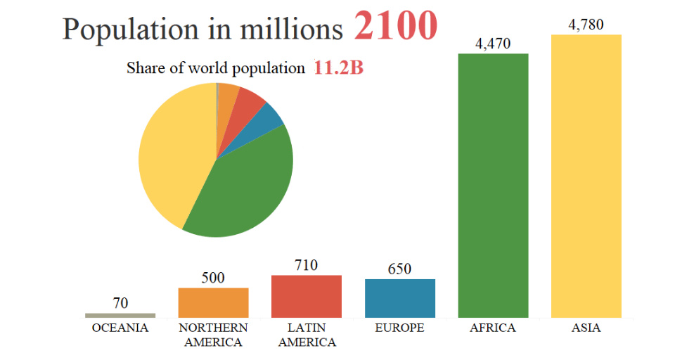
By 2100, the global population is projected to rise from 7.6 billion to 11.2 billion people. This animation shows how that growth will occur by region.


