Green
Visualizing the Prolific Plastic Problem in Our Oceans
In February of 2018, a dead sperm whale washed up on along the picturesque shoreline of Cabo de Palos in Spain.
Officials noted that the whale was unusually thin, and a necropsy confirmed that the whale died from an acute abdominal infection. Put simply, the whale ingested so much plastic debris – 67 lbs worth – that its digestive system ruptured.
The Plastic Problem, Visualized
Today’s infographic comes to us from Custom Made, and it helps put the growing marine debris problem in perspective.
A Spiraling Problem
The equivalent of one garbage truck full of plastic enters the sea every minute and the volume of ocean plastic is expected to triple within a decade.
Every stray bit of trash that enters the ocean, from a frayed fishing net off the coast of the Philippines to a plastic bottle cap from an Oakland storm drain, all end up circulating in rotating ocean currents called gyres.
For this reason, the Pacific Gyre is now better known by another name: The Great Pacific Garbage Patch.
The Sum of Many Plastic Parts
The Great Pacific Garbage Patch is often misrepresented online as a literal raft of floating trash stretching as far as the eye can see. The real situation is less visually dramatic, but it’s what we can’t see – microplastic – that’s the biggest problem. Tiny fragments of plastic pose the biggest risks to humans because it’s easy for them to enter the food chain after being ingested by marine life.
While derelict fishing gear such as nets and floats are a contributor to the problem, land-based activity accounts for the majority of the garbage circulating in the ocean. Most of the world’s countries have ocean coastlines, and with so many jurisdictions and varying degrees of environmental scrutiny, truly curbing the flow of plastic isn’t realistic in the near term.
No Solution on the Horizon
Garbage patches have formed deep in the middle of international waters, so there is no clear cut way to decide who is responsible for cleaning up the mess. Organizations like The Ocean Cleanup are researching ocean gyres and providing better insight into the extent of the plastic problem. The Ocean Cleanup is best positioned to make a real impact, though executing on their vision will require vast resources and substantial funding.
Nobody likes seeing whales wash up on shore, but for now, a fully-scaled solution may still far out on the horizon.


Green
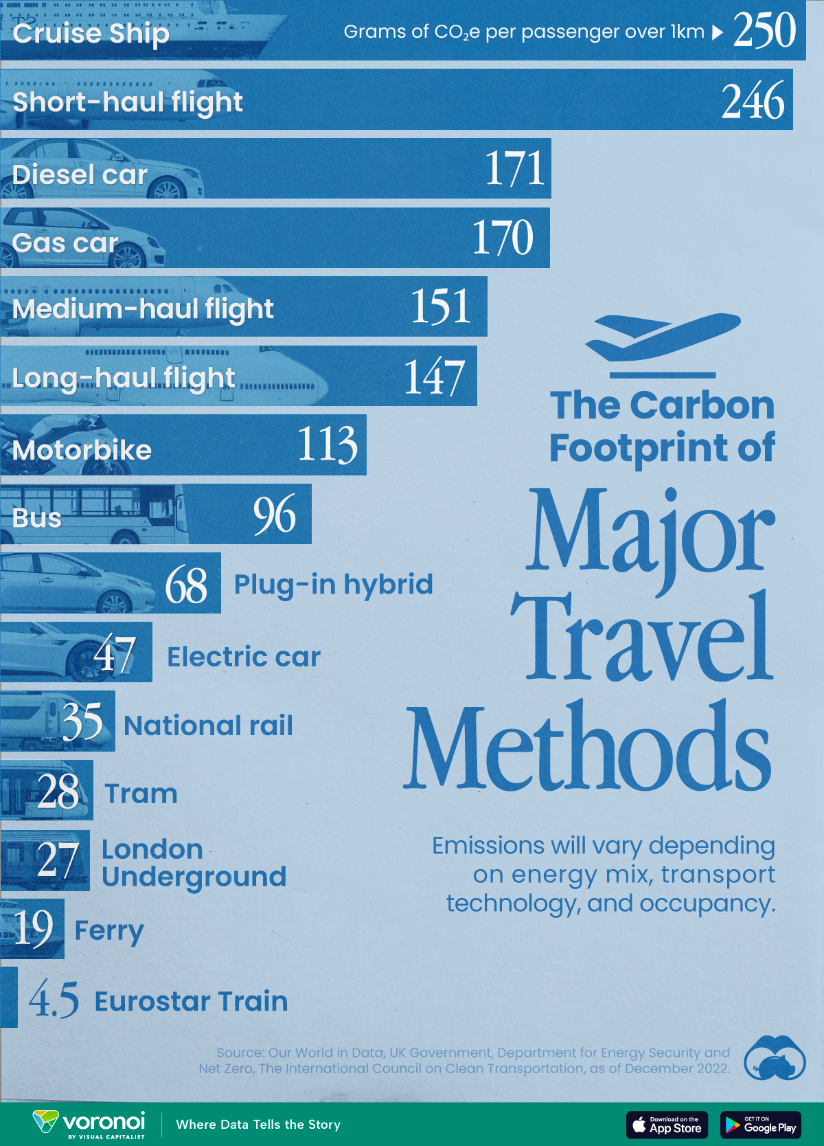
The Carbon Footprint of Major Travel Methods
Going on a cruise ship and flying domestically are the most carbon-intensive travel methods.

The Carbon Footprint of Major Travel Methods
This was originally posted on our Voronoi app. Download the app for free on iOS or Android and discover incredible data-driven charts from a variety of trusted sources.
Did you know that transport accounts for nearly one-quarter of global energy-related carbon dioxide (CO₂) emissions?
This graphic illustrates the carbon footprints of major travel methods measured in grams of carbon dioxide equivalent (CO₂e) emitted per person to travel one kilometer. This includes both CO₂ and other greenhouse gases.
Data is sourced from Our World in Data, the UK Government’s Department for Energy Security and Net Zero, and The International Council on Clean Transportation, as of December 2022.
These figures should be interpreted as approximations, rather than exact numbers. There are many variables at play that determine the actual carbon footprint in any individual case, including vehicle type or model, occupancy, energy mix, and even weather.
Cruise Ships are the Most Carbon-Intensive Travel Method
According to these estimates, taking a cruise ship, flying domestically, and driving alone are some of the most carbon-intensive travel methods.
Cruise ships typically use heavy fuel oil, which is high in carbon content. The average cruise ship weighs between 70,000 to 180,000 metric tons, meaning they require large engines to get moving.
These massive vessels must also generate power for onboard amenities such as lighting, air conditioning, and entertainment systems.
Short-haul flights are also considered carbon-intensive due to the significant amount of fuel consumed during initial takeoff and climbing altitude, relative to a lower amount of cruising.
| Transportation method | CO₂ equivalent emissions per passenger km |
|---|---|
| Cruise Ship | 250 |
| Short-haul flight (i.e. within a U.S. state or European country) | 246 |
| Diesel car | 171 |
| Gas car | 170 |
| Medium-haul flight (i.e. international travel within Europe, or between U.S. states) | 151 |
| Long-haul flight (over 3,700 km, about the distance from LA to NY) | 147 |
| Motorbike | 113 |
| Bus (average) | 96 |
| Plug-in hybrid | 68 |
| Electric car | 47 |
| National rail | 35 |
| Tram | 28 |
| London Underground | 27 |
| Ferry (foot passenger) | 19 |
| Eurostar (International rail) | 4.5 |
Are EVs Greener?
Many experts agree that EVs produce a lower carbon footprint over time versus traditional internal combustion engine (ICE) vehicles.
However, the batteries in electric vehicles charge on the power that comes straight off the electrical grid—which in many places may be powered by fossil fuels. For that reason, the carbon footprint of an EV will depend largely on the blend of electricity sources used for charging.
There are also questions about how energy-intensive it is to build EVs compared to a comparable ICE vehicle.

-

 Sports1 week ago
The Highest Earning Athletes in Seven Professional Sports
-

 Countries2 weeks ago
Population Projections: The World’s 6 Largest Countries in 2075
-

 Markets2 weeks ago
The Top 10 States by Real GDP Growth in 2023
-

 Demographics2 weeks ago
The Smallest Gender Wage Gaps in OECD Countries
-

 United States2 weeks ago
Where U.S. Inflation Hit the Hardest in March 2024
-

 Green2 weeks ago
Top Countries By Forest Growth Since 2001
-

 United States2 weeks ago
Ranked: The Largest U.S. Corporations by Number of Employees
-

 Maps2 weeks ago
The Largest Earthquakes in the New York Area (1970-2024)