Money
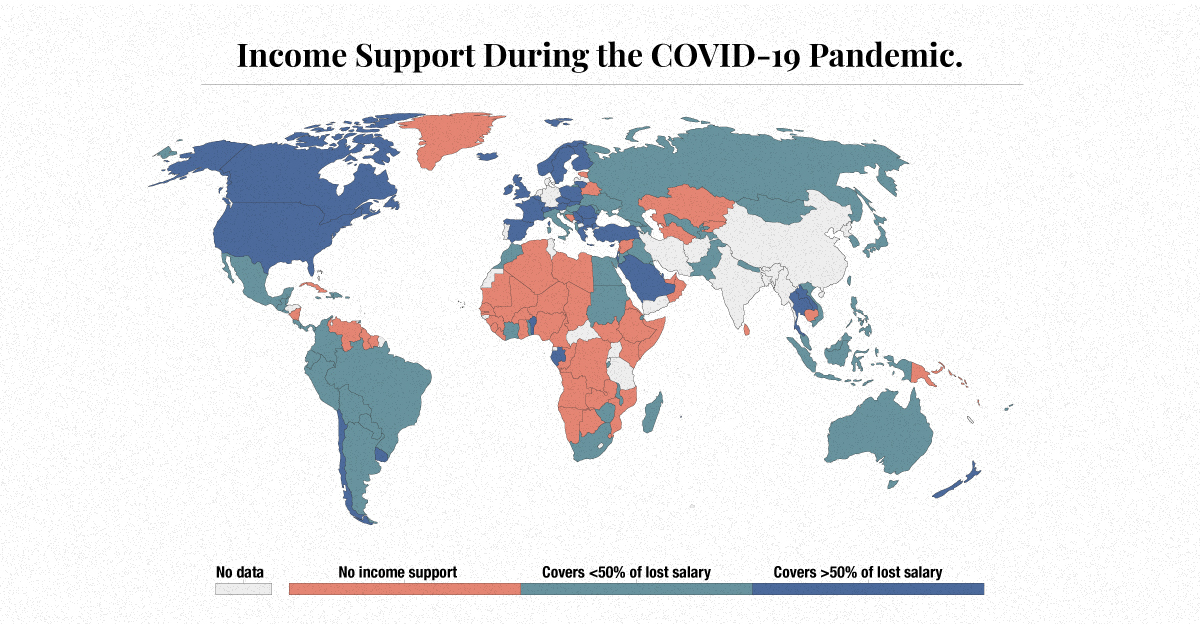
Mapping Global Income Support During COVID-19
Mapping Global Income Support During COVID-19
Income loss has impacted many during the COVID-19 pandemic. Unemployment, reduced hours, office closures, and business shutdowns have prompted the need for mass income support.
Globally, income from work fell $3.5 trillion in the first nine months of 2020, a change of -10.7% compared to the same period in 2019.
In the above map, Our World in Data reveals the different levels of income support provided by governments across the globe.
Income support, in this case, is defined as governments broadly covering lost salaries, or providing universal basic income or direct payments to people who have lost their jobs or cannot work. Levels of income support are changing over time.
Small Government
Many world governments have provided no support when it comes to a universally applicable scheme to cover lost income in their countries.
Examples: (as of January 25th, 2021)
- 🇻🇪 Venezuela
- 🇸🇾 Syria
- 🇧🇾 Belarus
- 🇧🇩 Bangladesh
- 🇰🇭 Cambodia
The majority of the governments providing no support are in low to lower-middle income countries. Based on a recent report from the International Labour Organization (ILO), lower-middle income countries have also seen the highest income losses, reaching 15.1% since 2019.
Developing countries tend to experience a significant fiscal stimulus gap, in which they do not have the capacity to cushion lost income or lost jobs. In fact, it’s estimated by the ILO that low and lower-middle income countries would need to inject an additional $982 billion into their economies to reach the same level of fiscal stimulus as high income countries.
A Helping Hand
There are other governments that are giving out some help on a wide-scale basis, providing citizens less than 50% of their lost salaries:
Examples: (as of January 25th, 2021)
- 🇿🇦 South Africa
- 🇨🇳 China
- 🇷🇺 Russia
- 🇹🇭 Thailand
- 🇦🇺 Australia
South Africa’s unemployment rate was the highest in the world at 37.0% in 2020, an increase from 28.7% in 2019. Despite having one of the strictest lockdowns, the country has not been able to slow rising case counts or job losses. Now, South Africa is facing another threat, as a new strain of the novel coronavirus has taken hold in the nation.
The Most Supportive Governments
Finally, many world governments have offered higher amounts of income support, providing citizens with more than 50% of lost income:
Examples: (as of January 25th, 2021)
- 🇨🇦 Canada
- 🇺🇸 United States
- 🇬🇧 United Kingdom
- 🇪🇸 Spain
- 🇸🇦 Saudi Arabia
Regionally, it’s the Americas that have been hit the hardest, according to the ILO. The region experienced a 12.1% drop in labor income in 2020 compared to 2019, revealing the need for broad-based income support.
U.S. unemployment went from 3.7% to 8.9% between 2019 and 2020. While the American government initially provided support in the form of the CARES Act, the policy response was recently extended through the more recent $900 billion relief deal.
Income Support Post COVID-19
While some countries have not been in extreme need of income support, others have been and haven’t received it. When looking at demographics, the hardest hit workers have been temporary workers, migrant workers, care workers, and self-employed vendors who have no labor contracts or employment insurance.
As a result, some critics have used this as an opportunity to call for universal basic income (UBI). A three-year study is already being implemented in Germany, for example, to test out how effective this kind of income support would be in the post-pandemic period.
Today, however, income is not a guarantee, and while in 2021 things may be returning to ‘normal,’ that does not mean that income levels will go back to normal.


Money
Charted: Which City Has the Most Billionaires in 2024?
Just two countries account for half of the top 20 cities with the most billionaires. And the majority of the other half are found in Asia.


Charted: Which Country Has the Most Billionaires in 2024?
This was originally posted on our Voronoi app. Download the app for free on iOS or Android and discover incredible data-driven charts from a variety of trusted sources.
Some cities seem to attract the rich. Take New York City for example, which has 340,000 high-net-worth residents with investable assets of more than $1 million.
But there’s a vast difference between being a millionaire and a billionaire. So where do the richest of them all live?
Using data from the Hurun Global Rich List 2024, we rank the top 20 cities with the highest number of billionaires in 2024.
A caveat to these rich lists: sources often vary on figures and exact rankings. For example, in last year’s reports, Forbes had New York as the city with the most billionaires, while the Hurun Global Rich List placed Beijing at the top spot.
Ranked: Top 20 Cities with the Most Billionaires in 2024
The Chinese economy’s doldrums over the course of the past year have affected its ultra-wealthy residents in key cities.
Beijing, the city with the most billionaires in 2023, has not only ceded its spot to New York, but has dropped to #4, overtaken by London and Mumbai.
| Rank | City | Billionaires | Rank Change YoY |
|---|---|---|---|
| 1 | 🇺🇸 New York | 119 | +1 |
| 2 | 🇬🇧 London | 97 | +3 |
| 3 | 🇮🇳 Mumbai | 92 | +4 |
| 4 | 🇨🇳 Beijing | 91 | -3 |
| 5 | 🇨🇳 Shanghai | 87 | -2 |
| 6 | 🇨🇳 Shenzhen | 84 | -2 |
| 7 | 🇭🇰 Hong Kong | 65 | -1 |
| 8 | 🇷🇺 Moscow | 59 | No Change |
| 9 | 🇮🇳 New Delhi | 57 | +6 |
| 10 | 🇺🇸 San Francisco | 52 | No Change |
| 11 | 🇹🇭 Bangkok | 49 | +2 |
| 12 | 🇹🇼 Taipei | 45 | +2 |
| 13 | 🇫🇷 Paris | 44 | -2 |
| 14 | 🇨🇳 Hangzhou | 43 | -5 |
| 15 | 🇸🇬 Singapore | 42 | New to Top 20 |
| 16 | 🇨🇳 Guangzhou | 39 | -4 |
| 17T | 🇮🇩 Jakarta | 37 | +1 |
| 17T | 🇧🇷 Sao Paulo | 37 | No Change |
| 19T | 🇺🇸 Los Angeles | 31 | No Change |
| 19T | 🇰🇷 Seoul | 31 | -3 |
In fact all Chinese cities on the top 20 list have lost billionaires between 2023–24. Consequently, they’ve all lost ranking spots as well, with Hangzhou seeing the biggest slide (-5) in the top 20.
Where China lost, all other Asian cities—except Seoul—in the top 20 have gained ranks. Indian cities lead the way, with New Delhi (+6) and Mumbai (+3) having climbed the most.
At a country level, China and the U.S combine to make up half of the cities in the top 20. They are also home to about half of the world’s 3,200 billionaire population.
In other news of note: Hurun officially counts Taylor Swift as a billionaire, estimating her net worth at $1.2 billion.

-

 Debt1 week ago
How Debt-to-GDP Ratios Have Changed Since 2000
-

 Markets2 weeks ago
Ranked: The World’s Top Flight Routes, by Revenue
-

 Countries2 weeks ago
Population Projections: The World’s 6 Largest Countries in 2075
-

 Markets2 weeks ago
The Top 10 States by Real GDP Growth in 2023
-

 Demographics2 weeks ago
The Smallest Gender Wage Gaps in OECD Countries
-

 United States2 weeks ago
Where U.S. Inflation Hit the Hardest in March 2024
-

 Green2 weeks ago
Top Countries By Forest Growth Since 2001
-

 United States2 weeks ago
Ranked: The Largest U.S. Corporations by Number of Employees