

This visual heatmap of unemployment claims by state highlights New York, California, and Alaska leading the country by a wide margin.
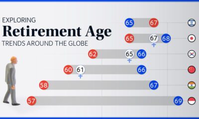

We chart current and effective retirement ages for 45 countries, revealing some stark regional differences.
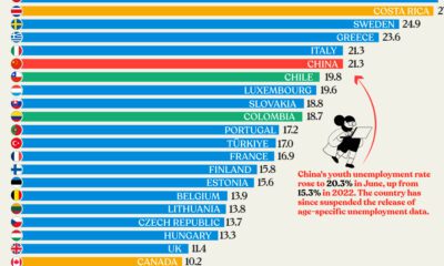

Nearly three years after COVID-19 first hit, youth unemployment in some countries, like China, has risen sharply.
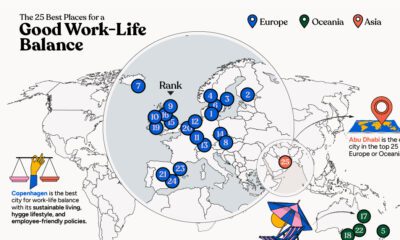

In this infographic, we explore which cities around the world excel in prioritizing work–life balance.
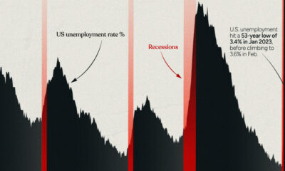

This infographic examines 50 years of data to highlight a clear visual trend: recessions are preceded by a cyclical low in unemployment.


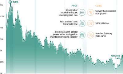
The U.S. labor market is remarkably strong, with a 3.4% unemployment rate. Which sectors are seeing the highest job gains in 2023?
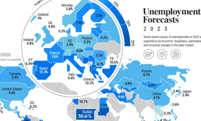

Unemployment is forecast to tick higher in 2023, but so far red-hot labor markets are resisting this trend on a global scale.

The Federal Reserve has raised U.S. interest rates five times in 2022, but how do today’s levels compare to historical interest rates?
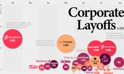

This infographic highlights the accelerating pace of layoffs so far in 2022, as businesses cut costs ahead of a potential recession.
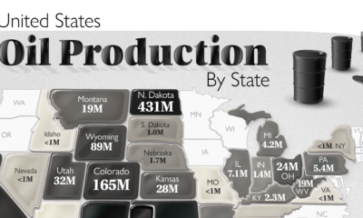

The U.S. is the largest oil producer in the world. Here we map the share of oil production in the country by all 50 states in...


