Money
Mapped: The World’s Ultra-Rich, by Country
Mapped: The World’s Ultra-Rich, by Country
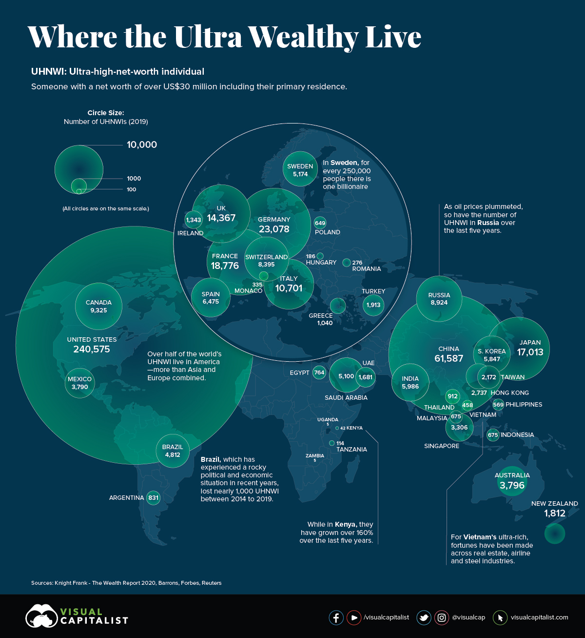
The global number of ultra-high net-worth individuals (UHNWIs) — those with over $30 million in assets — has continued to rise over the years.
Today’s infographic draws data from Knight Frank’s 2020 Wealth Report released in March, and it shows which countries have the highest number of UHNWIs, as well as how that number is projected to change in years to come.
No Ordinary Millionaire
To start, let’s look at where the world’s wealthiest could be found in 2019, which is both the peak of the decade-long bull market and the most recent year of data covered by the report.
| Rank | Country | Ultra-High Net Worth Population | 1-Year Change (%) |
|---|---|---|---|
| #1 | 🇺🇸 United States | 240,575 | 5.9% |
| #2 | 🇨🇳 China | 61,587 | 14.7% |
| #3 | 🇩🇪 Germany | 23,078 | 0.8% |
| #4 | 🇫🇷 France | 18,776 | 7.9% |
| #5 | 🇯🇵 Japan | 17,013 | 17.0% |
| #6 | 🇬🇧 UK | 14,367 | 3.6% |
| #7 | 🇮🇹 Italy | 10,701 | 20.8% |
| #8 | 🇨🇦 Canada | 9,325 | 5.3% |
| #9 | 🇷🇺 Russia | 8,924 | 3.9% |
| #10 | 🇨🇭 Switzerland | 8,395 | 3.0% |
| #11 | 🇪🇸 Spain | 6,475 | -1.1% |
| #12 | 🇮🇳 India | 5,986 | 0.2% |
| #13 | 🇰🇷 South Korea | 5,847 | 21.6% |
| #14 | 🇸🇪 Sweden | 5,174 | 0.3% |
| #15 | 🇸🇦 Saudi Arabia | 5,100 | 0.0% |
While the U.S. maintained its foothold, the ultra-rich in South Korea and Italy have grown over 20% each since 2018. An economic model focused on exports, conglomerates, and select manufacturing industries could likely be behind the UHNWI boom in South Korea.
Interestingly, the number of ultra-wealthy in Saudi Arabia increased by only one individual between 2018 and 2019.
Multi-Millionaire Next Door
Taking a closer look, what made up the wealth of this ultra rich population? Knight Frank found that 27% of UHNWI wealth was locked up in property investments:
| Property as an Investment | Equities | Bonds/Fixed Income | Cash | Private Equity | Collectables | Gold/Precious Metals | Crypto |
|---|---|---|---|---|---|---|---|
| 27% | 23% | 17% | 11% | 8% | 5% | 3% | 1% |
In terms of more liquid assets, the average UHNWI held 23% of their wealth in equities, 17% in bonds, 11% in cash, and 3% in precious metals. It will be illuminating to see how, or if, this changes in the aftermath of the ongoing COVID-19 economic crisis.
The Future Destination Hubs
Fast-forward to 2024, and Knight Frank estimates that the global hotspots of the world’s wealthiest will remain consistent, with some notable winners over the decade.
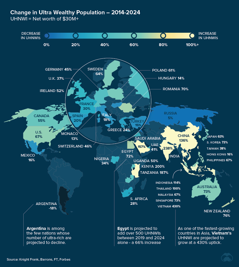
The greatest difference will be the rising cohort of the ultra-wealthy in China and India, both projected to grow by triple digits between 2014 and 2024. This burgeoning middle class in China is driving domestic consumption and is transforming the consumer landscape.
| Rank | Country | UHNWIs (Projected, 2024) | 10-Year Change (Projected, %) |
|---|---|---|---|
| #1 | 🇺🇸 U.S. | 293,136 | 67.0% |
| #2 | 🇨🇳 China | 97,082 | 135.8% |
| #3 | 🇩🇪 Germany | 26,819 | 45.0% |
| #4 | 🇫🇷 France | 22,728 | 29.7% |
| #5 | 🇯🇵 Japan | 19,110 | 63.3% |
| #6 | 🇬🇧 UK | 18,818 | 36.7% |
| #7 | 🇮🇹 Italy | 12,508 | 17.6% |
| #8 | 🇨🇦 Canada | 11,928 | 54.8% |
| #9 | 🇷🇺 Russia | 11,019 | 4.8% |
| #10 | 🇮🇳 India | 10,354 | 238.3% |
As the ripple effects of COVID-19 continue to take hold, experts pose differing opinions on how its impacts on the global economy will unfold.
Could the crash hasten the number of ultra-rich as inequality is laid bare, or will wealth be redistributed in response to the unprecedented crisis?


Money
Charted: Which City Has the Most Billionaires in 2024?
Just two countries account for half of the top 20 cities with the most billionaires. And the majority of the other half are found in Asia.


Charted: Which Country Has the Most Billionaires in 2024?
This was originally posted on our Voronoi app. Download the app for free on iOS or Android and discover incredible data-driven charts from a variety of trusted sources.
Some cities seem to attract the rich. Take New York City for example, which has 340,000 high-net-worth residents with investable assets of more than $1 million.
But there’s a vast difference between being a millionaire and a billionaire. So where do the richest of them all live?
Using data from the Hurun Global Rich List 2024, we rank the top 20 cities with the highest number of billionaires in 2024.
A caveat to these rich lists: sources often vary on figures and exact rankings. For example, in last year’s reports, Forbes had New York as the city with the most billionaires, while the Hurun Global Rich List placed Beijing at the top spot.
Ranked: Top 20 Cities with the Most Billionaires in 2024
The Chinese economy’s doldrums over the course of the past year have affected its ultra-wealthy residents in key cities.
Beijing, the city with the most billionaires in 2023, has not only ceded its spot to New York, but has dropped to #4, overtaken by London and Mumbai.
| Rank | City | Billionaires | Rank Change YoY |
|---|---|---|---|
| 1 | 🇺🇸 New York | 119 | +1 |
| 2 | 🇬🇧 London | 97 | +3 |
| 3 | 🇮🇳 Mumbai | 92 | +4 |
| 4 | 🇨🇳 Beijing | 91 | -3 |
| 5 | 🇨🇳 Shanghai | 87 | -2 |
| 6 | 🇨🇳 Shenzhen | 84 | -2 |
| 7 | 🇭🇰 Hong Kong | 65 | -1 |
| 8 | 🇷🇺 Moscow | 59 | No Change |
| 9 | 🇮🇳 New Delhi | 57 | +6 |
| 10 | 🇺🇸 San Francisco | 52 | No Change |
| 11 | 🇹🇭 Bangkok | 49 | +2 |
| 12 | 🇹🇼 Taipei | 45 | +2 |
| 13 | 🇫🇷 Paris | 44 | -2 |
| 14 | 🇨🇳 Hangzhou | 43 | -5 |
| 15 | 🇸🇬 Singapore | 42 | New to Top 20 |
| 16 | 🇨🇳 Guangzhou | 39 | -4 |
| 17T | 🇮🇩 Jakarta | 37 | +1 |
| 17T | 🇧🇷 Sao Paulo | 37 | No Change |
| 19T | 🇺🇸 Los Angeles | 31 | No Change |
| 19T | 🇰🇷 Seoul | 31 | -3 |
In fact all Chinese cities on the top 20 list have lost billionaires between 2023–24. Consequently, they’ve all lost ranking spots as well, with Hangzhou seeing the biggest slide (-5) in the top 20.
Where China lost, all other Asian cities—except Seoul—in the top 20 have gained ranks. Indian cities lead the way, with New Delhi (+6) and Mumbai (+3) having climbed the most.
At a country level, China and the U.S combine to make up half of the cities in the top 20. They are also home to about half of the world’s 3,200 billionaire population.
In other news of note: Hurun officially counts Taylor Swift as a billionaire, estimating her net worth at $1.2 billion.

-

 Debt1 week ago
How Debt-to-GDP Ratios Have Changed Since 2000
-

 Countries2 weeks ago
Population Projections: The World’s 6 Largest Countries in 2075
-

 Markets2 weeks ago
The Top 10 States by Real GDP Growth in 2023
-

 Demographics2 weeks ago
The Smallest Gender Wage Gaps in OECD Countries
-

 United States2 weeks ago
Where U.S. Inflation Hit the Hardest in March 2024
-

 Green2 weeks ago
Top Countries By Forest Growth Since 2001
-

 United States2 weeks ago
Ranked: The Largest U.S. Corporations by Number of Employees
-

 Maps2 weeks ago
The Largest Earthquakes in the New York Area (1970-2024)