Misc
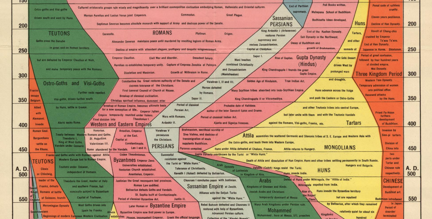
Histomap: Visualizing the 4,000 Year History of Global Power
Imagine creating a timeline of your country’s whole history stretching back to its inception.
It would be no small task, and simply weighing the relative importance of so many great people, technological achievements, and pivotal events would be a tiny miracle in itself.
While that seems like a challenge, imagine going a few steps further. Instead of a timeline for just one country, what about creating a graphical timeline showing the history of the entire world over a 4,000 year time period, all while having no access to computers or the internet?
An All-Encompassing Timeline?
Today’s infographic, created all the way back in 1931 by a man named John B. Sparks, maps the ebb and flow of global power going all the way back to 2,000 B.C. on one coherent timeline.
View a high resolution version of this graphic
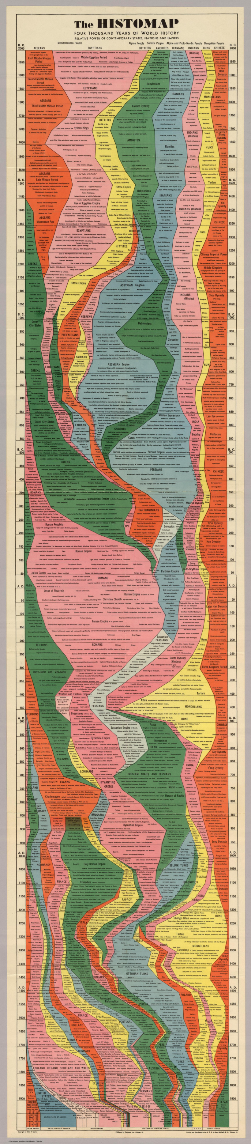
Histomap, published by Rand McNally in 1931, is an ambitious attempt at fitting a mountain of historical information onto a five-foot-long poster. The poster cost $1 at the time, which would equal approximately $18 when accounting for inflation.
Although the distribution of power is not quantitatively defined on the x-axis, it does provide a rare example of looking at historic civilizations in relative terms. While the Roman Empire takes up a lot of real estate during its Golden Age, for example, we still get a decent look at what was happening in other parts of the world during that period.
The visualization is also effective at showing the ascent and decline of various competing states, nations, and empires. Did Sparks see world history as a zero-sum exercise; a collection of nations battling one another for control over scarce territory and resources?
Timeline Caveats
Crowning a world leader at certain points in history is relatively easy, but divvying up influence or power to everyone across 4,000 years requires some creativity, and likely some guesswork, as well. Some would argue that the lack of hard data makes it impossible to draw these types of conclusions (though there have been other more quantitative approaches.)
Another obvious criticism is that the measures of influence are skewed in favor of Western powers. China’s “seam”, for example, is suspiciously thin throughout the length of the timeline. Certainly, the creator’s biases and blind spots become more apparent in the information-abundant 21st century.
Lastly, Histomap refers to various cultural and racial groups using terms that may seem rather dated to today’s viewers.
The Legacy of Histomap
John Spark’s creation is an admirable attempt at making history more approachable and entertaining. Today, we have seemingly limitless access to information, but in the 1930s an all encompassing timeline of history would have been incredibly useful and groundbreaking. Indeed, the map’s publisher characterized the piece as a useful tool for examining the correlation between different empires during points in history.

Critiques aside, work like this paved the way for the production of modern data visualizations and charts that help people better understand the world around them today.
Without a map who would attempt to study geography? –John B. Sparks
This post was first published in 2017. We have since updated it, adding in new content for 2021.


Misc
Visualizing the Most Common Pets in the U.S.
Lions, tigers, and bears, oh my!—these animals do not feature on this list of popular American household pets.


Visualizing The Most Common Pets in the U.S.
This was originally posted on our Voronoi app. Download the app for free on iOS or Android and discover incredible data-driven charts from a variety of trusted sources.
In this graphic, we visualized the most common American household pets, based on 2023-2024 data from the American Pet Products Association (accessed via Forbes Advisor).
Figures represent the number of households that own each pet type, rather than the actual number of each animal. The “small animal” category includes hamsters, gerbils, rabbits, guinea pigs, chinchillas, mice, rats, and ferrets.
What is the Most Popular American Household Pet?
Based on this data, dogs—one of the first domesticated animals—are the most common pets in the United States. In fact, around 65 million households own a dog, and spend an average of $900 a year on their care.
| Rank | Species | Households |
|---|---|---|
| 1 | 🐶 Dog | 65M |
| 2 | 🐱 Cat | 47M |
| 3 | 🐟 Freshwater Fish | 11M |
| 4 | 🐰 Small Animals | 7M |
| 5 | 🐦 Bird | 6M |
| 6 | 🦎 Reptile | 6M |
| 7 | 🐴 Horse | 2M |
| 8 | 🐠 Saltwater Fish | 2M |
Note: Households can own multiple pets, and are counted for all relevant categories.
Cats rank second, at 47 million households, and these smaller felines are a little less expensive to own at $700/year according to Forbes estimates.
But aside from these two juggernauts, there are plenty of other common pet types found in households across the country.
Freshwater fish can be found in 11 million households, along with small animals—rabbits, hamsters, guinea pigs—in 7 million. Meanwhile, nearly 6 million homes have birds or reptiles.
Pet Ownership is on the Rise in America
Forbes found that 66% of all American households (numbering 87 million) own at least one pet, up from 56% in 1988. One third of these (29 million) own multiple pets.
A combination of factors is driving this increase: rising incomes, delayed childbirth, and of course the impact of the pandemic which nearly cleared out animal shelters across the globe.
America’s loneliness epidemic may also be a factor. Fledgling research has shown that single-individual households with pets recorded lower rates of loneliness during the pandemic than those without a pet.

-

 Lithium6 days ago
Ranked: The Top 10 EV Battery Manufacturers in 2023
-

 Green2 weeks ago
Top Countries By Forest Growth Since 2001
-

 United States2 weeks ago
Ranked: The Largest U.S. Corporations by Number of Employees
-

 Maps2 weeks ago
The Largest Earthquakes in the New York Area (1970-2024)
-

 Green2 weeks ago
Ranked: The Countries With the Most Air Pollution in 2023
-

 Green2 weeks ago
Ranking the Top 15 Countries by Carbon Tax Revenue
-

 Markets2 weeks ago
U.S. Debt Interest Payments Reach $1 Trillion
-

 Mining2 weeks ago
Gold vs. S&P 500: Which Has Grown More Over Five Years?