Green
Animation: The Heartbeat of Nature’s Productivity
Animation: The Heartbeat of Nature’s Productivity
Even the most ferocious predator must rely on simple plants for vitality. That’s because without the conversion of carbon dioxide to organic compounds, entire food chains would cease to exist.
Photosynthesis is quite the catalyst for life, yet it’s easy to overlook this humble chemical process. But what if you could see its results scaled across the globe?
The Pulse of Nature
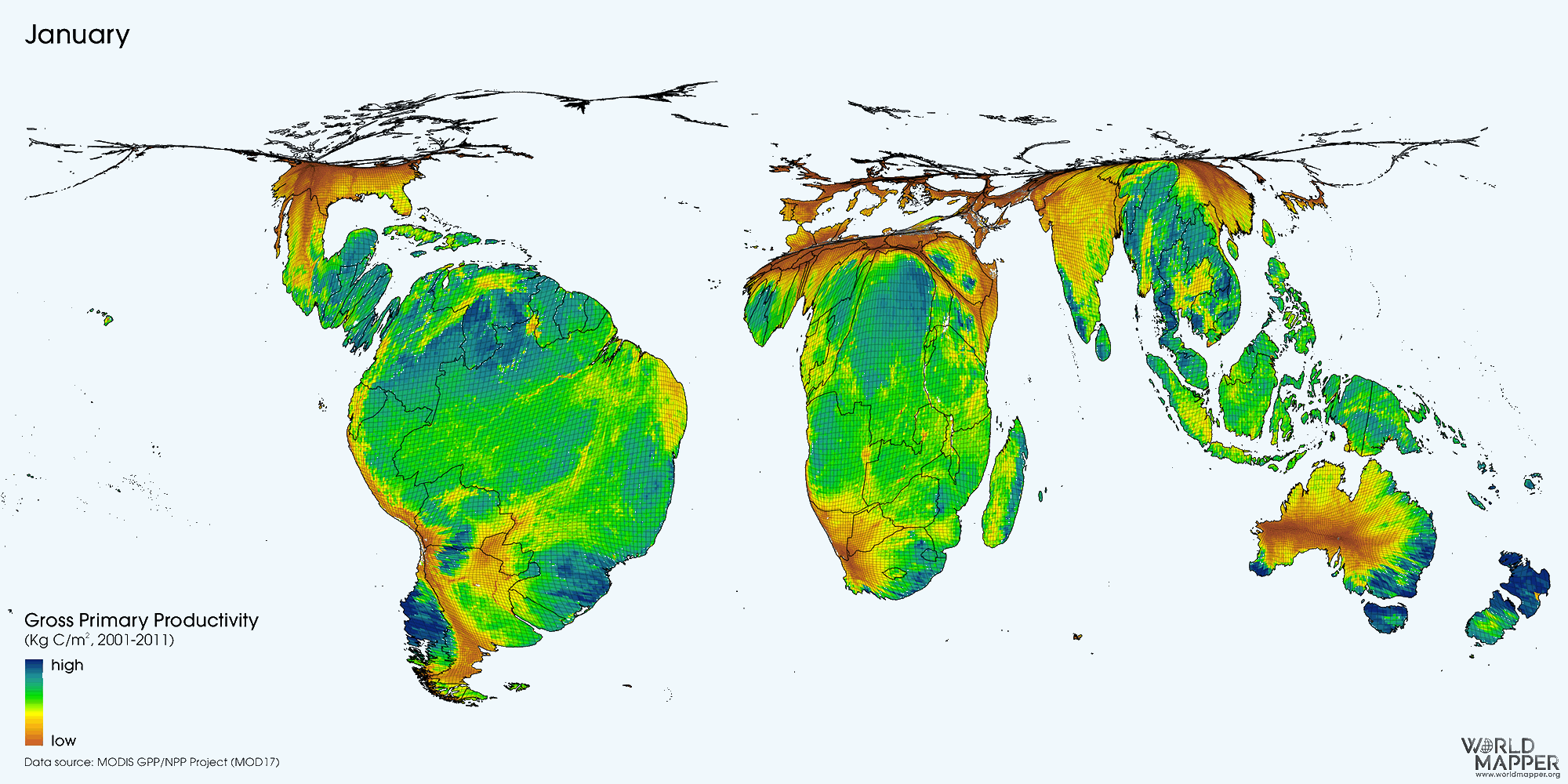
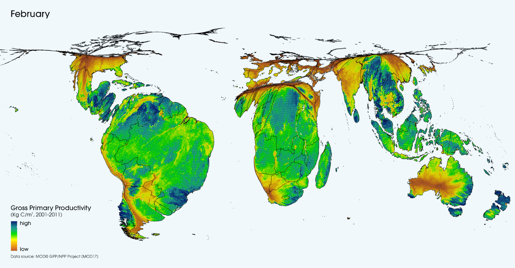
Today’s unique cartogram animation comes from geographer Benjamin Hennig at Worldmapper, and it depicts ongoing cycles in the productivity of ecological systems around the world. Created with Yadvinder Malhi from the University of Oxford, the researchers factored the daily net photosynthesis value over an 8-day interval of satellite observations, and extrapolated the trends for a year.
The outcome? A pattern of gross primary productivity (GPP) – the net amount of energy produced by land plants during photosynthesis – resembling the rhythmic impression of a “heartbeat”.
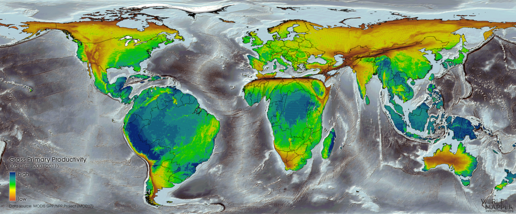
Here’s how a big-picture of average annual productivity ends up looking:
Location, Location, Location
Although the entire biosphere harnesses the sun’s energy, it’s clear this varies greatly based on both region and season. For example, desert areas such as the Sahara or Australian Outback occupy relatively low productivity areas on the map.
The taiga biome, a boreal forest made of coniferous trees such as pines, accounts for nearly a third of the world’s forest cover. Since the largest boreal areas are in Russia and Canada, it’s no wonder their productivity shrinks dramatically when it gets a bit cooler up north. When these areas slow down in sub-zero temperatures, their tropical neighbors to the south do the heavy lifting.
If forests are considered the world’s lungs, then the Amazon in South America and Congo forest in Central Africa help us all breathe a bit easier. The two largest forests act as crucial “carbon sinks”, trapping carbon that would otherwise be converted to carbon dioxide.
It’s also why rapid deforestation of these areas is cause for alarm. Many environmental scientists suggest that our human impact on forests could intensify global warming.
But there is good news – since the 1990s, the rate of net forest loss has declined by almost half. Progress fares differently across the regions:
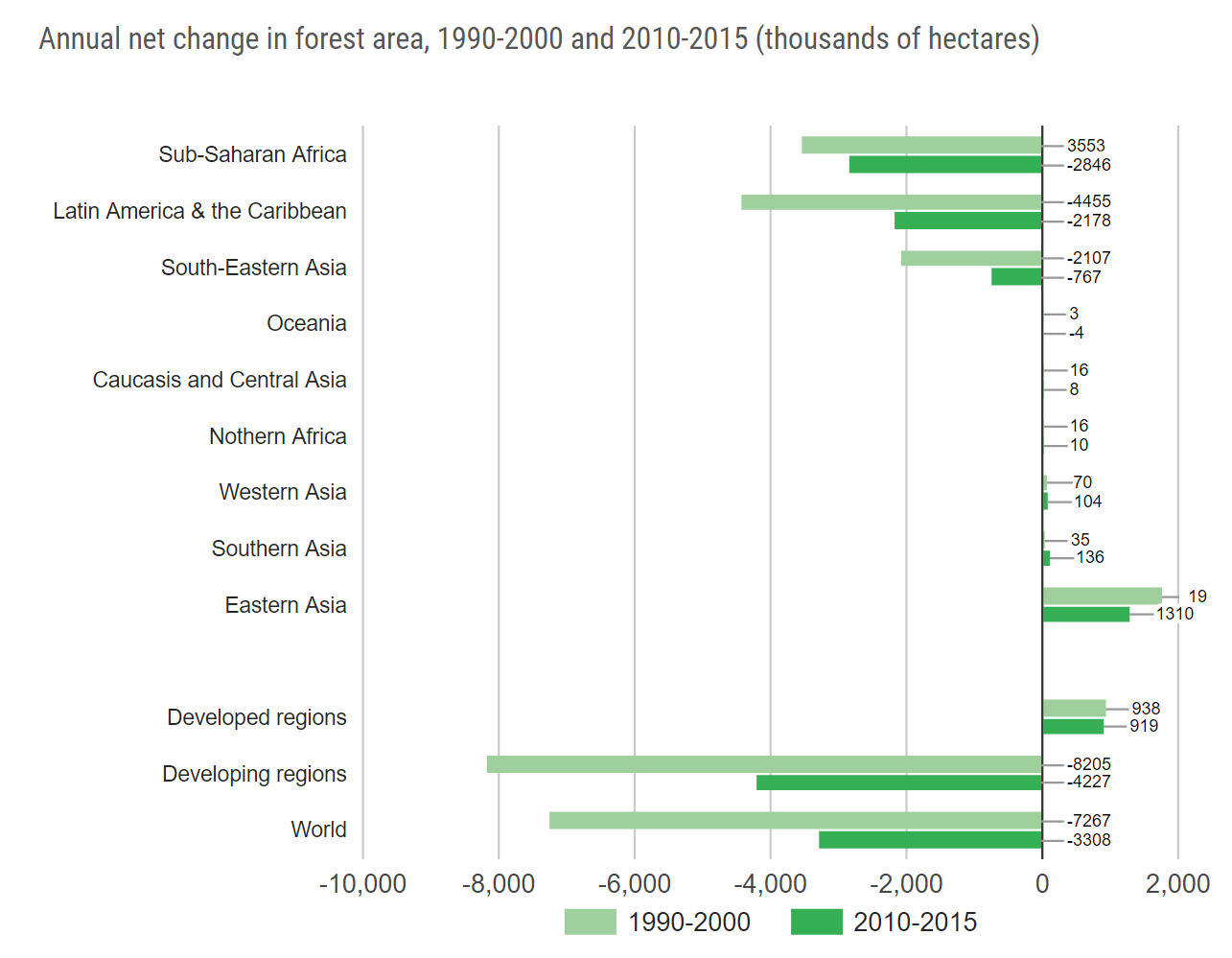
Image Source: United Nations


Green
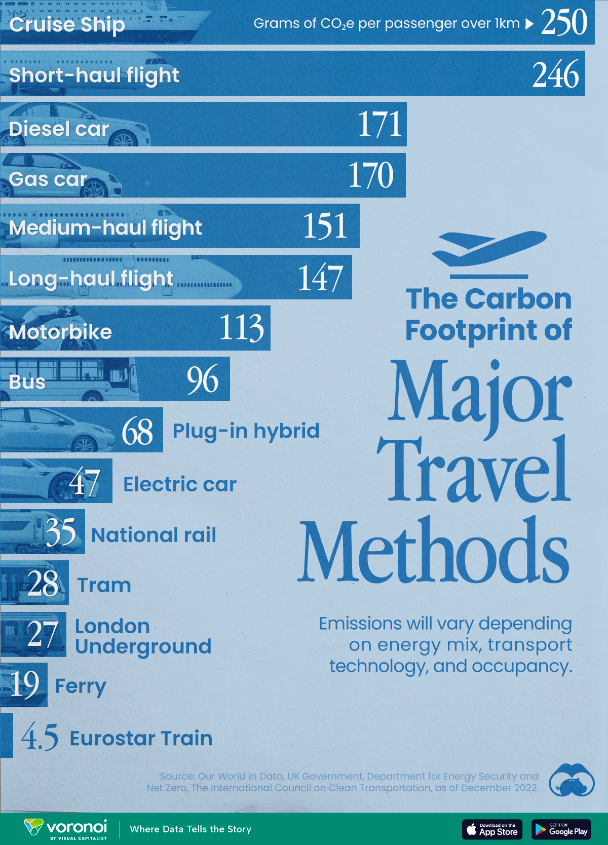
The Carbon Footprint of Major Travel Methods
Going on a cruise ship and flying domestically are the most carbon-intensive travel methods.

The Carbon Footprint of Major Travel Methods
This was originally posted on our Voronoi app. Download the app for free on iOS or Android and discover incredible data-driven charts from a variety of trusted sources.
Did you know that transport accounts for nearly one-quarter of global energy-related carbon dioxide (CO₂) emissions?
This graphic illustrates the carbon footprints of major travel methods measured in grams of carbon dioxide equivalent (CO₂e) emitted per person to travel one kilometer. This includes both CO₂ and other greenhouse gases.
Data is sourced from Our World in Data, the UK Government’s Department for Energy Security and Net Zero, and The International Council on Clean Transportation, as of December 2022.
These figures should be interpreted as approximations, rather than exact numbers. There are many variables at play that determine the actual carbon footprint in any individual case, including vehicle type or model, occupancy, energy mix, and even weather.
Cruise Ships are the Most Carbon-Intensive Travel Method
According to these estimates, taking a cruise ship, flying domestically, and driving alone are some of the most carbon-intensive travel methods.
Cruise ships typically use heavy fuel oil, which is high in carbon content. The average cruise ship weighs between 70,000 to 180,000 metric tons, meaning they require large engines to get moving.
These massive vessels must also generate power for onboard amenities such as lighting, air conditioning, and entertainment systems.
Short-haul flights are also considered carbon-intensive due to the significant amount of fuel consumed during initial takeoff and climbing altitude, relative to a lower amount of cruising.
| Transportation method | CO₂ equivalent emissions per passenger km |
|---|---|
| Cruise Ship | 250 |
| Short-haul flight (i.e. within a U.S. state or European country) | 246 |
| Diesel car | 171 |
| Gas car | 170 |
| Medium-haul flight (i.e. international travel within Europe, or between U.S. states) | 151 |
| Long-haul flight (over 3,700 km, about the distance from LA to NY) | 147 |
| Motorbike | 113 |
| Bus (average) | 96 |
| Plug-in hybrid | 68 |
| Electric car | 47 |
| National rail | 35 |
| Tram | 28 |
| London Underground | 27 |
| Ferry (foot passenger) | 19 |
| Eurostar (International rail) | 4.5 |
Are EVs Greener?
Many experts agree that EVs produce a lower carbon footprint over time versus traditional internal combustion engine (ICE) vehicles.
However, the batteries in electric vehicles charge on the power that comes straight off the electrical grid—which in many places may be powered by fossil fuels. For that reason, the carbon footprint of an EV will depend largely on the blend of electricity sources used for charging.
There are also questions about how energy-intensive it is to build EVs compared to a comparable ICE vehicle.

-

 Debt1 week ago
How Debt-to-GDP Ratios Have Changed Since 2000
-

 Markets2 weeks ago
Ranked: The World’s Top Flight Routes, by Revenue
-

 Countries2 weeks ago
Population Projections: The World’s 6 Largest Countries in 2075
-

 Markets2 weeks ago
The Top 10 States by Real GDP Growth in 2023
-

 Demographics2 weeks ago
The Smallest Gender Wage Gaps in OECD Countries
-

 United States2 weeks ago
Where U.S. Inflation Hit the Hardest in March 2024
-

 Green2 weeks ago
Top Countries By Forest Growth Since 2001
-

 United States2 weeks ago
Ranked: The Largest U.S. Corporations by Number of Employees