Money
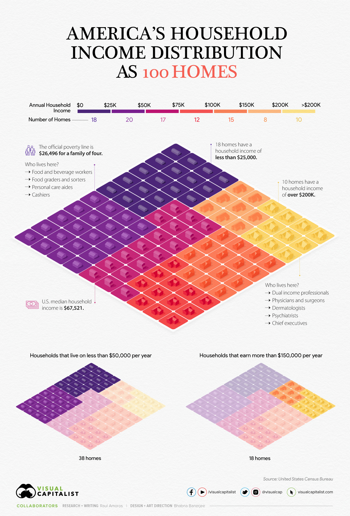
Household Income Distribution in the U.S. Visualized as 100 Homes


Household Income Distribution in the U.S. Visualized as 100 Homes
Income inequality and wealth disparity have been frequent topics of conversation, even before the pandemic upended the economy.
Now, rising inflation and interest rates, and a possible recession on the horizon are bringing these societal divides into sharp focus.
In the above visualization, U.S. households are parsed out into a neighborhood of 100 homes and then grouped by income brackets, using recent data from the U.S. Census Bureau.
The Neighborhood Breakdown
American households vary widely on their respective incomes. The largest cluster of homes, representing nearly 20% of all American households, are in the $25-$49.9k income bracket.
Here’s a look at the share of households in each income bracket and the number of homes they represent.
| Household Income | Share of Total | Number of Homes |
|---|---|---|
| Under $25K | 18.1% | 18 |
| $25K-$49.9K | 19.7% | 20 |
| $50K-$74.9K | 16.5% | 17 |
| $75K-99.9K | 12.2% | 12 |
| $100K-$149.9K | 15.3% | 15 |
| $150k-$199.9K | 8.0% | 8 |
| Over $200K | 10.3% | 10 |
In our hypothetical neighborhood, 18 of the households are in the lowest income bracket. People in this category have a wide variety of jobs, but personal care aides, cashiers, food and beverage positions are some of the most common. As a point of reference, the poverty line for a family of four currently sits at $26,496.
On the flip side, in this small community of 100 houses, 33 earn six figures and typically have at least one family member in a corporate or medical role.
The American Middle Class
The middle class in America has shrunk significantly in the past 50 years, going from 61% of adults being middle income in 1971 to 50% in 2021.
Here’s a look at the economic class breakdowns by annual household income, based on households with three people (Note: the average U.S. household has 2.6 people):
- Upper class: >$156,000
- Middle class: $52,000-$156,000
- Lower class: <$52,000
Although these definitions and conditions don’t align exactly with the buckets we use in the main houses visualization, they come pretty close.
In the neighborhood of 100 homes, 38 homes could be considered low income, while 18 are high income. Meanwhile, sitting in the $50-149.9k middle range of household income are 44 homes.
The Larger Trends
The pandemic had an extremely adverse impact on earnings and income worldwide, and the U.S. was no exception.
Median household income decreased 2.9% to $67.5k between 2019 and 2020, the first decrease since 2014. Additionally, the number of people who worked full-time jobs, year-round decreased by around 13.7 million.
That said, when looking at the longer-term trend, the median income for those considered middle class has jumped by 50% over the last five decades. Here’s a look at the median incomes in each economic class in 1970 vs. 2020:
| 1970 Median Household Income (in 2020 $) | 2020 Median Household Income | % Change | |
|---|---|---|---|
| Low Income | $20,604 | $29,963 | 45% |
| Middle Income | $59,934 | $90,131 | 50% |
| Upper Income | $130,008 | $219,572 | 69% |
With a recession highly likely to occur in the U.S., and rising inflation causing increases in the cost of basic, everyday goods, budgets may get tighter for many households in America, and incomes are likely to be impacted as well.


Economy
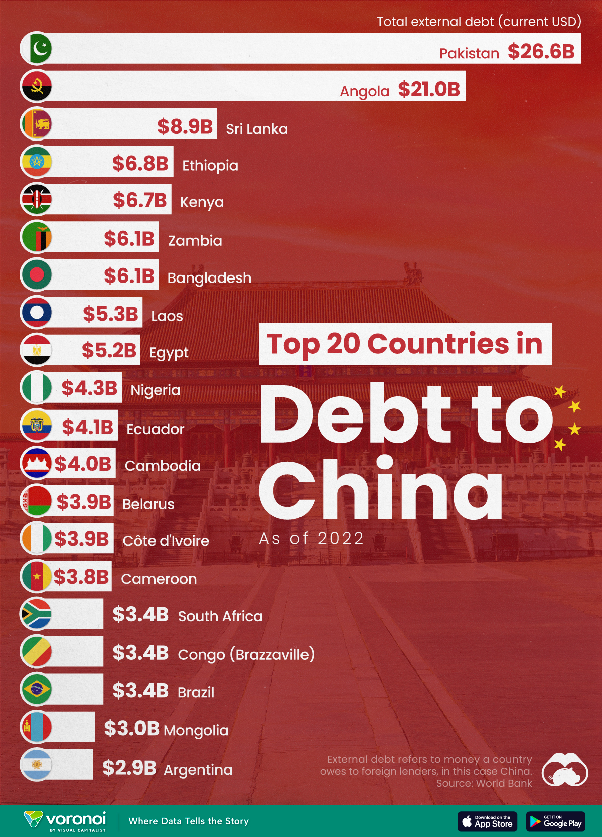
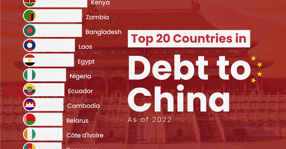
Ranked: The Top 20 Countries in Debt to China
The 20 nations featured in this graphic each owe billions in debt to China, posing concerns for their economic future.
Ranked: The Top 20 Countries in Debt to China
This was originally posted on our Voronoi app. Download the app for free on iOS or Android and discover incredible data-driven charts from a variety of trusted sources.
In this graphic, we ranked the top 20 countries by their amount of debt to China. These figures are as of 2022, and come from the World Bank (accessed via Yahoo Finance).
The data used to make this graphic can be found in the table below.
| Country | Total external debt to China ($B) |
|---|---|
| 🇵🇰 Pakistan | $26.6 |
| 🇦🇴 Angola | $21.0 |
| 🇱🇰 Sri Lanka | $8.9 |
| 🇪🇹 Ethiopia | $6.8 |
| 🇰🇪 Kenya | $6.7 |
| 🇧🇩 Bangladesh | $6.1 |
| 🇿🇲 Zambia | $6.1 |
| 🇱🇦 Laos | $5.3 |
| 🇪🇬 Egypt | $5.2 |
| 🇳🇬 Nigeria | $4.3 |
| 🇪🇨 Ecuador | $4.1 |
| 🇰🇭 Cambodia | $4.0 |
| 🇨🇮 Côte d'Ivoire | $3.9 |
| 🇧🇾 Belarus | $3.9 |
| 🇨🇲 Cameroon | $3.8 |
| 🇧🇷 Brazil | $3.4 |
| 🇨🇬 Republic of the Congo | $3.4 |
| 🇿🇦 South Africa | $3.4 |
| 🇲🇳 Mongolia | $3.0 |
| 🇦🇷 Argentina | $2.9 |
This dataset highlights Pakistan and Angola as having the largest debts to China by a wide margin. Both countries have taken billions in loans from China for various infrastructure and energy projects.
Critically, both countries have also struggled to manage their debt burdens. In February 2024, China extended the maturity of a $2 billion loan to Pakistan.
Soon after in March 2024, Angola negotiated a lower monthly debt payment with its biggest Chinese creditor, China Development Bank (CDB).
Could China be in Trouble?
China has provided developing countries with over $1 trillion in committed funding through its Belt and Road Initiative (BRI), a massive economic development project aimed at enhancing trade between China and countries across Asia, Africa, and Europe.
Many believe that this lending spree could be an issue in the near future.
According to a 2023 report by AidData, 80% of these loans involve countries in financial distress, raising concerns about whether participating nations will ever be able to repay their debts.
While China claims the BRI is a driver of global development, critics in the West have long warned that the BRI employs debt-trap diplomacy, a tactic where one country uses loans to gain influence over another.
Editor’s note: The debt shown in this visualization focuses only on direct external debt, and does not include publicly-traded, liquid, debt securities like bonds. Furthermore, it’s worth noting the World Bank data excludes some countries with data accuracy or reporting issues, such as Venezuela.
Learn More About Debt from Visual Capitalist
If you enjoyed this post, check out our breakdown of $97 trillion in global government debt.

-

 Technology6 days ago
All of the Grants Given by the U.S. CHIPS Act
-

 Uranium2 weeks ago
The World’s Biggest Nuclear Energy Producers
-

 Education2 weeks ago
How Hard Is It to Get Into an Ivy League School?
-

 Debt2 weeks ago
How Debt-to-GDP Ratios Have Changed Since 2000
-
 Sports2 weeks ago
The Highest Earning Athletes in Seven Professional Sports
-

 Science2 weeks ago
Visualizing the Average Lifespans of Mammals
-

 Brands1 week ago
How Tech Logos Have Evolved Over Time
-

 Energy1 week ago
Ranked: The Top 10 EV Battery Manufacturers in 2023