Money
Visualizing Unequal State Tax Burdens Across America


Visualizing Unequal State Tax Burdens Across America
What percentage of your income goes into Uncle Sam’s pocket?
Your answer will vary depending on how much you earn. Data shows that low and middle-income families pay a much greater share of their income towards state and local taxes than wealthy families.
Today’s visualization uses data from the Institute on Taxation and Economic Policy (ITEP) to map the effective tax rates—or taxes paid as a share of family income—across income groups at the state and local level.
Crunching the Numbers
The data reflects the effect of tax changes enacted through September 10, 2018, using 2015 income levels (the latest year for available, detailed income data). Both single and married tax filers are included, while elderly taxpayers, dependent filers, and those with negative incomes are excluded.
Taxes Included
The report includes the state and local taxes for all 50 states and the District of Columbia. Taxes are broken into 3 broad groups:
- Consumption taxes – general sales taxes and specialized excise taxes
- Property taxes – including taxes on homes, businesses, and motor vehicles
- Income taxes – paid by individuals and businesses
Federal taxes are not considered.
Editor’s note: It’s worth noting that federal personal income tax has progressive rates, with the lowest earning bracket at 10% and the highest earning bracket at 37% in 2019. At a national level, property taxes are not charged and there is a very low reliance on excise taxes—both of which tend to be regressive as outlined below.
Income Included
The report includes both taxable and tax-exempt income such as worker’s compensation benefits. It also includes estimates for the amount of unreported income.
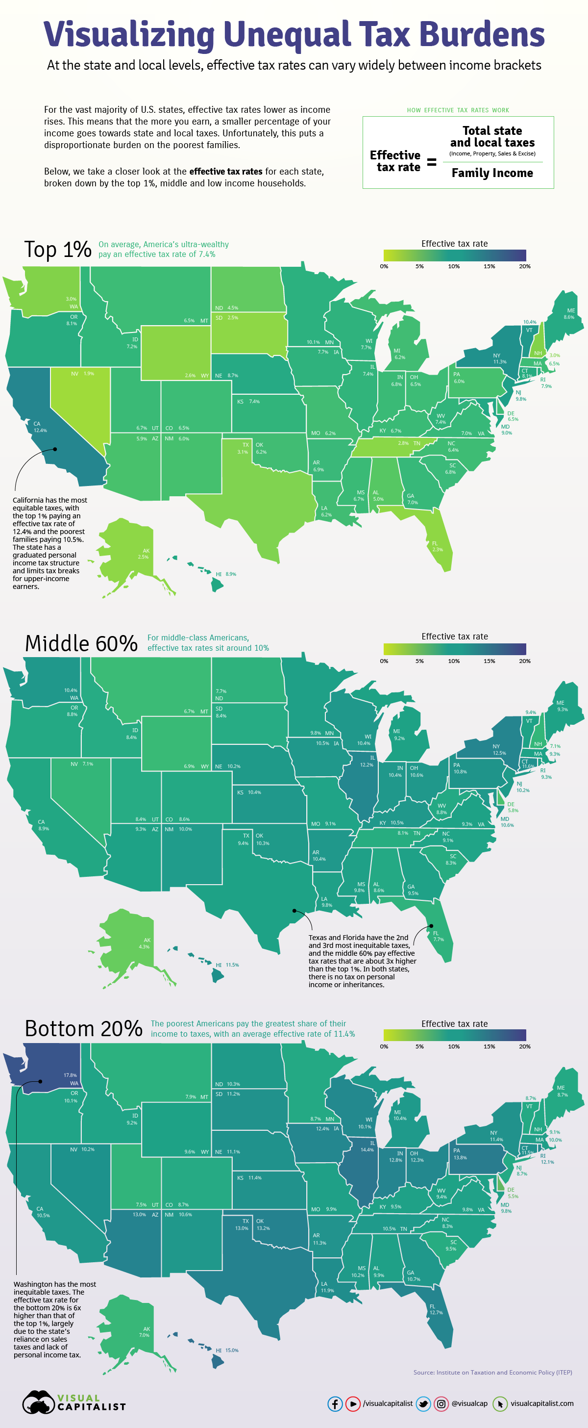
Which States Have the Most Unequal Tax Burdens?
Across the U.S., there is a wide disparity in how taxes affect different income groups. Here’s how it all breaks down, ranked in order of tax system inequality*:
Total State and Local Taxes As a Share of Income
By State and Income Group
| RANK | STATE | LOWEST 20% | MIDDLE 60% | TOP 1% |
|---|---|---|---|---|
| 1 | Washington | 17.8% | 10.4% | 3.0% |
| 2 | Texas | 13.0% | 9.4% | 3.1% |
| 3 | Florida | 12.7% | 7.7% | 2.3% |
| 4 | South Dakota | 11.2% | 8.4% | 2.5% |
| 5 | Nevada | 10.2% | 7.1% | 1.9% |
| 6 | Tennessee | 10.5% | 8.1% | 2.8% |
| 7 | Pennsylvania | 13.8% | 10.8% | 6.0% |
| 8 | Illinois | 14.4% | 12.2% | 7.4% |
| 9 | Oklahoma | 13.2% | 10.3% | 6.2% |
| 10 | Wyoming | 9.6% | 6.9% | 2.6% |
| 11 | Arizona | 13.0% | 9.3% | 5.9% |
| 12 | Indiana | 12.8% | 10.4% | 6.8% |
| 13 | Ohio | 12.3% | 10.6% | 6.5% |
| 14 | Louisiana | 11.9% | 9.8% | 6.2% |
| 15 | Hawaii | 15.0% | 11.5% | 8.9% |
| 16 | New Hampshire | 9.1% | 7.1% | 3.0% |
| 17 | North Dakota | 10.3% | 7.7% | 4.5% |
| 18 | Alabama | 9.9% | 8.6% | 5.0% |
| 19 | New Mexico | 10.6% | 10.0% | 6.0% |
| 20 | Arkansas | 11.3% | 10.4% | 6.9% |
| 21 | Iowa | 12.4% | 10.5% | 7.7% |
| 22 | Michigan | 10.4% | 9.2% | 6.2% |
| 23 | Kansas | 11.4% | 10.4% | 7.4% |
| 24 | Mississippi | 10.2% | 9.8% | 6.7% |
| 25 | Kentucky | 9.5% | 10.5% | 6.7% |
| 26 | Alaska | 7.0% | 4.3% | 2.5% |
| 27 | Georgia | 10.7% | 9.5% | 7.0% |
| 28 | Missouri | 9.9% | 9.1% | 6.2% |
| 29 | Connecticut | 11.5% | 11.6% | 8.1% |
| 30 | Massachusetts | 10.0% | 9.3% | 6.5% |
| 31 | North Carolina | 9.5% | 9.1% | 6.4% |
| 32 | Rhode Island | 12.1% | 9.3% | 7.9% |
| 33 | Virginia | 9.8% | 9.3% | 7.0% |
| 34 | Wisconsin | 10.1% | 10.4% | 7.7% |
| 35 | Colorado | 8.7% | 8.6% | 6.5% |
| 36 | Nebraska | 11.1% | 10.2% | 8.7% |
| 37 | West Virginia | 9.4% | 8.8% | 7.4% |
| 38 | Idaho | 9.2% | 8.4% | 7.2% |
| 39 | South Carolina | 8.3% | 8.3% | 6.8% |
| 40 | Utah | 7.5% | 8.4% | 6.7% |
| 41 | Oregon | 10.1% | 8.8% | 8.1% |
| 42 | Maryland | 9.8% | 10.6% | 9.0% |
| 43 | Montana | 7.9% | 6.7% | 6.5% |
| 44 | New York | 11.4% | 12.5% | 11.3% |
| 45 | Maine | 8.7% | 9.3% | 8.6% |
| 46 | New Jersey | 8.7% | 10.2% | 9.8% |
| 47 | Minnesota | 8.7% | 9.8% | 10.1% |
| 48 | Delaware | 5.5% | 5.8% | 6.5% |
| 49 | Vermont | 8.7% | 9.4% | 10.4% |
| 50 | District of Columbia | 6.3% | 9.8% | 9.5% |
| 51 | California | 10.5% | 8.9% | 12.4% |
* The ITEP Tax Inequality Index measures the effects of each state’s tax structure on income inequality. In states that rank high for inequality, incomes are less equal after state and local taxes are applied than before. On the flip side, states with the most equality are those where incomes are at least somewhat more equal after state and local taxes are levied than before.
Washington has the most unequal tax burdens. Proportional to their income, Washington taxpayers in the bottom 20% pay almost 6x more than those in the top 1%.
At the other end of the scale, California has the most equal tax system. As a share of their income, the state’s poorest families pay only 0.84x what the wealthiest families pay.
Overall, however, the vast majority of tax systems are regressive.
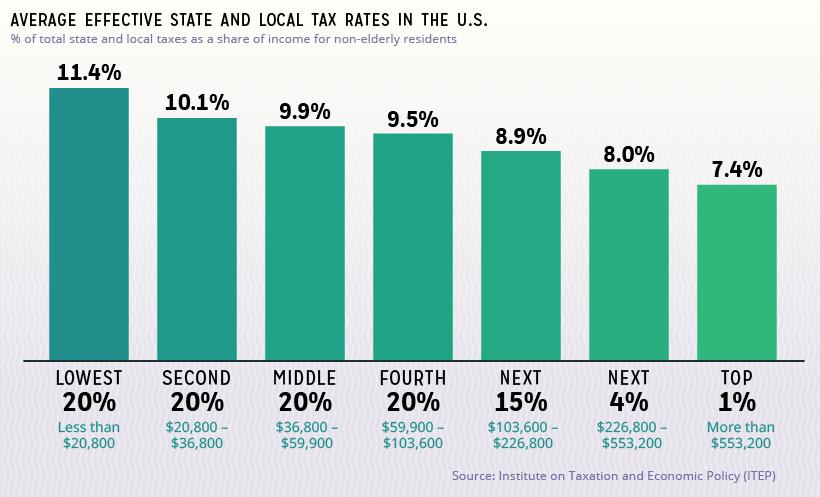
On average, the lowest 20% of income earners pay 1.54x more of their income in taxes compared to the top 1%.
The Main Causes
Two main factors drive a tax system’s (lack of) equality: how the state designs each tax, and the state’s reliance on different tax sources.
To better explain how this works, let’s take a closer look at each type of tax.
Sales & Excise Taxes
These taxes apply only to spent income, and exempt saved income. Since families with a higher household income are able to save a much larger percentage of their income, and the poorest families can barely save at all, the tax is regressive by nature.
The particular types of items that are taxed affect fairness as well. Quite a few states include food in their sales tax base, and low-income families spend the majority of their income on groceries and other necessities.
Not only that, excise taxes are levied on a small subset of goods that typically have a practical per-person maximum. For example, one person can only use so much fuel. As a wealthy family’s income increases, they generally do not continue to increase their spending on these goods.
States rely on these taxes more than any other tax source, which only exacerbates the problem.
Property Taxes
For the average household, the home makes up the majority of their total wealth—meaning most of their wealth is taxed. However, the wealth composition of richer families skews much more heavily towards stock portfolios, business equity, and other assets, which are exempt from property taxes.
While these types of assets are subject to taxes like capital gains and dividends, the distinction is that these taxes are levied only on earned gains. In contrast, property taxes are owed simply as a result of owning the asset.
What about those who don’t own homes? Landlords generally pass on the cost of property tax to renters in the form of higher rent. Since rent comprises a much higher share of expenses for poorer families, this makes property tax even more inequitable.
Income Taxes
State income taxes are typically progressive. This means effective tax rates go up as income goes up. Here’s how the U.S. averages break down:
- Low-income families: 0.04%
- Middle-income families: 2.1%
- Top 1%: 4.6%
However, certain policy choices can turn this on its head. Some states have a flat rate for all income levels, a lack of deductions and credits for low-income taxpayers, or tax loopholes that can be beneficial for wealthier income groups.
Nine states charge no income tax at all, garnering reputations as “low tax” states—but this is true only for high-income families. In order to make up for the lost revenue, states rely more heavily on tax sources that disproportionately affect the lowest earners.
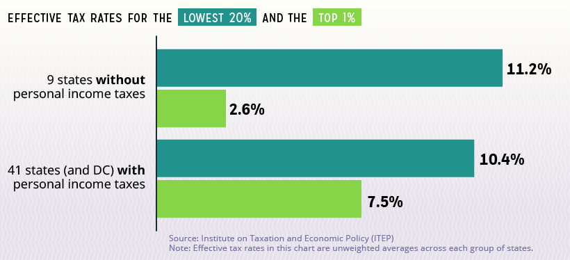
Evidently, states with personal income taxes have more equitable effective tax burdens.
Tackling Systemic Issues
Regressive state tax systems negatively impact the after-tax income of low and middle-income families. This means they have less to spend on daily expenses, or to save for the future.
Not only that, because wealthier families aren’t contributing a proportional share of tax dollars, state revenues grow more slowly.
For states looking to create a more equitable tax system, states with progressive systems offer some guidance:
- Graduated income tax rates
- Additional tax over a high-income threshold (e.g $1 million)
- Limits on tax breaks for upper-income taxpayers
- Targeted low-income tax credits
- Lower reliance on regressive consumption taxes
By implementing such policies, governments may see more tax equality—and more tax dollars for programs and services.
Hat tip to reddit user prikhodkop, whose visualization introduced us to this data.


Money
Charted: Which City Has the Most Billionaires in 2024?
Just two countries account for half of the top 20 cities with the most billionaires. And the majority of the other half are found in Asia.


Charted: Which Country Has the Most Billionaires in 2024?
This was originally posted on our Voronoi app. Download the app for free on iOS or Android and discover incredible data-driven charts from a variety of trusted sources.
Some cities seem to attract the rich. Take New York City for example, which has 340,000 high-net-worth residents with investable assets of more than $1 million.
But there’s a vast difference between being a millionaire and a billionaire. So where do the richest of them all live?
Using data from the Hurun Global Rich List 2024, we rank the top 20 cities with the highest number of billionaires in 2024.
A caveat to these rich lists: sources often vary on figures and exact rankings. For example, in last year’s reports, Forbes had New York as the city with the most billionaires, while the Hurun Global Rich List placed Beijing at the top spot.
Ranked: Top 20 Cities with the Most Billionaires in 2024
The Chinese economy’s doldrums over the course of the past year have affected its ultra-wealthy residents in key cities.
Beijing, the city with the most billionaires in 2023, has not only ceded its spot to New York, but has dropped to #4, overtaken by London and Mumbai.
| Rank | City | Billionaires | Rank Change YoY |
|---|---|---|---|
| 1 | 🇺🇸 New York | 119 | +1 |
| 2 | 🇬🇧 London | 97 | +3 |
| 3 | 🇮🇳 Mumbai | 92 | +4 |
| 4 | 🇨🇳 Beijing | 91 | -3 |
| 5 | 🇨🇳 Shanghai | 87 | -2 |
| 6 | 🇨🇳 Shenzhen | 84 | -2 |
| 7 | 🇭🇰 Hong Kong | 65 | -1 |
| 8 | 🇷🇺 Moscow | 59 | No Change |
| 9 | 🇮🇳 New Delhi | 57 | +6 |
| 10 | 🇺🇸 San Francisco | 52 | No Change |
| 11 | 🇹🇭 Bangkok | 49 | +2 |
| 12 | 🇹🇼 Taipei | 45 | +2 |
| 13 | 🇫🇷 Paris | 44 | -2 |
| 14 | 🇨🇳 Hangzhou | 43 | -5 |
| 15 | 🇸🇬 Singapore | 42 | New to Top 20 |
| 16 | 🇨🇳 Guangzhou | 39 | -4 |
| 17T | 🇮🇩 Jakarta | 37 | +1 |
| 17T | 🇧🇷 Sao Paulo | 37 | No Change |
| 19T | 🇺🇸 Los Angeles | 31 | No Change |
| 19T | 🇰🇷 Seoul | 31 | -3 |
In fact all Chinese cities on the top 20 list have lost billionaires between 2023–24. Consequently, they’ve all lost ranking spots as well, with Hangzhou seeing the biggest slide (-5) in the top 20.
Where China lost, all other Asian cities—except Seoul—in the top 20 have gained ranks. Indian cities lead the way, with New Delhi (+6) and Mumbai (+3) having climbed the most.
At a country level, China and the U.S combine to make up half of the cities in the top 20. They are also home to about half of the world’s 3,200 billionaire population.
In other news of note: Hurun officially counts Taylor Swift as a billionaire, estimating her net worth at $1.2 billion.

-

 Science1 week ago
Visualizing the Average Lifespans of Mammals
-

 Demographics2 weeks ago
The Smallest Gender Wage Gaps in OECD Countries
-

 United States2 weeks ago
Where U.S. Inflation Hit the Hardest in March 2024
-

 Green2 weeks ago
Top Countries By Forest Growth Since 2001
-

 United States2 weeks ago
Ranked: The Largest U.S. Corporations by Number of Employees
-

 Maps2 weeks ago
The Largest Earthquakes in the New York Area (1970-2024)
-

 Green2 weeks ago
Ranked: The Countries With the Most Air Pollution in 2023
-

 Green2 weeks ago
Ranking the Top 15 Countries by Carbon Tax Revenue