Maps
Where Will the Next Billion Internet Users Come From?
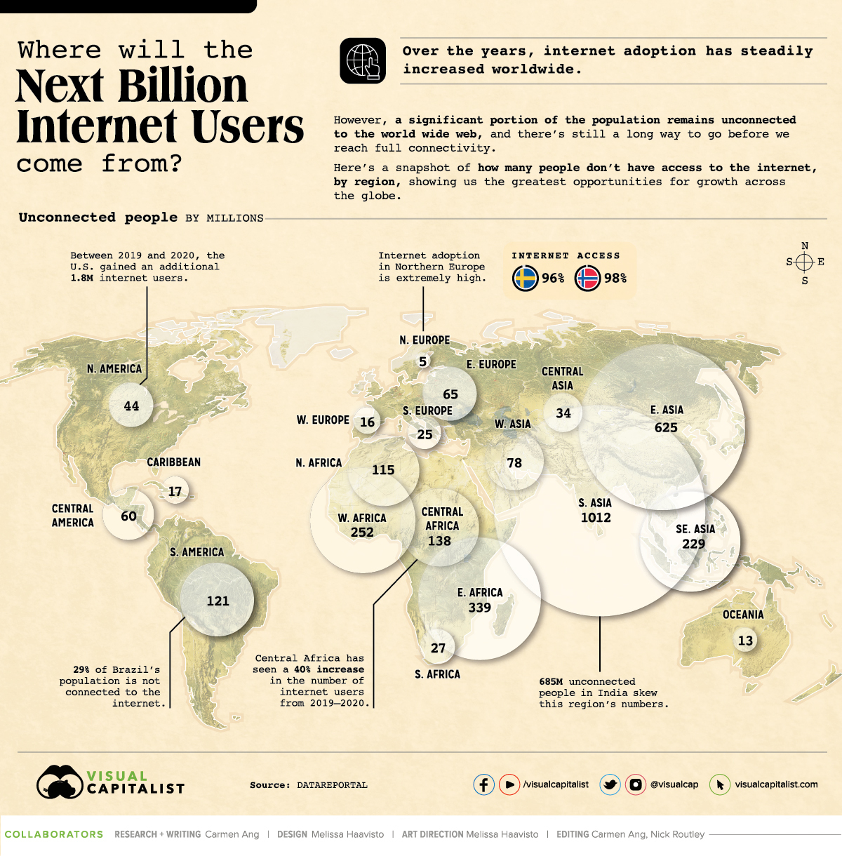


Where Will the Next Billion Internet Users Come From?
Internet adoption has steadily increased over the years—it’s more than doubled since 2010.
Despite its widespread use, a significant portion of the global population still isn’t connected to the internet, and in certain areas of the world, the number of disconnected people skews towards higher percentages.
Using information from DataReportal, this visual highlights which regions have the greatest number of people disconnected from the web. We’ll also dive into why some regions have low numbers, and take a look at which countries have seen the most growth in the last year.
Top 10 Most Disconnected, by Number of People
The majority of countries with lower rates of internet access are in Asia and Africa. Here’s a look at the top 10 countries with the highest numbers of people not connected to the web:
| Rank | Country / Territory | Unconnected People | % of Population |
|---|---|---|---|
| 1 | India | 685,591,071 | 50% |
| 2 | China | 582,063,733 | 41% |
| 3 | Pakistan | 142,347,735 | 65% |
| 4 | Nigeria | 118,059,925 | 58% |
| 5 | Bangladesh | 97,427,352 | 59% |
| 6 | Indonesia | 96,709,226 | 36% |
| 7 | Ethiopia | 92,385,728 | 81% |
| 8 | Democratic Republic of Congo | 71,823,319 | 81% |
| 9 | Brazil | 61,423,295 | 29% |
| 10 | Egypt | 46,626,170 | 46% |
*Note: Rankings only include countries/territories with populations over 50,000.
Interestingly, India has the highest number of disconnected people despite having the second largest online market in the world. That being said, 50% of the country’s population still doesn’t have internet access—for reference, only 14% of the U.S. population remains disconnected to the web. Clearly, India has some untapped potential.
China takes second place, with over 582 million people not connected to the internet. This is partly because of the country’s significant rural population—in 2019, 39% of the country’s population was living in rural areas.
The gap in internet access between rural and urban China is significant. This was made apparent during China’s recent switch to online learning in response to the pandemic. While one-third of elementary school children living in rural areas weren’t able to access their online classes, only 5.7% of city dwellers weren’t able to log on.
It’s important to note that the rural-urban divide is an issue in many countries, not just China. Even places like the U.S. struggle to provide internet access to remote or rugged rural areas.
Top 10 Most Disconnected, by Share of Population
While India, China, and Pakistan have the highest number of people without internet access, there are countries arguably more disconnected.
Here’s a look at the top 10 most disconnected countries, by share of population:
| Rank | Country / Territory | % of Population | Unconnected People |
|---|---|---|---|
| 1 | North Korea | 100% | 25,722,103 |
| 2 | South Sudan | 92% | 10,240,199 |
| 3 | Eritrea | 92% | 3,228,429 |
| 4 | Burundi | 90% | 10,556,111 |
| 5 | Somalia | 90% | 14,042,139 |
| 6 | Niger | 88% | 20,977,412 |
| 7 | Papua New Guinea | 88% | 7,761,628 |
| 8 | Liberia | 88% | 4,372,916 |
| 9 | Guinea-Bissau | 87% | 1,694,458 |
| 10 | Central African Republic | 86% | 4,132,006 |
There are various reasons why these regions have a high percentage of people not online—some are political, which is the case of North Korea, where only a select few people can access the wider web. Regular citizens are restricted from using the global internet but have access to a domestic intranet called Kwangmyong.
Other reasons are financial, which is the case in South Sudan. The country has struggled with civil conflict and economic hardship for years, which has caused widespread poverty throughout the nation. It’s also stifled infrastructural development—only 2% of the country has access to electricity as of 2020, which explains why so few people have access to the web.
In the case of Papua New Guinea, a massive rural population is likely the reason behind its low percentage of internet users—80% of the population lives in rural areas, with little to no connections to modern life.
Fastest Growing Regions
While internet advancements like 5G are happening in certain regions, and showing no signs of slowing down, there’s still a long way to go before we reach global connectivity.
Despite the long road ahead, the gap is closing, and previously untapped markets are seeing significant growth. Here’s a look at the top five fast-growing regions:
| Rank | Region | Change in internet use (From 2019 to 2020) |
|---|---|---|
| 1 | Central Africa | +40% |
| 2 | Southern Asia | +20% |
| 3 | Northern Africa | +14% |
| 4 | Western Asia | +11% |
| 5 | Caribbean | +9% |
Africa has seen significant growth, mainly because of a massive spike of internet users in the Democratic Republic of Congo (DRC)—between 2019 and 2020, the country’s number of internet users increased by 9 million (+122%). This growth has been facilitated by non-profit organizations and companies like Facebook, which have invested heavily in the development of Africa’s internet connectivity.
India has also seen significant growth—between 2019 and 2020, the number of internet users in the country grew by 128 million (+23%).
If these countries continue to grow at similar rates, who knows what the breakdown of internet users will look like in the next few years?


Maps
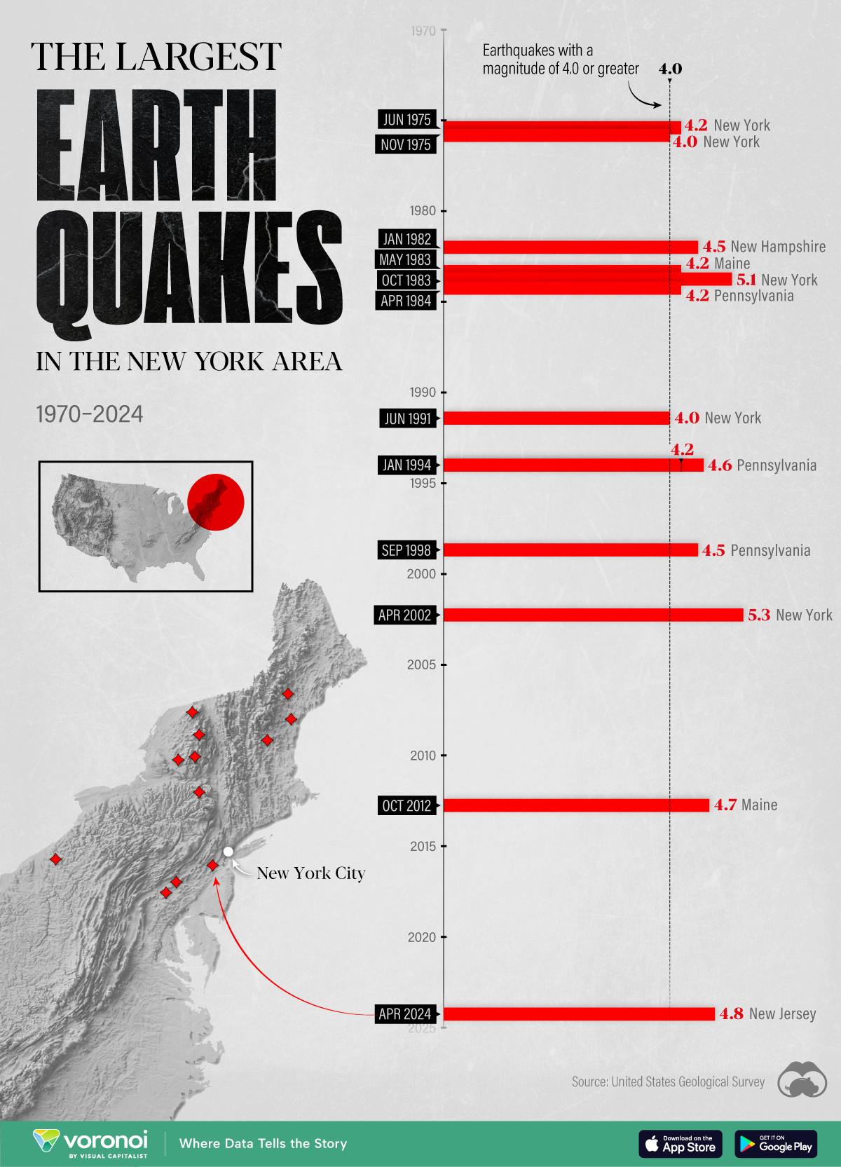
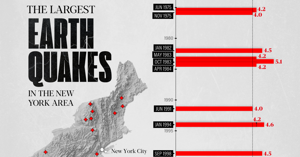
The Largest Earthquakes in the New York Area (1970-2024)
The earthquake that shook buildings across New York in April 2024 was the third-largest quake in the Northeast U.S. over the past 50 years.
The Largest Earthquakes in the New York Area
This was originally posted on our Voronoi app. Download the app for free on Apple or Android and discover incredible data-driven charts from a variety of trusted sources.
The 4.8 magnitude earthquake that shook buildings across New York on Friday, April 5th, 2024 was the third-largest quake in the U.S. Northeast area over the past 50 years.
In this map, we illustrate earthquakes with a magnitude of 4.0 or greater recorded in the Northeastern U.S. since 1970, according to the United States Geological Survey (USGS).
Shallow Quakes and Older Buildings
The earthquake that struck the U.S. Northeast in April 2024 was felt by millions of people from Washington, D.C., to north of Boston. It even caused a full ground stop at Newark Airport.
The quake, occurring just 5 km beneath the Earth’s surface, was considered shallow, which is what contributed to more intense shaking at the surface.
According to the USGS, rocks in the eastern U.S. are significantly older, denser, and harder than those on the western side, compressed by time. This makes them more efficient conduits for seismic energy. Additionally, buildings in the Northeast tend to be older and may not adhere to the latest earthquake codes.
Despite disrupting work and school life, the earthquake was considered minor, according to the Michigan Technological University magnitude scale:
| Magnitude | Earthquake Effects | Estimated Number Each Year |
|---|---|---|
| 2.5 or less | Usually not felt, but can be recorded by seismograph. | Millions |
| 2.5 to 5.4 | Often felt, but only causes minor damage. | 500,000 |
| 5.5 to 6.0 | Slight damage to buildings and other structures. | 350 |
| 6.1 to 6.9 | May cause a lot of damage in very populated areas. | 100 |
| 7.0 to 7.9 | Major earthquake. Serious damage. | 10-15 |
| 8.0 or greater | Great earthquake. Can totally destroy communities near the epicenter. | One every year or two |
The largest earthquake felt in the area over the past 50 years was a 5.3 magnitude quake that occurred in Au Sable Forks, New York, in 2002. It damaged houses and cracked roads in a remote corner of the Adirondack Mountains, but caused no injuries.
| Date | Magnitude | Location | State |
|---|---|---|---|
| April 20, 2002 | 5.3 | Au Sable Forks | New York |
| October 7, 1983 | 5.1 | Newcomb | New York |
| April 5, 2024 | 4.8 | Whitehouse Station | New Jersey |
| October 16, 2012 | 4.7 | Hollis Center | Maine |
| January 16, 1994 | 4.6 | Sinking Spring | Pennsylvania |
| January 19, 1982 | 4.5 | Sanbornton | New Hampshire |
| September 25, 1998 | 4.5 | Adamsville | Pennsylvania |
| June 9, 1975 | 4.2 | Altona | New York |
| May 29, 1983 | 4.2 | Peru | Maine |
| April 23, 1984 | 4.2 | Conestoga | Pennsylvania |
| January 16, 1994 | 4.2 | Sinking Spring | Pennsylvania |
| November 3, 1975 | 4 | Long Lake | New York |
| June 17, 1991 | 4 | Worcester | New York |
The largest earthquake in U.S. history, however, was the 1964 Good Friday quake in Alaska, measuring 9.2 magnitude and killing 131 people.

-

 Education1 week ago
How Hard Is It to Get Into an Ivy League School?
-

 Technology2 weeks ago
Ranked: Semiconductor Companies by Industry Revenue Share
-

 Markets2 weeks ago
Ranked: The World’s Top Flight Routes, by Revenue
-

 Demographics2 weeks ago
Population Projections: The World’s 6 Largest Countries in 2075
-

 Markets2 weeks ago
The Top 10 States by Real GDP Growth in 2023
-

 Demographics2 weeks ago
The Smallest Gender Wage Gaps in OECD Countries
-

 Economy2 weeks ago
Where U.S. Inflation Hit the Hardest in March 2024
-

 Green2 weeks ago
Top Countries By Forest Growth Since 2001