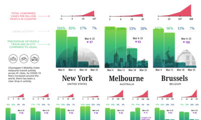

Amid the COVID-19 crisis, cities are dramatically slowing down. Today's chart demonstrates the impact of lockdowns on commuter activity worldwide.
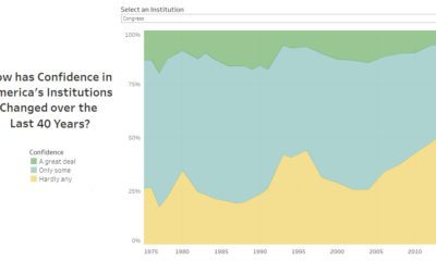

Americans rely on several institutions for their services and safety—but how has their confidence in institutions changed since 1975?
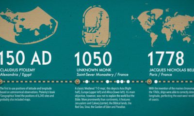

What did ancient maps look like, before we had access to airplanes and satellites? See the evolution of the world map in this nifty infographic.
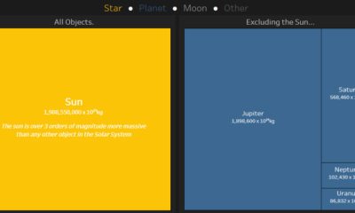

This interactive data visualization illustrates how the different planetary objects in our solar system compare based on their individual masses.
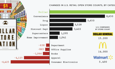

The retail apocalypse has forced the closure of many types of brick-and-mortar stores around the country. Despite this, here's why dollar stores are thriving.
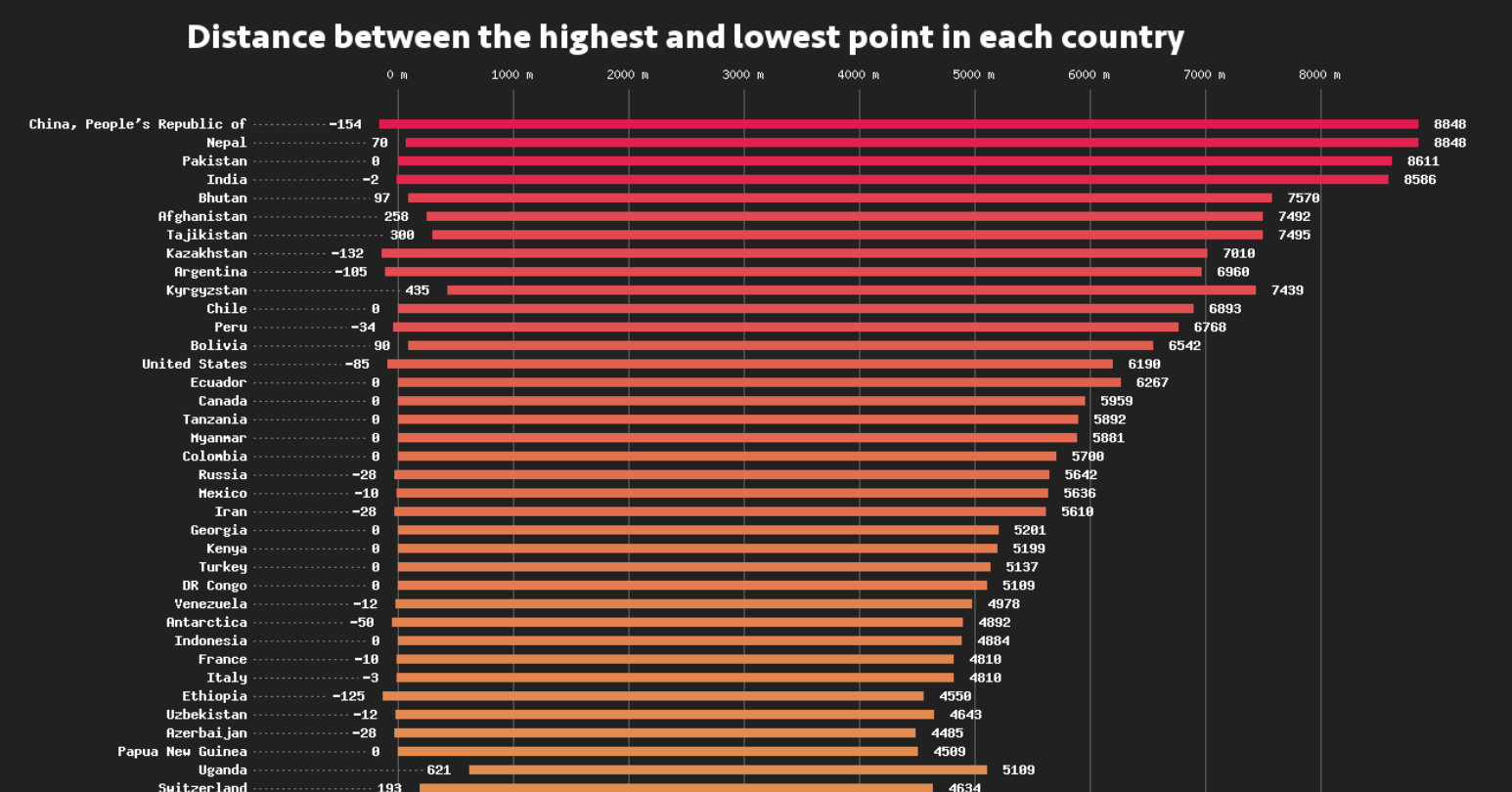
This data visualization compares the elevation span of every country, ranging from the mountain peaks of Bhutan, to the Dead Sea depression.
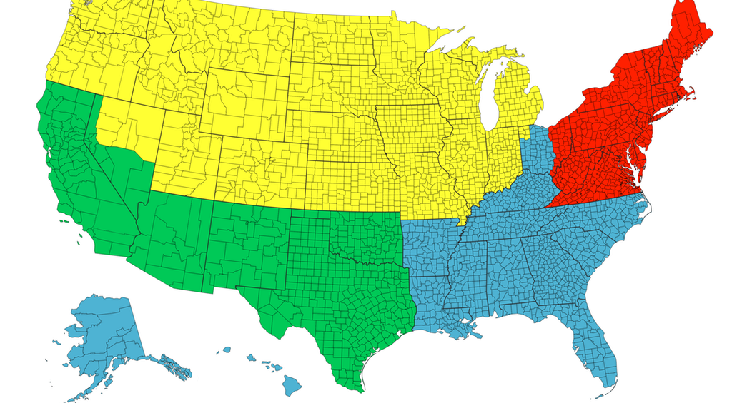
Each of the four colors is equal to 25% of the country's total population - and things get interesting when looking at Canada, Chile, or California.
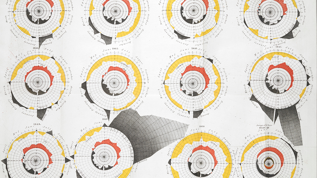
How a devastating series of cholera outbreaks in the 19th century inadvertently spurred innovation in the field of data visualization.
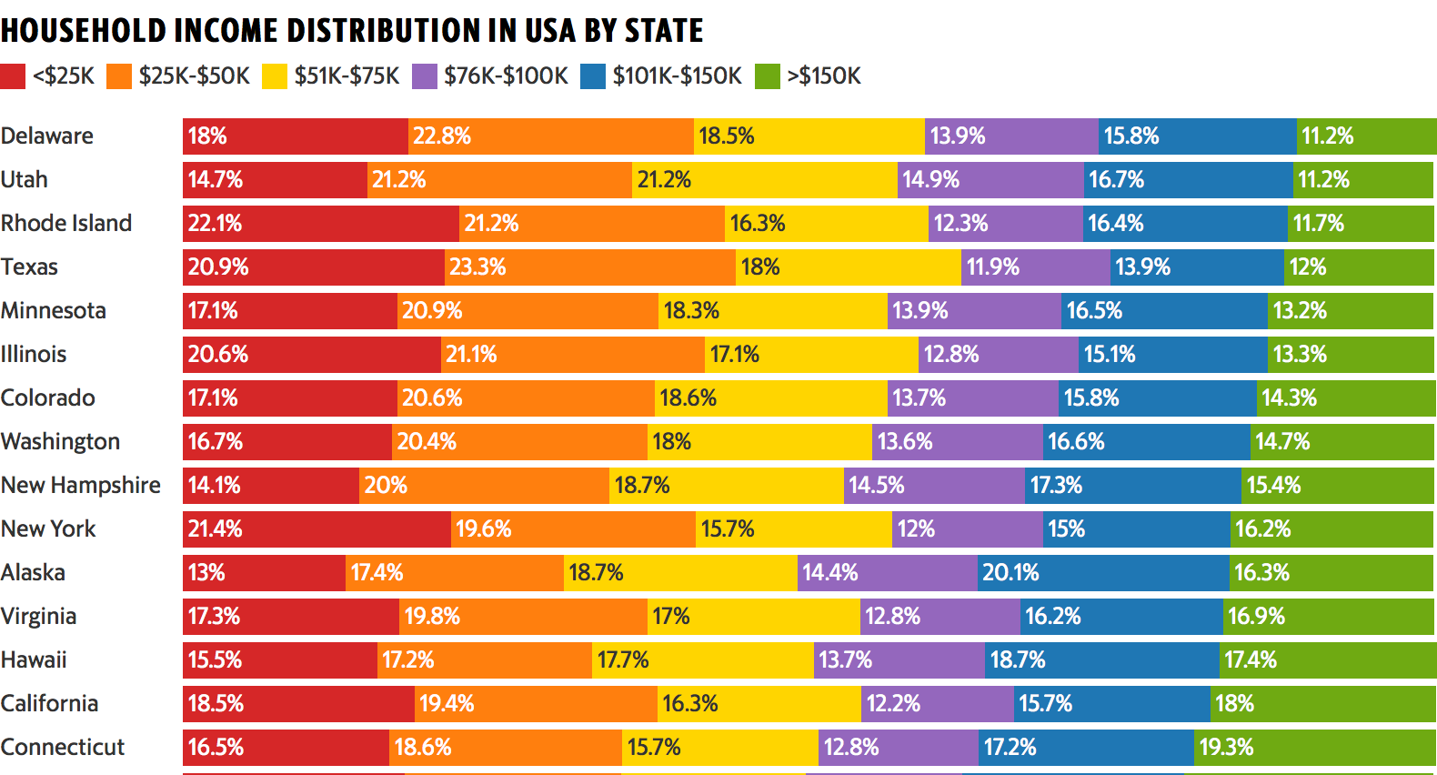
This colorful data visualization breaks down the household income of each U.S. state into six income brackets.
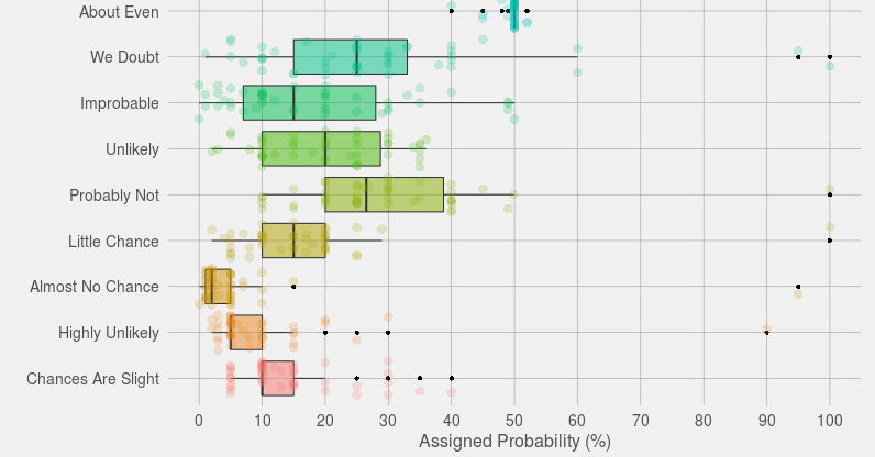
What's the precise difference between 'probable' and 'highly likely'? If you're struggling to quantify those terms, then you're not alone.


