Misc
Measuring Perceptions of Uncertainty
What is the difference between an event that is probable and one that is highly likely?
The two terms seem mostly interchangeable, but each individual’s interpretation is actually highly subjective. That means that when stakes are high, such as for the intelligence community or for high-ranking government officials, a slight misinterpretation in the meaning of these phrases could be a matter of life and death.
Sherman Kent and the CIA
Sherman Kent, often described as the “father of intelligence analysis”, was a CIA analyst that recognized the problem of using imprecise statements of uncertainty. Particularly, Kent was jolted by how policymakers interpreted the phrase “serious possibility” in a national estimate about the odds of a Soviet attack on Yugoslavia in 1951. After asking around, he found that some thought this meant a 20% chance of attack, while others ascribed an 80% chance to the phrase. Most people were somewhere in the middle.
Inspired by Kent’s work, a later study asked 23 NATO officers to assign actual numbers to terms like “probably”, “almost certain”, “little chance”, “unlikely”, and other words of estimated probability.
The results were fascinating:
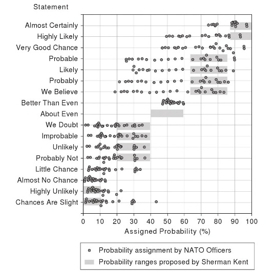
Interpretations are all over the map. The words are not precise to begin with, but it’s also worth keeping in mind that people attribute meaning to these phrases based on their personalities, backgrounds, and prior experiences. Context also matters.
How Do We Interpret These Terms?
Although the consequences are less severe for us civilians, we are stuck in the same quandary today.
We’re almost certain a deal will go through, or there’s little chance a candidate will win the presidency. People interpret these terms differently, and these small differences still impact our lives.
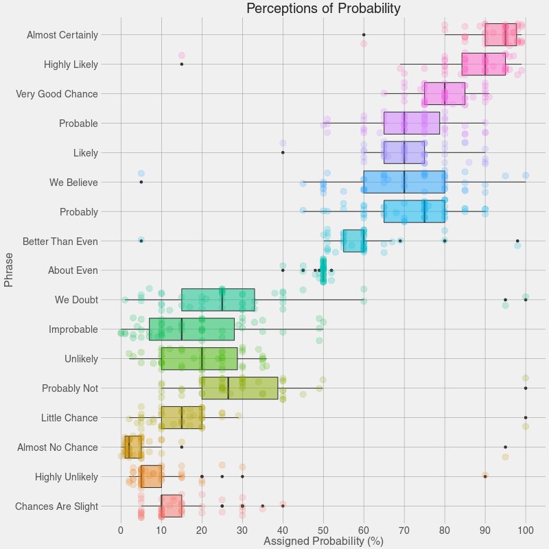
Reddit user zonination set out to recreate the poll to see if perceptions of words today matched up with data from the study inspired by Sherman Kent. The results below are very similar, and can help us communicate more clearly, particularly when the stakes are high.
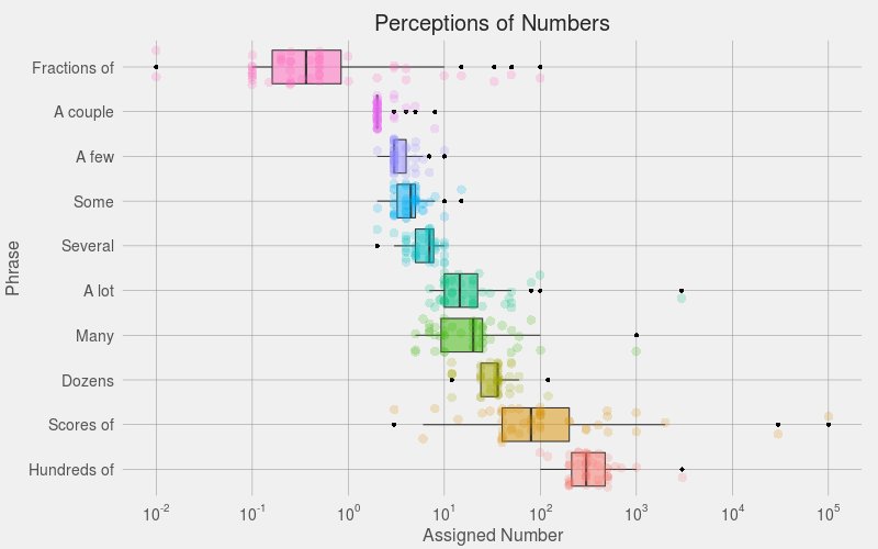
The same idea was also taken a step further, to look at potential misunderstandings that can occur when we use phrases instead of hard numbers.
For example, one person’s a few is another person’s several:
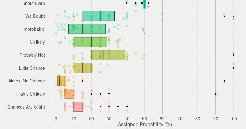
If you want to communicate with precision, it’s best to use numbers or specific odds.
Otherwise, be aware that a term like “improbable” can have a considerable range of interpretations – from 0% to 50% – depending on who you are talking to!


VC+
VC+: Get Our Key Takeaways From the IMF’s World Economic Outlook
A sneak preview of the exclusive VC+ Special Dispatch—your shortcut to understanding IMF’s World Economic Outlook report.

Have you read IMF’s latest World Economic Outlook yet? At a daunting 202 pages, we don’t blame you if it’s still on your to-do list.
But don’t worry, you don’t need to read the whole April release, because we’ve already done the hard work for you.
To save you time and effort, the Visual Capitalist team has compiled a visual analysis of everything you need to know from the report—and our upcoming VC+ Special Dispatch will be available exclusively to VC+ members on Thursday, April 25th.
If you’re not already subscribed to VC+, make sure you sign up now to receive the full analysis of the IMF report, and more (we release similar deep dives every week).
For now, here’s what VC+ members can expect to receive.
Your Shortcut to Understanding IMF’s World Economic Outlook
With long and short-term growth prospects declining for many countries around the world, this Special Dispatch offers a visual analysis of the key figures and takeaways from the IMF’s report including:
- The global decline in economic growth forecasts
- Real GDP growth and inflation forecasts for major nations in 2024
- When interest rate cuts will happen and interest rate forecasts
- How debt-to-GDP ratios have changed since 2000
- And much more!

Get the Full Breakdown in the Next VC+ Special Dispatch
VC+ members will receive the full Special Dispatch on Thursday, April 25th.
Make sure you join VC+ now to receive exclusive charts and the full analysis of key takeaways from IMF’s World Economic Outlook.
Don’t miss out. Become a VC+ member today.
What You Get When You Become a VC+ Member
VC+ is Visual Capitalist’s premium subscription. As a member, you’ll get the following:
- Special Dispatches: Deep dive visual briefings on crucial reports and global trends
- Markets This Month: A snappy summary of the state of the markets and what to look out for
- The Trendline: Weekly curation of the best visualizations from across the globe
- Global Forecast Series: Our flagship annual report that covers everything you need to know related to the economy, markets, geopolitics, and the latest tech trends
- VC+ Archive: Hundreds of previously released VC+ briefings and reports that you’ve been missing out on, all in one dedicated hub
You can get all of the above, and more, by joining VC+ today.

-

 Maps1 week ago
The Largest Earthquakes in the New York Area (1970-2024)
-

 Money2 weeks ago
Where Does One U.S. Tax Dollar Go?
-

 Automotive2 weeks ago
Almost Every EV Stock is Down After Q1 2024
-

 AI2 weeks ago
The Stock Performance of U.S. Chipmakers So Far in 2024
-

 Markets2 weeks ago
Charted: Big Four Market Share by S&P 500 Audits
-

 Real Estate2 weeks ago
Ranked: The Most Valuable Housing Markets in America
-

 Money2 weeks ago
Which States Have the Highest Minimum Wage in America?
-

 AI2 weeks ago
Ranked: Semiconductor Companies by Industry Revenue Share