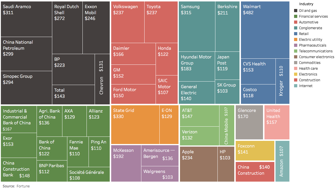
The usual oil companies and banks dominate the list of the largest 50 companies by revenue - but there are also some lesser knowns worth learning...
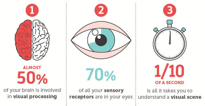
Why are our brains addicted to visually stimulating content such as infographics or charts? Here's the scientific evidence behind why we crave visuals.
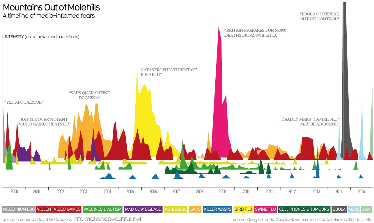
Each year, the media claims there to be a new virus or disaster that will threaten humankind. This data shows this coverage tends to be blown...
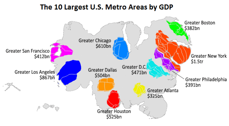
This animation uses county-level GDP data to re-size a U.S. map based on the economic contributions at a local level.
Put down your turkey leftovers - it's time to recap Visual Capitalist's top 15 infographics, data visualizations, and charts of 2015.
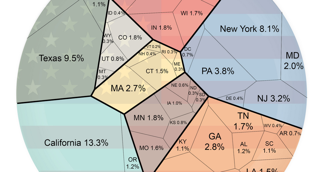
Ever wonder how your state compares in terms of economic output? This simple visualization compares the economies of every U.S. state.
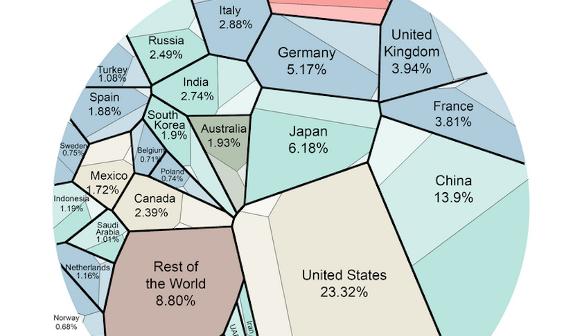
This data visualization is the most simple breakdown we have seen that shows the composition of the world economy.
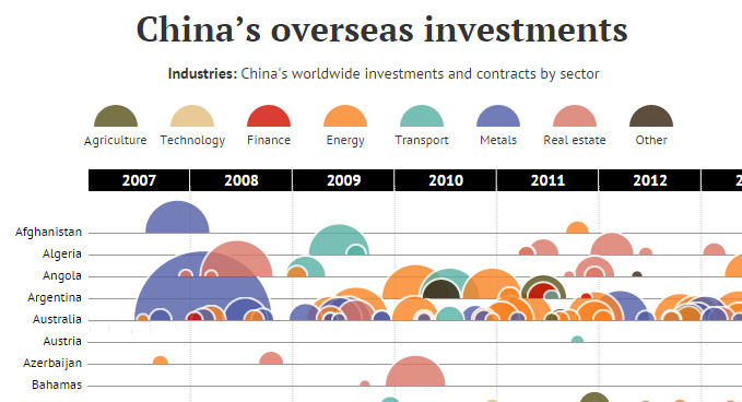
In this data visualization, every attempted Chinese overseas investment over $100 million is organized by country and sector.
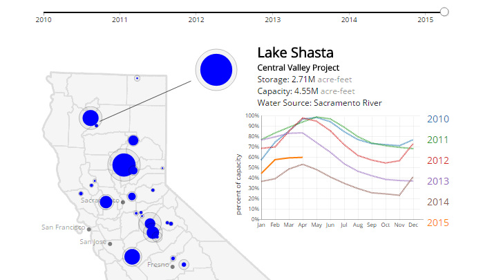
This California drought visualization shows the water levels in each of the state's largest 30 reservoirs since 2010.
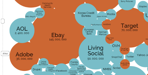
A data visualization showing the biggest hacks and data breaches in history, sorted by number of records stolen.


