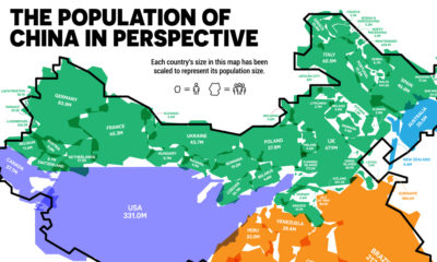

China is the world's most populous country. But how does the population of China compare to the rest of the world?
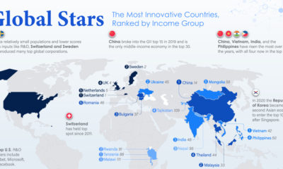

From Switzerland and China to Vietnam and Tanzania — here are the world's most innovative countries, taking income per capita into account.
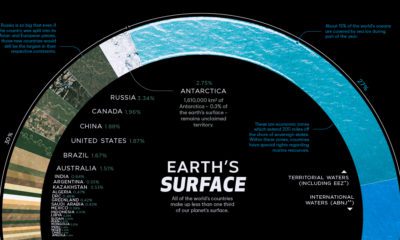

There are 510 million km² of area on the Earth, but less than 30% of this is land. Here's the share countries make up of the...
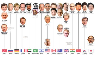

Who has led the world's 15 most powerful countries over the last 50 years? This visual looks at world leaders from 1970 to today.
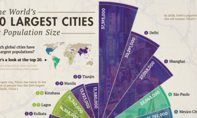

Where are the world’s largest cities in terms of population? This graphic looks at the top 20 most populous cities in the world.
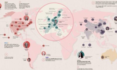

Fewer than 12% of global billionaires are women, but they still hold massive amounts of wealth. Who are the 50 richest women in the world?
Rare earth deposits exist all over the planet, but the majority of the world's rare earth metals are produced and refined in China.
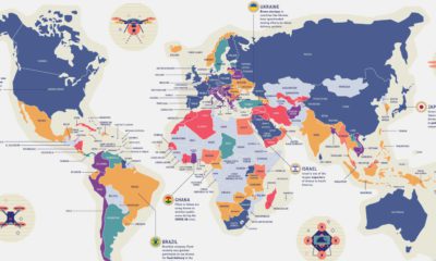

By 2025, the global commercial drone market could reach $42.8 billion. With such diverse uses, how do countries navigate drone privacy laws?
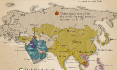

What are the top imports across Asia? Petroleum is the most popular import, followed by vehicles and electronic integrated circuits.
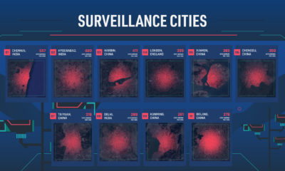

Which cities have the most CCTV cameras? This map reveals the top surveillance cities worldwide in terms of the prevalence of CCTV cameras.


