Mining
Silver Bulls: Visualizing the Price of Silver
Silver Bulls: Visualizing the Price of Silver
Silver has always shown its value throughout history. From ancient coins to its use as a global currency during the Age of Discovery, silver has circulated the world to become an important financial asset. Its value continues to shine in the era of the modern finance industry.
Today’s infographic comes to us from New Pacific Metals and it takes a look at the bull markets in silver prices and the future of silver.
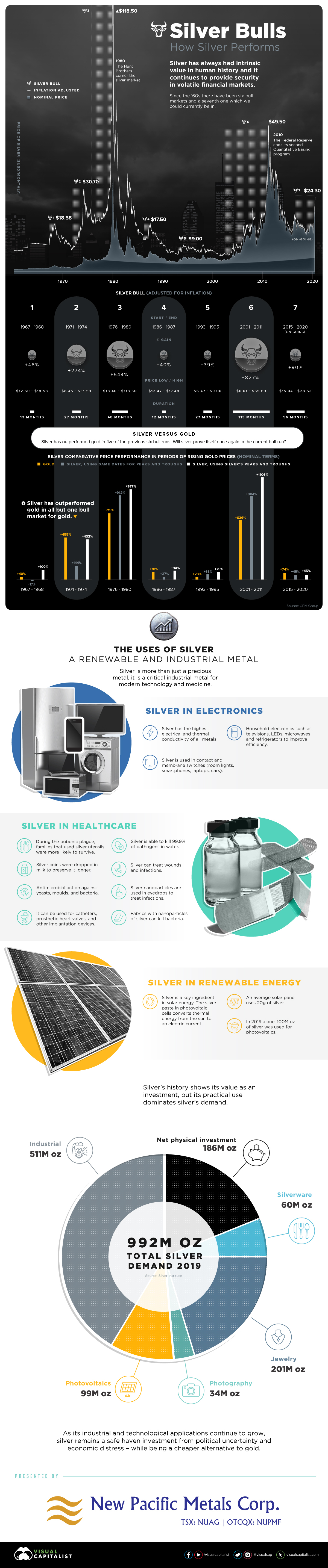
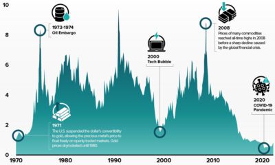
Silver Bulls: 1967 to Today
The late 1960s marked the beginning of the end for silver as currency, but also the start of its use in protecting and securing wealth.
In the United States, silver certificates were issued by the Treasury until late 1963, when the $1 Federal Reserve Note was released into circulation. After this, the remaining silver certificates were still redeemable for silver, but this practice ended in 1968.
Since then, silver has had several bull markets in which prices have increased—or as some silver aficionados may argue, the relative value of fiat currency has decreased.
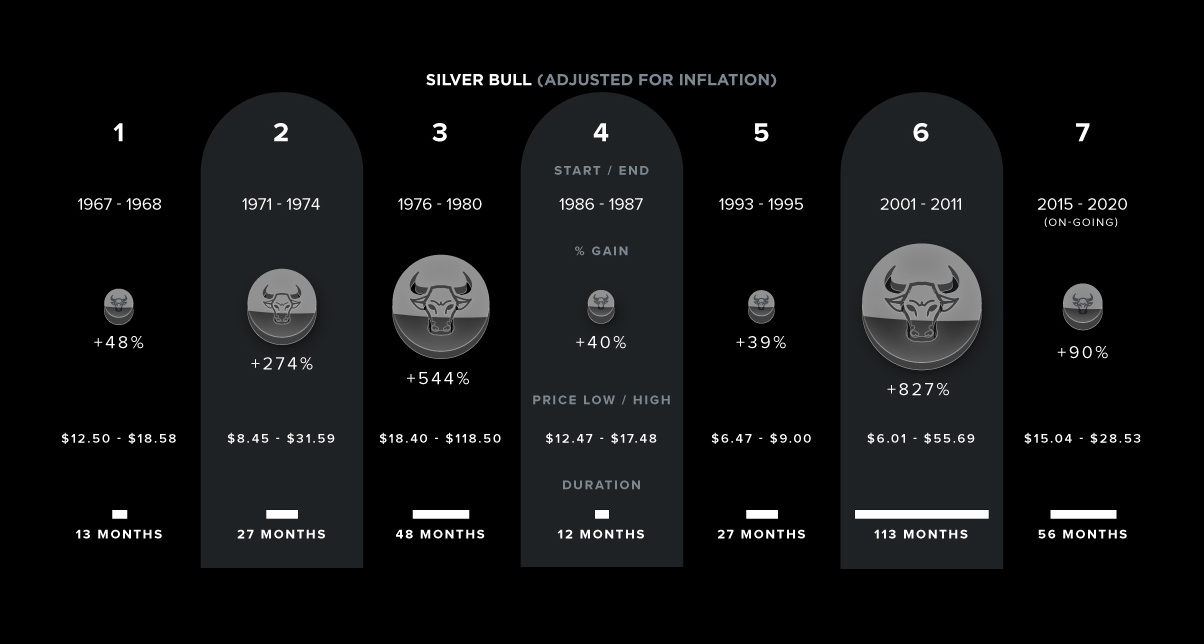
| Percentage Gain | Price Range (USD)* | Duration | |
|---|---|---|---|
| Silver Bull #1 (1967-68) | 49% | $12.50 - $18.58 | 13 months |
| Silver Bull #2 (1971-74) | 274% | $8.45 - $31.59 | 27 months |
| Silver Bull #3 (1976-80) | 544% | $18.40 - $118.50 | 48 months |
| Silver Bull #4 (1986-87) | 40% | $12.47 - $17.48 | 12 months |
| Silver Bull #5 (1993-95) | 39% | $6.47 - $9.00 | 27 months |
| Silver Bull #6 (2001-11) | 827% | $6.01 - $55.69 | 113 months |
| Silver Bull #7 (2015-Present?) | 90% | $15.04 - $28.53 | 56 months |
Source: MacroTrends
*Inflation-adjusted data using CPI from BLS, LBMA Monthly prices
That said, not all silver bull markets are the same, nor do they necessarily coincide with bull markets in the price of gold.
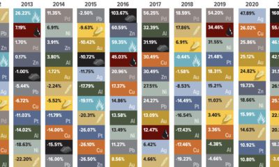
Performance: Gold vs. Silver
Despite being often referred to as “poor man’s gold”, silver has actually outperformed gold in five of the six previous bull markets for gold and silver.
There are two ways to look at how silver prices performed during these timeframes:
- We can compare silver price performance to corresponding peaks and troughs of the gold price
- We can also look at silver prices based on its own peaks and troughs, irrespective of gold
Often, gold prices move first with silver prices quickly following—but then, silver can outperform gold on its own timeline.
| Gold Performance | Silver Performance | Silver Performance | |
|---|---|---|---|
| Based on gold's peaks and troughs | Based on silver's peaks and troughs | ||
| Silver Bull #1 | 40% | -17% | 100% |
| Silver Bull #2 | 455% | 144% | 432% |
| Silver Bull #3 | 715% | 912% | 977% |
| Silver Bull #4 | 78% | 27% | 94% |
| Silver Bull #5 | 28% | 63% | 75% |
| Silver Bull #6: | 636% | 904% | 45% |
Source: CPM Group (Nominal data)
More recently, prices of silver have been on an upward trend since 2015 and some would say we are in a new bull market for the precious metal. For however longer, it is anyone’s guess.
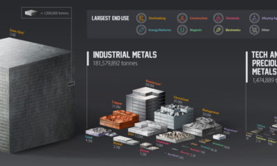
The Future of Silver?
While the future price direction of silver is difficult to predict, this doesn’t diminish the increasing importance of silver’s role as a metal in an electrified future.
As you can see in the demand breakdown below, silver is not only precious—it is useful:
| Silver Demand (2019) | Millions of Ounces |
|---|---|
| Industrial | 510.9 |
| ...of which Photovoltaics | 98.7 |
| Photography | 33.7 |
| Jewelry | 201.3 |
| Silverware | 59.8 |
| Net Physical Investment | 186.1 |
| Total Demand | 991.8 |
Source: Silver Institute
While silver’s uses and applications continue to grow, silver remains a safe haven investment from political uncertainty and economic distress—all while being a cheaper and better alternative to gold.


Lithium
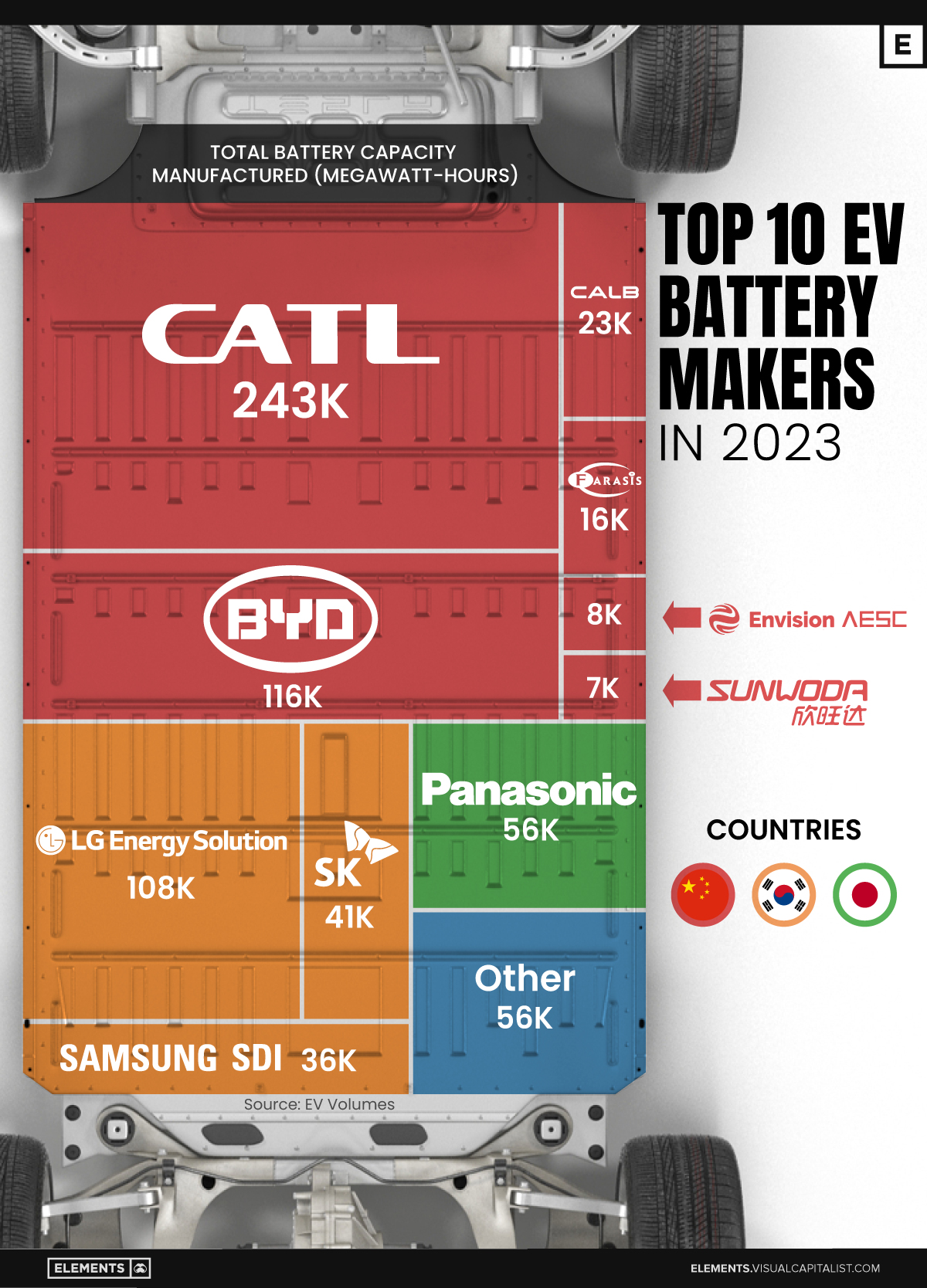
Ranked: The Top 10 EV Battery Manufacturers in 2023
Asia dominates this ranking of the world’s largest EV battery manufacturers in 2023.
The Top 10 EV Battery Manufacturers in 2023
This was originally posted on our Voronoi app. Download the app for free on iOS or Android and discover incredible data-driven charts from a variety of trusted sources.
Despite efforts from the U.S. and EU to secure local domestic supply, all major EV battery manufacturers remain based in Asia.
In this graphic we rank the top 10 EV battery manufacturers by total battery deployment (measured in megawatt-hours) in 2023. The data is from EV Volumes.
Chinese Dominance
Contemporary Amperex Technology Co. Limited (CATL) has swiftly risen in less than a decade to claim the title of the largest global battery group.
The Chinese company now has a 34% share of the market and supplies batteries to a range of made-in-China vehicles, including the Tesla Model Y, SAIC’s MG4/Mulan, and various Li Auto models.
| Company | Country | 2023 Production (megawatt-hour) | Share of Total Production |
|---|---|---|---|
| CATL | 🇨🇳 China | 242,700 | 34% |
| BYD | 🇨🇳 China | 115,917 | 16% |
| LG Energy Solution | 🇰🇷 Korea | 108,487 | 15% |
| Panasonic | 🇯🇵 Japan | 56,560 | 8% |
| SK On | 🇰🇷 Korea | 40,711 | 6% |
| Samsung SDI | 🇰🇷 Korea | 35,703 | 5% |
| CALB | 🇨🇳 China | 23,493 | 3% |
| Farasis Energy | 🇨🇳 China | 16,527 | 2% |
| Envision AESC | 🇨🇳 China | 8,342 | 1% |
| Sunwoda | 🇨🇳 China | 6,979 | 1% |
| Other | - | 56,040 | 8% |
In 2023, BYD surpassed LG Energy Solution to claim second place. This was driven by demand from its own models and growth in third-party deals, including providing batteries for the made-in-Germany Tesla Model Y, Toyota bZ3, Changan UNI-V, Venucia V-Online, as well as several Haval and FAW models.
The top three battery makers (CATL, BYD, LG) collectively account for two-thirds (66%) of total battery deployment.
Once a leader in the EV battery business, Panasonic now holds the fourth position with an 8% market share, down from 9% last year. With its main client, Tesla, now sourcing batteries from multiple suppliers, the Japanese battery maker seems to be losing its competitive edge in the industry.
Overall, the global EV battery market size is projected to grow from $49 billion in 2022 to $98 billion by 2029, according to Fortune Business Insights.

-

 Debt1 week ago
How Debt-to-GDP Ratios Have Changed Since 2000
-

 Markets2 weeks ago
Ranked: The World’s Top Flight Routes, by Revenue
-

 Countries2 weeks ago
Population Projections: The World’s 6 Largest Countries in 2075
-

 Markets2 weeks ago
The Top 10 States by Real GDP Growth in 2023
-

 Demographics2 weeks ago
The Smallest Gender Wage Gaps in OECD Countries
-

 United States2 weeks ago
Where U.S. Inflation Hit the Hardest in March 2024
-

 Green2 weeks ago
Top Countries By Forest Growth Since 2001
-

 United States2 weeks ago
Ranked: The Largest U.S. Corporations by Number of Employees