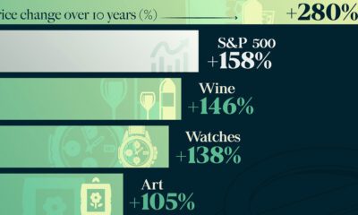
How does investing in luxury goods like expensive watches and rare whisky compare to other goods, or to the S&P...


click for more →


Scan with your phone's camera or QR code app to view
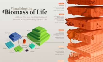

Our planet supports nearly 8.7 million species. We break down the total composition of the living world in terms of its biomass.
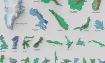

See the world's 100 biggest islands in a side-by-side comparison. Then, we look to see which islands have the highest population densities.
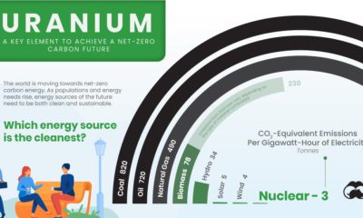

All energy sources have negative impacts, but some are better for the environment than others. Which energy source is the cleanest?
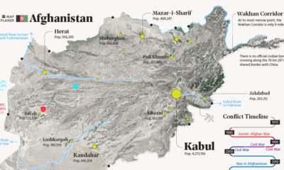

This map explainer looks at Afghanistan from a structural point of view, delving into geography and population patterns.
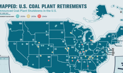

This infographic highlights announced coal plant closures in the U.S. and how much power will be affected.
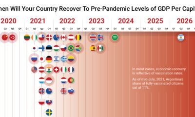

The path to COVID-19 recovery varies worldwide—some countries have already recovered, while others will not be back to normal for years.
For Olympic athletes that place on the podium, some can expect a handsome medal bonus from their home countries—up to six figures' worth.
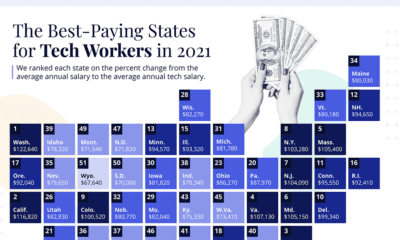

In America, tech jobs pay about 61% more than the average salary. Here's a look at which states have the highest tech salaries.
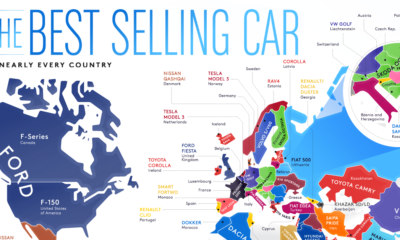

From American trucks to European sedans, this map shows the best-selling vehicles in the world.
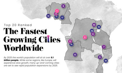

Nearly 60% of the world's population lives in cities and this trend is not slowing down—take a look at the world's 20 fastest growing cities.
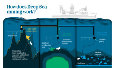

As more metals are necessary for electrification and clean energy transition, companies are looking at an unexplored market: ocean mining.

The world map you know is totally wrong. Check out this clever graphic, which helps put into perspective the true size of countries.
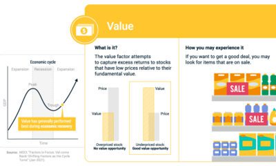

If you've bought an item on sale, you've experienced the value factor. We break down factor investing using real life examples.
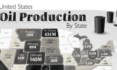

The U.S. is the largest oil producer in the world. Here we map the share of oil production in the country by all 50 states in...
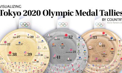

After 17 days and 339 events, the Tokyo Olympics have come to an end. Here we visualize the final medal tallies for every participating country.
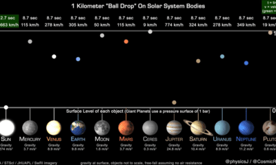

This unique animation, created by a planetary astronomer, compares and highlights the gravitational pull of the planets.
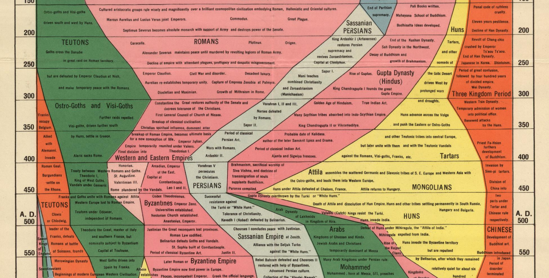
We examine an ambitious timeline that details the power of various civilizations going all the way back to 2,000 B.C.