Economy
When Will Your Country Recover from the Pandemic?
What started as a novel virus in China quickly became a sweeping disease that shut down the world and put a 1.5 year halt on the global economy.
But while some countries’ economies are already back to normal, others are lagging far behind.
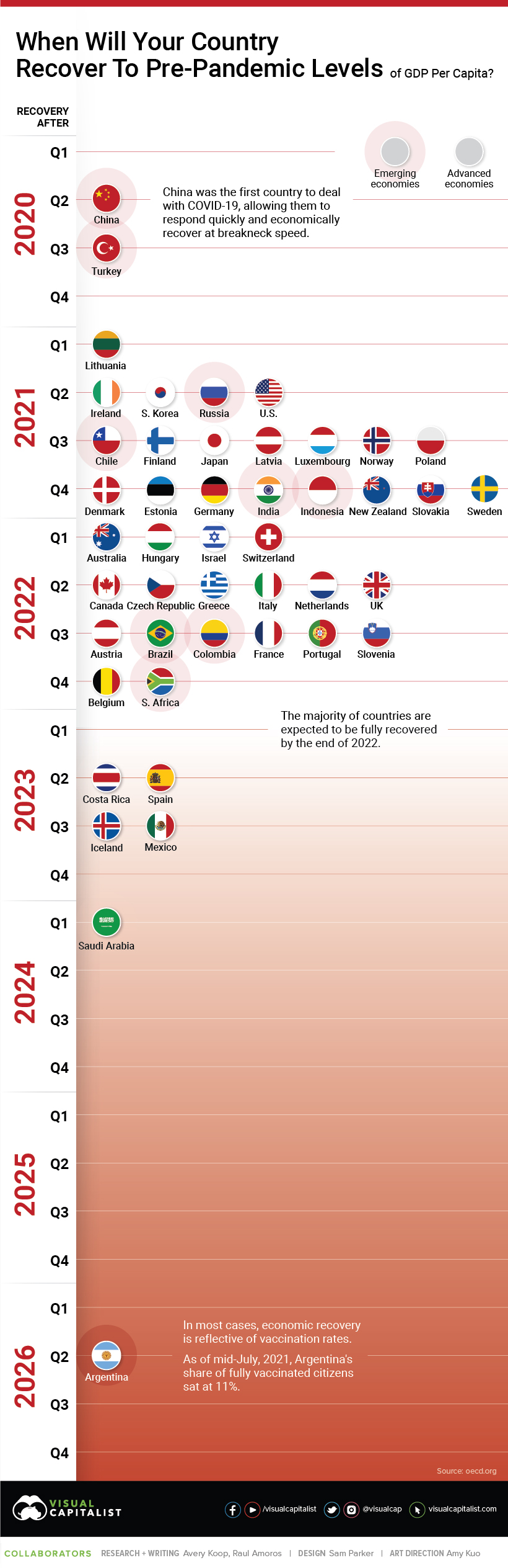
COVID-19 Recovery Timelines, by OECD Country
This chart using data from the OECD anticipates when countries will economically recover from the global pandemic, based on getting back to pre-pandemic levels of GDP per capita.
Note: The categorization of ‘advanced’ or ‘emerging’ economy was determined by OECD standards.


The Leaders of the Pack
At the top, China and the U.S. are recovering at breakneck speed. In fact, recovering is the wrong word for China, as they reached pre-pandemic GDP per capita levels just after Q2’2020.
On the other end, some countries are looking at years—not months—when it comes to their recovery date. Saudi Arabia isn’t expected to recover until after Q1’2024, and Argentina is estimated to have an even slower recovery, occurring only after Q2’2026.
| Country | Recovery | Economy |
|---|---|---|
| 🇧🇪 Belgium | After Q4 2022 | Advanced |
| 🇸🇪 Sweden | After Q4 2021 | Advanced |
| 🇸🇰 Slovakia | After Q4 2021 | Advanced |
| 🇳🇿 New Zealand | After Q4 2021 | Advanced |
| 🇩🇪 Germany | After Q4 2021 | Advanced |
| 🇪🇪 Estonia | After Q4 2021 | Advanced |
| 🇩🇰 Denmark | After Q4 2021 | Advanced |
| 🇮🇸 Iceland | After Q3 2023 | Advanced |
| 🇸🇮 Slovenia | After Q3 2022 | Advanced |
| 🇵🇹 Portugal | After Q3 2022 | Advanced |
| 🇫🇷 France | After Q3 2022 | Advanced |
| 🇦🇹 Austria | After Q3 2022 | Advanced |
| 🇵🇱 Poland | After Q3 2021 | Advanced |
| 🇳🇴 Norway | After Q3 2021 | Advanced |
| 🇱🇺 Luxembourg | After Q3 2021 | Advanced |
| 🇱🇻 Latvia | After Q3 2021 | Advanced |
| 🇯🇵 Japan | After Q3 2021 | Advanced |
| 🇫🇮 Finland | After Q3 2021 | Advanced |
| 🇪🇸 Spain | After Q2 2023 | Advanced |
| 🇬🇧 United Kingdom | After Q2 2022 | Advanced |
| 🇳🇱 Netherlands | After Q2 2022 | Advanced |
| 🇮🇹 Italy | After Q2 2022 | Advanced |
| 🇬🇷 Greece | After Q2 2022 | Advanced |
| 🇨🇿 Czech Republic | After Q2 2022 | Advanced |
| 🇨🇦 Canada | After Q2 2022 | Advanced |
| 🇺🇸 United States | After Q2 2021 | Advanced |
| 🇰🇷 South Korea | After Q2 2021 | Advanced |
| 🇮🇪 Ireland | After Q2 2021 | Advanced |
| 🇨🇭 Switzerland | After Q1 2022 | Advanced |
| 🇮🇱 Israel | After Q1 2022 | Advanced |
| 🇭🇺 Hungary | After Q1 2022 | Advanced |
| 🇦🇺 Australia | After Q1 2022 | Advanced |
| 🇱🇹 Lithuania | After Q1 2021 | Advanced |
| 🇿🇦 South Africa | After Q4 2022 | Emerging |
| 🇮🇩 Indonesia | After Q4 2021 | Emerging |
| 🇮🇳 India | After Q4 2021 | Emerging |
| 🇲🇽 Mexico | After Q3 2023 | Emerging |
| 🇨🇴 Colombia | After Q3 2022 | Emerging |
| 🇧🇷 Brazil | After Q3 2022 | Emerging |
| 🇨🇱 Chile | After Q3 2021 | Emerging |
| 🇹🇷 Turkey | After Q3 2020 | Emerging |
| 🇦🇷 Argentina | After Q2 2026 | Emerging |
| 🇨🇷 Costa Rica | After Q2 2023 | Emerging |
| 🇷🇺 Russia | After Q2 2021 | Emerging |
| 🇨🇳 China | After Q2 2020 | Emerging |
| 🇸🇦 Saudi Arabia | After Q1 2024 | Emerging |
Most countries will hit pre-pandemic levels of GDP per capita by the end of 2022. The slowest recovering advanced economies—Iceland and Spain—aren’t expected to bounce back until 2023.
Four emerging economies are speeding ahead, and are predicted to get back on their feet by the end of this year or slightly later (if they haven’t already):
- 🇷🇺 Russia: after Q2’2021
- 🇨🇱 Chile: after Q3’2021
- 🇮🇳 India: after Q4’2021
- 🇮🇩 Indonesia: after Q4’2021
However, no recovery is guaranteed, and many countries will continue face setbacks as waves of COVID-19 variants hit—India, for example, was battling its biggest wave as recently as May 2021.
Trailing Behind
Why are some countries recovering faster than others? One factor seems to be vaccination rates.
| Country | Doses Administered per 100 People | Total Doses Administered | Percent of Population Fully Vaccinated |
|---|---|---|---|
| World | 47 | 3,573,004,544 | – |
| 🇦🇪 U.A.E. | 166 | 16,194,526 | 69% |
| 🇲🇹 Malta | 143 | 718,418 | 71% |
| 🇧🇭 Bahrain | 136 | 2,224,916 | 63% |
| 🇮🇸 Iceland | 129 | 466,434 | 70% |
| 🇺🇾 Uruguay | 129 | 4,458,394 | 58% |
| 🇨🇱 Chile | 128 | 24,248,545 | 60% |
| 🇦🇼 Aruba | 125 | 133,421 | 59% |
| 🇶🇦 Qatar | 123 | 3,474,944 | 56% |
| 🇬🇧 United Kingdom | 122 | 81,438,892 | 53% |
| Mongolia | 121 | 3,912,996 | 56% |
| Israel | 121 | 10,959,633 | 58% |
| Canada | 118 | 44,293,659 | 48% |
| Singapore | 113 | 6,440,735 | 42% |
| Belgium | 111 | 12,700,513 | 46% |
| Curaçao | 108 | 170,857 | 51% |
| Denmark | 108 | 6,266,892 | 43% |
| Maldives | 106 | 561,748 | 46% |
| Netherlands | 105 | 18,273,238 | 43% |
| Spain | 105 | 49,585,197 | 49% |
| Hungary | 104 | 10,155,466 | 54% |
| Portugal | 103 | 10,579,259 | 44% |
| Luxembourg | 102 | 633,974 | 41% |
| Germany | 102 | 84,989,850 | 45% |
| China | 102 | 1,426,347,000 | – |
| United States | 101 | 336,054,953 | 48% |
| Ireland | 101 | 4,995,719 | 44% |
| Austria | 100 | 8,866,474 | 44% |
| Italy | 99 | 59,966,908 | 41% |
| Switzerland | 95 | 8,133,486 | 42% |
| France | 93 | 62,321,355 | 40% |
| Sweden | 93 | 9,536,164 | 36% |
| Finland | 90 | 4,951,925 | 26% |
| Norway | 89 | 4,785,937 | 31% |
| Greece | 89 | 9,560,592 | 42% |
| Lithuania | 88 | 2,459,605 | 42% |
| Czech Republic | 88 | 9,346,397 | 38% |
| Poland | 85 | 32,413,199 | 42% |
| Dominican Rep. | 84 | 9,066,151 | 34% |
| Estonia | 79 | 1,049,416 | 34% |
| Serbia | 78 | 5,415,434 | 38% |
| Slovenia | 78 | 1,626,072 | 36% |
| Cyprus | 76 | 916,819 | 35% |
| Turkey | 74 | 61,747,399 | 23% |
| Slovakia | 73 | 4,003,639 | 33% |
| Mauritius | 71 | 901,530 | 24% |
| Croatia | 71 | 2,870,866 | 32% |
| Macau | 69 | 434,726 | 27% |
| Cuba | 69 | 7,767,601 | 17% |
| Latvia | 66 | 1,264,433 | 33% |
| Bhutan | 64 | 487,060 | 0.02% |
| Saudi Arabia | 63 | 21,556,314 | 9.2% |
| Hong Kong | 62 | 4,638,908 | 26% |
| Barbados | 59 | 168,955 | 25% |
| Argentina | 58 | 26,134,815 | 11% |
| Brazil | 57 | 120,726,752 | 16% |
| Kuwait | 56 | 2,375,455 | 22% |
| Morocco | 56 | 20,584,812 | 26% |
| Cambodia | 56 | 9242925 | 24% |
| El Salvador | 53 | 3,422,214 | 20% |
| Japan | 53 | 66,714,528 | 20% |
| Costa Rica | 52 | 2,606,791 | 16% |
| French Polynesia | 51 | 141,523 | 24% |
| Montenegro | 49 | 304,655 | 23% |
| Fiji | 47 | 419,998 | 8% |
| Romania | 47 | 9,092,141 | 24% |
| Guyana | 46 | 363,442 | 16% |
| Colombia | 45 | 22,624,568 | 19% |
| Jordan | 45 | 4,498,748 | 18% |
| Azerbaijan | 42 | 4,242,727 | 17% |
| Panama | 42 | 1,781,542 | 15% |
| Mexico | 41 | 52,704,960 | 17% |
| Malaysia | 41 | 13,107,681 | 13% |
| South Korea | 41 | 21,157,612 | 12% |
| New Caledonia | 40 | 115,218 | 19% |
| Ecuador | 40 | 6,890,876 | 10% |
| Kazakhstan | 39 | 7,303,180 | 14% |
| Suriname | 38 | 222,377 | 8% |
| Australia | 38 | 9,631,807 | 10% |
| Belize | 38 | 147,080 | 10% |
| Albania | 37 | 1,052,108 | 16% |
| Russia | 35 | 50,383,638 | 14% |
| Oman | 35 | 1,728,618 | 6% |
| North Macedonia | 34 | 713,114 | 13% |
| Samoa | 32 | 62,161 | 4.7% |
| Moldova | 31 | 834,527 | 13% |
| Grenada | 31 | 35,072 | 13% |
| Peru | 31 | 9,954,429 | 12% |
| Saint Lucia | 30 | 54,361 | 13% |
| Sri Lanka | 29 | 6,431,100 | 7.3% |
| India | 29 | 391,340,491 | 6% |
| New Zealand | 29 | 1,404,343 | 11% |
| Brunei | 28 | 121,241 | 4.3% |
| Tonga | 27 | 28,667 | – |
| Bulgaria | 27 | 1,896,574 | 12% |
| Bolivia | 27 | 3,117,521 | 7% |
| Trinidad and Tobago | 27 | 375,924 | 11% |
| Bahamas | 25 | 97,992 | 10% |
| Lebanon | 25 | 1,693,164 | 9% |
| Laos | 24 | 1,708,981 | 9% |
| Saint Vincent and the Grenadines | 23 | 25,509 | – |
| Cape Verde | 23 | 124,958 | 3% |
| Timor-Leste | 22 | 281,283 | 3% |
| Indonesia | 21 | 55,819,781 | 6% |
| Equatorial Guinea | 21 | 279,112 | 9% |
| West Bank & Gaza | 20 | 958,519 | 9% |
| Thailand | 19 | 13,533,717 | 5% |
| Taiwan | 19 | 4,603,639 | 1% |
| Tunisia | 19 | 2,206,980 | 6% |
| São Tomé and Príncipe | 18 | 37,716 | 5% |
| Bosnia and Herzegovina | 14 | 470,218 | 5% |
| Venezuela | 14 | 4,000,000 | 4% |
| Nepal | 13 | 3,730,344 | 4% |
| Philippines | 13 | 14,074,514 | 4% |
| Botswana | 12 | 284,676 | 5% |
| Honduras | 12 | 1,172,830 | 1% |
| Paraguay | 12 | 826,642 | 2% |
| Belarus | – | – | – |
| Zimbabwe | 11 | 1,575,539 | 4% |
| Comoros | 11 | 90,880 | – |
| Uzbekistan | 11 | 3,541,442 | 4% |
| Pakistan | 10 | 2,166,0650 | 2% |
| Jamaica | 9.8 | 290,382 | 4% |
| Armenia | 8.8 | 260,813 | 2% |
| Ukraine | 8.8 | 3,899,890 | 3% |
| Iran | 7.9 | 6,530,124 | 3% |
| Georgia | 7.8 | 289,399 | 3% |
| South Africa | 7.7 | 4,535,222 | 3% |
| Guatemala | 6.9 | 1,146,477 | 1% |
| Namibia | 6.7 | 166,616 | 1% |
| Myanmar | 6.5* | 3,500,000 | – |
| Libya | 6.3 | 425,119 | – |
| Bangladesh | 6.2 | 10,108,224 | 3% |
| Guinea | 6 | 770,688 | 2% |
| Algeria | – | – | – |
| Eswatini | 5.2 | 60,069 | 2% |
| Rwanda | 5.1 | 646,909 | 2% |
| Senegal | 5.1 | 823,610 | 2% |
| Angola | 4.9 | 1,558,201 | 2% |
| Egypt | 4.8 | 4,851,349 | 1% |
| Vanuatu | 4.7 | 14,026 | – |
| Vietnam | 4.3 | 4,185,623 | 0.3% |
| Togo | – | – | – |
| Tajikistan | 4.3 | 397,694 | 0.2% |
| Ghana | 4.2 | 1,265,306 | 1% |
| Mauritania | 4 | 182,642 | 0.3% |
| Solomon Islands | 3.8 | 25,628 | 1% |
| Ivory Coast | 3.3 | 861,278 | – |
| Gabon | 3.3 | 72,351 | 1% |
| Republic of the Congo | 3 | 163,742 | – |
| Kenya | 2.9 | 1,550,389 | 1% |
| Sierra Leone | 2.9 | 225,380 | 0.2% |
| Iraq | 2.8 | 1,087,866 | 1% |
| Djibouti | 2.8 | 26,796 | – |
| Afghanistan | 2.7 | 1,024,168 | 1% |
| Kyrgyzstan | 2.7 | 173,700 | 1.% |
| Lesotho | 2.7 | 56,322 | 1% |
| Nicaragua | – | – | – |
| Uganda | 2.4 | 1,079,943 | – |
| Malawi | 2.3 | 428,407 | 0.2% |
| Nigeria | 2 | 3,938,945 | 1% |
| Liberia | 1.9 | 95,423 | 0.2% |
| Ethiopia | 1.9 | 2,090,997 | – |
| Gambia | 1.9 | 43,557 | 1% |
| Niger | 1.8 | 423,335 | 0.3% |
| Mozambique | 1.7 | 508,184 | 1% |
| Central African Republic | 1.7 | 78,685 | – |
| Somalia | 1.6 | 249,790 | 1% |
| Sudan | 1.6 | 677,957 | 0.3% |
| Zambia | 1.4 | 243,818 | 0.3% |
| Guinea-Bissau | 1.3 | 25,012 | 0.1% |
| Yemen | 1 | 297,405 | <0.1% |
| Mali | 1 | 196,862 | 0.3% |
| Syria | 0.8 | 131,221 | 0.1% |
| Madagascar | 0.7 | 197,001 | – |
| Turkmenistan | – | – | – |
| Cameroon | 0.6 | 163,921 | 0.1% |
| Papua New Guinea | 0.6 | 51,170 | <0.1% |
| South Sudan | 0.5 | 55,915 | <0.1% |
| Benin | 0.4 | 52,563 | 0.1% |
| Burkina Faso | 0.2 | 33,960 | <0.1% |
| Chad | 0.2 | 24,459 | <0.1% |
| Congo | 0.1 | 73,764 | <0.1% |
As of July 16th, 2021.
The higher the rate of vaccination, the harder it is for COVID-19 to spread. This gives countries a chance to loosen restrictions, let people get back to work and regular life, and fuel the economy. Additionally, the quicker vaccines are rolled out, the less time there is for variants to mutate.
Another factor is the overall strength of a country’s healthcare infrastructure. More advanced economies often have more ICU capacity, more efficient dissemination of public health information, and, simply, more hospital staff. These traits help better handle the pandemic, with reduced cases, less restrictions, and a speedy recovery.
Finally, the level of government support and fiscal stimulus injected into different economies has determined how swiftly they’ve recovered. Similar to the disparity in vaccine rollouts, there was a significant fiscal stimulus gap, especially during the heat of the pandemic.
Recovering to Normal?
Many experts and government leaders are now advocating for funneling more money into healthcare infrastructure and disease research preventatively. The increased funding now would help stop worldwide shut downs and needless loss of life in future.
Time will tell when we return to “normal” everywhere, however, normal will likely never be the same. Many impacts of the global pandemic will stay with us over the long term.


Economy
Economic Growth Forecasts for G7 and BRICS Countries in 2024
The IMF has released its economic growth forecasts for 2024. How do the G7 and BRICS countries compare?
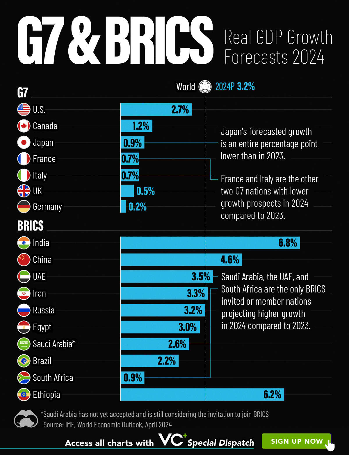
G7 & BRICS Real GDP Growth Forecasts for 2024
The International Monetary Fund’s (IMF) has released its real gross domestic product (GDP) growth forecasts for 2024, and while global growth is projected to stay steady at 3.2%, various major nations are seeing declining forecasts.
This chart visualizes the 2024 real GDP growth forecasts using data from the IMF’s 2024 World Economic Outlook for G7 and BRICS member nations along with Saudi Arabia, which is still considering an invitation to join the bloc.
Get the Key Insights of the IMF’s World Economic Outlook
Want a visual breakdown of the insights from the IMF’s 2024 World Economic Outlook report?
This visual is part of a special dispatch of the key takeaways exclusively for VC+ members.
Get the full dispatch of charts by signing up to VC+.
Mixed Economic Growth Prospects for Major Nations in 2024
Economic growth projections by the IMF for major nations are mixed, with the majority of G7 and BRICS countries forecasted to have slower growth in 2024 compared to 2023.
Only three BRICS-invited or member countries, Saudi Arabia, the UAE, and South Africa, have higher projected real GDP growth rates in 2024 than last year.
| Group | Country | Real GDP Growth (2023) | Real GDP Growth (2024P) |
|---|---|---|---|
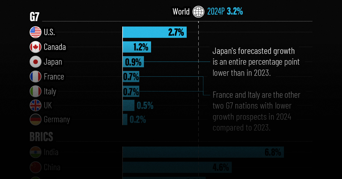
| G7 | 🇺🇸 U.S. | 2.5% | 2.7% |
| G7 | 🇨🇦 Canada | 1.1% | 1.2% |
| G7 | 🇯🇵 Japan | 1.9% | 0.9% |
| G7 | 🇫🇷 France | 0.9% | 0.7% |
| G7 | 🇮🇹 Italy | 0.9% | 0.7% |
| G7 | 🇬🇧 UK | 0.1% | 0.5% |
| G7 | 🇩🇪 Germany | -0.3% | 0.2% |
| BRICS | 🇮🇳 India | 7.8% | 6.8% |
| BRICS | 🇨🇳 China | 5.2% | 4.6% |
| BRICS | 🇦🇪 UAE | 3.4% | 3.5% |
| BRICS | 🇮🇷 Iran | 4.7% | 3.3% |
| BRICS | 🇷🇺 Russia | 3.6% | 3.2% |
| BRICS | 🇪🇬 Egypt | 3.8% | 3.0% |
| BRICS-invited | 🇸🇦 Saudi Arabia | -0.8% | 2.6% |
| BRICS | 🇧🇷 Brazil | 2.9% | 2.2% |
| BRICS | 🇿🇦 South Africa | 0.6% | 0.9% |
| BRICS | 🇪🇹 Ethiopia | 7.2% | 6.2% |
| 🌍 World | 3.2% | 3.2% |
China and India are forecasted to maintain relatively high growth rates in 2024 at 4.6% and 6.8% respectively, but compared to the previous year, China is growing 0.6 percentage points slower while India is an entire percentage point slower.
On the other hand, four G7 nations are set to grow faster than last year, which includes Germany making its comeback from its negative real GDP growth of -0.3% in 2023.
Faster Growth for BRICS than G7 Nations
Despite mostly lower growth forecasts in 2024 compared to 2023, BRICS nations still have a significantly higher average growth forecast at 3.6% compared to the G7 average of 1%.
While the G7 countries’ combined GDP is around $15 trillion greater than the BRICS nations, with continued higher growth rates and the potential to add more members, BRICS looks likely to overtake the G7 in economic size within two decades.
BRICS Expansion Stutters Before October 2024 Summit
BRICS’ recent expansion has stuttered slightly, as Argentina’s newly-elected president Javier Milei declined its invitation and Saudi Arabia clarified that the country is still considering its invitation and has not joined BRICS yet.
Even with these initial growing pains, South Africa’s Foreign Minister Naledi Pandor told reporters in February that 34 different countries have submitted applications to join the growing BRICS bloc.
Any changes to the group are likely to be announced leading up to or at the 2024 BRICS summit which takes place October 22-24 in Kazan, Russia.
Get the Full Analysis of the IMF’s Outlook on VC+
This visual is part of an exclusive special dispatch for VC+ members which breaks down the key takeaways from the IMF’s 2024 World Economic Outlook.
For the full set of charts and analysis, sign up for VC+.

-

 Education1 week ago
How Hard Is It to Get Into an Ivy League School?
-

 Technology2 weeks ago
Ranked: Semiconductor Companies by Industry Revenue Share
-

 Markets2 weeks ago
Ranked: The World’s Top Flight Routes, by Revenue
-

 Demographics2 weeks ago
Population Projections: The World’s 6 Largest Countries in 2075
-

 Markets2 weeks ago
The Top 10 States by Real GDP Growth in 2023
-

 Demographics2 weeks ago
The Smallest Gender Wage Gaps in OECD Countries
-

 Economy2 weeks ago
Where U.S. Inflation Hit the Hardest in March 2024
-

 Green2 weeks ago
Top Countries By Forest Growth Since 2001