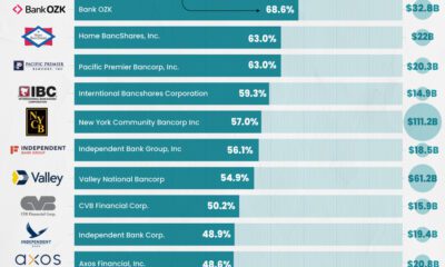
Here are the banks with the highest concentration of commercial real estate loans as the sector faces mounting pressures.


click for more →


Scan with your phone's camera or QR code app to view
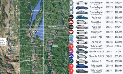

We visualize how far popular EV models will take you on real-world routes between major cities, and which are the most cost effective.
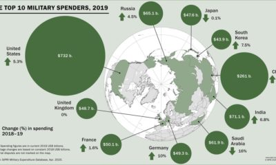

Global military spending surpassed $1.9 trillion in 2019, but nearly 75% of this total can be traced to just 10 countries.


This infographic delves into five major forces reshaping our world and the new rules of leadership that CEOs should follow as a result.
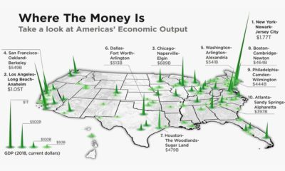

The total U.S. GDP stands at a whopping $21 trillion, but which metro areas contribute to the most in terms of economic output?
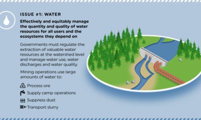

The responsible management of natural resources and ecosystems such as soils, plants, animals, water and air is central to becoming more sustainable.


This graphic looks at 29 different psychological tricks that marketers use to try and influence consumer behavior.
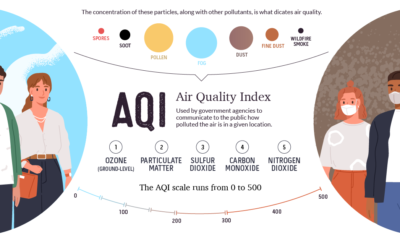

This graphic breaks down how the air quality index is measured, and looks at which regions are hardest hit by atmospheric pollution and wildfires.
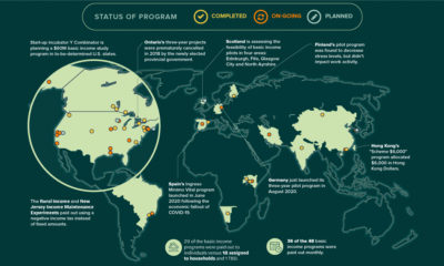

Amid the pandemic, the idea of Universal Basic Income has been gaining steam with policymakers. Where has it been tried, and has it worked?
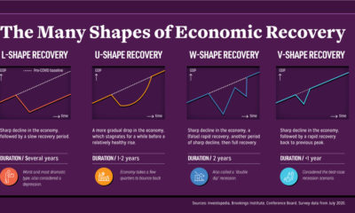

Economic recovery from COVID-19 could come in four shapes—L, U, W, and V. What do they mean, and what do global CEOs see as the most...


A lot can happen in an internet minute. This graphic looks at the enormous numbers behind the online services billions use every day.
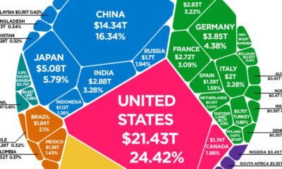

The world's total GDP crested $88 trillion in 2019—but how are the current COVID-19 economic contractions affecting its future outlook?

This interesting graphic gives an overview of the world’s most popular—and the highest paid—YouTubers in 187 different countries.

We’ve come a long way since Pangea. This short video examines the area, population, and GDP of our continents as a share of the world's total.
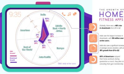

During lockdown, fitness apps have seen a huge spike in downloads worldwide. Which regions are driving this growth?
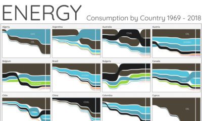

For the last 50 years, fossil fuels have dominated energy consumption. This chart looks at how the energy mix is changing in over 60+ countries.

Coming to our VC+ members in September: infographics on generational differences, a preview of chapters for our new book, and more!
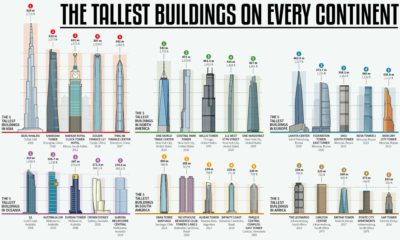

How much higher and further into the skies can we reach? This infographic looks at the most impressive skyscrapers gracing every continent.