Misc
The Growth of Home Fitness Apps


The Growth of Home Fitness Apps
Home fitness apps have been shaping our lives—and our glutes—long before COVID-19, but their popularity has truly surged in the last few months.
Which regions are driving this growth? And is home fitness here to stay, or will it fade away when the pandemic is over?
This graphic uses data from MoEngage and Apptopia to highlight the growth in home fitness apps across five different regions, representing 1.5 billion mobile app users. Note that the report uses data from Google’s Play Store and Apple’s App Store, so China was not included.
Growth, by Number of Downloads
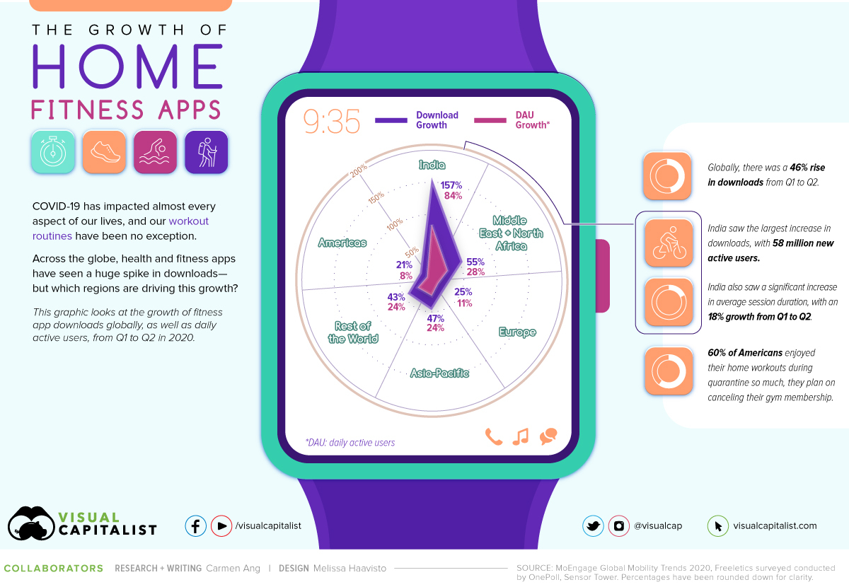
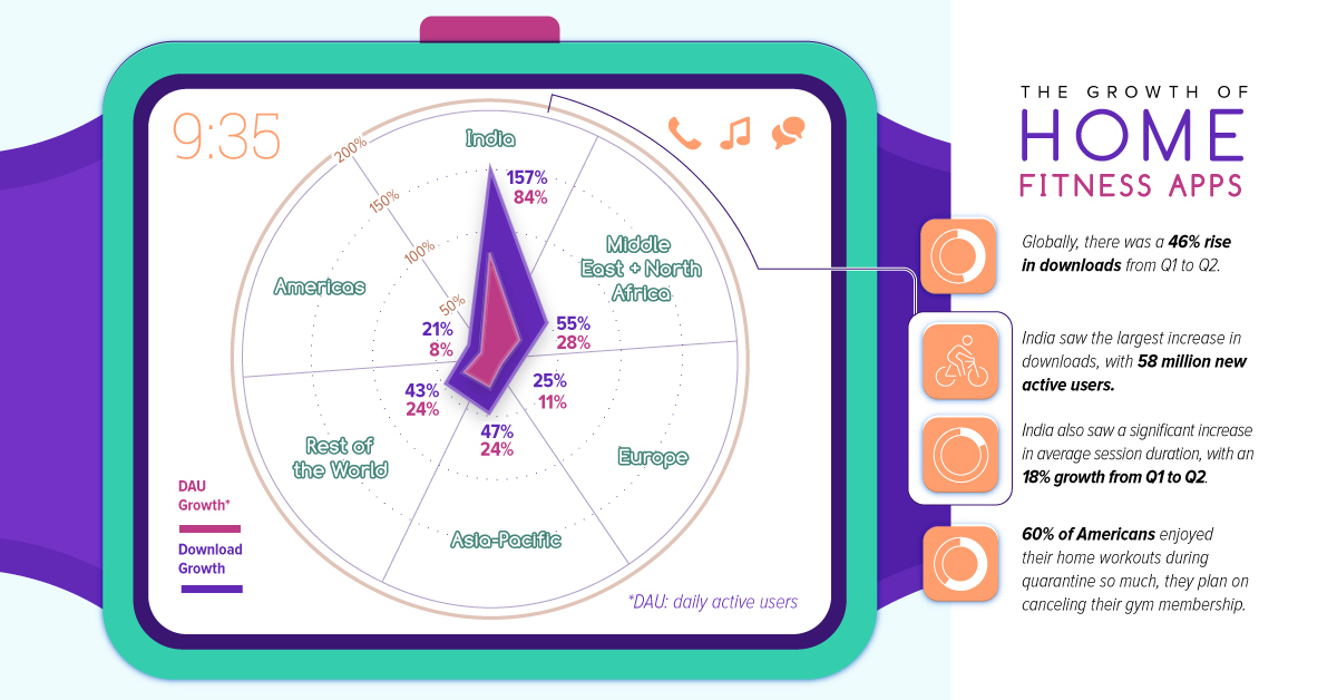
Between Q1 and Q2 2020, health and fitness app downloads grew by 46% worldwide. Here’s a look at the regional breakdown:
| Region | Download Growth |
|---|---|
| India | 157% |
| MENA | 55% |
| Europe | 25% |
| Asia-Pacific | 47% |
| Rest of the World | 43% |
| Americas | 21% |
India saw the highest increase in downloads, rising by 156%. That translates to 58 million new active users—almost the entire population of Italy.
This makes sense considering that India had the largest lockdown in the world—from March 25 to May 2020, 1.3 billion people were instructed to stay inside. That’s a lot of people who, quite suddenly, found themselves homebound.
The Middle East and North Africa (MENA) region saw the second highest growth in downloads, at a 55% increase, followed by Asia-Pacific with a 47% increase.
Growth, by Daily Active Users
Along with a surge in downloads, fitness apps also saw a rise in daily active users (DAUs). This is significant because it shows people weren’t just downloading these apps and forgetting about them—they were actually using them.
Globally, DAUs for fitness apps increased by 24% from Q1 to Q2. Here’s a look at the growth in each region:
| Region | DAU Growth |
|---|---|
| India | 84% |
| MENA | 28% |
| Europe | 11% |
| Asia-Pacific | 24% |
| Rest of the World | 24% |
| Americas | 8% |
As with downloads, India saw the largest increase in DAUs with an 84% increase, or 12 million new users. MENA saw the second-highest growth (which also aligns with downloads) at 28%.
In contrast, the Americas saw the smallest increase at just 8%—but this also may be a function of having more users to start with. Despite the lower growth rate than other regions, those who did adopt fitness apps in the Americas seemed to enjoy them, particularly in the United States.
According to a mid-year survey by OnePoll, 74% of Americans used at least one fitness app during quarantine, and 60% enjoyed their home workouts so much, they now plan on canceling their gym membership for good.
Top Grossing Health & Fitness Apps in Q2 2020
Which companies have been capitalizing on this trend? Here’s a look at the top-grossing health and fitness apps in Q2 2020, using data from Sensor Tower:
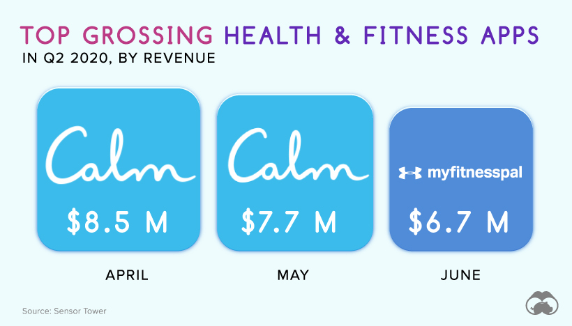
April was focused on mindfulness and meditation more than active workouts. Calm, an app for sleep, meditation, and relaxation, was the highest-grossing app at $8.5 million. Another popular mindfulness app came in second place—Headspace grossed $5.5 million. MyFitnessPal, used for tracking your diet and exercise, ranked third.
In May, meditation remained a primary focus. Calm grossed $7.7 million and kept its top spot as the highest-grossing health and fitness app, while MyFitnessPal ranked second with more than $6.5 million in gross revenue. Strava, an app with built-in GPS that tracks your workouts, came in at third place.
By June, people had shifted their focus to diet tracking and active workouts. MyFitnessPal took first place, grossing $6.7 million. Calm and Headspace came second and third, respectively.
Is Home Fitness Here to Stay?
During lockdown, gyms and fitness studios were left with no other choice than to increase their digital presence. Many started offering virtual classes, allowing members to access services from the comfort of their own homes.
Lockdown also inspired people to improve their home gyms and invest in home fitness equipment. Exercise equipment company Peloton has surged in popularity this year—it’s set to double its sales in 2020, with an estimated $1.8 billion in revenue by the end of the year.
With gyms online and fancy new equipment at home, will people maintain their lockdown workout routines even after the pandemic ends?


Misc
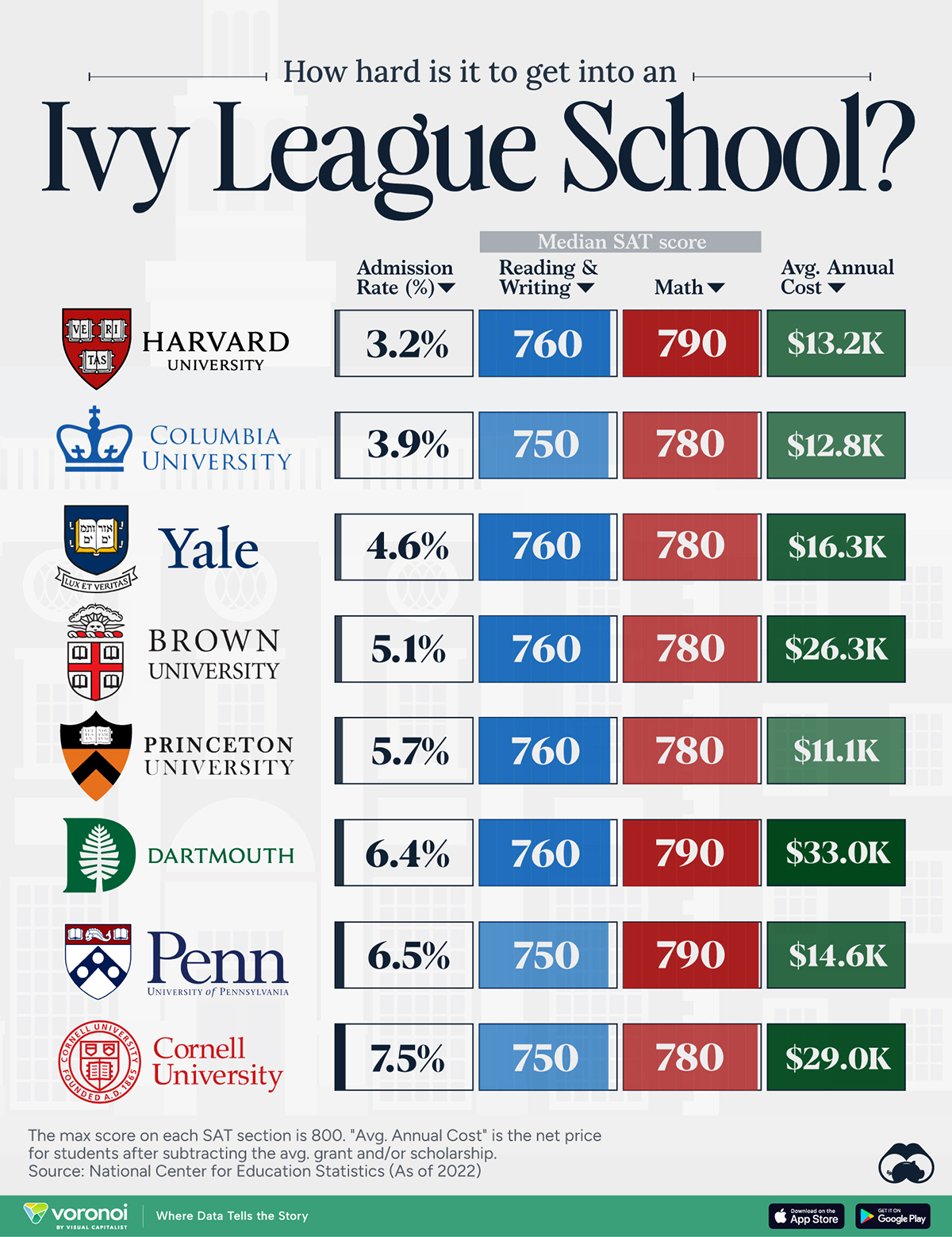
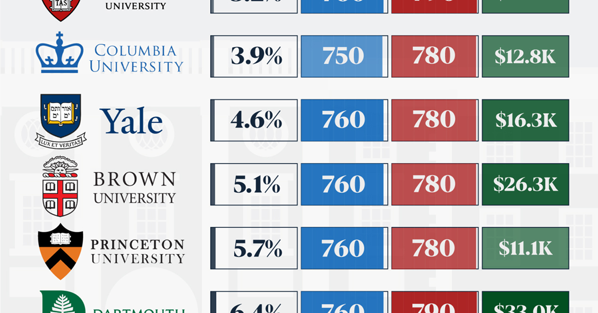
How Hard Is It to Get Into an Ivy League School?
We detail the admission rates and average annual cost for Ivy League schools, as well as the median SAT scores required to be accepted.
How Hard Is It to Get Into an Ivy League School?
This was originally posted on our Voronoi app. Download the app for free on iOS or Android and discover incredible data-driven charts from a variety of trusted sources.
Ivy League institutions are renowned worldwide for their academic excellence and long-standing traditions. But how hard is it to get into one of the top universities in the U.S.?
In this graphic, we detail the admission rates and average annual cost for Ivy League schools, as well as the median SAT scores required to be accepted. The data comes from the National Center for Education Statistics and was compiled by 24/7 Wall St.
Note that “average annual cost” represents the net price a student pays after subtracting the average value of grants and/or scholarships received.
Harvard is the Most Selective
The SAT is a standardized test commonly used for college admissions in the United States. It’s taken by high school juniors and seniors to assess their readiness for college-level academic work.
When comparing SAT scores, Harvard and Dartmouth are among the most challenging universities to gain admission to. The median SAT scores for their students are 760 for reading and writing and 790 for math. Still, Harvard has half the admission rate (3.2%) compared to Dartmouth (6.4%).
| School | Admission rate (%) | SAT Score: Reading & Writing | SAT Score: Math | Avg Annual Cost* |
|---|---|---|---|---|
| Harvard University | 3.2 | 760 | 790 | $13,259 |
| Columbia University | 3.9 | 750 | 780 | $12,836 |
| Yale University | 4.6 | 760 | 780 | $16,341 |
| Brown University | 5.1 | 760 | 780 | $26,308 |
| Princeton University | 5.7 | 760 | 780 | $11,080 |
| Dartmouth College | 6.4 | 760 | 790 | $33,023 |
| University of Pennsylvania | 6.5 | 750 | 790 | $14,851 |
| Cornell University | 7.5 | 750 | 780 | $29,011 |
*Costs after receiving federal financial aid.
Additionally, Dartmouth has the highest average annual cost at $33,000. Princeton has the lowest at $11,100.
While student debt has surged in the United States in recent years, hitting $1.73 trillion in 2023, the worth of obtaining a degree from any of the schools listed surpasses mere academics. This is evidenced by the substantial incomes earned by former students.
Harvard grads, for example, have the highest average starting salary in the country, at $91,700.

-

 Real Estate2 weeks ago
Visualizing America’s Shortage of Affordable Homes
-

 Technology1 week ago
Ranked: Semiconductor Companies by Industry Revenue Share
-

 Money1 week ago
Which States Have the Highest Minimum Wage in America?
-

 Real Estate1 week ago
Ranked: The Most Valuable Housing Markets in America
-

 Business1 week ago
Charted: Big Four Market Share by S&P 500 Audits
-

 AI1 week ago
The Stock Performance of U.S. Chipmakers So Far in 2024
-

 Misc2 weeks ago
Almost Every EV Stock is Down After Q1 2024
-

 Money2 weeks ago
Where Does One U.S. Tax Dollar Go?