Maps
The Incredible Historical Map That Changed Cartography
View the full-size version of this graphic
The Incredible Historical Map That Changed Cartography
This map is the latest in our Vintage Viz series, which presents historical visualizations along with the context needed to understand them.
In a one-paragraph story called On Exactitude in Science (Del Rigor en la Ciencia), Jorge Luis Borges imagined an empire where cartography had reached such an exact science that only a map on the same scale of the empire would suffice.
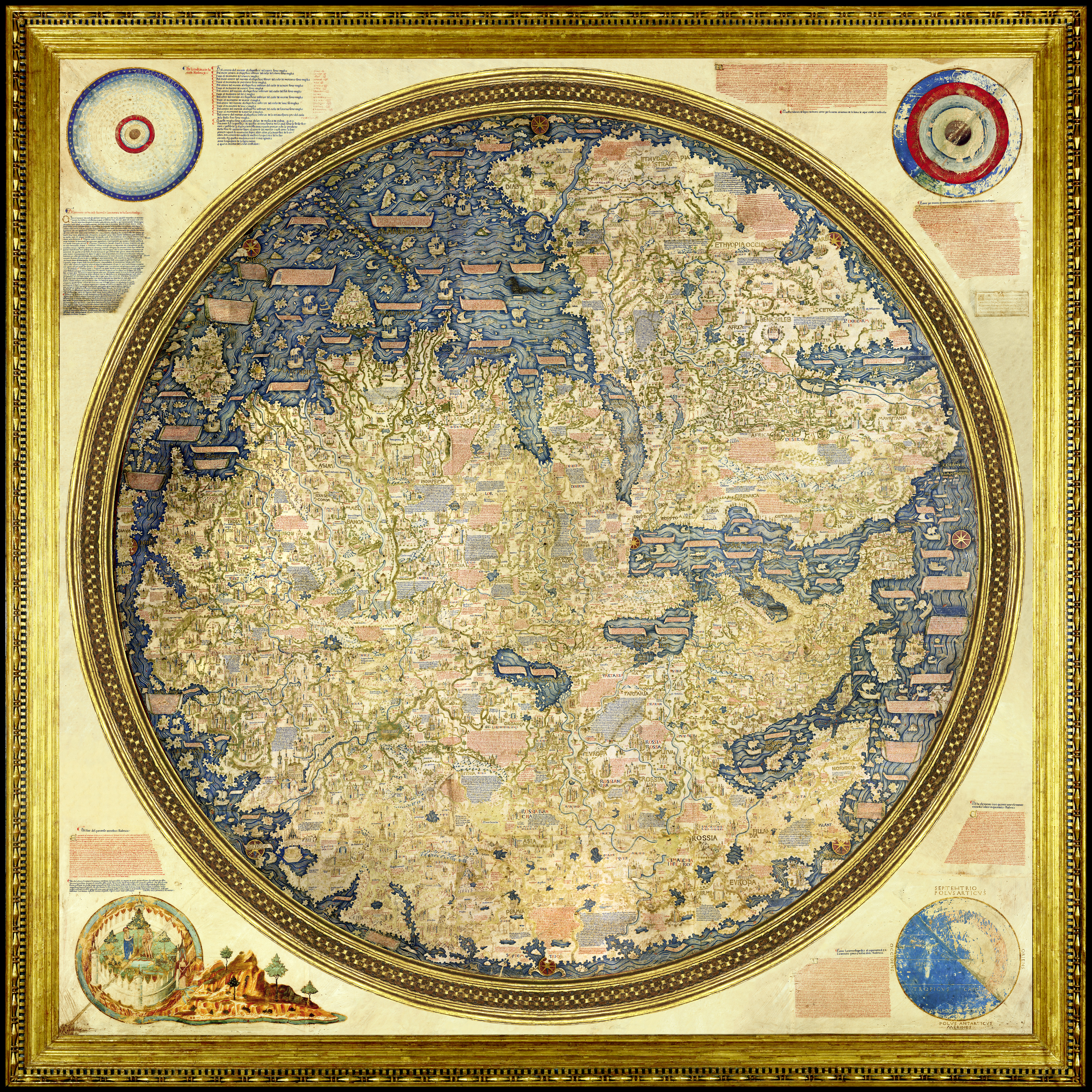
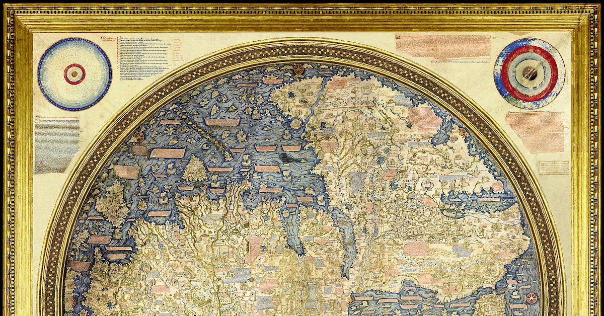
The Fra Mauro Mappa Mundi (c. 1450s), named for the lay Camaldolite monk and cartographer whose Venetian workshop created it, is not nearly as large, at a paltry 77 inches in diameter (196 cm). But its impact and significance as a bridge between Middle Age and Renaissance thought certainly rivaled Borges’ imagined map.
One of ‘the Wonders of Venice’
Venice was the undisputed commercial power in the Mediterranean, whose trade routes connected east and west, stretching to Flanders, London, Algeria, and beyond.
This network was protected by fleets of warships built at the famous Arsenale di Venezia, the largest production facility in the West, whose workforce of thousands of arsenalotti built ships on an assembly line, centuries before Henry Ford.
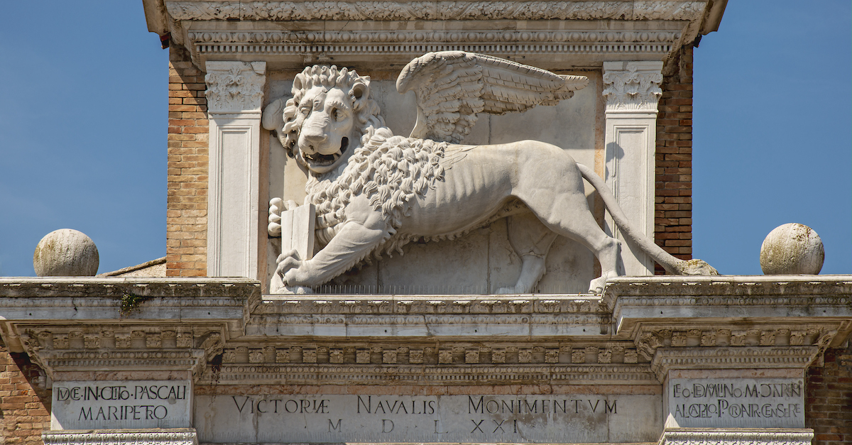
The lion of St Mark guards the land gate to the Arsenale di Venezia, except instead of the usual open bible in its hands offering peace, this book is closed, reflecting its martial purpose. Source: Wikipedia
The Mappa Mundi (literally “map of the world”) was considered one of the wonders of Venice with a reputation that reached the Holy Land. It is a circular planisphere drawn on four sheets of parchment, mounted onto three poplar panels and reinforced by vertical battens.
The map is painted in rich reds, golds, and blues; this last pigment was obtained from rare lapis lazuli, imported from mines in Afghanistan. At its corners are four spheres showing the celestial and sublunar worlds, the four elements (earth, air, fire, and water), and an illumination of the Garden of Eden by Leonardo Bellini (active 1443-1490).
Japan (on the left edge, called the Isola de Cimpagu) appears here for the first time in a Western map. And contradicting Ptolemaic tradition, it also shows that it was possible to circumnavigate Africa, presaging the first European journey around the Cape of Good Hope by the Portuguese explorer Bartolomeu Dias in 1488.
NASA called the historical map “stunning” in its accuracy.
A Historical Map Between Two Worlds
Medieval maps, like the Hereford Mappa Mundi (c. 1300), were usually oriented with east at the top, because that’s where the Garden of Eden was thought to be. Fra Mauro, however, chose to orient his to the south, perhaps following Muslim geographers such as Muhammad ibn Muhammad al-Idrisi.
Significantly, the Garden of Eden is placed outside of geographic space and Jerusalem is no longer at the center, though it is still marked by a windrose. The nearly 3,000 place names and descriptions are written in the Venetian vernacular, rather than Latin.
At the same time, as much as Fra Mauro’s map is a departure from the past, it also retains traces of a medieval Christian worldview. For example, included on the map are the Kingdom of the Magi, the Kingdom of Prester John, and the Tomb of Adam.
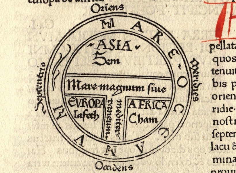
Isidore of Seville, Etymologiae (c. 600–625). Source: Wikipedia
The circular planisphere also follows the medieval T-O schema, first described by Isidore of Seville, with Asia occupying the top half of the circle, and Europe and Africa each occupying the bottom two quarters (Fra Mauro turns the ‘T’ on its side, to reflect a southern orientation). Around the circle, are many islands, beyond which is the “dark sea” where only shipwreck and misfortune await.
Fra Mauro’s Legacy
Fra Mauro died some time before 20 October 1459, and unfortunately his contributions fell into obscurity soon thereafter; until 1748, it was believed that the Mappa Mundi was a copy of a lost map by Marco Polo.
In 1811, the original was moved from Fra Mauro’s monastery of San Michele to the Biblioteca Nazionale Marciana, following the suppression of religious orders in the Napoleonic era, where it can be viewed today.
Two digital editions have also been produced by the Museo Galileo and the Engineering Historical Memory project, where readers can get a glimpse into a fascinating piece of cartographic history.


Maps
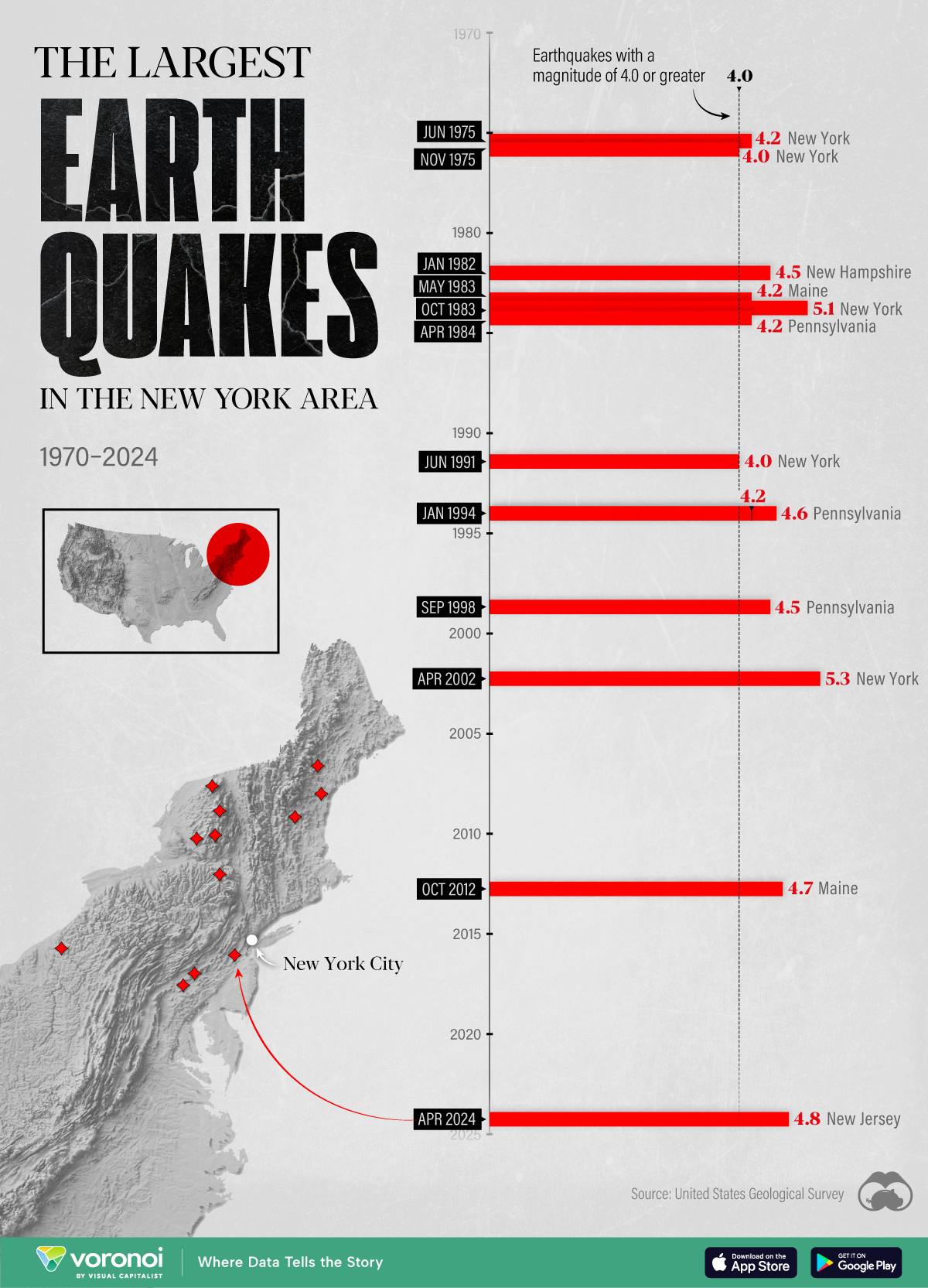
The Largest Earthquakes in the New York Area (1970-2024)
The earthquake that shook buildings across New York in April 2024 was the third-largest quake in the Northeast U.S. over the past 50 years.
The Largest Earthquakes in the New York Area
This was originally posted on our Voronoi app. Download the app for free on Apple or Android and discover incredible data-driven charts from a variety of trusted sources.
The 4.8 magnitude earthquake that shook buildings across New York on Friday, April 5th, 2024 was the third-largest quake in the U.S. Northeast area over the past 50 years.
In this map, we illustrate earthquakes with a magnitude of 4.0 or greater recorded in the Northeastern U.S. since 1970, according to the United States Geological Survey (USGS).
Shallow Quakes and Older Buildings
The earthquake that struck the U.S. Northeast in April 2024 was felt by millions of people from Washington, D.C., to north of Boston. It even caused a full ground stop at Newark Airport.
The quake, occurring just 5 km beneath the Earth’s surface, was considered shallow, which is what contributed to more intense shaking at the surface.
According to the USGS, rocks in the eastern U.S. are significantly older, denser, and harder than those on the western side, compressed by time. This makes them more efficient conduits for seismic energy. Additionally, buildings in the Northeast tend to be older and may not adhere to the latest earthquake codes.
Despite disrupting work and school life, the earthquake was considered minor, according to the Michigan Technological University magnitude scale:
| Magnitude | Earthquake Effects | Estimated Number Each Year |
|---|---|---|
| 2.5 or less | Usually not felt, but can be recorded by seismograph. | Millions |
| 2.5 to 5.4 | Often felt, but only causes minor damage. | 500,000 |
| 5.5 to 6.0 | Slight damage to buildings and other structures. | 350 |
| 6.1 to 6.9 | May cause a lot of damage in very populated areas. | 100 |
| 7.0 to 7.9 | Major earthquake. Serious damage. | 10-15 |
| 8.0 or greater | Great earthquake. Can totally destroy communities near the epicenter. | One every year or two |
The largest earthquake felt in the area over the past 50 years was a 5.3 magnitude quake that occurred in Au Sable Forks, New York, in 2002. It damaged houses and cracked roads in a remote corner of the Adirondack Mountains, but caused no injuries.
| Date | Magnitude | Location | State |
|---|---|---|---|
| April 20, 2002 | 5.3 | Au Sable Forks | New York |
| October 7, 1983 | 5.1 | Newcomb | New York |
| April 5, 2024 | 4.8 | Whitehouse Station | New Jersey |
| October 16, 2012 | 4.7 | Hollis Center | Maine |
| January 16, 1994 | 4.6 | Sinking Spring | Pennsylvania |
| January 19, 1982 | 4.5 | Sanbornton | New Hampshire |
| September 25, 1998 | 4.5 | Adamsville | Pennsylvania |
| June 9, 1975 | 4.2 | Altona | New York |
| May 29, 1983 | 4.2 | Peru | Maine |
| April 23, 1984 | 4.2 | Conestoga | Pennsylvania |
| January 16, 1994 | 4.2 | Sinking Spring | Pennsylvania |
| November 3, 1975 | 4 | Long Lake | New York |
| June 17, 1991 | 4 | Worcester | New York |
The largest earthquake in U.S. history, however, was the 1964 Good Friday quake in Alaska, measuring 9.2 magnitude and killing 131 people.

-

 Energy6 days ago
Mapped: The Age of Energy Projects in Interconnection Queues, by State
-

 AI2 weeks ago
Visualizing AI Patents by Country
-

 Markets2 weeks ago
Economic Growth Forecasts for G7 and BRICS Countries in 2024
-

 Wealth2 weeks ago
Charted: Which City Has the Most Billionaires in 2024?
-

 Technology1 week ago
All of the Grants Given by the U.S. CHIPS Act
-

 Green1 week ago
The Carbon Footprint of Major Travel Methods
-

 United States1 week ago
Visualizing the Most Common Pets in the U.S.
-

 Culture1 week ago
The World’s Top Media Franchises by All-Time Revenue