Misc
Histomap: Visualizing the 4,000 Year History of Global Power
Imagine creating a timeline of your country’s whole history stretching back to its inception.
It would be no small task, and simply weighing the relative importance of so many great people, technological achievements, and pivotal events would be a tiny miracle in itself.
While that seems like a challenge, imagine going a few steps further. Instead of a timeline for just one country, what about creating a graphical timeline showing the history of the entire world over a 4,000 year time period, all while having no access to computers or the internet?
An All-Encompassing Timeline?
Today’s infographic, created all the way back in 1931 by a man named John B. Sparks, maps the ebb and flow of global power going all the way back to 2,000 B.C. on one coherent timeline.
View a high resolution version of this graphic
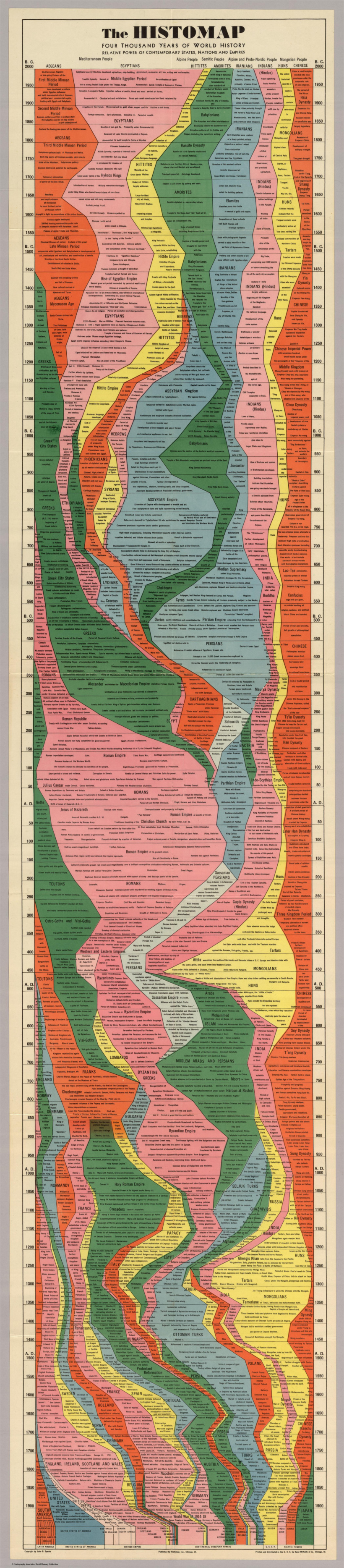
Histomap, published by Rand McNally in 1931, is an ambitious attempt at fitting a mountain of historical information onto a five-foot-long poster. The poster cost $1 at the time, which would equal approximately $18 when accounting for inflation.
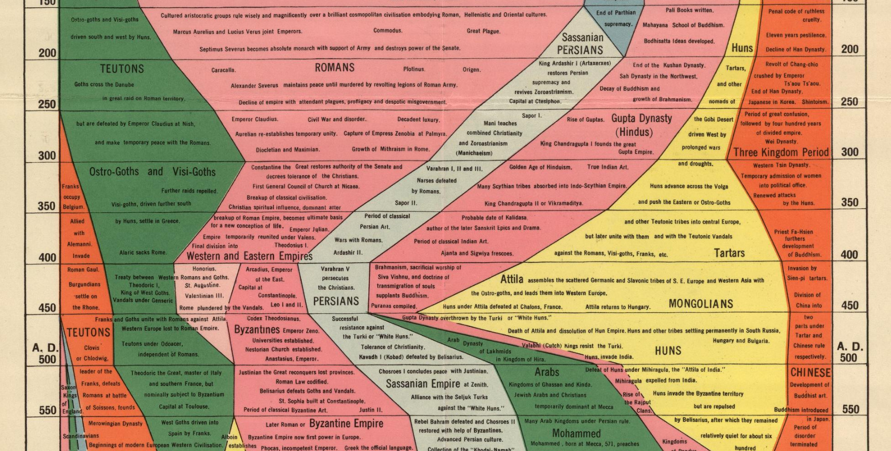
Although the distribution of power is not quantitatively defined on the x-axis, it does provide a rare example of looking at historic civilizations in relative terms. While the Roman Empire takes up a lot of real estate during its Golden Age, for example, we still get a decent look at what was happening in other parts of the world during that period.
The visualization is also effective at showing the ascent and decline of various competing states, nations, and empires. Did Sparks see world history as a zero-sum exercise; a collection of nations battling one another for control over scarce territory and resources?
Timeline Caveats
Crowning a world leader at certain points in history is relatively easy, but divvying up influence or power to everyone across 4,000 years requires some creativity, and likely some guesswork, as well. Some would argue that the lack of hard data makes it impossible to draw these types of conclusions (though there have been other more quantitative approaches.)
Another obvious criticism is that the measures of influence are skewed in favor of Western powers. China’s “seam”, for example, is suspiciously thin throughout the length of the timeline. Certainly, the creator’s biases and blind spots become more apparent in the information-abundant 21st century.
Lastly, Histomap refers to various cultural and racial groups using terms that may seem rather dated to today’s viewers.
The Legacy of Histomap
John Spark’s creation is an admirable attempt at making history more approachable and entertaining. Today, we have seemingly limitless access to information, but in the 1930s an all encompassing timeline of history would have been incredibly useful and groundbreaking. Indeed, the map’s publisher characterized the piece as a useful tool for examining the correlation between different empires during points in history.

Critiques aside, work like this paved the way for the production of modern data visualizations and charts that help people better understand the world around them today.
Without a map who would attempt to study geography? –John B. Sparks
This post was first published in 2017. We have since updated it, adding in new content for 2021.


Misc
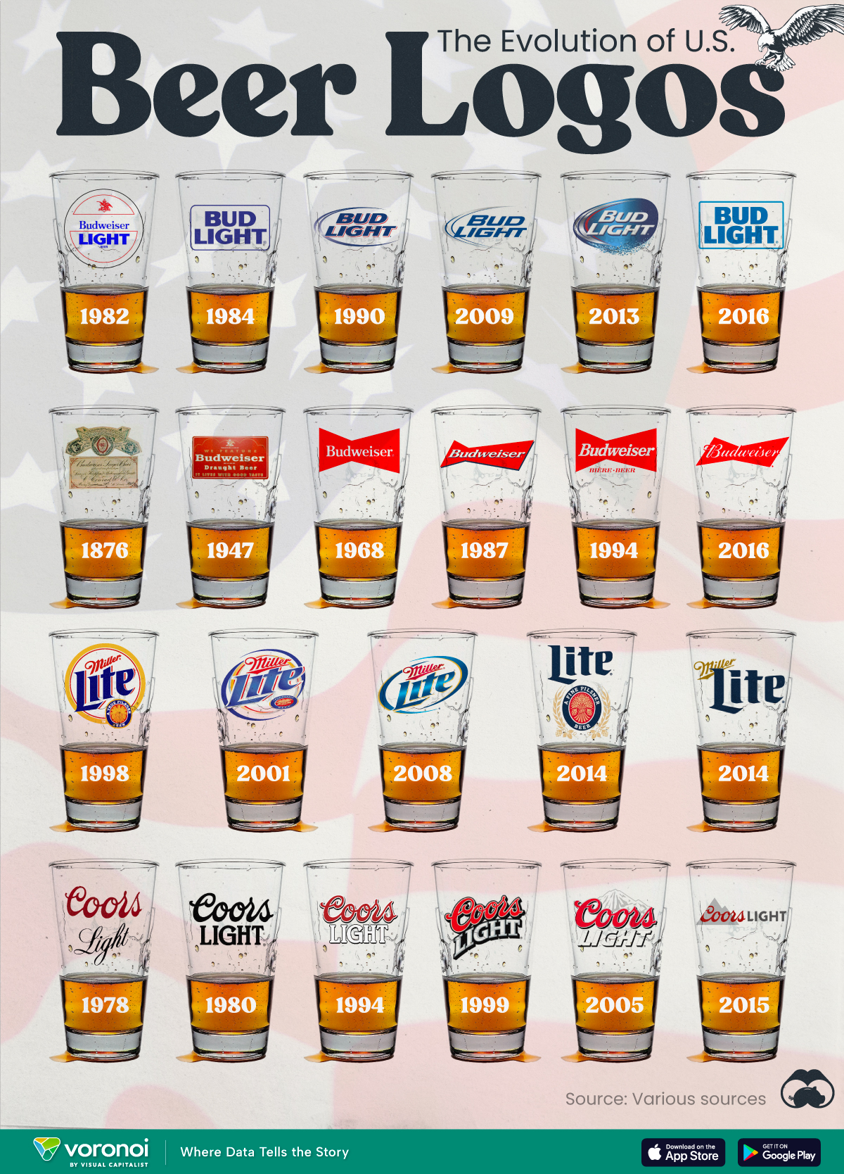
The Evolution of U.S. Beer Logos
In this graphic, we analyze the evolution of popular U.S. beer logos like Budweiser, Coors Light, Bud Light, and more.

The Evolution of U.S. Beer Logos
This was originally posted on our Voronoi app. Download the app for free on iOS or Android and discover incredible data-driven charts from a variety of trusted sources.
Despite selling a popular product, beer companies have to be creative to stand out in a competitive market.
In this graphic, we analyze the evolution of some U.S. beer logos based on various sources. We chose brands based on a mixture of criteria, including popularity (based on YouGov surveys), availability of logo assets, and those with interesting developments.
Bud Light Back to the ’80s
Despite recent backlash and calls for a boycott after sending a commemorative can to transgender influencer Dylan Mulvaney, Bud Light remains one of America’s best-selling beers.
The brand of light beer, owned by the Anheuser-Busch company, has switched from its more circular logo with italic letters adopted in the 1990s back to the Bud Light badge of the 1980s. It is composed of heavy uppercase lettering, written in two levels in a shade of blue with the inscription placed on a solid white background and enclosed in a thin rectangular frame.
Miller Lite Goes Old School
After following a similar approach to Bud Light’s branding throughout the 2000s, Miller Lite decided to undergo a major rebranding in 2014.
The company returned to its 1970s roots, once again combining a white can with its original blue, gold, and red logo. The redesign was largely considered a success, given that Miller Lite sales immediately increased following the change.
A Symbol of American Brewing
The oldest brand on our U.S. beer list, the Budweiser logo, has undergone more than 15 changes over the years.
The design of two connected triangles represents a red bow tie, as a symbol of American brewing.
The colors of the Budweiser logo include a vibrant red, which helps the logo stand out and be easily recognizable from a distance. Studies also suggest that the color red stimulates appetite. Meanwhile, the white inscription symbolizes purity and cleanliness.
Curious to learn more about the beer market? Check out this graphic about global beer consumption.

-

 Business6 days ago
The Top Private Equity Firms by Country
-

 Countries2 weeks ago
Countries With the Largest Happiness Gains Since 2010
-

 Economy2 weeks ago
VC+: Get Our Key Takeaways From the IMF’s World Economic Outlook
-

 Demographics2 weeks ago
The Countries That Have Become Sadder Since 2010
-

 Money2 weeks ago
Charted: Who Has Savings in This Economy?
-

 Technology2 weeks ago
Visualizing AI Patents by Country
-

 Economy2 weeks ago
Economic Growth Forecasts for G7 and BRICS Countries in 2024
-

 Wealth1 week ago
Charted: Which City Has the Most Billionaires in 2024?