

Lions, tigers, and bears, oh my!—these animals do not feature on this list of popular American household pets.
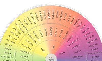

For years, humans have attempted to categorize and codify human emotion. Here are those attempts, visualized.
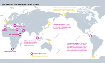

Ocean shipping is the primary mode of international trade. This map identifies maritime choke points that pose a risk to this complex logistic network.
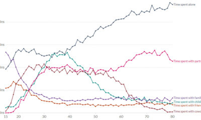

Ever wondered who Americans spend the most time with? This chart assesses how many minutes per day Americans spend with different people.
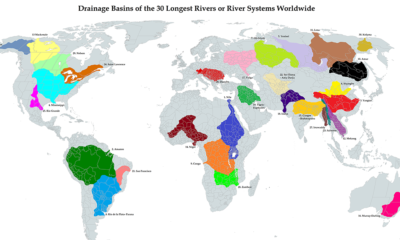

This unique map illustrates the immense size of drainage basins that feed the world's longest river systems
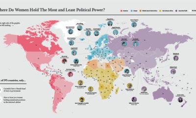

Where do women hold the most ministerial positions? In this map, we look at women's political power by country, and key positions held by women.


From artwork to rare whiskeys, see which categories of luxury investment were the most popular in 2020 across nine global regions.
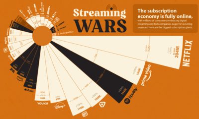

From Netflix and Disney+ to Spotify and Apple Music, we rank the streaming services with the most monthly paid subscriptions.
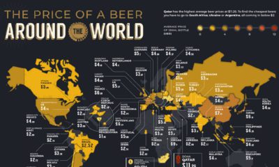

The global desire for beer prevails even in a pandemic. These maps compare the average beer price in 58 countries—just how much do we drink?
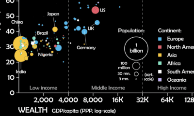

This unique animated visualization uses health and wealth measurements to chart the evolution of countries over time.
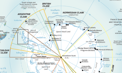

Antarctica is the most inhospitable region on Earth, but that hasn't stopped countries from making territorial claims. This maps shows them all.


