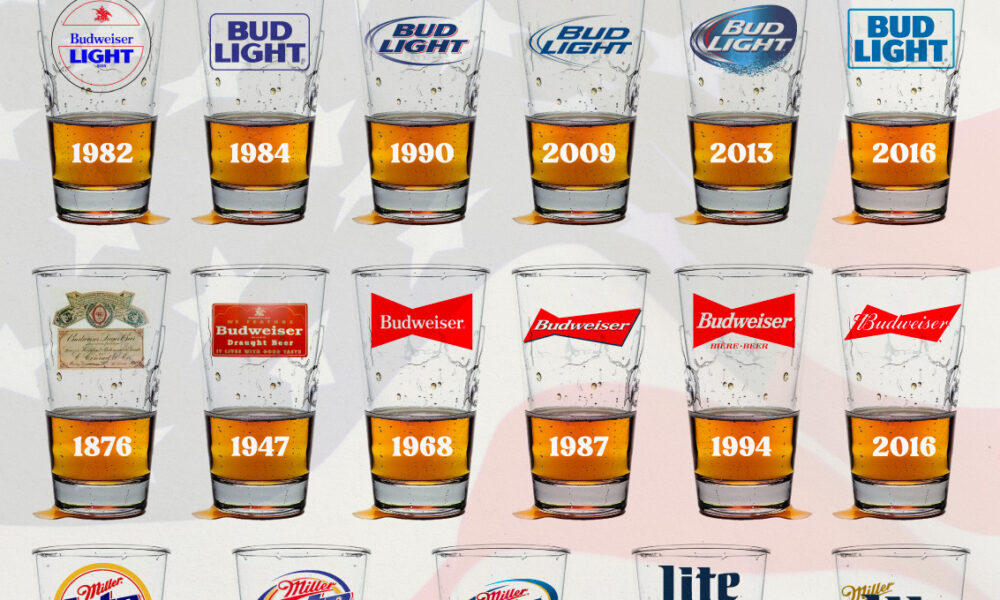
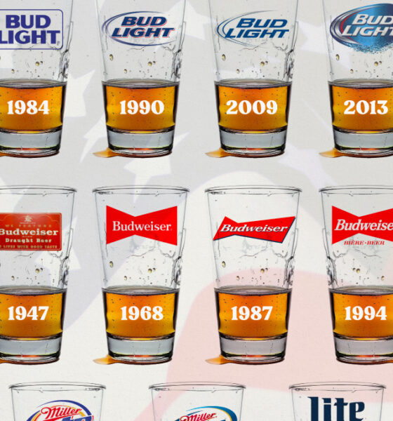
In this graphic, we analyze the evolution of popular U.S. beer logos like Budweiser, Coors Light, Bud Light, and more.
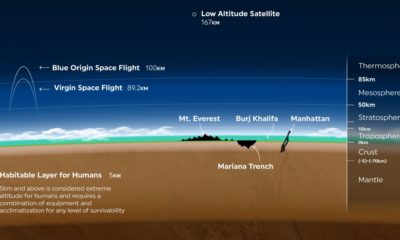

Earth’s atmosphere is thousands of miles long, but only a fraction can sustain life. Here's a look at how small Earth's habitable zone is.


Athletes pull huge sums of money from their on-field and off-field contracts. Here we rank the top 50 highest-paid athletes in the world.
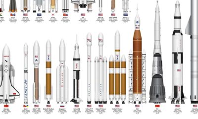

This infographic sizes up different rockets used to explore space, from the USSR's Soyuz to the SpaceX Starship.
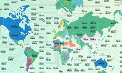

Learning a new language has become a popular hobby during the pandemic. Here’s a look at the most popular languages people wanted to learn around the...
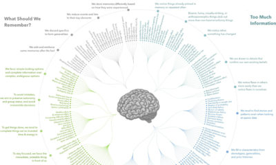

Here's all 188 cognitive biases in existence, grouped by how they impact our thoughts and actions. We also give some specific cognitive bias examples.
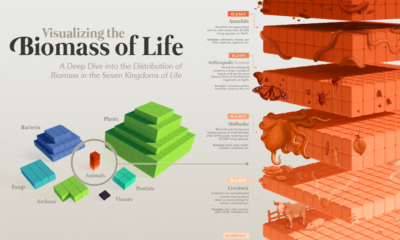

Our planet supports nearly 8.7 million species. We break down the total composition of the living world in terms of its biomass.
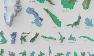

See the world's 100 biggest islands in a side-by-side comparison. Then, we look to see which islands have the highest population densities.
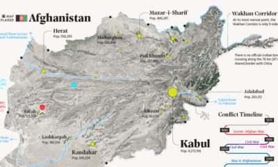

This map explainer looks at Afghanistan from a structural point of view, delving into geography and population patterns.
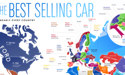

From American trucks to European sedans, this map shows the best-selling vehicles in the world.
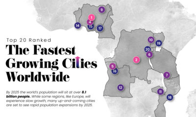

Nearly 60% of the world's population lives in cities and this trend is not slowing down—take a look at the world's 20 fastest growing cities.


