Misc
This is the Language Each Country Wants to Learn the Most
This is the Language Each Country Wants to Learn the Most
When it came to choosing a new hobby during COVID-19 lockdowns, learning a new language was a popular choice—in March 2020, the language app Duolingo saw a 300% boost in new users.
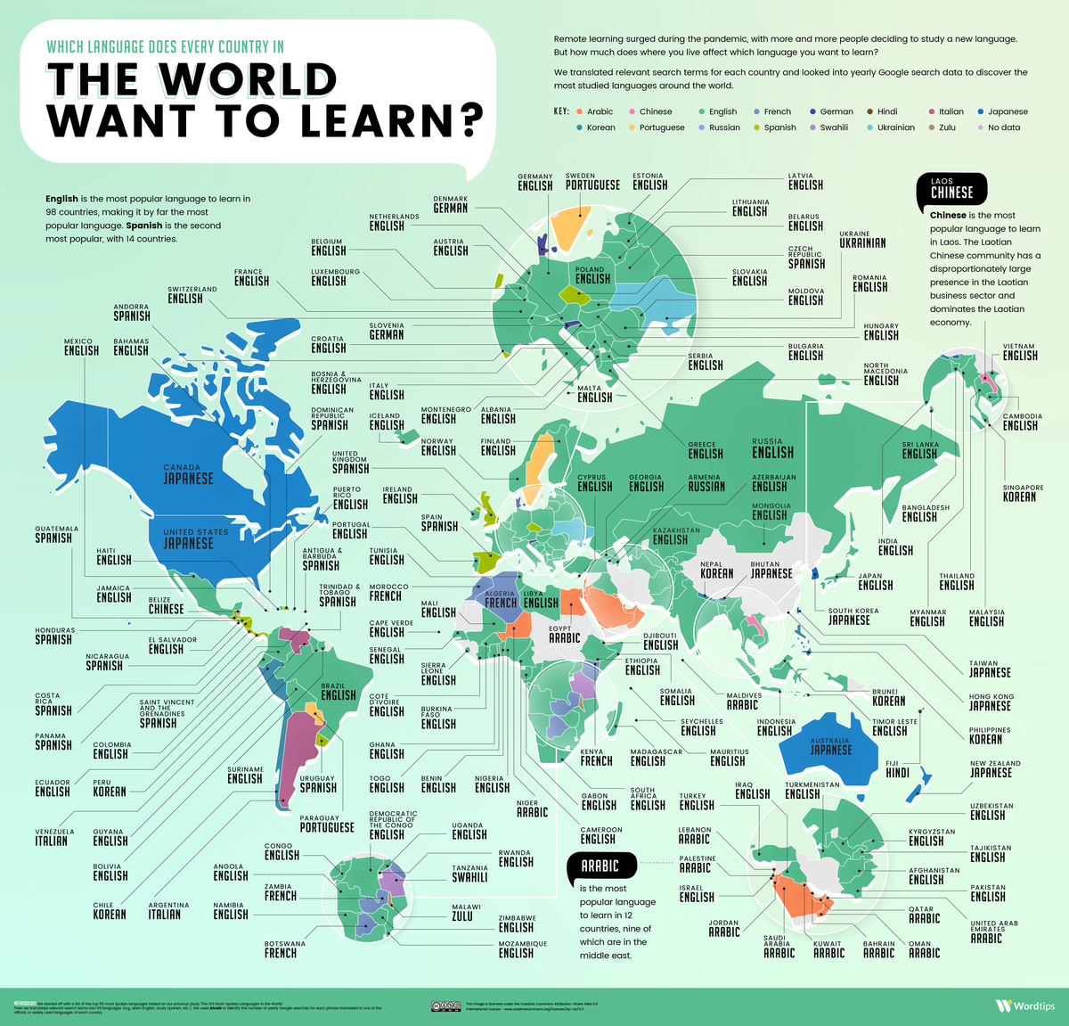
But which languages were the most popular to learn in each country? This graphic by Wordtips maps the most popular language learning choices around the globe.
To find out which countries wanted to learn which languages, Wordtips used Google’s Keyword Planner, and tallied the number of searches for ‘learn x language’ (translated into different languages) in every country from May 2020 to May 2021.
Most Desired Languages to Learn in North America
Interestingly, Japanese is the most popular language that Americans and Canadians want to learn.
While this may sound surprising, North Americans have consumed and adored Japanese pop culture since the early 1990s. And recently, Westerners’ interest in anime has grown even more prominent, with the demand for anime programs in the U.S., for Q1 of 2021, up 33% compared to a year prior.
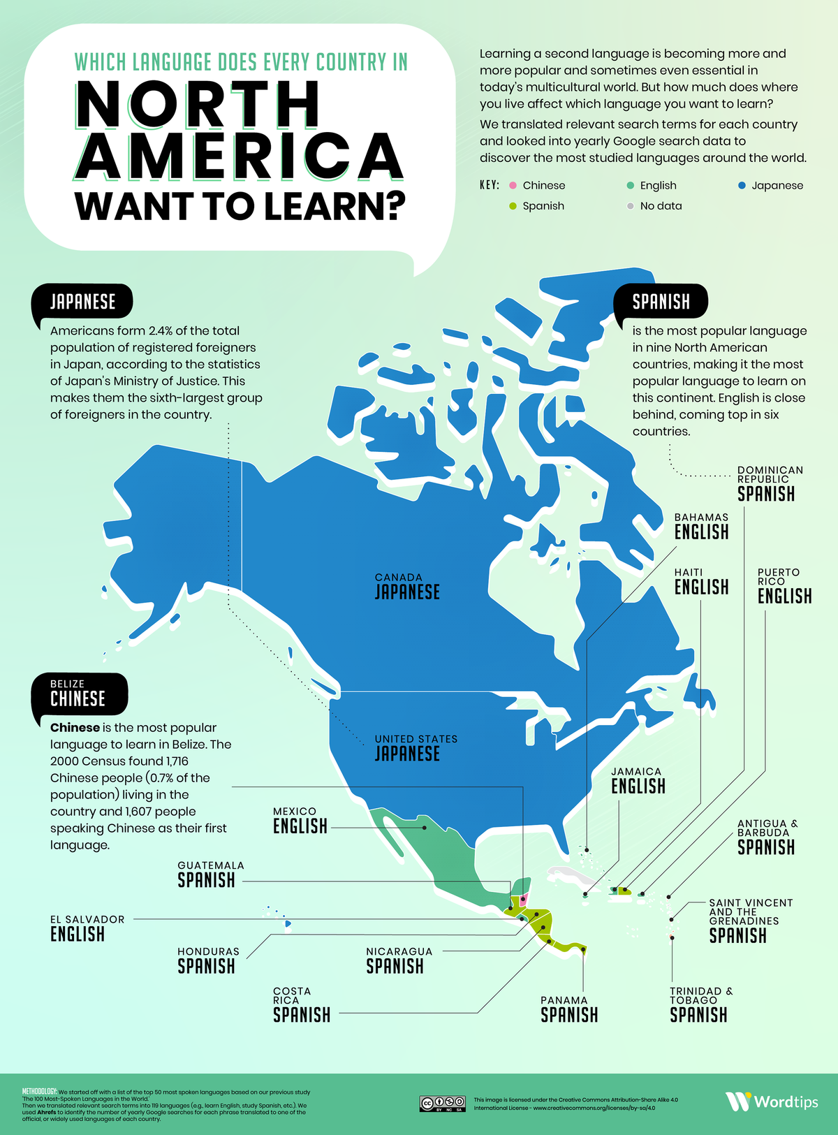
Another country’s top pick that may come as a surprise is Belize, where the most popular language to learn is Chinese.
According to the 2000 Census, almost 1% of the country’s population identifies as Chinese. Chinese immigration to Belize began in the mid-1800s, when Chinese immigrants were brought into the country (then known as British Honduras) as laborers.
More recently, a wave of Taiwanese migrants have immigrated and set up businesses in Belize, as part of Taiwan’s international development efforts.
Meanwhile in South America, both Peru and Chile showed a strong desire to learn Korean. The popularity of K-Pop in South America demonstrates how media and art can help spread languages far beyond their original borders, and sometimes in unexpected places.
Most Desired Languages to Learn in Europe
English is the most popular language across Europe, as it’s the top searched language in 34 European countries.
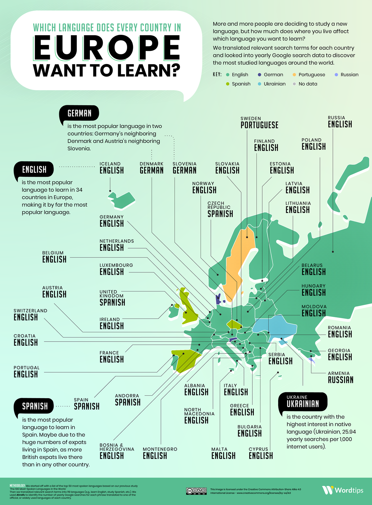
But a few countries differ from the norm—for instance, German is the most popular language to learn in Denmark. In a small Southern region of Denmark, German is the official minority language. And according to World Atlas, up to 20,000 ethnic Germans live in the area, with about 8,000 speaking standard German as their native tongue.
In the UK, Spanish takes the top spot. But more interestingly, Spanish is also Spain’s most popular language to learn, which seems counterintuitive. However, it could be because of Spain’s high concentration of British expats. According to BBC News, there are more than 300,000 British expats currently living in Spain.
Top Languages Spoken Worldwide
While English is the most popular language to learn in various countries, it’s also the most spoken language worldwide, with approximately 1.1 billion total speakers—that’s roughly 15% of the global population.
| Rank | Language | Total Speakers |
|---|---|---|
| 1 | English | 1,132 million |
| 2 | Mandarin Chinese | 1,117 million |
| 3 | Hindi | 615 million |
| 4 | Spanish | 534 million |
| 5 | French | 280 million |
| 6 | Standard Arabic | 274 million |
| 7 | Bengali | 265 million |
| 8 | Russian | 258 million |
| 9 | Portuguese | 234 million |
| 10 | Indonesian | 199 million |
And with more people interested in learning English, it looks like it could remain the world’s lingua franca (a common language among people who don’t speak the same native language) for years to come.


United States
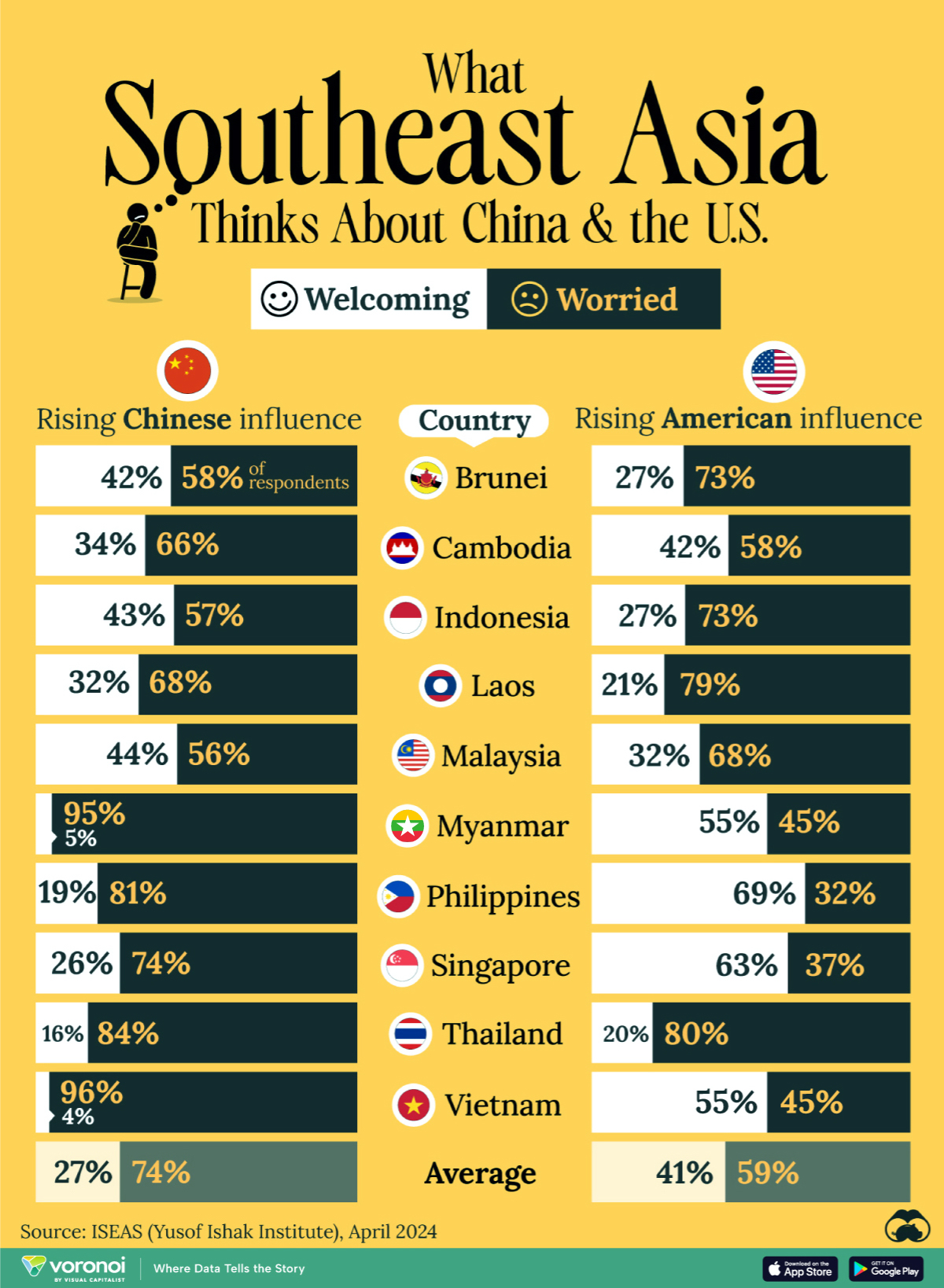
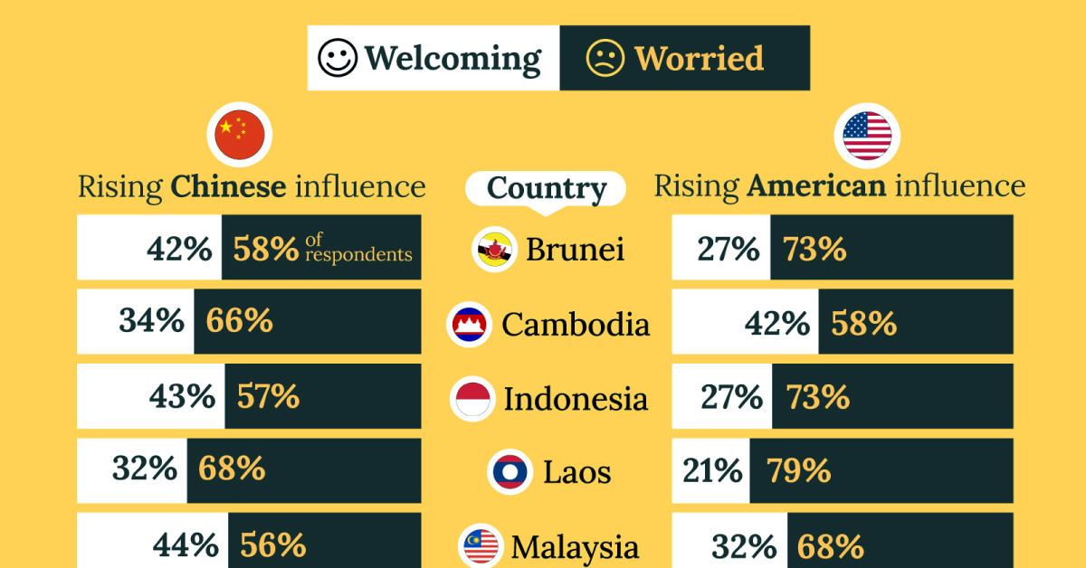
Charted: What Southeast Asia Thinks About China & the U.S.
A significant share of respondents from an ASEAN-focused survey are not happy about rising American and Chinese influence in the region.
What Southeast Asia Thinks About China & the U.S.
This was originally posted on our Voronoi app. Download the app for free on iOS or Android and discover incredible data-driven charts from a variety of trusted sources.
This chart visualizes the results of a 2024 survey conducted by the ASEAN Studies Centre at the ISEAS-Yusof Ishak Institute. Nearly 2,000 respondents were asked if they were worried or welcoming of rising Chinese and American geopolitical influence in their country.
The countries surveyed all belong to the Association of Southeast Asian Nations (ASEAN), a political and economic union of 10 states in Southeast Asia.
Feelings Towards China
On average, a significant share of respondents from all 10 countries are worried about rising influence from both the U.S. and China.
However, overall skepticism is higher for China, at 74% (versus 59% for U.S.).
| Country | Worried About Growing 🇨🇳 Influence | Welcome Growing 🇨🇳 Influence |
|---|---|---|
| 🇧🇳 Brunei | 58% | 42% |
| 🇰🇭 Cambodia | 66% | 34% |
| 🇮🇩 Indonesia | 57% | 43% |
| 🇱🇦 Laos | 68% | 32% |
| 🇲🇾 Malaysia | 56% | 44% |
| 🇲🇲 Myanmar | 95% | 5% |
| 🇵🇭 Philippines | 81% | 19% |
| 🇸🇬 Singapore | 74% | 26% |
| 🇹🇭 Thailand | 84% | 16% |
| 🇻🇳 Vietnam | 96% | 4% |
| Average | 74% | 27% |
The recently-cooled but still active territorial concerns over the South China Sea may play a significant role in these responses, especially in countries which are also claimants over the sea.
For example, in Vietnam over 95% of respondents said they were worried about China’s growing influence.
Feelings Towards America
Conversely, rising American influence is welcomed in two countries with competing claims in the South China Sea, the Philippines (69%) and Vietnam (55%).
| Country | Worried About Growing 🇺🇸 Influence | Welcome Growing 🇺🇸 Influence |
|---|---|---|
| 🇧🇳 Brunei | 73% | 27% |
| 🇰🇭 Cambodia | 58% | 42% |
| 🇮🇩 Indonesia | 73% | 27% |
| 🇱🇦 Laos | 79% | 21% |
| 🇲🇾 Malaysia | 68% | 32% |
| 🇲🇲 Myanmar | 45% | 55% |
| 🇵🇭 Philippines | 32% | 69% |
| 🇸🇬 Singapore | 37% | 63% |
| 🇹🇭 Thailand | 80% | 20% |
| 🇻🇳 Vietnam | 45% | 55% |
| Average | 59% | 41% |
Despite this, on a regional average, more respondents worry about growing American influence (59%) than they welcome it (41%).
Interestingly, it seems almost every ASEAN nation has a clear preference for one superpower over the other.
The only exception is Thailand, where those surveyed were not a fan of either option, with 84% worried about China, and 80% worried about the U.S.

-

 Culture7 days ago
The World’s Top Media Franchises by All-Time Revenue
-

 Science2 weeks ago
Visualizing the Average Lifespans of Mammals
-

 Brands2 weeks ago
How Tech Logos Have Evolved Over Time
-

 Energy2 weeks ago
Ranked: The Top 10 EV Battery Manufacturers in 2023
-

 Countries2 weeks ago
Countries With the Largest Happiness Gains Since 2010
-

 Economy2 weeks ago
VC+: Get Our Key Takeaways From the IMF’s World Economic Outlook
-

 Demographics2 weeks ago
The Countries That Have Become Sadder Since 2010
-

 Money1 week ago
Charted: Who Has Savings in This Economy?