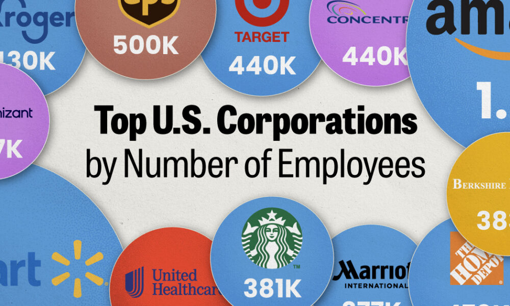
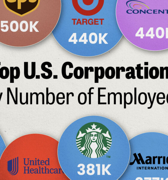
We visualized the top U.S. companies by employees, revealing the massive scale of retailers like Walmart, Target, and Home Depot.


We visualized product categories that saw the highest % increase in price due to U.S. inflation as of March 2024.
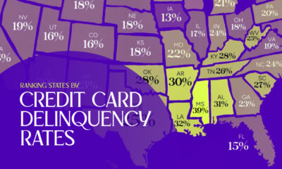

Which states have the lowest credit card delinquency rates in America, and which have the highest?
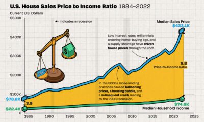

We chart the ever-widening gap between median incomes and the median price of houses in America, using data from the Federal Reserve from 1984 to 2022.
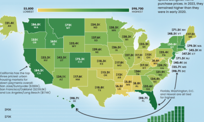

From coast to coast, the median down payment on a single family home can be close to $100,000 or less than $10,000.
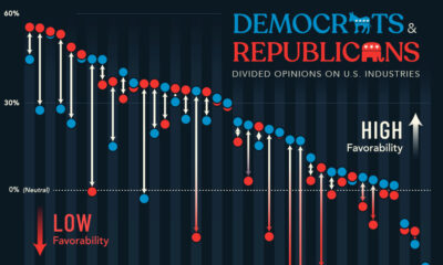

A survey looked at U.S. industry favorability across political lines, showing where Democrats and Republicans are divided over the economy.
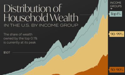

Wealth distribution in America is becoming increasingly unequal, with the wealth held by the top 0.1% reaching its highest level on record.
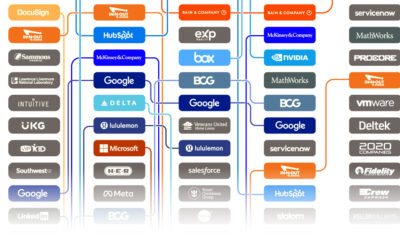

Glassdoor’s annual list is determined by an algorithm that converts reviews to ratings—here are America's 15 best places to work since 2020.


We visualize the amount of money Americans lost from scam text messages in the year 2022, accessing data from the Federal Trade Commission.
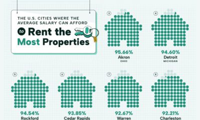

Visualizing the most affordable U.S. cities for renters by the percentage of affordable rentals available on an average salary.


 Creator Program