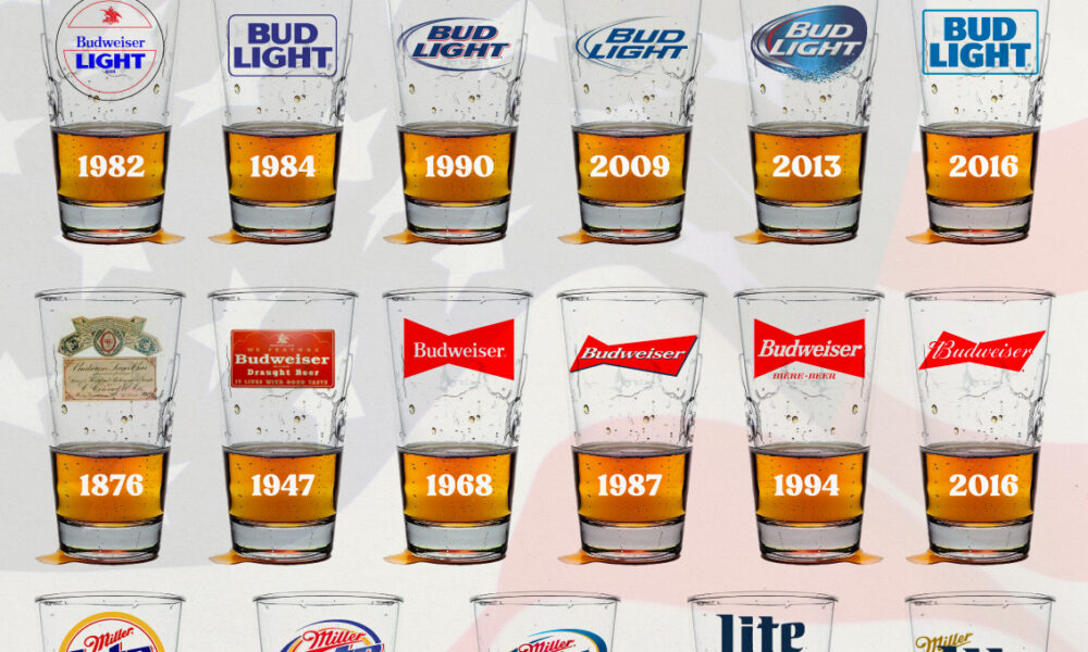
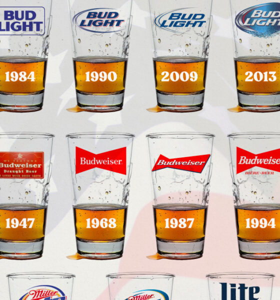
In this graphic, we analyze the evolution of popular U.S. beer logos like Budweiser, Coors Light, Bud Light, and more.


COVID-19 hit the global economy hard, but some companies thrived amidst the chaos. Here are the top 100 most valuable brands of 2021.
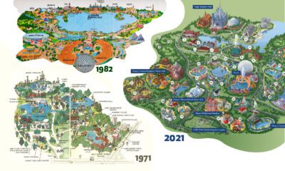

Historical maps highlight the Magic Kingdom's dramatic transformation from swampland to the biggest theme park in the world.
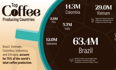

Coffee is the third most consumed beverage globally. Here we visualize the countries that have the highest coffee production in the world.
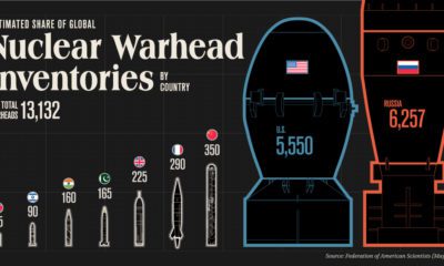

How big is the world’s nuclear arsenal? Here are the stockpiles of the nine countries with nuclear weapons.
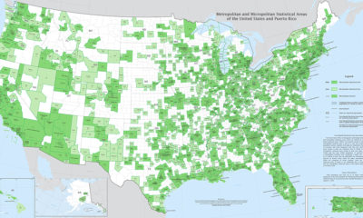

Fitting a complex population center into a tidy statistical box is no easy feat. Thankfully, this U.S. Census Bureau map is up to the challenge.


From Fords in the Midwest to Toyotas on the coasts, here are the best selling vehicles in America, visualized by state.
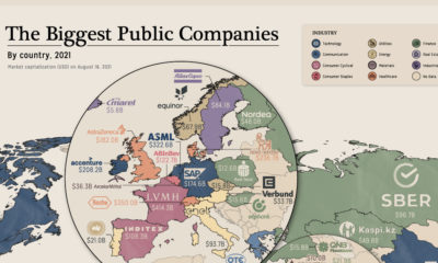

Tech, finance or energy giant? We mapped the biggest companies by market cap and industry.
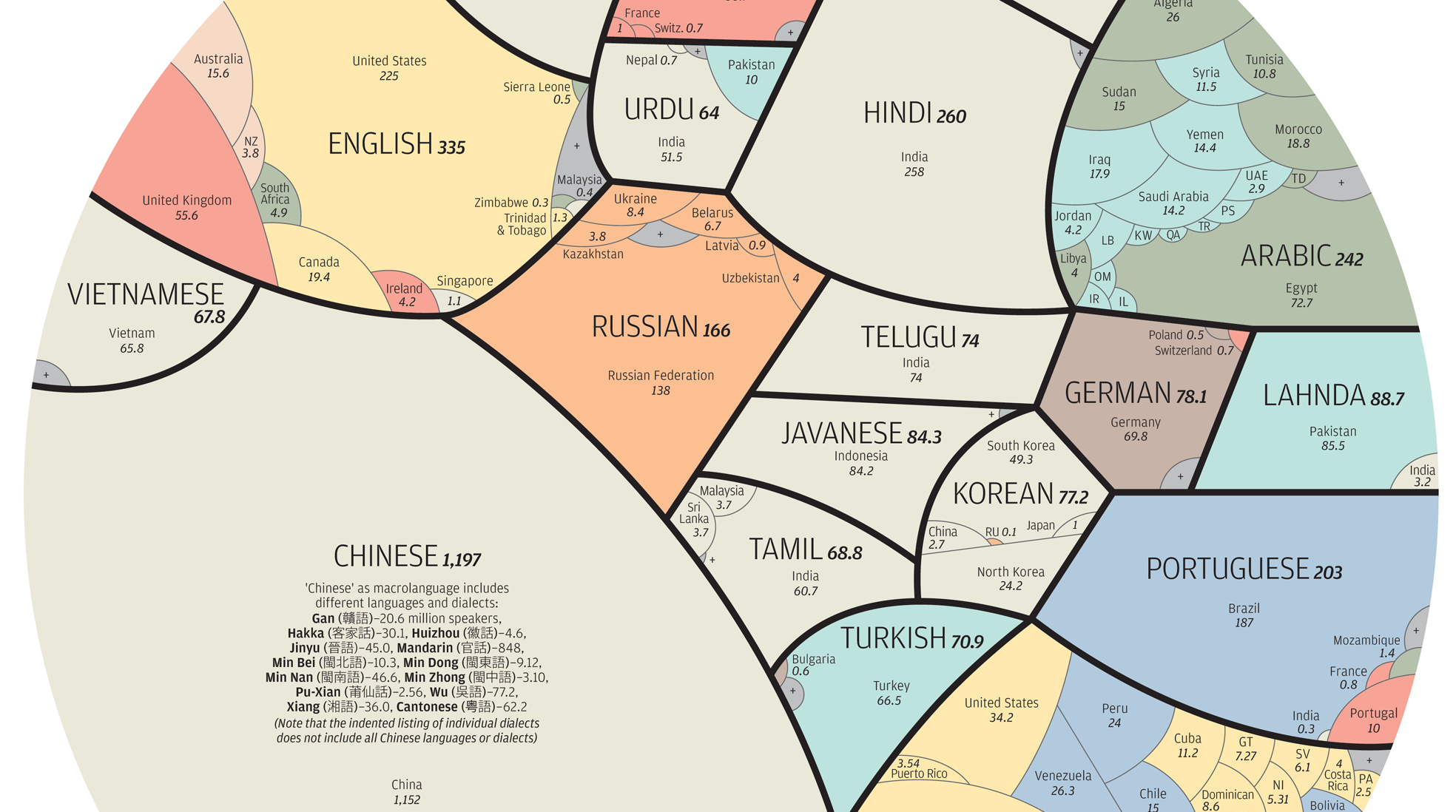
See the world's major languages broken down by country in this stunning visualization.
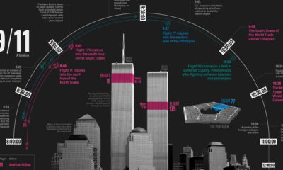

This timeline visualization is a high-level record of what happened on the fateful morning of September 11, 2001


This unique map graphic uses the Great Lakes region as a point of comparison for the top 25 largest lakes in the world.


